


记录一次学习过程,参考来源于【朝夕教育Winform开发体验课】,感谢分享!
接上一篇文章学习过程记录[WinForm]自定义开关控件制作学习过程_你好阿劲的博客-CSDN博客
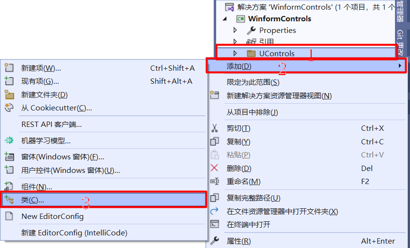
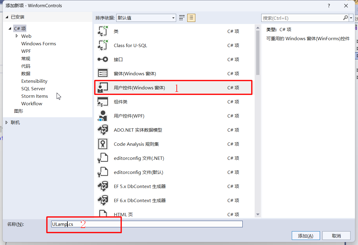
第一步:在“Ucontrols”文件夹上继续建立用户控件(Windows窗体)“USwitch”
第二步:调整控件默认大小,编写控件默认设置代码
public partial class ULamp1 : Control
    {
        public ULamp1()
        {
            InitializeComponent();

            #region 控件样式标志设置
            SetStyle(ControlStyles.AllPaintingInWmPaint, true);//如果为true,则控件忽略窗口消息WM_ERASEBKGND以减少闪烁
            SetStyle(ControlStyles.OptimizedDoubleBuffer, true);//如果为true,则控件首先绘制到缓冲区而不是直接绘制到屏幕,这样可以减少闪烁
            SetStyle(ControlStyles.ResizeRedraw, true);//如果为true,则控件在调整大小时进行重绘
            SetStyle(ControlStyles.UserPaint, true);//如果为true,则会由控件而不是由操作系统来绘制控件自身
            SetStyle(ControlStyles.Selectable, true);//如果为true,则控件可以接收焦点
            SetStyle(ControlStyles.SupportsTransparentBackColor, true);//如果为true,则控件接受alpha组建数小于255个的Control.BlackColor来模拟透明度

            #endregion

            #region 设置默认控件大小
            this.Size = new Size(50, 50);

            #endregion

        }
第三步:编写ULamp扩展属性参数
        #region ULamp扩展属性

        /// <summary>
        /// 边框颜色
        /// </summary>
        private Color broderColor = Color.Gray;
        [DefaultValue(typeof(Color), "Gray"), Description("边框颜色")]
        public Color BroderColor
        {
            get { return broderColor; }
            set
            {
                broderColor = value;
                Invalidate();//使控件的整个图面无效并导致重绘控件
            }
        }

        /// <summary>
        /// 中心放射颜色
        /// </summary>
        private Color CenterColor = Color.White;
        [DefaultValue(typeof(Color), "White"), Description("中心放射颜色")]
        public Color centerColor
        {
            get { return CenterColor; }
            set
            {
                CenterColor = value;
                Invalidate();//使控件的整个图面无效并导致重绘控件
            }
        }

        /// <summary>
        /// 打开颜色
        /// </summary>
        private Color trueColor = Color.Green;
        [DefaultValue(typeof(Color), "Green"), Description("打开颜色")]
        public Color TrueColor
        {
            get { return trueColor; }
            set
            {
                trueColor = value;
                Invalidate();//使控件的整个图面无效并导致重绘控件
            }
        }

        /// <summary>
        /// 关闭颜色
        /// </summary>
        private Color falseColor = Color.Red;
        [DefaultValue(typeof(Color), "Green"), Description("关闭颜色")]
        public Color FalseColor
        {
            get { return falseColor; }
            set
            {
                falseColor = value;
                Invalidate();//使控件的整个图面无效并导致重绘控件
            }
        }

        /// <summary>
        /// 打开文本
        /// </summary>
        private string trueText = "运行";
        [DefaultValue(typeof(string), "运行"), Description("打开文本")]
        public string TrueText
        {
            get { return trueText; }
            set
            {
                trueText = value;
                Invalidate();//使控件的整个图面无效并导致重绘控件
            }
        }

        /// <summary>
        /// 关闭文本
        /// </summary>
        private string falseText = "停止";
        [DefaultValue(typeof(string), "停止"), Description("关闭文本")]
        public string FalseText
        {
            get { return falseText; }
            set
            {
                falseText = value;
                Invalidate();//使控件的整个图面无效并导致重绘控件
            }
        }

        /// <summary>
        /// 打开边框颜色
        /// </summary>
        private Color[] truesurroundColor = { Color.Green };
        public Color[] TruesurroundColors
        {
            get { return truesurroundColor; }
            set
            {
                truesurroundColor = value;
                Invalidate();//使控件的整个图面无效并导致重绘控件
            }
        }

        /// <summary>
        /// 关闭边框颜色
        /// </summary>
        private Color[] falsesurroundColor = { Color.Red };
        public Color[] FalsesurroundColors
        {
            get { return falsesurroundColor; }
            set
            {
                falsesurroundColor = value;
                Invalidate();//使控件的整个图面无效并导致重绘控件
            }
        }

        /// <summary>
        /// 状态判断
        /// </summary>
        private bool mChecked;

        public bool Checked
        {
            get { return mChecked; }
            set
            {
                mChecked = value;
                Invalidate();//使控件的整个图面无效并导致重绘控件
            }
        }

        #endregion
第四步:运用GDI+绘制图形
#region 运用GDI+绘制图形
/// <summary>
/// 运用GDI+绘制图形
/// </summary>
/// <param name="e"></param>
protected override void OnPaint(PaintEventArgs e)
{
Graphics g = e.Graphics;//封装一个GDI+绘图画面
g.SmoothingMode = System.Drawing.Drawing2D.SmoothingMode.AntiAlias;//指定消除锯齿的呈现
GraphicsPath graphicsPath = new GraphicsPath();//定义灯的路径
Rectangle borderEllipse;//边框的位置和大小
Rectangle rectEllipse;//灯的位置和大小
if (!string.IsNullOrEmpty(trueText) & !string.IsNullOrEmpty(falseText))//有文本时
{
borderEllipse= new Rectangle(Width/4, Height/8, Width/2, Height/2);//定义边框的位置和大小
rectEllipse = new Rectangle(Width / 4 + 4, Height / 8 + 4, Width / 2 - 8, Height / 2 - 8);//定义灯的位置和大小
}
else//没有文本时
{
borderEllipse = new Rectangle(5, 5, Width - 10, Height - 10);//定义边框的位置和大小
rectEllipse = new Rectangle(Width / 10 + 5, Height / 10 + 5, Width - 10 - Width / 5, Height - 10 - Height / 5);//定义灯的位置和大小
}
graphicsPath.AddEllipse(rectEllipse);//添加灯的矩形路径
PathGradientBrush pathGradientBrush = new PathGradientBrush(graphicsPath);//定义灯的中心填充
pathGradientBrush.CenterColor = centerColor;//添加灯的中心颜色
if (mChecked)
{
pathGradientBrush.SurroundColors = truesurroundColor;//添加灯的环绕颜色
}
else
{
pathGradientBrush.SurroundColors = falsesurroundColor;//添加灯的环绕颜色
}
g.FillEllipse(new SolidBrush(broderColor), borderEllipse);//填充边框
g.FillEllipse(pathGradientBrush, rectEllipse);//填充圆形
if (!string.IsNullOrEmpty(trueText)& mChecked)
{
Rectangle rectText = new Rectangle(Width / 6, Height - Height / 3, Width - Width / 3, Height / 3);//定义文本的矩形
StringFormat Format = new StringFormat();//文本的格式化
Format.Alignment= StringAlignment.Center;//文本水平居中
Format.LineAlignment= StringAlignment.Center;//文本垂直居中
g.DrawString(TrueText, this.Font, new SolidBrush(ForeColor), rectText, Format);//绘制文本
}
else if((!string.IsNullOrEmpty(falseText) & !mChecked))
{
Rectangle rectText = new Rectangle(Width / 6, Height - Height / 3, Width - Width / 3, Height / 3);//定义文本的矩形
StringFormat Format = new StringFormat();//文本的格式化
Format.Alignment = StringAlignment.Center;//文本水平居中
Format.LineAlignment = StringAlignment.Center;//文本垂直居中
g.DrawString(falseText, this.Font, new SolidBrush(ForeColor), rectText, Format);//绘制文本
}
}
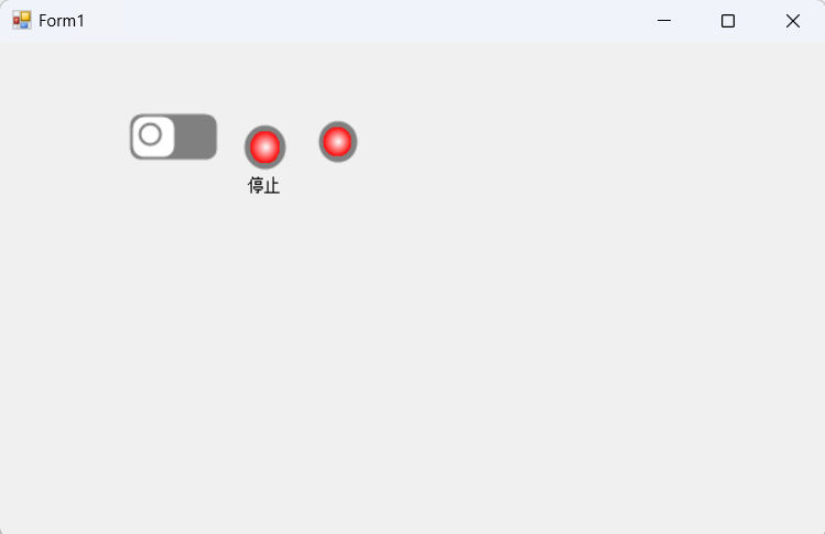
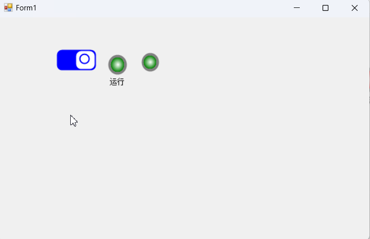
#endregion第五步:在工具箱拖拽指示灯到From1中
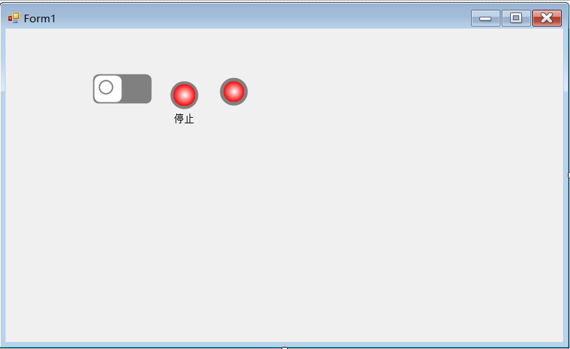
开关是上一篇文章所绘制的,这一篇延续着(下面是上一篇文章的连接,需要的可以去查看)
接上一篇文章学习过程记录[WinForm]自定义开关控件制作学习过程_你好阿劲的博客-CSDN博客
两个指示灯一个是包含文本的,另一个是不包含文本的,可以在ULamp属性“TrueText”和“FalseText”中进行编写;
private void uSwitch1_Click(object sender, EventArgs e)
        {
            uSwitch1.Checked = !uSwitch1.Checked;
            uLamp11.Checked = !uLamp11.Checked;
            uLamp12.Checked = !uLamp12.Checked;
        }
编写完这段代码就可以运行测试了。
效果演示:
记录一次学习过程,参考来源于【朝夕教育Winform开发体验课】,感谢分享!


 1948
1948

 被折叠的 条评论
为什么被折叠?
被折叠的 条评论
为什么被折叠?
 到【灌水乐园】发言


