


CSS小技巧之position和transform
position 属性指定了元素的定位类型,CSS中常用的定位属性.元素可以使用的顶部,底部,左侧和右侧属性定位。然而,这些属性无法工作,除非是先设定position属性。他们也有不同的工作方式,这取决于定位方法。
transform是css3中的一个特征,可以实现元素的缩放,位移,变形。
属性值:
scale:缩放
translate 位移
rotate 旋转
skew 倾斜
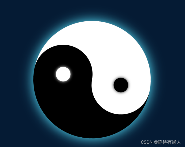
此次使用position和transform实现一个旋转的太极图案.
html如下:
<div class="backg">
<div class="rang">
<div class="groundUp">
  <div class="one"></div>
</div>
 <div class="grounddottom">
  <div class="two">
简单的构架标签,通过css构建实现太极图的旋转。
构建背景。
.backg{
  display: flex;
  justify-content: center;
  align-items: center;
  min-height: 100vh;
  background: #001d30;
  animation: changeback 1s linear infinite;  /*变换颜色*/
}

@keyframes changeback{
  to{
    filter: hue-rotate(360deg);
  }
}
.rang{
  width: 400px;
  height: 400px;
  border-radius: 50%;
  box-shadow: 0 0 40px #51eeee;
  animation: xuh 1s linear infinite;   /*动画添加 设置时间等*/
}
@keyframes xuh{
  to{
    transform: rotateZ(360deg);
  }
}
.groundUp{
  position: relative;
  width: 400px;
  height: 200px;
  background: white;  /*设置渐变*/
  border-top-left-radius: 200px;
  border-top-right-radius: 200px;
}
.grounddottom{
  position: relative;
  width: 400px;
  height: 200px;
  background: rgb(0, 0, 0);
  border-bottom-left-radius: 200px;
  border-bottom-right-radius: 200px;
}
.grounddottom::before{
  content: '';
  position: absolute;
  width: 50px;
  height: 50px;
  border-radius: 50%;
  background: rgb(255, 255, 255);
  top: -25px;
  left: 75px;
  box-shadow: 0 0 10px #ffffff;
}
.one{
  position: absolute;
  top: 100px;
  width: 200px;
  height: 200px;
  border-radius: 50%;
  background: rgb(0, 0, 0);
}
.two{
  position: absolute;
  bottom: 100px;
  right: 0;
  width: 200px;
  height: 200px;
  border-radius: 50%;
  background: rgb(255, 255, 255);
}
.two::before{
  content: '';
  position: absolute;
  width: 50px;
  height: 50px;
  border-radius: 50%;
  background: rgb(0, 0, 0);
  top: 75px;
  left: 75px;
  box-shadow: 0 0 10px #000000; /*阴影偏移和颜色*/
}
以上就是全部的代码了。
看看效果


 5719
5719


 被折叠的 条评论
为什么被折叠?
被折叠的 条评论
为什么被折叠?
 到【灌水乐园】发言


