


CSS Transitions and Transforms
简介
CSS transitions feature let you smoothly change one, or several, CSS properties from one value to another over a given amount of time.
CSS transforms let you change the position of an element and alter its shape, without disrupting the normal document flow.
参考:
Transition
如何使用Transition:
- List the properties to transition
- Define how long the transition should take
- Set an optional delay and change in speed
transition-duration sets the length of time of the transition; the property accepts a time unit of seconds or milliseconds.
transition-duration: .4s;
或者
transition-duration: 400ms;
transition-property tells the browser the CSS property, or set of properties, that will be transitioned.
transition-property: all; can create unexpected behaviors because it may transition properties that don’t need to be transitioned.
- List of animatable CSS properties – MDN
- Animatable properties – W3C
- Animatable properties demo – by Lea Verou
- transition-property – MDN
transition多个属性
.button {
  ...
  transition-property: background, border-radius, color;
  transition-duration: .4s, .8s, .4s;
}
transition-delay控制transition开始的时间:
.button {
  ...
  transition-property: opacity, background, box-shadow;
  transition-duration: .4s;
  transition-delay: .2s, .3s, 0s;
}
使用Timing Functions改变transition的速度, transition-timing-function的keyword:
ease- Starts gently, then speeds uplinear- Maintains a linear motion, at a constant speed with no easingease-in- Starts gradually and stops suddenlyease-out– Starts suddenly, then slows down at the endease-in-out– Starts and stops gradually
资源:
- transition-timing-function
- Pure CSS Questionnaire – with easing
- Pure CSS Questionnaire – with no easing
transition简写
transition: <transition-property> <transition-duration> <transition-timing-function> <transition-delay>;例如:
.photo-overlay {
  transition-property: opacity;
  transition-duration: .5s;
}
简写为:
.photo-overlay {
  transition: opacity .5s;
}
transform
资源:
- Using CSS transforms – MDN
- transform
- rotate()
- Angle units – MDN
- Alternative Units for CSS3 Rotation Transforms
rotate()旋转
- A positive value rotates an element clockwise, while a negative value rotates an element counterclockwise.
- Rotations––and all transforms––do not affect the position of nearby elements.
- You can use the
turnangle unit to create one, or several, full rotations.
旋转动画:
img {
   transition: transform .5s;
}

img:hover {
  transform: rotate(-5deg);
}
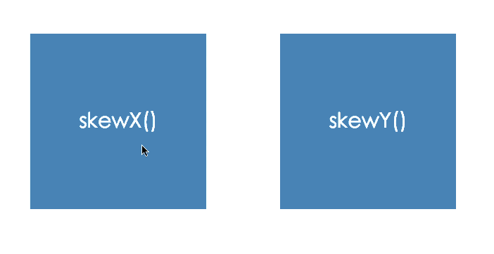
skewX() applies a horizontal skew to an element.
skewY() applies a vertical skew to an element.
例子 :Front-End Design Conference website
scaleX() scaleY() scale()缩放
Changing the Transform Position with transform-origin
- The default transform origin of an HTML element is its center, or 50% 50%.
- transform-origin is a separate CSS property; you add it to the element you’re transforming.
- transform-origin accepts values as length units, percentages, or position keywords.
- In transform-origin, the first value sets the horizontal origin, and the second value sets the vertical origin.
- The value 0 0 moves the origin to the element’s top-left corner.
- The value 100% 100% positions the origin at the furthest point on the X axis and the furthest point on the Y axis––or bottom right.
translate() ,translateX(), translateY()移动
cubic-bezier()资源
3D Transforms
一些资源:
Perspective
When defining the perspective property for an element, it is the CHILD elements that get the perspective view, NOT the element itself.
- Perspective is what separates 3D transforms from 2D transforms.
- You define 3D space with the ‘perspective’ property.
- The perspective property creates the illusion of depth; it sets how far away or how close objects appear to us.
- You can apply the perspective property to the
<body>, a<div>, or any block-level element. - The value for perspective can be set in pixels, em, or rem.
- When you enable 3D space with perspective, the smaller the value, the deeper the perspective; the greater the value, the shallower the perspective.
- A value between 500px and 800px usually renders a realistic perspective.
- If you delete the perspective property at any time, you will lose the 3D effect on your page.
transform-style&backface-visibility
- Using CSS 3D transforms
- transform-style – MDN
- transform-style – WebKit demo
- backface-visibility – MDN
- cubic-bezier – WPD
transform-style: preserve-3d; indicates that the children of the element should be positioned in the 3D space.
backface-visibility: hidden; hides the backside of a 3D-transformed element.
rotate3d(), you can rotate on the X, Y and Z axis at the same time.
rotate3d(x, y, z, <angle>)
perspective-origin sets where the viewer sees the objects in 3D space. 默认值为50% 50%。


 1010
1010

 被折叠的 条评论
为什么被折叠?
被折叠的 条评论
为什么被折叠?
 到【灌水乐园】发言


