


 本文详细介绍了使用Python进行图表制作,包括条形图、水平条形图、堆垛条形图、散点图、折线图、面积图、刻面、饼图、甜甜圈图、棒棒糖图以及2D马赛克和树形图的实例,展示了如何通过matplotlib和seaborn等库实现各种类型的可视化效果。
大家好,小编来为大家解答以下问题,python制作图表和Excel制作图表,基于python的图表生成系统,今天让我们一起来看看吧!
40张python图表
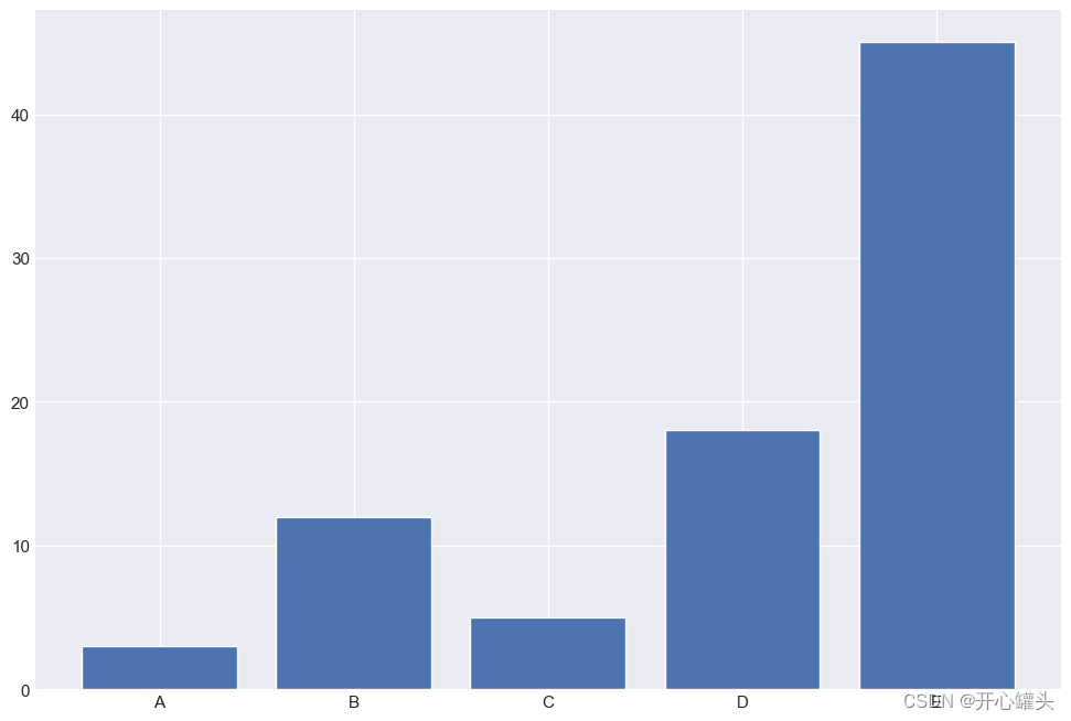
1. 条形图
# 库
import numpy as np
import matplotlib.pyplot as plt

# 创建数据集
height = [3, 12, 5, 18, 45]
bars = ('A', 'B', 'C', 'D', 'E')
x_pos = np.arange(len(bars))

# 创建条形图
plt.bar(x_pos, height)

# 在x轴上创建名称
plt.xticks(x_pos, bars)

# 显示图形
plt.show()
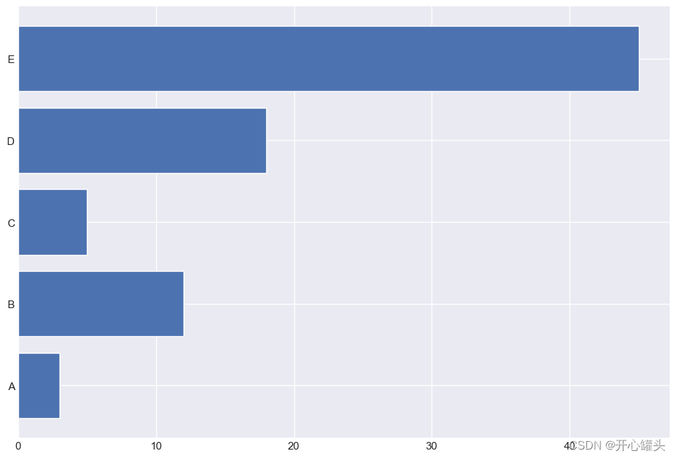
#水平条形图
import matplotlib.pyplot as plt
import numpy as np

height = [3, 12, 5, 18, 45]
bars = ('A', 'B', 'C', 'D', 'E')
y_pos = np.arange(len(bars))
#height后面加上代码color=(0.2, 0.4, 0.6, 0.6)可以改变颜色
plt.barh(y_pos, height)

plt.yticks(y_pos, bars)
plt.show()
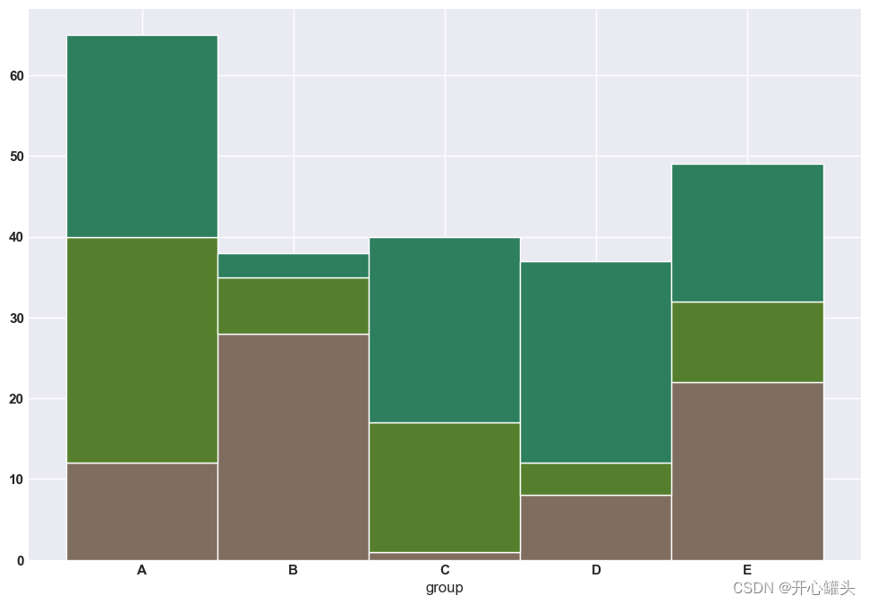
# 堆垛条形图
# 库
import numpy as np
import matplotlib.pyplot as plt
from matplotlib import rc
import pandas as pd
rc('font', weight='bold')
bars1 = [12, 28, 1, 8, 22]
bars2 = [28, 7, 16, 4, 10]
bars3 = [25, 3, 23, 25, 17]
bars = np.add(bars1, bars2).tolist()
r = [0,1,2,3,4]
names = ['A','B','C','D','E']
barWidth = 1
plt.bar(r, bars1, color='#7f6d5f', edgecolor='white', width=barWidth)
plt.bar(r, bars2, bottom=bars1, color='#557f2d', edgecolor='white', width=barWidth)
plt.bar(r, bars3, bottom=bars, color='#2d7f5e', edgecolor='white', width=barWidth)
plt.xticks(r, names, fontweight='bold')
plt.xlabel("group")
plt.show()
2.散点图
import matplotlib.pyplot as plt
import numpy as np

rng = np.random.default_rng(1234)

# Generate data
x = rng.lognormal(size=200)
y = x + rng.normal(scale=5 * (x / np.max(x)), size=200)

# Initialize layout
fig, ax = plt.subplots(figsize = (9, 6))

# Add scatterplot
ax.scatter(x, y, s=60, alpha=0.7, edgecolors="k");
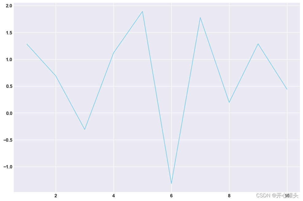
3.折线图
# Libraries and data
import matplotlib.pyplot as plt
import numpy as np
import pandas as pd
df=pd.DataFrame({
'x_values': range(1,11), 'y_values': np.random.randn(10) })
# Draw plot
plt.plot( 'x_values', 'y_values', data=df, color='skyblue')
plt.show()
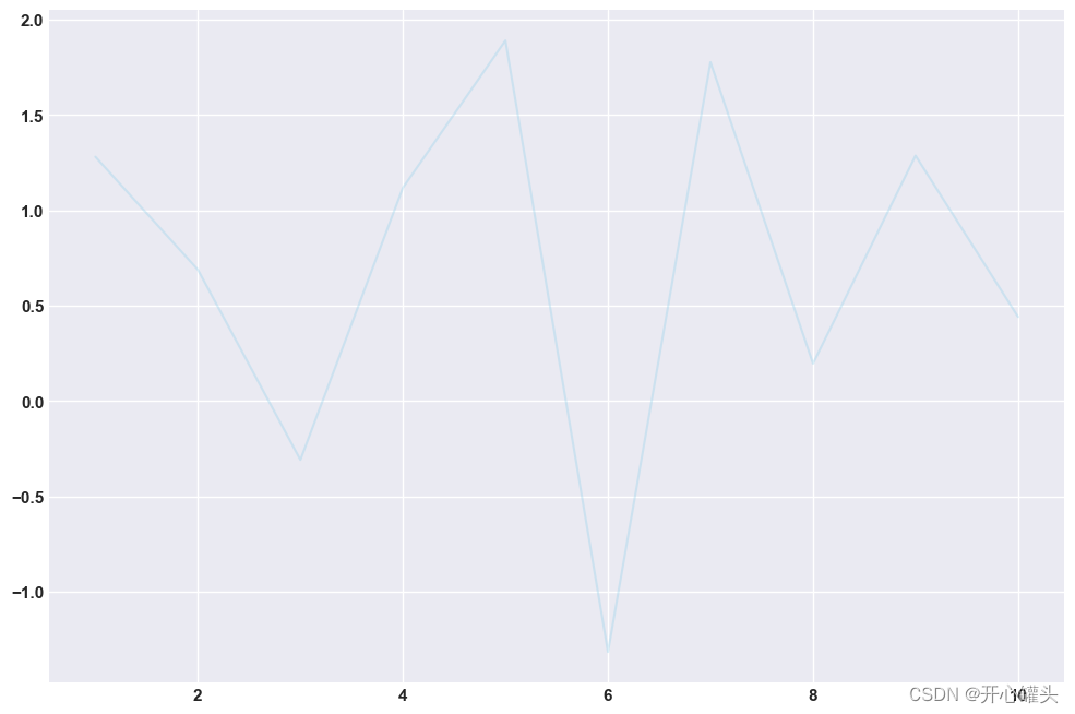
# Draw line chart by modifiying transparency of the line
plt.plot( 'x_values', 'y_values', data=df, color='skyblue', alpha=0.3)
# Show plot
plt.show()
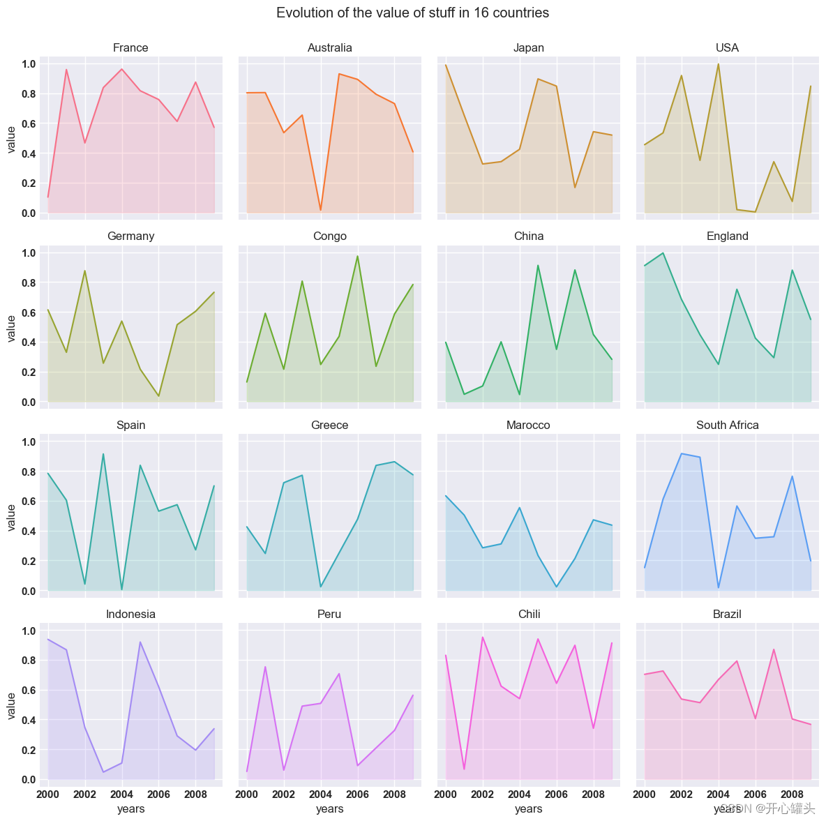
4.面积图和刻面
# libraries
import numpy as np
import seaborn as sns
import pandas as pd
import matplotlib.pyplot as plt

# Create a dataset
my_count=["France","Australia","Japan","USA","Germany","Congo","China","England","Spain","Greece","Marocco","South Africa","Indonesia","Peru","Chili","Brazil"]
df = pd.DataFrame({

"country":np.repeat(my_count, 10),
"years":list(range(2000, 2010)) * 16,
"value":np.random.rand(160)
})

# Create a grid : initialize it
g = sns.FacetGrid(df, col='country', hue='country', col_wrap=4, )

# Add the line over the area with the plot function
g = g.map(plt.plot, 'years', 'value')

# Fill the area with fill_between
g = g.map(plt.fill_between, 'years', 'value', alpha=0.2).set_titles("{col_name} country")

# Control the title of each facet
g = g.set_titles("{col_name}")

# Add a title for the whole plot
plt.subplots_adjust(top=0.92)
g = g.fig.suptitle('Evolution of the value of stuff in 16 countries')

# Show the graph
plt.show()
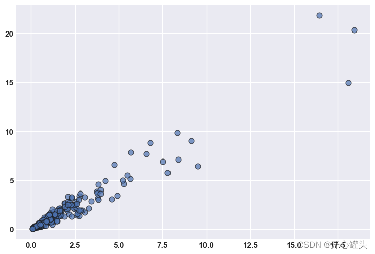
5.散点图
# libraries
import matplotlib.pyplot as plt
import numpy as np
import pandas as pd

# Create a dataset:
df=pd.DataFrame({
   'x_values': range(1,101), 'y_values': np.random.randn(100)*15+range(1,101) })

# plot
plt.plot( 'x_values', 'y_values', data=df, linestyle='none', marker='o')
plt.show()
![[外链图片转存失败,源站可能有防盗链机制,建议将图片保存下来直接上传(img-RyQuAWhB-1685956274523)(output_12_0.png)]](https://img-blog.csdnimg.cn/339f4c643610454dafc7af77aa1fea61.png)
6. 基本饼图
# library
import pandas as pd
import matplotlib.pyplot as plt

# --- dataset 1: just 4 values for 4 groups:
df = pd.DataFrame([8,8,1,2], index=['a', 'b', 'c', 'd'], columns=['x'])

# make the plot
df.plot(kind='pie', subplots=True, figsize=(8, 8))

# show the plot
plt.show()
![[外链图片转存失败,源站可能有防盗链机制,建议将图片保存下来直接上传(img-qbtqrHEZ-1685956274524)(output_14_0.png)]](https://img-blog.csdnimg.cn/401386265032456c869191ff2f023d34.png)
6.基本甜甜圈图
# library
import matplotlib.pyplot as plt

# create data
size_of_groups=[12,11,3,30]

# Create a pie plot
plt.pie(size_of_groups)
#plt.show()

# add a white circle at the center
my_circle=plt.Circle( (0,0), 0.7, color='white')
p=plt.gcf()
p.gca().add_artist(my_circle)

# show the graph
plt.show()
![[外链图片转存失败,源站可能有防盗链机制,建议将图片保存下来直接上传(img-EMUEG6Wq-1685956274524)(output_16_0.png)]](https://img-blog.csdnimg.cn/31c5e527f97d44b092d4e6ad089b0562.png)
7.棒棒糖图
# libraries
import matplotlib.pyplot as plt
import numpy as np

# create data
x=range(1,41)
values=np.random.uniform(size=40)

# stem function
plt.stem(x, values)
plt.ylim(0, 1.2)
plt.show()

# stem function: If x is not provided, a sequence of numbers is created by python:
plt.stem(values)
plt.show()
![[外链图片转存失败,源站可能有防盗链机制,建议将图片保存下来直接上传(img-SreaDyDR-1685956274524)(output_18_0.png)]](https://img-blog.csdnimg.cn/8a46b4f677d341efa3dc9442bc206bd4.png)
![[外链图片转存失败,源站可能有防盗链机制,建议将图片保存下来直接上传(img-J97UbtMU-1685956274524)(output_18_1.png)]](https://img-blog.csdnimg.cn/7d03a1522ce8456f97268ab64d7ece65.png)
8. 2D马赛克
# libraries
import matplotlib.pyplot as plt
import numpy as np

# Data
x = np.random.normal(size=50000)
y = x * 3 + np.random.normal(size=50000)

# A histogram 2D
plt.hist2d(x, y, bins=(50, 50), cmap=plt.cm.Reds)

# Add a basic title
plt.title("A 2D histogram")

# Show the graph
plt.show()
![[外链图片转存失败,源站可能有防盗链机制,建议将图片保存下来直接上传(img-5WZnzhRd-1685956274525)(output_20_0.png)]](https://img-blog.csdnimg.cn/8598f864a2694cbc9ccb0f2698d9115f.png)
9.树形图
# libraries
import pandas as pd
import matplotlib.pyplot as plt
import squarify    # pip install squarify (algorithm for treemap)

# If you have 2 lists
squarify.plot(sizes=[13,22,35,5], label=["group A", "group B", "group C", "group D"], alpha=.7 )
plt.axis('off')
plt.show()

# If you have a data frame
df = pd.DataFrame({
   'nb_people':[8,3,4,2], 'group':["group A", "group B", "group C", "group D"] })
squarify.plot(sizes=df['nb_people'], label=df['group'], alpha=.8 )
plt.axis('off')
plt.show()
![[外链图片转存失败,源站可能有防盗链机制,建议将图片保存下来直接上传(img-gMNlFuHT-1685956274525)(output_22_0.png)]](https://img-blog.csdnimg.cn/e4e980b86e3a4bd3b044a75e8fa5f06a.png)
![[外链图片转存失败,源站可能有防盗链机制,建议将图片保存下来直接上传(img-STBoPWPb-1685956274525)(output_22_1.png)]](https://img-blog.csdnimg.cn/6af9a0131aaf413c9ee882a0cf533621.png)
10.带有颜色映射值的树状图
#libraries
import matplotlib
import matplotlib.pyplot as plt
import squarify # pip install squarify (algorithm for treemap)</pre>

# Create a dataset:
my_values=[i**3 for i in range(1,100)]

# create a color palette, mapped to these values
cmap = matplotlib.cm.Blues
mini=min(my_values)
maxi=max(my_values)
norm = matplotlib.colors.Normalize(vmin=mini, vmax=maxi)
colors = [cmap(norm(value)) for value in my_values]

# Change color
squarify.plot(sizes=my_values, alpha=.8, color=colors 


 3429
3429


 被折叠的 条评论
为什么被折叠?
被折叠的 条评论
为什么被折叠?
 到【灌水乐园】发言


