


 本文介绍了Android中Button控件的基本用法及属性设置,包括如何通过指定背景属性改变按钮外观,如何利用自定义Drawable对象实现不同状态下的背景变化,并提供了具体的XML配置示例。
Button继承了TextView,它主要是在UI界面上生成一个按钮,该按钮可以供用户单击,当用户单击按钮时,按钮会触发一个onClick事件。
按钮使用起来比较容易,可以通过指定android:background属性为按钮增加背景颜色或背景图片,如果将背景图片设为不规则的背景图片,则可以开发出各种不规则形状的按钮。
如果需要让按钮的背景颜色、背景图片随用户动作改变,则可以考虑使用自定义Drawable对象来实现。
实例:
irregular_button.xml
<?xml version="1.0" encoding="utf-8"?>
<LinearLayout xmlns:android="http://schemas.android.com/apk/res/android"
android:orientation="vertical" android:layout_width="match_parent"
android:layout_height="match_parent">
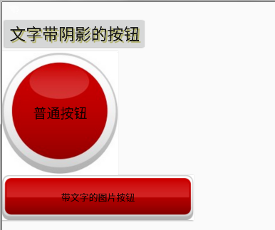
<!--文字带阴影的按钮-->
<Button
android:layout_width="wrap_content"
android:layout_height="wrap_content"
android:text="文字带阴影的按钮"
android:textSize="12pt"
android:shadowColor="#aa5"
android:shadowRadius="1"
android:shadowDx="5"
android:shadowDy="5" />
<!--普通文字按钮-->
<Button
android:layout_width="wrap_content"
android:layout_height="wrap_content"
android:text="普通按钮"
android:textSize="10pt"
android:background="@drawable/red"/>
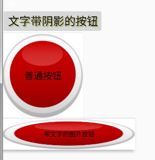
<!--带文字的图片按钮-->
<Button
android:layout_width="wrap_content"
android:layout_height="wrap_content"
android:background="@drawable/button_selector"
android:textSize="30px"
android:text="带文字的图片按钮"/>
</LinearLayout>button_selector.xml
<?xml version="1.0" encoding="utf-8"?>
<selector xmlns:android="http://schemas.android.com/apk/res/android">
    <!--指定按钮按下时的图片-->
    <item android:state_pressed="true"
        android:drawable="@drawable/red"/>
    <!--指定按钮松开时的图片-->
    <item android:state_pressed="false"
        android:drawable="@drawable/purple"/>
</selector>


 扫一扫
扫一扫


 1615
1615

 被折叠的 条评论
为什么被折叠?
被折叠的 条评论
为什么被折叠?
 到【灌水乐园】发言


