


We sometimes need to authorize controls, instead of writing someting starting from scratch, we might sometimes need to do with alternatives that are offered here : Control Authoring Overview ,
One of them is to write DataTemplate or ControlTemplate.
And sometimes we need to venture into finding out and re-template the Resources that is already defined in some target assemblies (or for themeing support) .
First let' see from the Guide/Overview, in the section called "Defining and Referencing Keys for Theme Resources", which state "When you define a resource at the theme level, you must use a ComponentResourceKey as the key. The following example defines a resource in generic.xaml. "
<LinearGradientBrush
     x:Key="{ComponentResourceKey TypeInTargetAssembly={x:Type local:Painter},
                                  ResourceId=MyEllipseBrush}"
                                  StartPoint="0,0" EndPoint="1,0">
    <GradientStop Color="Blue" Offset="0" />
    <GradientStop Color="Red" Offset="0.5" />
    <GradientStop Color="Green" Offset="1"/>
</LinearGradientBrush>
<RepeatButton
    Grid.Column="1" Grid.Row="0"
    Background="{StaticResource {ComponentResourceKey
                        TypeInTargetAssembly={x:Type local:NumericUpDown},
                        ResourceId=ButtonBrush}}">
    Up
</RepeatButton>
<RepeatButton
    Grid.Column="1" Grid.Row="1"
    Background="{StaticResource {ComponentResourceKey
                    TypeInTargetAssembly={x:Type local:NumericUpDown},
                    ResourceId=ButtonBrush}}">
    Down
 </RepeatButton>
[assembly: ThemeInfo(ResourceDictionaryLocation.SourceAssembly,
           ResourceDictionaryLocation.SourceAssembly)]
...
And then we will examine how we will treat as a re-template of the exisitng controlTemplate.
Suppose, that we are writing new template for the system control, you might have this:
<!-- this is to override the FrameworkElement's host assembly, and retemplate the controltemplate  but want to use property values that come from resources provided by the control's themes -->
    <Style x:Key="{ComponentResourceKey ResourceId=MenuScrollViewer1, TypeInTargetAssembly={x:Type FrameworkElement}}" BasedOn="{x:Null}" TargetType="{x:Type ScrollViewer}">
        <Setter Property="HorizontalScrollBarVisibility" Value="Auto"/>
        <Setter Property="VerticalScrollBarVisibility" Value="Auto"/>
        <Setter Property="Background" Value="Red" />
        <Setter Property="BorderBrush" Value="Aqua" />
        <Setter Property="BorderThickness" Value="5" />
        <Setter Property="Padding" Value="10" />
        <Setter Property="Margin" Value="20" />
        <Setter Property="Template">
            <Setter.Value>
                <ControlTemplate TargetType="{x:Type ScrollViewer}">
                    <Grid>
                        <Grid.ColumnDefinitions>
                            <ColumnDefinition Width="*"/>
                        </Grid.ColumnDefinitions>
                        <Grid.RowDefinitions>
                            <RowDefinition Height="Auto"/>
                            <RowDefinition Height="*"/>
                            <RowDefinition Height="Auto"/>
                        </Grid.RowDefinitions>
                        <!--The following is added to the Border element below to illustrate how we can use ComponentResourceKey to affect the looking and feel of the ScrollViewer-->
                        <!--BorderBrush="{TemplateBinding BorderBrush}"
                                BorderThickness="{TemplateBinding BorderThickness}"-->
                        <Border Grid.Column="0" Grid.Row="1"
                                BorderBrush="{TemplateBinding BorderBrush}"
                                BorderThickness="{TemplateBinding BorderThickness}"
                                >
                            <ScrollContentPresenter Margin="{TemplateBinding Padding}"  />
                        </Border>
                        <!--<RepeatButton Grid.Column="0" CommandTarget="{Binding RelativeSource={RelativeSource TemplatedParent}}" Command="{x:Static ScrollBar.LineUpCommand}" Focusable="false" Grid.Row="0" Style="{StaticResource MenuScrollButton}">
                            <RepeatButton.Visibility>
                                <MultiBinding ConverterParameter="0" Converter="{StaticResource MenuScrollingVisibilityConverter}" FallbackValue="Visibility.Collapsed">
                                    <Binding Path="ComputedVerticalScrollBarVisibility" RelativeSource="{RelativeSource TemplatedParent}"/>
                                    <Binding Path="VerticalOffset" RelativeSource="{RelativeSource TemplatedParent}"/>
                                    <Binding Path="ExtentHeight" RelativeSource="{RelativeSource TemplatedParent}"/>
                                    <Binding Path="ViewportHeight" RelativeSource="{RelativeSource TemplatedParent}"/>
                                </MultiBinding>
                            </RepeatButton.Visibility>
                            <Path Data="{StaticResource UpArrow}" Fill="{StaticResource MenuFGBrush}"/>
                        </RepeatButton>
                        <RepeatButton Grid.Column="0" CommandTarget="{Binding RelativeSource={RelativeSource TemplatedParent}}" Command="{x:Static ScrollBar.LineDownCommand}" Focusable="false" Grid.Row="2" Style="{StaticResource MenuScrollButton}">
                            <RepeatButton.Visibility>
                                <MultiBinding ConverterParameter="100" Converter="{StaticResource MenuScrollingVisibilityConverter}" FallbackValue="Visibility.Collapsed">
                                    <Binding Path="ComputedVerticalScrollBarVisibility" RelativeSource="{RelativeSource TemplatedParent}"/>
                                    <Binding Path="VerticalOffset" RelativeSource="{RelativeSource TemplatedParent}"/>
                                    <Binding Path="ExtentHeight" RelativeSource="{RelativeSource TemplatedParent}"/>
                                    <Binding Path="ViewportHeight" RelativeSource="{RelativeSource TemplatedParent}"/>
                                </MultiBinding>
                            </RepeatButton.Visibility>
                            <Path Data="{StaticResource DownArrow}" Fill="{StaticResource MenuFGBrush}"/>
                        </RepeatButton>-->
                    </Grid>
                </ControlTemplate>
            </Setter.Value>
        </Setter>
    </Style>
and if you apply that style to the ScrollViewer.
<Window x:Class="ComponentResourceKeyDemo.MainWindow"
        xmlns="http://schemas.microsoft.com/winfx/2006/xaml/presentation"
        xmlns:x="http://schemas.microsoft.com/winfx/2006/xaml"
        Title="MainWindow" Height="350" Width="525">
    <Window.Resources>
        <ResourceDictionary>
            <ResourceDictionary.MergedDictionaries>
                <ResourceDictionary Source="/ResourceDictionary.xaml" />
            </ResourceDictionary.MergedDictionaries>
        </ResourceDictionary>
    </Window.Resources>
    <Grid>
        <Grid.RowDefinitions>
            <RowDefinition />
        </Grid.RowDefinitions>
        <Grid.ColumnDefinitions>
            <ColumnDefinition />
            <ColumnDefinition />
        </Grid.ColumnDefinitions>
        <!-- you don't need to use the ComponentResourceKey to explicitly reference the Resource, it shall be implicitly applied ?/-->
        <ScrollViewer x:Name="scrollViewer"
                      HorizontalScrollBarVisibility="Auto" VerticalScrollBarVisibility="Auto"
                      Grid.Column="0"
                      Style="{StaticResource ResourceKey={ComponentResourceKey ResourceId=MenuScrollViewer1, TypeInTargetAssembly={x:Type FrameworkElement}}}"
                      >
            <!--
            HorizontalAlignment="Stretch" VerticalAlignment="Stretch"
            Width="{Binding ElementName=scrollViewer, Path=Width}"
            MinWidth="100"
        -->
            <TextBox
                TextWrapping="Wrap"
                 HorizontalAlignment="Stretch" VerticalAlignment="Stretch"
                Width="{Binding ElementName=scrollViewer, Path=Width}"
                MinWidth="100"
            >
                <sys:String xmlns:sys="clr-namespace:System;assembly=mscorlib">Hello, there is a very long sentence and I
                    <![CDATA[And I am writing something in the middle ]]>
                </sys:String>
            </TextBox>
        </ScrollViewer>

    </Grid>

</Window> 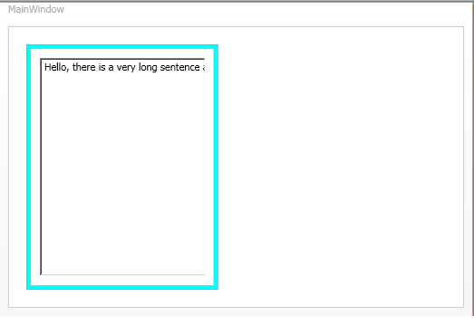


 2933
2933

 被折叠的 条评论
为什么被折叠?
被折叠的 条评论
为什么被折叠?
 到【灌水乐园】发言


