一、思路
- 步骤:
- 骨架:在app.vue的根组件构建基本的html,添加CSS构建基本的显示效果
- 抽离:根据上一步的代码膨胀量,抽取相应功能模块到子组件中,根组件只保留子组件的标签,1、2步循环
- 完善:根据逻辑,补充子组件的JS,包括父子组件之间的数据传递
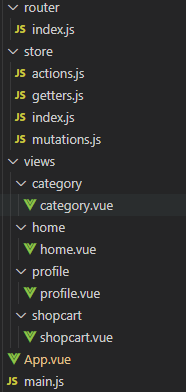
- 项目目录结构
- 项目公共组件:assets,注意按功能再细分文件夹,例如TabBar
- 页面组件:views,注意按路由再细分文件夹,例如category

- 最终达到的效果

二、App.vue
<template>
  <TabBar></TabBar>											// 3. 使用TabBar组件
  <router-view></router-view>
</template>

<script>
  import TabBar from './assets/components/TabBar/TabBar'	// 1. 导入TabBar组件
  export default {
    name: 'App',
    components: {
      TabBar,  												// 2. 注册TabBar组件
    }
  }
</script>

<style>
  @import "~@/assets/css/base.css";							// CSS格式化位置及写法
</style>
三、TabBar
<template>
    <div id="TabBar">

        <TabBarIterm path='/home'>			// a.此处向子组件传递路由,用于比对,若当前活动路由为此路由时激活此组件
            <template v-slot:slotImg>								 // a1.具名插槽写法
                <img src="@/assets/img/TabBar/home.svg" alt="">      // a1.未激活时,显示的图片(黑色的),地址简写见前
            </template>

            <template v-slot:slotImg_active>						   // a2.具名插槽写法
                <img src="@/assets/img/TabBar/home_active.svg" alt=""> // a2.激活时,显示的图片(红色的),地址简写见前
            </template>

            <template v-slot:slotText>								   // a3.具名插槽写法
                <div>首页</div>									       // a3.传入文本
            </template>

        </TabBarIterm>

        <TabBarIterm path='/category'>...							   // b.此处折叠了,同第一个
        </TabBarIterm>

        <TabBarIterm path='/shopcart'>...			 				   // c.此处折叠了,同第一个
        </TabBarIterm>

        <TabBarIterm path='/profile'>...			 				   // d.此处折叠了,同第一个
        </TabBarIterm>

    </div>
</template>

<script>
import TabBarIterm from './TabBarIterm'							      // 1. 导入TabBarIterm组件
export default {
    name: 'TabBar',
    components: {
        TabBarIterm													  // 2. 注册TabBar组件
    },
    data(){
        return {
            path: '',												  // 初始化变量,否则会有警告,但不影响运行
        }
    }
}
</script>

<style>

  #TabBar {
    display: flex;									// 使用flex布局
    background-color: #cac9ca;						// 设置背景颜色,可使用snipaste工具获取
    position: fixed;								// 设置TabBar固定位置,不随页面滚动
    left: 0;										// 设置tabbar距离浏览器左边距离
    bottom: 0;										// 设置tabbar距离浏览器底边距离
    right: 0;										// 设置tabbar距离浏览器右边距离
    height: 49px;									// 设置tabbar高度
    text-align: center;								// 设置tabbar中的TabBarIterm水平居中
    align-items: center;							// 设置tabbar中的TabBarIterm垂直居中
    box-shadow: 0px -5px 3px rgb(202, 201, 202);	// 设置tabbar盒子阴影
  }

</style>
四、TabBarIterm
<template>
    <div class="TabBarIterm" @click="itemClick">				// a.传进来的图片、文字用盒子装起来,并监控点击
        <div v-if='isActive'><slot name="slotImg"></slot></div>	// a1.传进来的图片用盒子装起来,用isActive监控是否开启
        <div v-else><slot name="slotImg_active"></slot></div>   // a2.v-else作用:上一行如果没显示就显示这一行
        <div :style='activeStyle'><slot name="slotText"></slot></div>	// a3.绑定样式,activeStyle为计算属性
    </div>
</template>

<script>
export default {
    name: 'TabBarIterm',
    props: {												// 父传子
        path:String,										// 父的path变量
        itemColor: {										// 父的itemColor变量,可以不传,默认红色
          type: String,
          default: 'red'
        }
    },
    methods: {
      itemClick() {											// TabBarIterm组件被点击了则跳转
        this.$router.push(this.path)
      }
    },
    computed: {
      isActive(){											// 判断是否被点击
        return this.$route.path !== this.path				// 若当前激活路由不等于各个组件传进来的path,则返回true
      },
      activeStyle(){										// 判断是否激活样式
        return this.isActive?{}:{color:this.itemColor}		// 三目运算符:若isActive为false,使用后面属性,也可父传入
      }
    }
}
</script>

<style>

  .TabBarIterm img {										// 设置图片大小
    height: 24px;
    width: 24px;
  }

  .TabBarIterm {											// 设置各个TabBarIterm组件在TabBar中的排列
    flex: 1;
  }

</style>
上一篇:Vue进阶知识(一)------项目初始化
下一篇:Vue进阶知识(三)------页面滚动


 扫一扫
扫一扫
 5万+
5万+

 被折叠的 条评论
为什么被折叠?
被折叠的 条评论
为什么被折叠?
 到【灌水乐园】发言


