


This tutorial I will show you how to slice up the menu design (step by step) and put them together with CSS. Most of you probably know how to code a horizontal or vertical CSS list menu. Now let’s take it to the next level — code an advanced (un-typical) list menu utilizing the CSS position property.
View Demo CSS menu Download Demo ZIP
Overview
Here are the required graphics to assembe the menu (you can download from the zip).
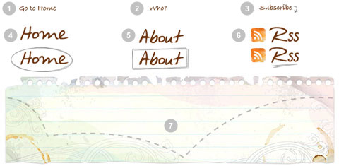
1. Main background
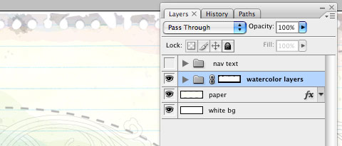
Open the Photoshop file. Turn off the menu text Layer Group and save the main background as menu-bg.jpg.
2. Button graphics
Turn off the background Layer Group and leave only the menu text layers visible. Make a rectangle selection cover the "home" item, go to menu Edit > Copy Merged (Cmd + Shift + C).

Create a new file and take note of the file dimension (w x h), in my case the "home" graphic is 144 x 58px. Paste the "home" graphic in the new file. Go to menu Image > Canvas Size, adjust the image height x 2 (58 + 58 = 116px). Duplicate the home graphic layer and align it to the bottom. Erase the highlight strokes in the upper layer.

Here is how the hover effect will work. We will set the link button to 144 x 58px, when mouseover, we will shift the background image from top to bottom.

Repeat this step for the other buttons. You should have the follow graphics:
3. HTML source
When you are done with the graphics, let’s start coding. Start with an un-ordered list <ul>.
- note there is an id="menu" assigned to the
<ul>tag - an unique class name assigned to each link
<a> - an empty
<span>tag (the purpose of this is to make the mouseover effect)
<ul id="menu">
  <li><a href="#" class="home">Home <span></span></a></li>
  <li><a href="#" class="about">About <span></span></a></li>
  <li><a href="#" class="rss">RSS <span></span></a></li>
</ul>
#menu
Reset the menu to no padding, no margin, and no list-style. Specify the width and height same dimension as the menu-bg.jpg. Then attach the menu background image. The key point to remember here is set the position property to relative.
#menu {
  list-style: none;
  padding: 0;
  margin: 0;
  width: 774px;
  height: 210px;
  background: url(images/menu-bg.jpg) no-repeat;
  position: relative;
}
#menu span
Specify the span element to display:none (so they will be invisible by default). Specify position:absolute, so we can place the mouseover GIF image on exact position.
#menu span {
  display: none;
  position: absolute;
}
#menu a
The key point here is the text-indent property. We specify the text-indent property with a negative value (-900%), so the text will be hidden.
#menu a {
  display: block;
  text-indent: -900%;
  position: absolute;
  outline: none;
}
#menu a:hover
When mouseover the link, we want to shift the background image from top to bottom
#menu a:hover {
  background-position: left bottom;
}
#menu a:hover span
When mouseover the link, we want the span element to display:block.
#menu a:hover span {
  display: block;
}
#menu .home
Specify the width, height, and background image. Since we already specified all <a> element postition:absolute in previous step, now just say where the .home button should be by specifying the left and top property.
#menu .home {
  width: 144px;
  height: 58px;
  background: url(images/home.gif) no-repeat;
  left: 96px;
  top: 73px;
}
#menu .home span
Here we are specifying the width, height, background, and position of the span element of .home (mouseover GIF image)
#menu .home span {
  width: 86px;
  height: 14px;
  background: url(images/home-over.gif) no-repeat;
  left: 28px;
  top: -20px;
}
#menu .about
Copy the .home rules and rename them to .about. Now just change the width, height, background, left, and top property.
#menu .about {
  width: 131px;
  height: 51px;
  background: url(images/about.gif) no-repeat;
  left: 338px;
  top: 97px;
}
#menu .about span {
  width: 40px;
  height: 12px;
  background: url(images/about-over.gif) no-repeat;
  left: 44px;
  top: 54px;
}
#menu .rss
Repeat this step for .rss
#menu .rss {
  width: 112px;
  height: 47px;
  background: url(images/rss.gif) no-repeat;
  left: 588px;
  top: 94px;
}
#menu .rss span {
  width: 92px;
  height: 20px;
  background: url(images/rss-over.gif) no-repeat;
  left: 26px;
  top: -20px;
}
All in one:
#menu {
  list-style: none;
  padding: 0;
  margin: 0;
  width: 774px;
  height: 210px;
  background: url(images/menu-bg.jpg) no-repeat;
  position: relative;
}
#menu span {
  display: none;
  position: absolute;
}
#menu a {
  display: block;
  text-indent: -900%;
  position: absolute;
  outline: none;
}
#menu a:hover {
  background-position: left bottom;
}
#menu a:hover span {
  display: block;
}

#menu .home {
  width: 144px;
  height: 58px;
  background: url(images/home.gif) no-repeat;
  left: 96px;
  top: 73px;
}
#menu .home span {
  width: 86px;
  height: 14px;
  background: url(images/home-over.gif) no-repeat;
  left: 28px;
  top: -20px;
}

#menu .about {
  width: 131px;
  height: 51px;
  background: url(images/about.gif) no-repeat;
  left: 338px;
  top: 97px;
}
#menu .about span {
  width: 40px;
  height: 12px;
  background: url(images/about-over.gif) no-repeat;
  left: 44px;
  top: 54px;
}

#menu .rss {
  width: 112px;
  height: 47px;
  background: url(images/rss.gif) no-repeat;
  left: 588px;
  top: 94px;
}
#menu .rss span {
  width: 92px;
  height: 20px;
  background: url(images/rss-over.gif) no-repeat;
  left: 26px;
  top: -20px;
}


 扫一扫
扫一扫

 被折叠的 条评论
为什么被折叠?
被折叠的 条评论
为什么被折叠?
 到【灌水乐园】发言


