


本章内容
- 对齐
- 尺寸
- 分类
- 导航栏
- 图片
对齐
使用margin属性进行水平对齐
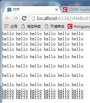
居中效果:
<body>
    <div class="div"></div>
</body>.div{
width: 70%;
height: 800px;
background-color: aquamarine;
margin-left: auto;
margin-right: auto;
}使用position属性进行左右对齐
居左对齐
.div{
    width: 70%;
    height: 800px;
    background-color: aquamarine;
    position: absolute;
    right: 0px;
}
使用float属性进行左右对齐
居右对齐
.div{
    width: 70%;
    height: 800px;
    background-color: aquamarine;
    float: right;
}
尺寸
height              设置元素高度
line-height         设置行高
max-height          设置元素最大高度
max-width           设置元素最大宽度
min-width           设置元素最小宽度
min-height          设置元素最小高度
width 设置元素宽度*{
margin: 0px;
padding: 0px;
}
.p1{
width: 300px;
line-height: normal;
}
.p2{
width: 300px;
line-height: 200%;
}
.p3{
width: 300px;
line-height: 50%;
}效果:
分类
clear               设置一个元素的侧面是否允许其他的浮动元素

cursor              规定当指向某元素之上时显示的指针类型
display             设置是否及如何显示元素

float               定义元素在哪个方向浮动

position            把元素放置到一个静态的、相对的、绝对的、固定的位置

visibility          设置元素是否可见或不可见
示例:
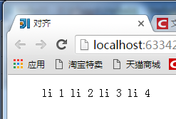
<body>
    <ul>
        <li>li 1</li>
        <li>li 2</li>
        <li>li 3</li>
        <li>li 4</li>
    </ul>
    <p>pppppppp</p>
</body>li{
display: inline;
}
p{
visibility: hidden;
}效果:
导航栏
垂直导航栏
水平导航栏
导航栏效果
效果图:
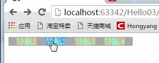
<body>
    <ul>
        <li><a href="#">导航1</a></li>
        <li><a href="#">导航2</a></li>
        <li><a href="#">导航3</a></li>
        <li><a href="#">导航4</a></li>
    </ul>
</body>ul{
list-style-type: none;
margin: 0px;
padding: 0px;
background-color: darkgray;
width: 250px;
text-align: center;
}
a:link,a:visited{
font-weight: bold;
text-decoration: none;
background-color: burlywood;
color: aquamarine;
width: 50px;
text-align: center;
}
a:active,a:hover{
background-color: cornflowerblue;
}
li{
display: inline;
padding: 3px;
padding-right: 5px;
padding-left: 5px;
}图片
效果:
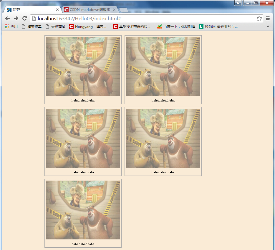
<div class="image">
        <a href="#" target="_self">
            <img src="a.jpg" alt="风景" width="250px" height="200px">
        </a>
        <div class="text">hahahahahhaha</div>
</div>body{
margin: 10px auto;
width: 70%;
height: auto;
background-color: antiquewhite;
}
.image{
border: 1px solid darkgray;
width: auto;
height: auto;
float: left;
text-align: center;
margin: 5px;
}
img{
margin: 5px;
opacity: 0.5;
}
.text{
font-size: 12px;
margin-bottom: 5px;
}


 805
805


 被折叠的 条评论
为什么被折叠?
被折叠的 条评论
为什么被折叠?
 到【灌水乐园】发言


