


本文介绍了两种实现效果:一种使用画布(canvas)标签/元素,另一种不用画布(canvas)标签/元素主要使用CSS实现。
使用画布(canvas)标签/元素实现,下面,在画布上,用JavaScript画两个红灯笼,并且红灯笼左右来回移动的源码:
<!DOCTYPE html>
<html>
<head>
  <title>红灯笼</title>
  <style>
    canvas {
      border: 1px solid black;
      background-color: blue; /*设置画布的背景色为蓝色*/
    }
  </style>
</head>
<body>
<!-- 设置画布宽高是500*300,单位是 px。 -->
  <canvas id="canvas" width="500" height="300"></canvas>

  <script>
    var canvas = document.getElementById('canvas');
    var context = canvas.getContext('2d');

    var angle1 = 0;
    var angle2 = 0;  // 使第二个灯笼的初始角度与第一个灯笼不同

    function drawLantern(x, y, radius, angle) {
      x += Math.sin(angle) * 20;

      // Draw the suspension line
      context.beginPath();
      context.moveTo(x, y - radius / 4);
      context.lineTo(x, 0);
      context.stroke();

      // Draw the top
      context.beginPath();
      context.arc(x, y, radius / 4, 0, Math.PI * 2);
      context.fillStyle = 'gold';
      context.fill();
      context.stroke();

      // Draw the main body
      context.beginPath();
      context.arc(x, y, radius, 0, Math.PI * 2);
      context.fillStyle = 'red';
      context.fill();
      context.stroke();

      // Draw the bottom
      context.beginPath();
      context.arc(x, y + radius / 2, radius / 4, 0, Math.PI * 2);
      context.fillStyle = 'gold';
      context.fill();
      context.stroke();

      // Draw the tassel
      context.beginPath();
      context.moveTo(x, y + radius / 2);
      context.lineTo(x, y + radius * 1.2);
      context.moveTo(x - radius / 6, y + radius / 2);
      context.lineTo(x - radius / 6, y + radius * 1.2);
      context.moveTo(x + radius / 6, y + radius / 2);
      context.lineTo(x + radius / 6, y + radius * 1.2);
      context.stroke();
    }

    function animate() {
      context.clearRect(0, 0, canvas.width, canvas.height);

      context.fillStyle = 'blue';
      context.fillRect(0, 0, canvas.width, canvas.height);

      drawLantern(200, 200, 50, angle1);
      drawLantern(300, 200, 50, angle2);

      angle1 += 0.05;
      angle2 += 0.05;

      requestAnimationFrame(animate);
    }

    animate();
  </script>
</body>
</html>
运行效果如下:

下面是另一种实现主要使用CSS实现,源码如下:
<!DOCTYPE html>
<html lang="en">
<head>
<meta charset="UTF-8">
<title>红灯笼效果</title>
<!-- 灯笼代码↓,放在 head标签内-->
<div class="deng-box2">
<div class="deng">
<div class="xian">
</div>
<div class="deng-a">
<div class="deng-b">
<div class="deng-t">年</div>
</div>
</div>
<div class="shui shui-a">
<div class="shui-c">
</div>
<div class="shui-b"></div>
</div>
</div>
</div>
<div class="deng-box3">
<div class="deng">
<div class="xian">
</div>
<div class="deng-a">
<div class="deng-b">
<div class="deng-t">新</div>
</div>
</div>
<div class="shui shui-a">
<div class="shui-c"></div>
<div class="shui-b">
</div>
</div>
</div>
</div>
<div class="deng-box1">
<div class="deng">
<div class="xian">
</div>
<div class="deng-a">
<div class="deng-b">
<div class="deng-t">乐</div>
</div>
</div>
<div class="shui shui-a">
<div class="shui-c"></div>
<div class="shui-b"></div>
</div>
</div>
</div>
<div class="deng-box">
<div class="deng">
<div class="xian">
</div>
<div class="deng-a">
<div class="deng-b">
<div class="deng-t">快</div>
</div>
</div>
<div class="shui shui-a">
<div class="shui-c">
</div>
<div class="shui-b"></div>
</div>
</div>
</div>
<style type="text/css">
.deng-box {
position: fixed;
top: -40px;
right: 150px;
z-index: 9999;
pointer-events: none;
}
.deng-box1 {
position: fixed;
top: -30px;
right: 10px;
z-index: 9999;
pointer-events: none
}
.deng-box2 {
position: fixed;
top: -40px;
left: 150px;
z-index: 9999;
pointer-events: none
}
.deng-box3 {
position: fixed;
top: -30px;
left: 10px;
z-index: 9999;
pointer-events: none
}
.deng-box1 .deng,
.deng-box3 .deng {
position: relative;
width: 120px;
height: 90px;
margin: 50px;
background: #d8000f;
background: rgba(216, 0, 15, .8);
border-radius: 50% 50%;
-webkit-transform-origin: 50% -100px;
-webkit-animation: swing 5s infinite ease-in-out;
box-shadow: -5px 5px 30px 4px #fc903d
}
.deng {
position: relative;
width: 120px;
height: 90px;
margin: 50px;
background: #d8000f;
background: rgba(216, 0, 15, .8);
border-radius: 50% 50%;
-webkit-transform-origin: 50% -100px;
-webkit-animation: swing 3s infinite ease-in-out;
box-shadow: -5px 5px 50px 4px #fa6c00
}
.deng-a {
width: 100px;
height: 90px;
background: #d8000f;
background: rgba(216, 0, 15, .1);
margin: 12px 8px 8px 8px;
border-radius: 50% 50%;
border: 2px solid #dc8f03
}
.deng-b {
width: 45px;
height: 90px;
background: #d8000f;
background: rgba(216, 0, 15, .1);
margin: -4px 8px 8px 26px;
border-radius: 50% 50%;
border: 2px solid #dc8f03
}
.xian {
position: absolute;
top: -20px;
left: 60px;
width: 2px;
height: 20px;
background: #dc8f03
}
.shui-a {
position: relative;
width: 5px;
height: 20px;
margin: -5px 0 0 59px;
-webkit-animation: swing 4s infinite ease-in-out;
-webkit-transform-origin: 50% -45px;
background: orange;
border-radius: 0 0 5px 5px
}
.shui-b {
position: absolute;
top: 14px;
left: -2px;
width: 10px;
height: 10px;
background: #dc8f03;
border-radius: 50%
}
.shui-c {
position: absolute;
top: 18px;
left: -2px;
width: 10px;
height: 35px;
background: orange;
border-radius: 0 0 0 5px
}
.deng:before {
position: absolute;
top: -7px;
left: 29px;
height: 12px;
width: 60px;
content: " ";
display: block;
z-index: 999;
border-radius: 5px 5px 0 0;
border: solid 1px #dc8f03;
background: orange;
background: linear-gradient(to right, #dc8f03, orange, #dc8f03, orange, #dc8f03)
}
.deng:after {
position: absolute;
bottom: -7px;
left: 10px;
height: 12px;
width: 60px;
content: " ";
display: block;
margin-left: 20px;
border-radius: 0 0 5px 5px;
border: solid 1px #dc8f03;
background: orange;
background: linear-gradient(to right, #dc8f03, orange, #dc8f03, orange, #dc8f03)
}
.deng-t {
font-family: 黑体, Arial, Lucida Grande, Tahoma, sans-serif;
font-size: 3.2rem;
color: #dc8f03;
font-weight: 700;
line-height: 85px;
text-align: center
}
.night .deng-box,
.night .deng-box1,
.night .deng-t {
background: 0 0 !important
}
@-moz-keyframes swing {
0% {
-moz-transform: rotate(-10deg)
}
50% {
-moz-transform: rotate(10deg)
}
100% {
-moz-transform: rotate(-10deg)
}
}
@-webkit-keyframes swing {
0% {
-webkit-transform: rotate(-10deg)
}
50% {
-webkit-transform: rotate(10deg)
}
100% {
-webkit-transform: rotate(-10deg)
}
}
</style>
<!-- 灯笼代码↑-->
</head>
<body>
</body>
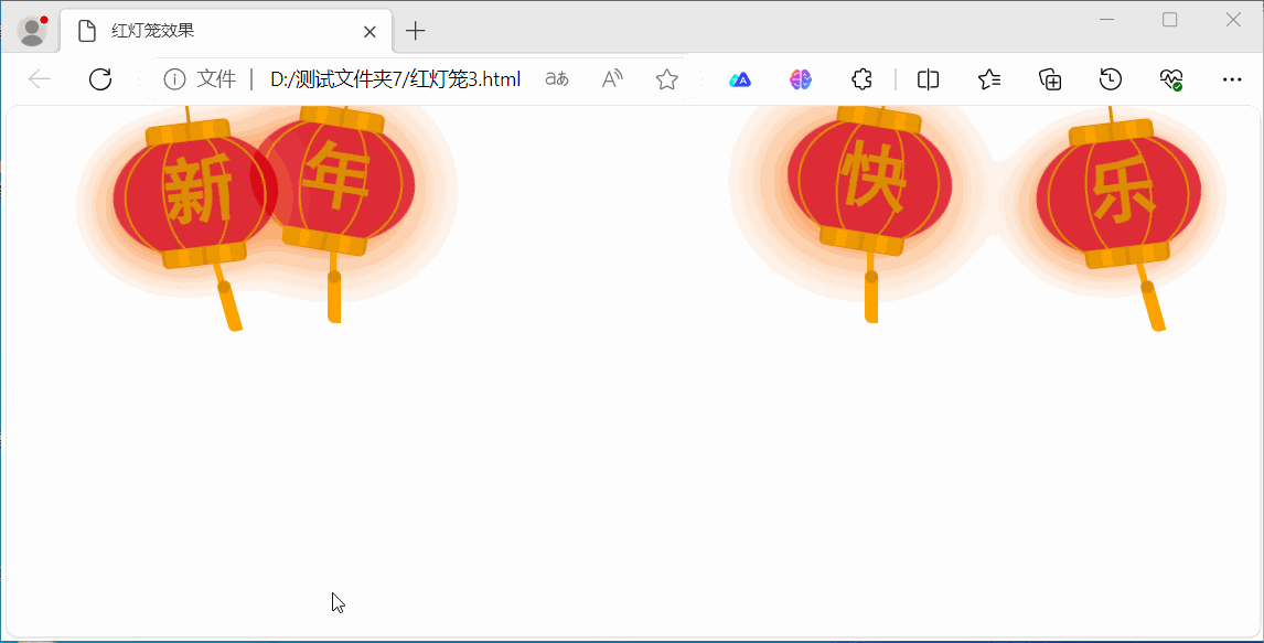
</html>运行效果如下:
附录
为HTML网页添加喜庆气氛的诸多方法https://blog.csdn.net/cnds123/article/details/128865230


 445
445

 被折叠的 条评论
为什么被折叠?
被折叠的 条评论
为什么被折叠?
 到【灌水乐园】发言


