


flutter 主要包含的按钮有:ButtonBar,DropdownButton,ElevatedButton,FloatingActionButton,IconButton,OutlinedButton,PopupMenuButton,TextButton。最下面是圆角的按钮的实现
TextButton(
  onPressed: () {
      // Respond to button press
  },
  child: Text("TEXT BUTTON"),
)ButtonBar:一般用于在界面上有几个按钮时使用,末端对齐。
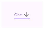
/// Flutter code sample for DropdownButton
// This sample shows a `DropdownButton` with a large arrow icon,
// purple text style, and bold purple underline, whose value is one of "One",
// "Two", "Free", or "Four".
//
// 
import 'package:flutter/material.dart';
void main() => runApp(const MyApp());
/// This is the main application widget.
class MyApp extends StatelessWidget {
const MyApp({Key? key}) : super(key: key);
static const String _title = 'Flutter Code Sample';
@override
Widget build(BuildContext context) {
return MaterialApp(
title: _title,
home: Scaffold(
appBar: AppBar(title: const Text(_title)),
body: const Center(
child: MyStatefulWidget(),
),
),
);
}
}
/// This is the stateful widget that the main application instantiates.
class MyStatefulWidget extends StatefulWidget {
const MyStatefulWidget({Key? key}) : super(key: key);
@override
_MyStatefulWidgetState createState() => _MyStatefulWidgetState();
}
/// This is the private State class that goes with MyStatefulWidget.
class _MyStatefulWidgetState extends State<MyStatefulWidget> {
String dropdownValue = 'One';
@override
Widget build(BuildContext context) {
return DropdownButton<String>(
value: dropdownValue,
icon: const Icon(Icons.arrow_downward),
iconSize: 24,
elevation: 16,
style: const TextStyle(color: Colors.deepPurple),
underline: Container(
height: 2,
color: Colors.deepPurpleAccent,
),
onChanged: (String? newValue) {
setState(() {
dropdownValue = newValue!;
});
},
items: <String>['One', 'Two', 'Free', 'Four']
.map<DropdownMenuItem<String>>((String value) {
return DropdownMenuItem<String>(
value: value,
child: Text(value),
);
}).toList(),
);
}
}
分享三个按钮OutlinedButton、ElevatedButton、TextButton
https://new.qq.com/rain/a/20201107A032HY00
IconButton在标题栏中用的比较多,但在其他地方也可以使用。
// This is the type used by the popup menu below.
enum WhyFarther { harder, smarter, selfStarter, tradingCharter }

// This menu button widget updates a _selection field (of type WhyFarther,
// not shown here).
PopupMenuButton<WhyFarther>(
  onSelected: (WhyFarther result) { setState(() { _selection = result; }); },
  itemBuilder: (BuildContext context) => <PopupMenuEntry<WhyFarther>>[
    const PopupMenuItem<WhyFarther>(
      value: WhyFarther.harder,
      child: Text('Working a lot harder'),
    ),
    const PopupMenuItem<WhyFarther>(
      value: WhyFarther.smarter,
      child: Text('Being a lot smarter'),
    ),
    const PopupMenuItem<WhyFarther>(
      value: WhyFarther.selfStarter,
      child: Text('Being a self-starter'),
    ),
    const PopupMenuItem<WhyFarther>(
      value: WhyFarther.tradingCharter,
      child: Text('Placed in charge of trading charter'),
    ),
  ],
)
TextButton(
        onPressed: () => cart.gtynAddToCart(productID),
        child: Container(
            alignment: Alignment.center,
            height: 44,
            decoration: BoxDecoration(
              borderRadius: BorderRadius.all(Radius.circular(4)),
              color: Colors.green[900],
            ),
            style:ButtonStyle(tapTargetSize:MaterialTapTargetSize.shrinkWrap,
            ),
            // minWidth: double.infinity,
            child: Text(
              'Button',
              style: TextStyle(color: Colors.white),
            )))


TextButton(
                onPressed: () => cart.gtynAddToCart(productID),
                style: ButtonStyle(
                    tapTargetSize: MaterialTapTargetSize.shrinkWrap,
                    minimumSize:
                        MaterialStateProperty.all(Size(double.infinity, 44)),
                    shape: MaterialStateProperty.all(
                      RoundedRectangleBorder(
                          borderRadius: BorderRadius.circular(4.0)),
                    ),
                    backgroundColor:
                        MaterialStateProperty.all(Colors.green[900])),
                child: Text(
                  'Button',
                  style: TextStyle(color: Colors.white),
                  textAlign: TextAlign.center,
                ))


 3361
3361


 被折叠的 条评论
为什么被折叠?
被折叠的 条评论
为什么被折叠?
 到【灌水乐园】发言


