


This article is a part of our AtoZ CSS Series. You can find other entries to the series here. You can view the full transcript and screencast for @supports here.
本文是我们的AtoZ CSS系列的一部分。 您可以在此处找到该系列的其他条目。 您可以在此处查看@supports的完整成绩单和截屏视频。
Welcome to our AtoZ CSS series! In this series, I’ll be exploring different CSS values (and properties) each beginning with a different letter of the alphabet. We know that sometimes screencasts are just not enough, so in this article, we’ve added quick tips on what to consider for multiple browser support.
欢迎来到我们的AtoZ CSS系列! 在本系列中,我将探索不同CSS值(和属性),每个均以不同的字母开头。 我们知道有时仅进行视频广播还不够,因此在本文中,我们添加了有关考虑如何支持多种浏览器的快速提示。
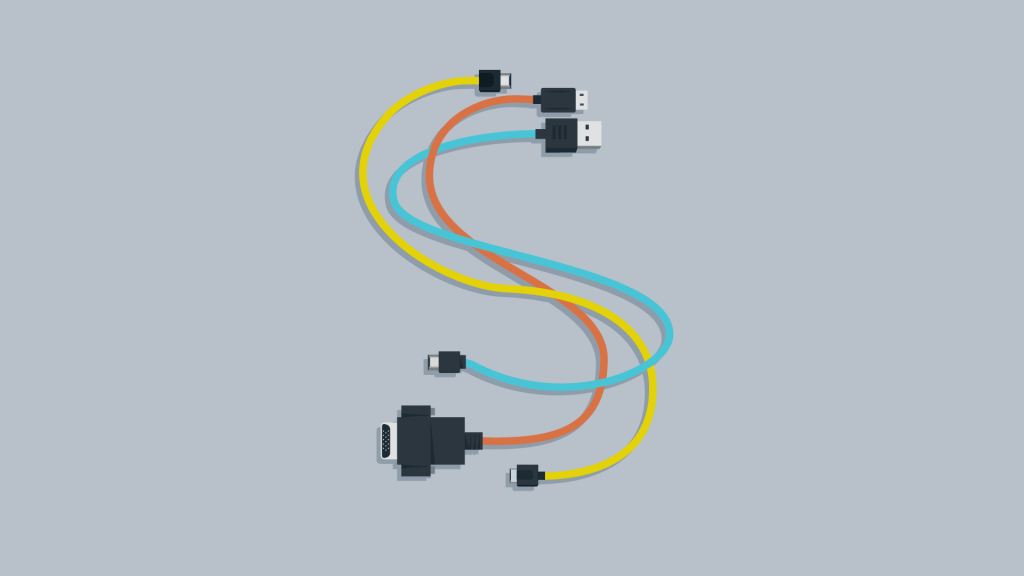
S支持多种浏览器 (S is for support in multiple browsers)
Keeping track of which browsers support which features is practically a full-time job. There are great sites out there like caniuse.com to keep us in the loop and amazing automation tools like Autoprefixer that mean you’ll never have to write a vendor prefix ever again.
跟踪哪些浏览器支持哪些功能实际上是一项全职工作。 有诸如caniuse.com之类的绝佳站点可以使我们与时俱进 ,还有诸如Autoprefixer之类的出色自动化工具,这意味着您无需再编写供应商前缀。
But still, as diligent front-end developers and designers, we need to ensure that our content is accessible to as many users as possible and even if they don’t get the super fancy version, they can still consume the content and get the information they need.
但是,作为勤奋的前端开发人员和设计师,我们仍然需要确保尽可能多的用户可以访问我们的内容,即使他们没有超级版本,他们仍然可以使用内容并获取信息他们需要。
These quick tips will suggest areas that you don’t need to fret about (for the most part) whilst still ensuring that your projects work across a wide range of browsers and devices.
这些快速提示将建议您(大部分)不需要烦恼的领域,同时仍然确保您的项目可在各种浏览器和设备上正常工作。
不用担心动画和过渡 (Don’t worry about animations and transitions)
For the most part animations and transitions should be subtle effects to make the content stand out more, direct the user’s attention or add a bit of personality and character to a page. If animations or transitions aren’t supported in a particular browser, the elements will just remain static or snap between states on hover of focus.
在大多数情况下,动画和过渡效果应该是微妙的效果,以使内容更加突出,吸引用户的注意力或在页面上添加一些个性和特色。 如果特定浏览器不支持动画或过渡效果,则元素将仅保持静态或在焦点悬停时在状态之间捕捉。
As long as the initial state of the animation isn’t positioning an element off screen or making it invisible (e.g. by setting opacity: 0) then the fact that the element won’t move in an old browser doesn’t really matter.
只要动画的初始状态不是将元素放置在屏幕外或使其不可见(例如,通过设置opacity: 0 ),那么该元素就不会在旧浏览器中移动的事实并不重要。
In the case of animations, you could try and provide a fallback using JavaScript but I’d really have to think hard about whether the extra effort, code and maintenance is worth the hassle.
对于动画,您可以尝试使用JavaScript进行后备,但我真的不得不认真考虑是否值得付出额外的精力,代码和维护。
不用担心微妙的转换 (Don’t worry about subtle transformations)
In a similar vein to the comments about animations and transitions, I’d also not stress too much about making subtle effects like rotations or skews work across every device either.
与关于动画和过渡的评论类似,我也不会对在每个设备上产生旋转或偏斜等细微效果产生太大的压力。
.wonky-image {
  transform: rotate(2deg);
}
If a device supports transform and you add a small rotation to an image to inspire a carefree and relaxed style that’s great. Does it really matter if a user with an old browser sees a straight image? Probably not. We should spend our time solving more relevant problems than trying to make every page look identical in every browser.
如果设备支持transform并且您向图像添加较小的旋转角度,则可以激发出无忧无虑的轻松风格。 使用旧浏览器的用户看到直线图像真的重要吗? 可能不是。 我们应该花时间解决更多相关问题,而不是试图使每个页面在每个浏览器中看起来都一样。
不用担心半透明的颜色 (Don’t worry about semi-transparent colours)
Based on the previous tips you should get the picture that it’s not worth worrying about making every last visual detail work on every type of device or browser. After all, it’s more about the experience as a whole and about enhancing that experience for those with more modern capabilities.
根据前面的技巧,您应该获得不必担心在所有类型的设备或浏览器上都可以使用每个视觉细节的图片。 毕竟,它更多的是关于整体体验,以及对于那些具有更现代能力的人而言,如何增强这种体验。
Progressive enhancement means providing a good base experience for everyone and then enhancing that experience where appropriate and where possible.
渐进式增强意味着为每个人提供良好的基础体验,然后在适当的地方(如果可能)增强这种体验。
In the case of animations or transformations there isn’t really any alternative – although you could maybe use a GIF for an animation depending on the circumstances. However, in some cases, lack of support means nothing shows up on the page. If you have to support IE8, this is certainly the case for semi-transparent colors.
对于动画或变换,实际上没有任何其他选择-尽管您可以根据情况为动画使用GIF。 但是,在某些情况下,缺少支持意味着页面上什么也没有显示。 如果必须支持IE8,则半透明颜色肯定是这种情况。
Fortunately, due to the way CSS handles properties or values it doesn’t understand, a simple fallback solution can be provided.
幸运的是,由于CSS处理不了解的属性或值的方式,可以提供一种简单的后备解决方案。
If you want to add a semi-transparent red to the background of an element, you can first declare a solid color and then override that with the semi-transparent one.
如果要在元素的background上添加半透明的红色,可以先声明一种纯色,然后再用半透明的color覆盖。
.box {
  background: red;
  background: rgba(255,0,0,0.5);
}
Old browsers will see the first declaration and “understand” the value of red. They’ll then see the next declaration (which should override the first) but see a value they don’t understand. This makes the second declaration of background invalid, leaving the background painted red.
旧的浏览器将看到第一个声明并“理解”红色的值。 然后,他们将看到下一个声明(应覆盖第一个声明),但看到一个他们不理解的值。 这会使background的第二个声明无效, background变为红色。
Modern browsers will see the first background declaration and then the second just beneath. If the browser knows what rgba() is, it will paint the semi-transparent color and override the first.
现代浏览器将看到第一个background声明,然后在下面的第二个声明。 如果浏览器知道rgba()是什么,它将绘制半透明color并覆盖第一个。
This technique can be used with transparent colors, gradients, rounded corners, using rem values and lots more so is a handy concept to grasp.
此技术可用于透明的颜色,渐变,圆角,使用rem值等等,因此是一个方便掌握的概念。
那我要担心什么 (What should I worry about then?)
It may sound like I’m dismissing the need to think about browser support but I’m not. I’m suggesting that visual flair doesn’t (necessarily) need to look and work exactly the same way in every browser or on every device.
听起来好像我已经不再需要考虑对浏览器的支持了,但事实并非如此。 我建议视觉风格不需要(不必要)在每个浏览器或每个设备上看起来和工作都完全相同。
There are three things that I would spend time worrying about, having freed up a load of time by not worrying about the above. Do worry about:
有三件事情,我会花时间去担心,具有不担心上述腾出时间的负荷。 担心:
- Layout 布局
- Legibility 易读性
- Performance 性能
Layout is key to a user being able to navigate your site, use your app or consume your content. Ensure that the techniques you’ve used for layout work in all of the browsers you need to support.
布局是用户能够浏览您的网站,使用您的应用或使用您的内容的关键。 确保用于布局的技术可在您需要支持的所有浏览器中使用。
Legibility is incredibly important. I was recently trying to read an article that we set in a very fine medium-grey font on a light gray background. I had to fiddle around in the developer tools to increase the contrast just so I could read the content!
易读性非常重要。 最近,我试图阅读一篇文章,我们将其设置为浅灰色背景的非常好的中灰色字体。 我不得不在开发人员工具中四处弄乱以增加对比度,以便可以阅读内容!
Performance of your site is also incredibly important. This is a huge topic which I’m not going to try and sum up in a single paragraph but in relation to our topic of browser support, don’t try and polyfill functionality or add a whole heap of animation and effects with JS at the expense of performance. Many of the old browsers that you’re trying to patch with extra code are already clunky and slow at parsing scripts, so adding more is just a recipe for disaster.
您网站的性能也非常重要。 这是一个巨大的主题,我不会在单个段落中进行总结,但是关于我们的浏览器支持主题,请勿尝试使用polyfill功能或在JS处添加整个动画和效果堆。牺牲性能。 您尝试用额外的代码修补的许多旧浏览器已经笨拙且解析脚本的速度很慢,因此添加更多内容只是灾难的根源。
Instead, leverage progressive enhancement and start with a good baseline experience for as many people and as many devices as possible within the constraints of the project. Then enhance that base experience with all the bells and whistles to really make your work shine.
取而代之的是,利用渐进增强功能,并在项目限制内为尽可能多的人和尽可能多的设备提供良好的基准体验。 然后,通过所有的风吹草动增强基本的体验,使您的工作真正发光。
翻译自: https://www.sitepoint.com/atoz-css-quick-tip-browser-support/


 扫一扫
扫一扫
 129
129

 被折叠的 条评论
为什么被折叠?
被折叠的 条评论
为什么被折叠?
 到【灌水乐园】发言


