


ux设计
It would seem like a win as an app maker to have a large number of downloads — and to some extent it is — but that sense of victory and accomplishment slowly diminishes once you realize the downloads are not being converted into active users.
作为一个应用程序制造商,拥有大量下载似乎是一个胜利,并且在某种程度上是这样。但是,一旦您意识到下载未转换为活跃用户,这种胜利感和成就感就会逐渐减弱。
That initial excitement disappears when you realize there is not much value to an applying dormant.
当您意识到Hibernate的应用没有太大价值时,最初的兴奋就消失了。
The good news is this is avoidable. There are multiple approaches to creating an app that appeals to users and keeps them coming back, but it is necessary to determine what it is specifically that makes an app stand out in such a competitive market.
好消息是这是可以避免的。 有多种方法可以创建吸引用户并使他们回头的应用,但是有必要确定使应用在竞争激烈的市场中脱颖而出的具体方式。
Surely solid development plays a role, but finding a well-developed app is not exactly difficult.
当然,稳固的开发起着一定的作用,但要找到一个完善的应用程序并不完全困难。
So, what is it then?
那么,那是什么呢?
If you test out enough top apps, you will begin to decipher a pattern among them: fantastic user experience (UX) design. The best apps go beyond basic appeal and transport users into a preternatural state of clairvoyance. A state where each tap is intuitive and never requires a second guess.
如果您测试了足够多的顶级应用程序,那么您将开始破译其中的一种模式:出色的用户体验(UX)设计。 最好的应用超越了基本吸引力,将用户带入了千里眼的千里眼。 一种状态,每次轻按都是直观的,不需要再次猜测。
There are a lot of factors that go into excellent mobile UX design and an equal amount of ways it could go wrong.
出色的移动用户体验设计需要考虑很多因素,并且可能会有很多错误。
We will take a look at some of these factors and help you avoid all of the common errant UX pitfalls, most notably failure to retain users and obtain conversions, so you– and more importantly, your users – can get the most out of your app and maintain engagement.
我们将研究其中一些因素,并帮助您避免所有常见的错误UX陷阱,最显着的是无法保留用户并获得转化,因此您-更重要的是,您的用户-可以充分利用您的应用程序并保持敬业度。
错误1:跳过测试 (Mistake #1: Skipping the Test)
You know your app – inside and out. You conceived of it, designed it, developed it, launched it, and marketed it. You innately understand its purpose and precisely how to operate it… but that is just you.
您从内到外都知道您的应用程序。 您构思,设计,开发,启动和销售了它。 您天生就了解它的目的以及确切地如何操作它……但这就是您自己。
What happens when others attempt to use your app and it is not as obvious?
当其他人尝试使用您的应用程序时,会发生什么情况呢?
One of the easiest – and most damaging – mistakes an app creator can make is not having others, be they family, friends, or a test group, test your app first. They have a resource you can never have again — new eyes.
应用程序创建者可能犯的最容易(且最具破坏性)的错误之一是没有其他人(无论是家人,朋友还是测试小组)首先测试您的应用程序。 他们拥有您永远无法拥有的资源-新的眼睛。
Have them share their thoughts throughout the initial interaction to get an idea of what works and what they are thinking. This is a valuable lesson in learning how to optimize for your users rather than yourself.
让他们在最初的互动过程中分享他们的想法,以了解他们的想法和想法。 这是学习如何针对您的用户而不是您自己进行优化的宝贵课程。
When you are ready to test your app, take into account three key elements: network environment, device targets, and testing types (functional, performance, security, and compliance.) For more information on app testing, you can learn here.
准备测试应用程序时,请考虑以下三个关键要素:网络环境,设备目标和测试类型(功能,性能,安全性和合规性。)有关应用程序测试的更多信息,请在此处学习。
错误2:假设用户知道如何浏览您的应用 (Mistake #2: Assuming a User Knows How to Navigate Your App)
It is best to begin at the onboarding experience, where users will form their first impression of the app. Because first impressions mean so much in a competitive market like that of the app world, it is crucial you optimize UX for the initial encounter.
最好从入职体验开始,在此,用户将对应用程序产生第一印象。 因为在像应用程序世界这样的竞争激烈的市场中,第一印象意义重大,因此对于初次体验优化UX至关重要。
You cannot just assume that a user knows how your app works and therefore must provide some guidelines and tutorials for the introductory session. The onboarding process is important for retaining your users, and if it does not work well it is likely users will quit your app and not return to it.
您不能仅仅假设用户知道您的应用程序如何工作,因此必须为入门课程提供一些指导和教程。 入职流程对于保留您的用户很重要,如果不能很好地运行,则很可能用户会退出您的应用程序而不返回您的应用程序。
Inline hinting is traditionally used for someone new to an app. Whenever a user reaches a new point of exploration, some text appears inline explaining what is happening or what action needs to take place in order to advance. It is discreet enough to not interrupt the session, but prominent enough to help out when necessary.
传统上,内联提示用于不熟悉应用程序的人。 每当用户到达新的探索点时,都会在线显示一些文本,以解释正在发生的事情或需要采取什么行动才能前进。 它足够谨慎,不会打断会议,但足够突出,可以在必要时提供帮助。
Also popular are tutorials in which a screen overlay appears over the app, guiding you either throughout each step or with a quick account of what takes place at each juncture.
同样受欢迎的是教程,其中屏幕叠加层显示在应用程序上,可以指导您完成每个步骤,或者快速介绍每个接合点发生的情况。
错误3:Web UX令人困惑的移动UX (Mistake #3: Confusing Mobile UX for Web UX)
It may seem obvious to some, but not everyone realizes that the mobile experience is going to differ vastly from the web. Users interact with mobile devices in a completely different way and designers need to take this into account when creating an app.
对于某些人来说,这似乎是显而易见的,但并非所有人都意识到,移动体验将与网络大不相同。 用户与移动设备进行交互的方式完全不同,设计人员在创建应用程序时需要考虑到这一点。
Clearly UI contributes to great UX. Some of the UI constraints that affect an app should be taken into consideration when designing for an app.
显然,UI有助于出色的UX。 在设计应用程序时,应考虑一些会影响应用程序的UI约束。
One important factor is screen size. There is a lot less real estate to work with and without a mouse to navigate and an abundance of screen space, a user is required to interact using their fingers. Successful apps almost always utilize a minimal UI design, meaning only what is necessary for usage should appear and clutter on the screen should be avoided at all costs.
一个重要因素是屏幕尺寸。 使用和不使用鼠标进行导航都需要占用更少的空间,并且屏幕空间丰富,因此要求用户使用手指进行交互。 成功的应用程序几乎总是采用最小的UI设计,这意味着应该只显示使用所必需的内容,并且不惜一切代价避免屏幕出现混乱。
Consider how icons are used to represent buttons, how a virtual keyboard should show up on-screen whenever it is needed, and how help and error messages should appear.
考虑如何使用图标表示按钮,何时需要虚拟键盘如何在屏幕上显示以及如何显示帮助和错误消息。
User behavior is another consideration. When designing your app UX, take into account that unique gestures – pinches, swipes and taps – are required on mobile devices and that a percentage of your desktop users may not be familiar with.
用户行为是另一个考虑因素。 在设计应用UX时,请考虑到移动设备上需要独特的手势(捏,轻按和轻敲),并且可能有一定比例的台式机用户不熟悉。
If something is typically clickable on a desktop website, be aware that it might be expected that a similarly designed app will yield similar expectations.
如果通常可以在桌面网站上单击某些内容,请注意,设计相似的应用程序可能会产生相似的期望。
错误四:忽视创建优化的结帐流程 (Mistake #4: Neglecting to Create an Optimized Checkout Process)
The last place you would want any difficulty with your app is at the checkout point. If a customer or user is prepared to make a purchase – whether it is an item of clothing or bonus points to advance in a game – it is imperative the experience is uncomplicated and unflawed.
您想要在应用程序上遇到任何困难的最后一个地方是结帐点。 如果客户或用户准备购买商品(无论是一件衣服还是要在游戏中获得积分的购买商品),那么体验就必须变得简单而无懈可击。
Having too many steps until the purchase point is one potential problem, as are unclear navigation and flow, and call-to-action buttons that are not prominent enough.
直到购买点为止的步骤太多,这是一个潜在的问题,导航和流程不清楚,号召性用语按钮不够醒目。
For a smooth process, offer multiple payment options, such as the ability to connect to a PayPal account, and be sure to avoid any technical problems at this most critical step to prevent a user from leaving your app without paying.
为了顺利进行,请提供多种付款方式,例如连接到PayPal帐户的功能,并确保在此最关键的步骤中避免任何技术问题,以防止用户不付费就离开您的应用程序。
Mistake #5: Not Properly Monitoring Your UX
错误5:无法正确监控用户体验
Everything mentioned until now essentially leads to this point, which cannot only help you locate the problem but also solve it.
到目前为止,提到的所有内容基本上都指向这一点,它不仅可以帮助您找到问题,而且可以解决问题。
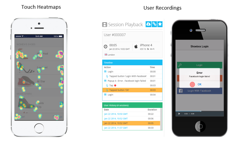
Analytics solutions, such as Google Analytics and Flurry, provide insights that reveal basic information, such as metrics and numbers. Using a visual app analytics tool such as Appsee (disclosure: I’m Community Manager for Appsee), can help you measure, understand, and improve your UX.
Google Analytics(分析)和Flurry等Google Analytics (分析)解决方案可提供洞察力,以揭示基本信息,例如指标和数字。 使用可视化应用程序分析工具,例如Appsee (公开:我是Appsee的社区管理器),可以帮助您评估,理解和改进UX。
All of these tools grant you the ability to see your app through users’ eyes, understand the reasoning behind the actions they take, and identify which UX issues are leading to your app’s abandonment.
所有这些工具使您能够通过用户的眼睛查看应用程序,了解他们采取的措施背后的原因以及确定导致用户放弃应用程序的UX问题。
Insights such as these can sometimes be difficult to obtain from standard analytics services, such as Google Analytics, which just focus on key metrics and numbers more than behaviour.
从标准分析服务(例如Google Analytics(分析))有时很难获得诸如此类的见解,该服务仅关注关键指标和数字而不是行为。
Visual mobile analytics tools that give you the ability to playback video from actual app user sessions and analyze touch heatmaps can help you identify problem areas
视觉移动分析工具可让您从实际的应用程序用户会话中回放视频并分析触摸热图,从而帮助您确定问题区域
This can help you you can pinpoint problem areas with your app – perhaps users are getting stuck on a particular screen, or your app is taking too long to load – and correct them without all the guesswork.
这可以帮助您确定应用程序中的问题区域-可能用户被困在特定的屏幕上,或者您的应用程序加载时间太长-无需进行任何猜测就可以纠正它们。
Delivering a great mobile UX design should be your goal if you want your app to stand out. Avoiding all of these common mistakes and implementing the tips listed above gives you a reliable way to determine the sort of difficulties your app may face and what it will take to optimize its UX design to keep your users coming back.
如果您希望您的应用脱颖而出,那么交付出色的移动UX设计应该是您的目标。 避免所有这些常见错误,并实施上面列出的提示,可以为您提供一种可靠的方法来确定您的应用程序可能面临的困难以及优化其UX设计以使用户回头的需要采取的措施。
翻译自: https://www.sitepoint.com/mobile-ux-design-ways-go-wrong/
ux设计


 6068
6068

 被折叠的 条评论
为什么被折叠?
被折叠的 条评论
为什么被折叠?
 到【灌水乐园】发言


