


css 表单 样式
A big part of our work as website designers is the ability to make things look good and function well. We spend hours taking the time to make every aspect of our site visually compelling, intuitive, user friendly, accessible and overall beautiful. Our forms are no exception! Our forms should be beautiful, easy to use, and should look consistent with the rest of our website. We can do this easily with CSS.
作为网站设计师,我们工作的很大一部分是使事物看起来更好并且功能良好的能力。 我们花了很多时间来使网站的各个方面都引人注目,直观,用户友好,可访问且整体美观。 我们的表格也不例外! 我们的表格应该美观,易于使用,并且外观应与我们网站的其余部分保持一致。 我们可以使用CSS轻松做到这一点。
The process isn’t difficult, you just can to know what each tag does, and how to style it. The first thing we need to do is bring in our HTML. Below is the HTML found in our sample form.
这个过程并不困难,您只需要知道每个标签的功能以及样式设置即可。 我们需要做的第一件事就是引入HTML。 以下是在示例表单中找到HTML。
<form>
<div>
<h1>Contact Form :</h1>
<label>
<span>Your name</span><input id="name" type="text" name="name" />
</label>
<label>
<span>Email Address</span><input id="email" type="text" name="email" />
</label>
<label>
<span>Subject</span><input id="subject" type="text" name="subject" />
</label>
<label>
<span>Message</span><textarea id="feedback" name="feedback"></textarea>
<input type="button" value="Submit Form" />
</label>
</div>
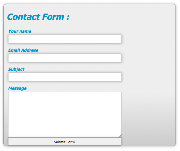
</form>You will notice that in the HTML, I used words, names, and ids that make sense. They are consistent with what you’d expect each field to be called. Each Field is wrapped in a label tag to make things easy for us to style. Our form looks pretty plain without any styling, as you can see from the sample below:
您会注意到,在HTML中,我使用了有意义的单词,名称和ID。 它们与您期望每个字段被调用的内容一致。 每个字段都包裹在一个标签中,以使我们可以轻松设计样式。 从下面的示例中可以看出,我们的表单看起来很普通,没有任何样式:
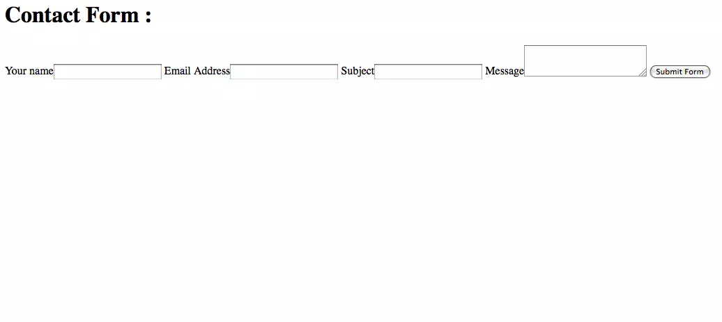
Our form has no structure, no color, and no personality. We can change that with a little bit of code. First, we are going to style the form tag itself.
我们的形式没有结构,没有颜色,没有个性。 我们可以用一些代码来改变它。 首先,我们将样式化表单标签本身。
form {
  background: -webkit-linear-gradient(bottom, #CCCCCC, #EEEEEE 175px);
  background: -moz-linear-gradient(bottom, #CCCCCC, #EEEEEE 175px);
  background: linear-gradient(bottom, #CCCCCC, #EEEEEE 175px);
  margin: auto;
  position: relative;
  width: 550px;
  height: 450px;
  font-family: Tahoma, Geneva, sans-serif;
  font-size: 14px;
  font-style: italic;
  line-height: 24px;
  font-weight: bold;
  color: #09C;
  text-decoration: none;
  border-radius: 10px;
  padding: 10px;
  border: 1px solid #999;
  border: inset 1px solid #333;
  -webkit-box-shadow: 0px 0px 8px rgba(0, 0, 0, 0.3);
  -moz-box-shadow: 0px 0px 8px rgba(0, 0, 0, 0.3);
  box-shadow: 0px 0px 8px rgba(0, 0, 0, 0.3);
}
The code above can look like a mouthful, but it is fairly simple when broken down. Flat colors can be really boring, so adding a slight gradient can break up the monotony and give your design some dimension. That is done with the background style. When using this property and gradients, you have to include the specific prefixes for certain browsers such as Firefox, or they won’t show up. Both are saying the same thing. Create a linear gradient, start from the bottom, and use a medium gray and a light gray and blend it over 175px.
上面的代码看起来很冗长,但是分解后却很简单。 纯色可能真的很无聊,因此添加轻微的渐变可以打破单调并为您的设计提供一定的尺寸。 这是通过背景样式完成的。 使用此属性和渐变时,必须包括某些浏览器(例如Firefox)的特定前缀,否则它们将不会显示。 两者都在说同一件事。 创建一个线性渐变,从底部开始,然后使用中灰色和浅灰色并将其混合到175px以上。
Since this is where you entire form is going to be contained, I decided to center the form in the browser by setting margin to auto. Setting the Position to Relative is intended for aligning an element later, so that explanation is to come. I specified the width and the height of the form, the fonts used, and styled it to be bold, italic, 14px in size and a line height (spacing between each line of text) of 24px.
由于这是要包含整个表单的地方,因此我决定通过将margin设置为auto来使表单在浏览器中居中。 将“位置”设置为“相对”是为了稍后对齐元素,以便进行说明。 我指定了表单的宽度和高度,所使用的字体,并将其样式设置为粗体,斜体,大小为14px,行高(每行文本之间的间距)为24px。
Border radius gives us rounded corners for our boxes. Increase the number for more rounded corners. Padding gives some space between the text and the edge of the form, so that your text doesn’t run outside the bounds of your form and its rounded corners.
边界半径为我们的盒子提供了圆角。 增加数量以得到更多的圆角。 填充在文本和窗体的边缘之间留出一些空间,以使文本不会超出窗体及其圆角的范围。
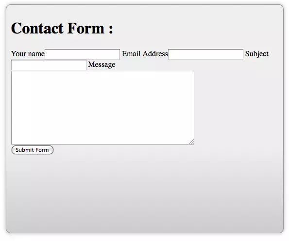
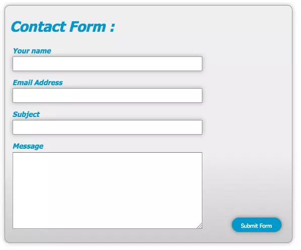
You can create subtle borders for contrast and dimension. I also added box shadows to the overall form, so if this becomes a popup form, it will add dimension and make the form look like it is floating over the rest of the site. This is a popular technique right now. This is yet another style that needs you to specify the proper prefix in order to get it to show up. You form should look something like this:
您可以为对比度和尺寸创建微妙的边框。 我还向整个窗体中添加了框阴影,因此,如果这成为弹出窗体,它将添加尺寸并使该窗体看起来像在网站的其余部分上浮动。 目前,这是一种流行的技术。 这是另一种样式,需要您指定正确的前缀才能显示它。 您的表单应如下所示:
Next, we should style the input area. That is where the text is actually entered into each field.
接下来,我们应该为输入区域设置样式。 这就是文本实际输入到每个字段的位置。
input {
width: 375px;
display: block;
border: 1px solid #999;
height: 25px;
-webkit-box-shadow: 0px 0px 8px rgba(0, 0, 0, 0.3);
-moz-box-shadow: 0px 0px 8px rgba(0, 0, 0, 0.3);
box-shadow: 0px 0px 8px rgba(0, 0, 0, 0.3);
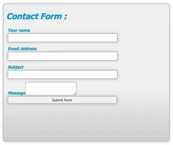
}The code shown above selects all of the text input areas, and styles them to be 375px wide, and setting the display to block stacks them vertically. Adding a 1px border helps to emphasize each input area, and setting the height to 25px gives the user plenty of room visually to enter their text.
上面显示的代码选择所有文本输入区域,并将其样式设置为375px宽,并将显示设置为块状,将它们垂直堆叠。 添加1px边框有助于强调每个输入区域,并将高度设置为25px可为用户提供足够的视觉空间来输入其文本。
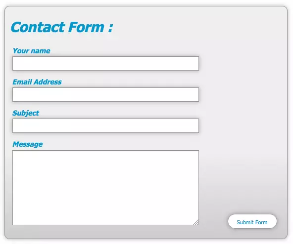
I added a box shadow for dimension, but remember to include the prefix for each browser. The first 2 digits control the offset for the shadow. Positive numbers push the shadow to the right and up, and negative numbers push it to the left and down. The 3rd number determines how much the shadow is blurred. The higher the number, the larger the blur. Inside of the parenthesis, the 1st three numbers determine the red, green, and blue values of the shadow, and the decimal number determines the opacity of the shadow itself. 1 is 100% opacity and 0.1 is 10% opacity. With these style added, your form should begin to take shape, and look like the image below:
我为尺寸添加了阴影,但请记住为每个浏览器添加前缀。 前2位数字控制阴影的偏移量。 正数将阴影向右和向上推,负数将阴影向左和向下推。 第三个数字确定阴影的模糊程度。 数值越高,模糊越大。 在括号内,前三个数字确定阴影的红色,绿色和蓝色值,十进制数字确定阴影本身的不透明度。 1是100%不透明,而0.1是10%不透明。 添加了这些样式后,您的表单应开始成形,如下图所示:
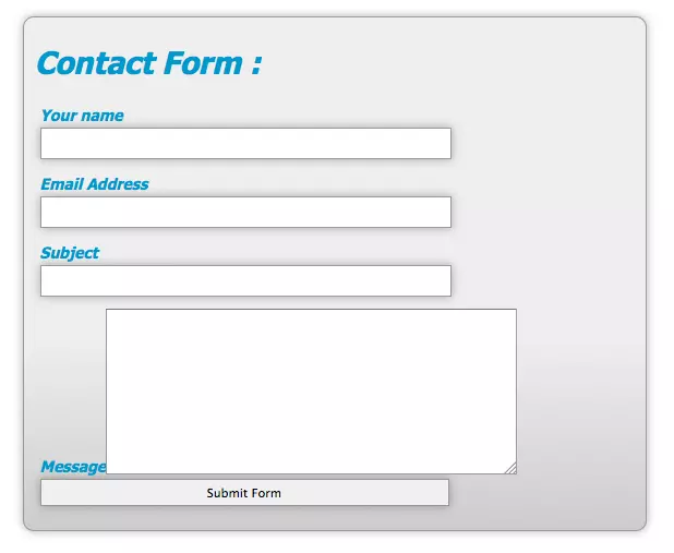
Everything is aligned, but notice that the submit button has been affected b the width styling. We will fix this later. The message area doesn’t look right, but we can fix this easily.
一切都对齐了,但是请注意,提交按钮已受到宽度样式的影响。 我们稍后将解决此问题。 消息区域看起来不正确,但是我们可以轻松解决此问题。
textarea#feedback {
  width: 375px;
  height: 150px;
}
You can specify the width and the height directly, but this still doesn’t make the textarea fall in line with the other fields.
您可以直接指定宽度和高度,但这仍然不能使textarea与其他字段保持一致。
We have to set the display property to block manually, so that it performs the same way as the input areas.
我们必须将display属性设置为手动block ,以使其执行与输入区域相同的方式。
textarea#feedback {
  width: 375px;
  height: 150px;
  display: block;
}
Now that everything is aligned properly, we can get down to fixing the submit button. The CSS that we need to fix this is fairly simple:
现在一切都已正确对齐,接下来我们可以修复提交按钮。 我们需要解决CSS非常简单:
button {
  width: 100px;
  position: absolute;
  right: 20px;
  bottom: 20px;
  background: #09C;
  color: #fff;
  font-family: Tahoma, Geneva, sans-serif;
  height: 30px;
  border-radius: 15px;
  border: 1p solid #999;
}

input.button:hover {
  background: #fff;
  color: #09C;
}
We select the button named submit and define its width to 100px and set its position to absolute. As we mentioned earlier, we had styled the form to have a relative position. The way this works is that when you set something to have a absolute position, it looks for the last element that has its position set to relative. If that element is nested inside of the element with a position of relative, its absolute position is relative to that element. In other words, the submit button will be positioned somewhere inside of the bounds of the form container. I defined that it will be 20px from the right and from the bottom with those respective styles.
我们选择名为Submit的按钮,并将其宽度定义为100px,并将其位置设置为absolute。 正如我们前面提到的,我们已经将表单设计为具有相对位置。 它的工作方式是,当您将某物设置为具有绝对位置时,它将查找其位置设置为相对的最后一个元素。 如果该元素以相对位置嵌套在元素内部,则其绝对位置是相对于该元素的。 换句话说,提交按钮将位于表单容器边界内的某个位置。 我定义了分别带有相应样式的右侧和底部分别为20px和20px。
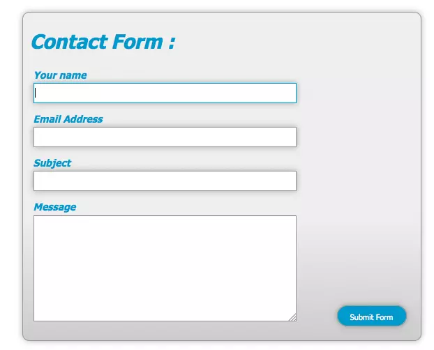
I set the background to blue and the text to white. I gave it a definite height of 30px and rounded corners. I also have it a 1px gray border. This is the normal state for your submit button.
我将背景设置为蓝色,并将文本设置为白色。 我给它一个确定的高度30px和圆角。 我也有一个1px的灰色边框。 这是您的提交按钮的正常状态。
You will notice that I defined a hover state for the submit button. The styles defined here override the original styling once the user hovers over the button. I changed the background to white and the text to blue, giving the user a highly contrasting effect when they mouse over the button.
您会注意到,我为提交按钮定义了悬停状态。 用户将鼠标悬停在按钮上时,此处定义的样式将覆盖原始样式。 我将背景更改为白色,将文本更改为蓝色,当用户将鼠标悬停在按钮上时,会给用户带来强烈的对比效果。
Here is the normal state:
这是正常状态:
Here is the hover state:
这是悬停状态:
Our form’s structure is done. You could stop here and you would have a great form, all styled with CSS. However, you could take it one step further, by adding a little user friendly styling to the text input areas, so that the user can tell where they are typing. You can do this with a small amount of CSS:
表单的结构已完成。 您可以在这里停止,您将拥有一个很棒的表单,所有表单均使用CSS样式。 但是,您可以更进一步,在文本输入区域中添加一些用户友好的样式,以便用户可以知道他们在哪里键入内容。 您可以使用少量CSS来做到这一点:
textarea:focus, input:focus {
  border: 1px solid #09C;
}
What this does is it tells the browser that if a person has a text input or text area selected, that it needs to add a 1px blue border around the active input area, so the user knows where they are visually in the form. This is just a little extra something that is much appreciated by many users.
它的作用是告诉浏览器,如果一个人选择了文本输入或文本区域,则需要在活动输入区域周围添加一个1px的蓝色边框,以便用户知道他们在表单中的视觉位置。 这只是一些额外的东西,许多用户对此表示赞赏。
结论 (Conclusion)
You can do some wonderful things with CSS, including creating beautiful web forms for your users. With just a little CSS and some imagination, you can make something as boring as filling out a form, much more enjoyable for anyone who is visiting your site.
您可以使用CSS做一些很棒的事情,包括为您的用户创建漂亮的Web表单。 只需一点CSS和一些想象力,您就可以像填写表格一样使人感到无聊,对访问您网站的任何人来说都更加有趣。
Below you’ll find a CodePen demo with the example we’ve built in this post:
在下面,您将找到一个CodePen演示,其中包含我们在本文中构建的示例:
See the Pen 729ceb6e733ccb086a414ed7a4d381e4 by SitePoint (@SitePoint) on CodePen.
请参阅CodePen上 SitePoint( @SitePoint )的Pen 729ceb6e733ccb086a414ed7a4d381e4 。
If you enjoyed reading this post, you’ll love Learnable; the place to learn fresh skills and techniques from the masters. Members get instant access to all of SitePoint’s ebooks and interactive online courses, like Styling Forms with CSS.
如果您喜欢阅读这篇文章,您会喜欢Learnable的 ; 向大师学习新鲜技能的地方。 会员可以立即访问所有SitePoint的电子书和交互式在线课程,例如CSS样式表 。
Style your own forms from the ground up with HTML5 and CSS3 – our CSS forms course is here, and it’s free with a SitePoint Premium trial!
使用HTML5和CSS3从头开始为您自己的表单设置样式- 我们的CSS表单课程就在这里,并且通过SitePoint Premium试用版是免费的 !
Comments on this article are closed. Have a question about CSS? Why not ask it on our forums?
本文的评论已关闭。 对CSS有疑问吗? 为什么不在我们的论坛上提问呢?
css 表单 样式


 扫一扫
扫一扫
 1406
1406

 被折叠的 条评论
为什么被折叠?
被折叠的 条评论
为什么被折叠?
 到【灌水乐园】发言


