


visionpro简单易用
In this article, we’ll show how to create a responsive modern CSS Grid layout, demonstrating how to use fallback code for old browsers, how to add CSS Grid progressively, and how to restructure the layout in small devices and center elements using the alignment properties.
在本文中,我们将展示如何创建一个响应式的现代CSS Grid布局,演示如何对旧的浏览器使用后备代码,如何逐步添加CSS Grid以及如何使用对齐方式在小型设备和中心元素中重新布局布局属性。
In a previous article we explored four different techniques for easily building responsive grid layouts. That article was written back in 2014 — before CSS Grid was available — so in this tutorial, we’ll be using a similar HTML structure but with modern CSS Grid layout.
在上一篇文章中,我们探讨了四种可轻松构建响应式网格布局的不同技术。 该文章写于2014年-在CSS Grid可用之前-因此,在本教程中,我们将使用类似HTML结构,但具有现代CSS Grid布局。
Throughout this tutorial, we’ll create a demo with a basic layout using floats and then enhance it with CSS Grid. We’ll demonstrate many useful utilities such as centering elements, spanning items, and easily changing the layout on small devices by redefining grid areas and using media queries. You can find the code in this pen:
在整个教程中,我们将使用浮点数创建具有基本布局的演示,然后使用CSS Grid对其进行增强。 我们将演示许多有用的实用程序,例如居中元素,跨项目,通过重新定义网格区域并使用媒体查询轻松更改小型设备上的布局。 您可以在这支笔中找到代码:
See the Pen css-grid-example4 by SitePoint (@SitePoint) on CodePen.
请参阅CodePen上 SitePoint( @SitePoint )的Pen css-grid- example4 。
响应式现代CSS网格布局 (Responsive Modern CSS Grid Layout)
Before we dive into creating our responsive grid demo, let’s first introduce CSS Grid.
在开始创建响应式网格演示之前,让我们首先介绍CSS Grid。
CSS Grid is a powerful 2-dimensional system that was added to most modern browsers in 2017. It has dramatically changed the way we’re creating HTML layouts. Grid Layout allows us to create grid structures in CSS and not HTML.
CSS Grid是一个功能强大的二维系统,已在2017年添加到大多数现代浏览器中。它极大地改变了我们创建HTML布局的方式。 网格布局允许我们使用CSS而非HTML创建网格结构。
CSS Grid is supported in most modern browsers except for IE11, which supports an older version of the standard that could give a few issues. You can use caniuse.com to check for support.
除IE11外,大多数现代浏览器均支持CSS Grid,而IE11支持较早版本的标准,可能会出现一些问题。 您可以使用caniuse.com来检查支持。
A Grid Layout has a parent container with the display property set to grid or inline-grid. The child elements of the container are grid items which are implicitly positioned thanks to a powerful Grid algorithm. You can also apply different classes to control the placement, dimensions, position and other aspects of the items.
网格布局具有其display属性设置为grid或inline-grid的父容器。 容器的子元素是网格项,由于强大的网格算法,这些网格项被隐式放置。 您还可以应用不同的类来控制项目的放置,尺寸,位置和其他方面。
Let’s start with a basic HTML page. Create an HTML file and add the following content:
让我们从一个基本HTML页面开始。 创建一个HTML文件并添加以下内容:
<header>
    <h2>CSS Grid Layout Example</h2>
</header>
<aside>
  .sidebar
</aside>

<main>
  <article>
    <span>1</span>
  </article>
  <article>
    <span>2</span>
  </article>
  <!--... -->
  <article>
    <span>11</span>
  </article>
</main>

<footer>
  Copyright 2018
</footer>
We use HTML semantics to define the header, sidebar, main and footer sections of our page. In the main section, we add a set of items using the <article> tag. <article> is an HTML5 semantic tag that could be used for wrapping independent and self-contained content. A single page could have any number of <article> tags.
我们使用HTML语义定义页面的页眉,侧栏,主要和页脚部分。 在主要部分,我们使用<article>标记添加一组项目。 <article>是HTML5语义标记,可用于包装独立且自包含的内容。 单个页面可以具有任意数量的<article>标签。
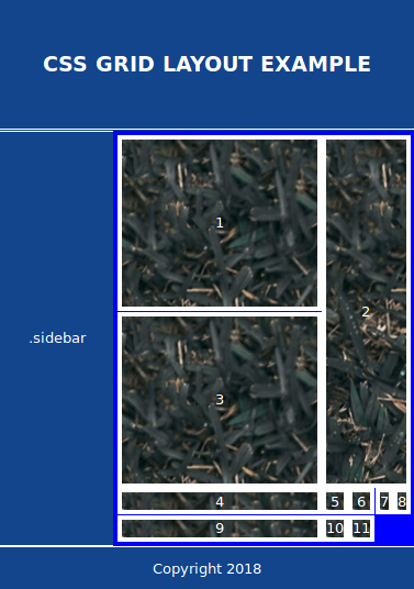
This is a screen shot of the page at this stage:
这是此阶段页面的屏幕截图:

Next, let’s add basic CSS styling. Add a <style> tag in the head of the document and add the following styles:
接下来,让我们添加基本CSS样式。 在文档的开头添加<style>标记,并添加以下样式:
body {
  background: #12458c;
  margin: 0rem;
  padding: 0px;
  font-family: -apple-system, BlinkMacSystemFont,
            "Segoe UI", "Roboto", "Oxygen", "Ubuntu", "Cantarell",
            "Fira Sans", "Droid Sans", "Helvetica Neue",
            sans-serif;
}

header {
  text-transform: uppercase;
  padding-top: 1px;
  padding-bottom: 1px;
  color: #fff;
  border-style: solid;
  border-width: 2px;
}

aside {
  color: #fff;
  border-width:2px;
  border-style: solid;
  float: left;
  width: 6.3rem;
}

footer {
  color: #fff;
  border-width:2px;
  border-style: solid;
  clear: both;
}

main {
  float: right;
  width: calc(100% - 7.2rem);
  padding: 5px;
  background: hsl(240, 100%, 50%);
}

main > article {
  background: hsl(240, 100%, 50%);
  background-image: url('https://source.unsplash.com/daily');
  color: hsl(240, 0%, 100%);
  border-width: 5px;
}
This is a small demonstration page, so we’ll style tags directly to aid readability rather than applying class naming systems.
这是一个很小的演示页面,因此我们将直接设置标签样式以提高可读性,而不是应用类命名系统。
We use floats to position the sidebar to the left and the main section to the right and we set the width of the sidebar to a fixed 6.3rem width. Then we calculate and set the remaining width for the main section using the CSS calc() function. The main section contains a gallery of items organized as vertical blocks.
我们使用浮子将侧边栏放置在左侧,将主要部分放置在右侧,然后将侧边栏的宽度设置为固定的6.3rem宽度。 然后,我们使用CSS calc()函数计算并设置主要部分的剩余宽度。 主要部分包含以垂直图块形式组织的项目库。
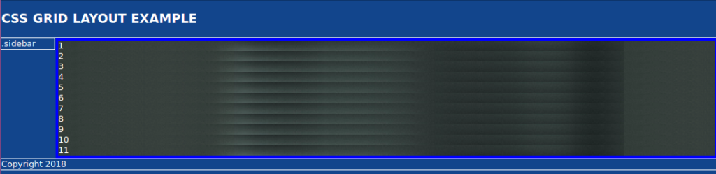
The layout is not perfect. For example, the sidebar does not have the same height as the main content section. There are various CSS techniques to solve the problems but most are hacks or workarounds. Since this layout is a fallback for Grid, it will be seen by a rapidly diminishing number of users. The fallback is usable and good enough.
布局不完美。 例如,侧边栏的高度与主要内容部分的高度不同。 有多种CSS技术可以解决问题,但大多数都是黑客或变通方法。 由于此布局是Grid的后备,因此用户数量Swift减少将可以看到它。 后备是可用的并且足够好。
The latest versions of Chrome, Firefox, Edge, Opera and Safari have support for CSS Grid, so that means if your visitors are using these browsers you don’t need to worry about providing a fallback. Also you need to account for evergreen browsers. The latest versions of Chrome, Firefox, Edge, and Safari are evergreen browsers. That is, they automatically update themselves silently without prompting the user. To ensure your layout works in every browser, you can start with a default float-based fallback then use progressive enhancement techniques to apply a modern Grid layout. Those with older browsers will not receive an identical experience but it will be good enough.
Chrome,Firefox,Edge,Opera和Safari的最新版本均支持CSS Grid,因此,如果您的访问者正在使用这些浏览器,则无需担心提供后备功能。 另外,您需要考虑常绿浏览器。 Chrome,Firefox,Edge和Safari的最新版本是常绿浏览器 。 也就是说,它们会自动静默更新自己,而不会提示用户。 为了确保您的布局在每种浏览器中都能正常工作,您可以从默认的基于浮点的后备开始,然后使用渐进增强技术来应用现代的Grid布局。 那些使用旧浏览器的用户将不会获得相同的体验,但这将足够好。
逐步增强:您不必覆盖所有内容 (Progressive Enhancement: You Don’t Have to Override Everything)
When adding the CSS Grid layout on top of your fallback layout, you don’t actually need to override all tags or use completely separate CSS styles:
在后备布局的顶部添加CSS网格布局时,实际上不需要覆盖所有标记或使用完全独立CSS样式:
- In a browser that doesn’t support CSS Grid, the grid properties you add will be simply ignored. 在不支持CSS网格的浏览器中,添加的网格属性将被简单地忽略。
If you’re using floats for laying out elements, keep in mind that a grid item takes precedence over float. That is, if you add a
float: left|rightstyle to an element which is also a grid element (a child of a parent element that has adisplay: gridstyle), the float will be ignored in favor of grid.如果使用浮点数对元素进行布局,请记住,网格项的优先级高于浮点数。 也就是说,如果在也是网格元素的元素(具有
display: grid样式的父元素的子元素)中添加float: left|right样式,则将忽略float以支持grid。Specific feature support can be checked in CSS using
@supportsrules. This allows us to override fallback styles where necessary while older browsers ignore the@supportsblock.可以使用
@supports规则在CSS中检查特定功能的支持。 这使我们可以在必要时覆盖回退样式,而较旧的浏览器将忽略@supports块。
Now, let’s add CSS Grid to our page. First, let’s make the <body> a grid container and set the grid columns, rows and areas:
现在,让我们向页面添加CSS Grid。 首先,让<body>成为网格容器,并设置网格的列,行和区域:
body {
  /*...*/
  display: grid;
  grid-gap: 0.1vw;
  grid-template-columns: 6.5rem 1fr;
  grid-template-rows: 6rem 1fr 3rem;
  grid-template-areas: "header   header"
                       "sidebar content"
                       "footer footer";
}
We use the display:grid property to mark <body> as a grid container. We set a grid gap of 0.1vw. Gaps lets you create gutters between Grid cells instead of using margins.
我们使用display:grid属性将<body>标记为网格容器。 我们将网格间隙设置为0.1vw 。 间距使您可以在网格单元之间创建间距,而不使用间距。
We also use grid-template-columns to add two columns. The first column takes a fixed width which is 6.5rem and the second column takes the remaining width. fr is a fractional unit and 1fr equals one part of the available space.
我们还使用grid-template-columns添加两列。 第一列采用固定宽度6.5rem ,第二列采用剩余宽度。 fr是小数单位, 1fr等于可用空间的一部分。
Next, we use grid-template-rows to add three rows. The first row takes a fixed height which equals 6rem, the third row takes a fixed height of 3rem and the remaining available space (1fr) is assigned to the second row.
接下来,我们使用grid-template-rows添加三行。 第一行的固定高度等于6rem ,第三行的固定高度为3rem ,剩余的可用空间( 1fr )分配给第二行。
We then use grid-template-areas to assign the virtual cells, resulted from the intersection of columns and rows, to areas. Now we need to actually define those areas specified in the areas template using grid-area:
然后,我们使用grid-template-areas将列和行的交集产生的虚拟像元分配给区域。 现在,我们需要使用grid-area实际定义在Areas模板中指定grid-area :
header {
  grid-area: header;
  /*...*/
}
aside {
  grid-area: sidebar;
  /*...*/
}
footer {
  grid-area: footer;
  /*...*/
}
main {
  grid-area: content;
  /*...*/
}
Most of our fallback code doesn’t have any side effects on the CSS Grid except for the width of the main section width: calc(100% - 7.2rem); which calculates the remaining width for the main section after subtracting the width of the sidebar plus any margin/padding spaces.
除了主要部分的width: calc(100% - 7.2rem);之外,我们的大多数后备代码对CSS Grid都没有任何副作用width: calc(100% - 7.2rem); 减去边栏的宽度加上任何边距/边距后,将计算主要部分的剩余宽度。
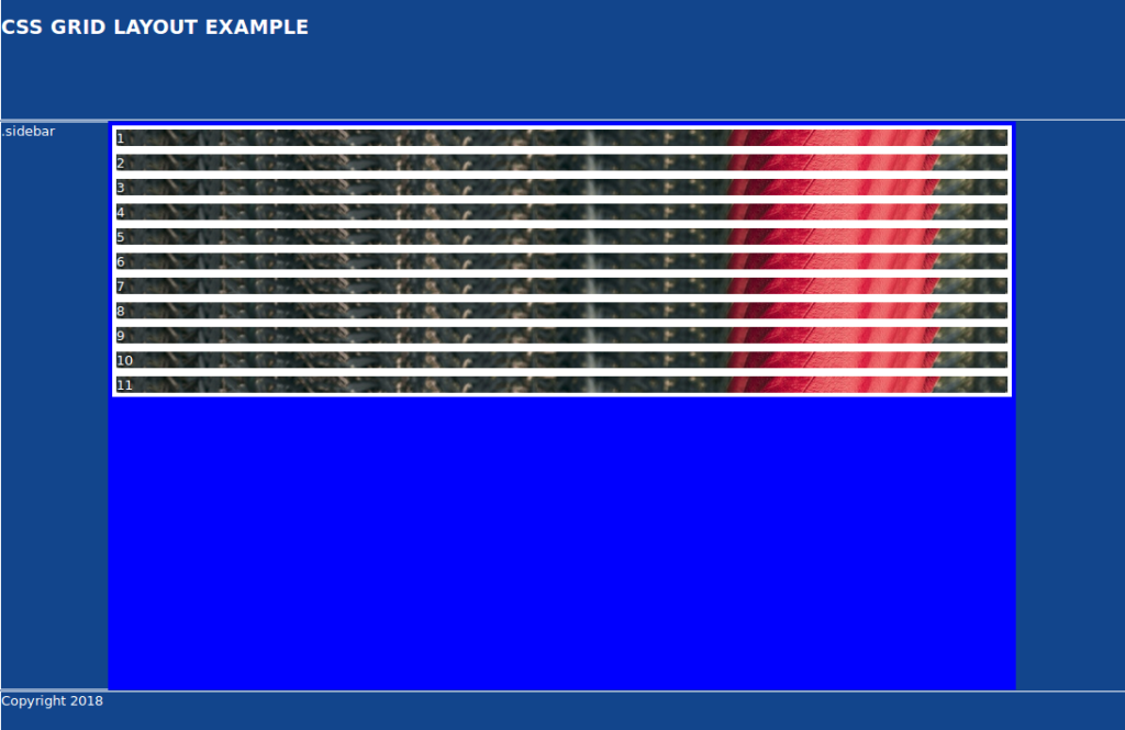
This is a screen shot of the result. Notice how the main area is not taking the full remaining width:
这是结果的屏幕截图。 请注意,主要区域是如何不占用全部剩余宽度的:
To solve this issue, we can add width: auto; when Grid is supported:
为了解决这个问题,我们可以添加width: auto; 当支持网格时:
@supports (display: grid) {
main {
width: auto;
}
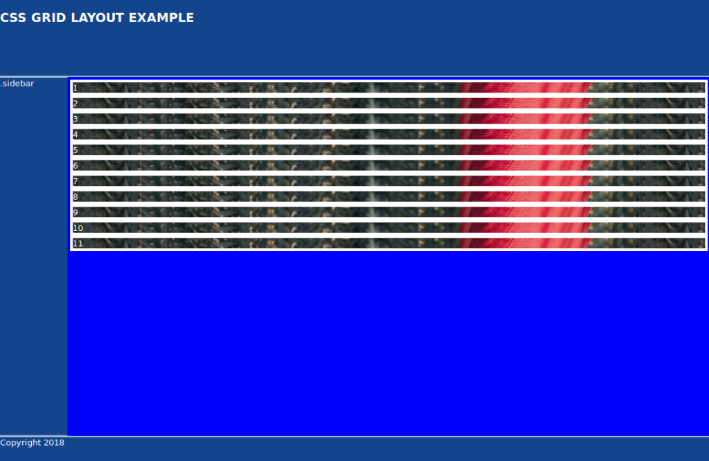
}This is the screen shot of the result now:
现在是结果的屏幕截图:
添加嵌套网格 (Adding a Nested Grid)
A Grid child can be a Grid container itself. Let’s make the main section a Grid container:
Grid子级可以是Grid容器本身。 让我们将主要部分设为Grid容器:
main {
/*...*/
display: grid;
grid-gap: 0.1vw;
grid-template-columns: repeat(auto-fill, minmax(12rem, 1fr));
grid-template-rows: repeat(auto-fill, minmax(12rem, 1fr));
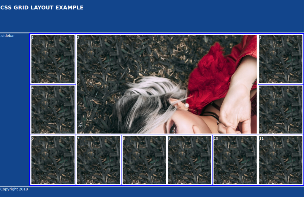
}We use a grid gap of 0.1vw and we define columns and rows using the repeat(auto-fill, minmax(12rem, 1fr)); function. The auto-fill option tries to fill the available space with as many columns or rows as possible, creating implicit columns or rows if needed. If you want to fit the available columns or rows into the available space, you need to use auto-fit. Read a good explanation of the differences between auto-fill and auto-fit.
我们使用0.1vw的网格间隙,并使用repeat(auto-fill, minmax(12rem, 1fr));定义列和行repeat(auto-fill, minmax(12rem, 1fr)); 功能。 auto-fill选项尝试用尽可能多的列或行填充可用空间,并在需要时创建隐式列或行。 如果您想将可用的列或行适合到可用空间中,则需要使用auto-fit 。 阅读有关auto-fill和auto-fit之间差异的很好的解释。
This is the screen shot of the result:
这是结果的屏幕截图:

使用Grid grid-column , grid-row和span关键字 (Using the Grid grid-column, grid-row and span Keywords)
CSS Grid provides grid-column and grid-row, which allow you to position grid items inside their parent grid using grid lines. They’re shorthand for the following properties:
CSS Grid提供了grid-column和grid-row ,它们允许您使用网格线将网格项放置在其父网格内。 它们是以下属性的简写:
grid-row-start: specifies the start position of the grid item within the grid rowgrid-row-start:指定网格项在网格行中的开始位置grid-row-end: specifies the end position of the grid item within the grid rowgrid-row-end:指定网格项目在网格行中的结束位置grid-column-start: specifies the start position of the grid item within the grid columngrid-column-start:指定网格项在网格列中的开始位置grid-column-end: specifies the end position of the grid item within the grid column.grid-column-end:指定网格项在网格列中的结束位置。
You can also use the keyword span to specify how many columns or rows to span.
您还可以使用关键字span来指定要跨越多少列或行。
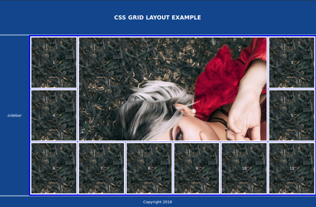
Let’s make the second child of the main area span four columns and two rows and position it from column line two and row line one (which is also its default location):
让我们使主区域的第二个子元素跨越四列两行,并将其从第二列和第一行(这也是其默认位置)定位:
main article:nth-child(2) {
  grid-column: 2/span 4;
  grid-row: 1/span 2;
}
This is a screen shot of the result:
这是结果的屏幕截图:
使用网格对齐工具 (Using Grid Alignment Utilities)
We want to center the text inside the header, sidebar and footer and the numbers inside the <article> elements.
我们希望将文本居中放置在页眉,边栏和页脚以及<article>元素内部的数字的中心。
CSS Grid provides six properties justify-items, align-items, justify-content, align-content, justify-self and align-self, which can be used to align and justify grid items. They are actually part of CSS box alignment module.
CSS Grid提供了六个属性justify-items , align-items , justify-content , align-content , justify-self和align-self ,它们可以用于对齐和对齐网格项目。 它们实际上是CSS框对齐模块的一部分 。
Inside the header, aside, article and footer selectors add the following:
在页眉,文章和页脚选择器内添加以下内容:
display: grid;
align-items: center;
justify-items: center;justify-itemsis used to justify the grid items along the row axis or horizontally.justify-items用于沿着行轴或水平方向对齐网格项目。align-itemsaligns the grid items along the column axis, or vertically. They can both take thestart,end,centerandstretchvalues.align-items沿列轴或垂直对齐网格项。 它们都可以采用start,end,center和stretch值。
This is a screen shot after centering elements:
这是居中元素之后的屏幕截图:
重组小型设备中的网格布局 (Restructuring the Grid Layout in Small Devices)
Our demo layout is convenient for medium and large screens, but might not be the best way to structure the page in small screen devices. Using CSS Grid, we can easily change this layout structure to make it linear in small devices — by redefining Grid areas and using Media Queries.
我们的演示版图对于中型和大型屏幕很方便,但可能不是在小屏幕设备中构造页面的最佳方法。 使用CSS Grid,通过重新定义Grid区域并使用Media Queries,我们可以轻松地更改此布局结构以使其在小型设备中呈线性。
This is a screen shot before adding code to re-structure the layout on small devices:
这是添加代码以重新构造小型设备上的布局之前的屏幕截图:
Now, add the following CSS code:
现在,添加以下CSS代码:
@media all and (max-width: 575px) {
  body {
    grid-template-rows: 6rem  1fr 5.5rem  5.5rem;
    grid-template-columns: 1fr;
    grid-template-areas:
      "header"
      "content"
      "sidebar"
      "footer";
    }
}
On devices with <= 575px we use four rows with 6rem, 1fr, 5.5rem, and 5.5rem widths respectively, and one column that takes all the available space. We also redefine Grid areas so the sidebar can take the third row after the main content area on small devices:
在<= 575px设备上,我们分别使用四行宽度为6rem , 1fr , 5.5rem和5.5rem宽度,以及一列占用所有可用空间的列。 我们还重新定义了网格区域,以便侧边栏可以排在小型设备上主要内容区域之后的第三行:

Notice that the width of the sidebar isn’t filling the available width. This is caused by the fallback code, so all we need to do is override the width: 6.3rem; pair with width: auto; on browsers supporting Grid:
请注意,侧边栏的宽度没有填充可用的宽度。 这是由后备代码引起的,因此我们要做的就是覆盖width: 6.3rem; 与width: auto;配对width: auto; 在支持Grid的浏览器上:
@supports (display: grid) {
  main, aside {
    width: auto;
  }
}
This is a screen shot of the final result:
这是最终结果的屏幕截图:

You can find the final code in the pen displayed near the start of this article, or visit the pen directly.
您可以在本文开头附近显示的笔中找到最终代码,或直接访问笔 。
结论 (Conclusion)
Throughout this tutorial, we’ve created a responsive demo layout with CSS Grid. We’ve demonstrated using fallback code for old browsers, adding CSS Grid progressively, restructuring the layout in small devices and centering elements using the alignment properties.
在整个教程中,我们已经使用CSS Grid创建了响应式演示布局。 我们已经展示了针对旧浏览器使用后备代码,逐步添加CSS Grid,在小型设备中重新布局以及使用对齐属性将元素居中的方法。
翻译自: https://www.sitepoint.com/easy-responsive-modern-css-grid-layout/
visionpro简单易用


 336
336


 被折叠的 条评论
为什么被折叠?
被折叠的 条评论
为什么被折叠?
 到【灌水乐园】发言


