


css 网格布局

This article was updated on 23rd March, 2017. Specifically: browser support for CSS Grid Layout.
本文已于2017年3月23日更新。特别是:浏览器对CSS Grid Layout的支持。
In this article, we are going to learn seven ways in which you can place elements in a web page using the Grid Layout module.
在本文中,我们将学习使用Grid Layout模块将元素放置在网页中的七种方法。
Previously, SitePoint published Introducing the CSS Grid Layout. Recently, I also wrote Where Things Are at in the CSS Grid Layout Working Draft.
先前,SitePoint发布了CSS网格布局简介 。 最近,我还在CSS Grid Layout Working Draft中写了《事物在哪里》 。
Here, the focus will be entirely on specific ways in which you can lay out elements on the web using CSS Grid. Now, let’s go over each one of them.
在这里,重点将完全放在使用CSS Grid在Web上布置元素的特定方式。 现在,让我们逐一检查它们。
解决浏览器对网格布局的支持 (Addressing Browser Support for Grid Layout)
At this time, Grid Layout doesn’t yet have consistent browser support. However, as of March 2017, both latest versions of Chrome and Firefox browsers have been released with CSS Grid Layout support by default. IE still supports the old implementation, Opera needs the Experimental Web Platform flag turned on, and Safari has no support at all. To properly work with all the examples in this article, I suggest you use either Chrome or Firefox. For readers who for some reason find it problematic to use these browsers, I have added a screenshot to show the final result of each technique.
目前,网格布局尚未获得一致的浏览器支持。 但是,截至2017年3月,默认情况下,最新版本的Chrome浏览器和Firefox浏览器均已发布并具有CSS Grid Layout支持。 IE仍然支持旧的实现,Opera需要打开Experimental Web Platform标志,而Safari完全不支持。 为了正确处理本文中的所有示例,建议您使用Chrome或Firefox。 对于出于某种原因发现使用这些浏览器有问题的读者,我添加了一个屏幕截图以显示每种技术的最终结果。
#1在各个属性中指定所有内容 (#1 Specifying Everything in Individual Properties)
This is the version we have been using to place the elements in our previous articles. This method is verbose but easy to understand. Basically, the left/right and top/bottom bounds of an element are specified using grid-column-start/grid-column-end and grid-row-start/grid-row-end properties. If an element is only going to span one row or column, you can omit the -end properties, this way you will have to write a little less CSS.
这是我们在以前的文章中用来放置元素的版本。 此方法冗长但易于理解。 基本上,使用grid-column-start / grid-column-end和grid-row-start / grid-row-end属性指定元素的左/右边界和上/下边界。 如果一个元素仅跨越一行或一列,则可以省略-end属性,这样,您将需要编写更少CSS。
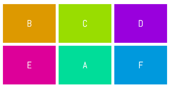
In the demo below, element A has been placed in the second row and second column using the following CSS:
在下面的演示中,使用以下CSS将元素A放置在第二行和第二列中:
.a {
  grid-column-start: 2;
  grid-column-end: 3;
  grid-row-start: 2;
  grid-row-end: 3;
}
The same effect could be achieved by using:
通过使用以下方法可以达到相同的效果:
.a {
  grid-column-start: 2;
  grid-row-start: 2;
}
See the Pen Specifying Everything in individual Properties by SitePoint (@SitePoint) on CodePen.
见笔指定一切都在个人属性由SitePoint( @SitePoint上) CodePen 。
#2使用grid-row和grid-column (#2 Using grid-row and grid-column)
Even though the CSS in our first example was readable and easy to understand, we had to use four different properties to place a single element. Instead of using four properties, we can just use two — grid-column and grid-row. Both these properties will take two values separated by a slash where the first value will determine the start line and the second value will determine the end line of our element.
即使我们第一个示例中CSS可读易懂,我们也必须使用四个不同的属性来放置单个元素。 除了使用四个属性,我们还可以只使用两个属性grid-column和grid-row 。 这两个属性都将采用两个值,并以斜杠分隔,其中第一个值将确定元素的起始行,第二个值将确定元素的结束行。
Here is the syntax you need to use with these properties:
这是您需要对这些属性使用的语法:
.selector {
grid-row: row-start / row-end;
grid-column: col-start / col-end;
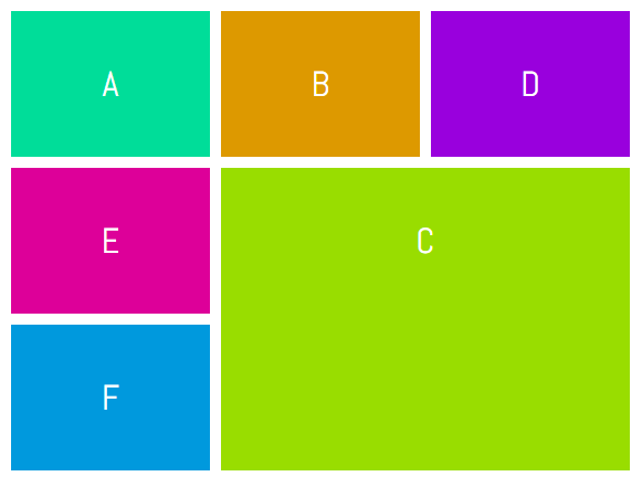
}To place item C in the bottom right corner of our grid, we can use the following CSS:
要将项目C放置在网格的右下角,可以使用以下CSS:
.c {
  grid-row: 2 / 4;
  grid-column: 2 / 4;
}
See the Pen Using grid-row and grid-column by SitePoint (@SitePoint) on CodePen.
请参阅CodePen上的SitePoint ( @SitePoint )的使用网格行和网格列的笔 。
#3使用grid-area (#3 Using grid-area)
Technically, the item we are laying out covers a specific area of the webpage. The boundary of that item is determined by the values we provide for the grid lines. All of these values can be supplied at once using the grid-area property.
从技术上讲,我们要布置的项目涵盖了网页的特定区域。 该项目的边界由我们为网格线提供的值确定。 使用grid-area属性可以一次提供所有这些值。
This is what your CSS would look like when using this property:
这是使用此属性时CSS的外观:
.selector {
  grid-area: row-start / col-start / row-end / col-end;
}
If you have trouble remembering the correct order of these values, just keep in mind that first you have to specify the position of the top-left ( row-start – col-start ) corner and then the bottom-right ( row-end – col-end ) corner of your element.
如果您在记住这些值的正确顺序时遇到麻烦,请记住,首先必须指定左上角( row-start - col-start )角的位置,然后指定右下角( row-end col-end )元素的一角。
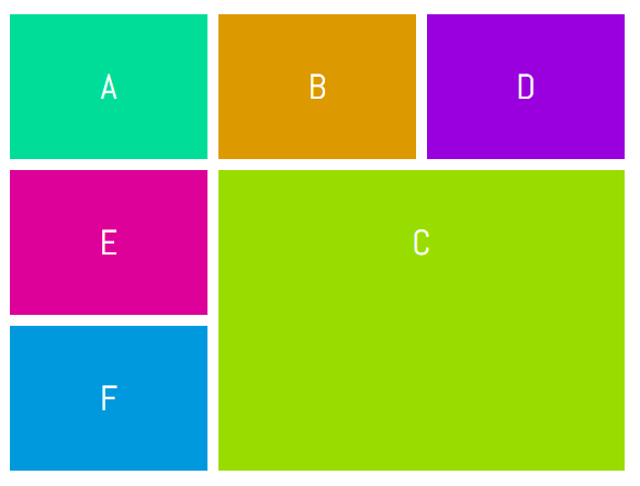
Just like the previous example, to place item C in the bottom right corner of our grid, we can use the following CSS:
就像前面的示例一样,要将项目C放置在网格的右下角,我们可以使用以下CSS:
.c {
  grid-area: 2 / 2 / 4 / 4;
}
See the Pen Using grid-area by SitePoint (@SitePoint) on CodePen.
请参阅CodePen上的SitePoint笔( @SitePoint ) 使用网格区域 。
#4使用span关键字 (#4 Using the span Keyword)
Instead of specifying the end line while laying out elements, you can also use the span keyword to set the number of columns or rows a particular element will span.
您也可以使用span关键字来设置特定元素将跨越的列数或行数,而不是在布置元素时指定结束线。
This is the proper syntax when using the span keyword:
使用span关键字时,这是正确的语法:
.selector {
  grid-row: row-start / span row-span-value;
  grid-column: col-start / span col-span-value;
}
If your element spans across only one row or column you can omit both the span keyword and its value.
如果您的元素仅跨越一行或一列,则可以忽略span关键字及其值。
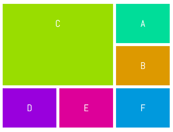
This time let’s place item C in the top left corner of our grid. We can use the following CSS to do so.
这次让我们将项目C放置在网格的左上角。 我们可以使用以下CSS来做到这一点。
.c {
  grid-row: 1 / span 2;
  grid-column: 1 / span 2;
}
See the Pen Using span with grid lines by SitePoint (@SitePoint) on CodePen.
请参阅CodePen上的SitePoint ( @SitePoint )的钢笔使用带有网格线的跨度 。
#5使用命名行 (#5 Using Named Lines)
Until now, we have been using raw numbers to specify grid lines and it is easy to use when we are working with simple layouts. However, when you have to place several elements, it can get a bit confusing. Most of the times, an element on your page will fall under a specific category. For example, the header may go from column line c1 to column line c2 and from row line r1 to row line r2. It would be a lot easier to properly name all the lines and then place your elements using these names instead of numbers.
到目前为止,我们一直在使用原始数字来指定网格线,并且在使用简单布局时很容易使用。 但是,当您必须放置多个元素时,可能会有些混乱。 大多数情况下,页面上的元素会属于特定类别。 例如,标题可以从列线c1到列线c2并且从行线r1到行线r2 。 正确命名所有行,然后使用这些名称而不是数字放置元素会容易得多。
Let’s create a very basic layout to make the concept clearer. First, we will have to modify the CSS applied to our grid container:
让我们创建一个非常基本的布局以使概念更清晰。 首先,我们将必须修改应用于网格容器CSS:
.container {
  display: grid;
  grid-gap: 10px;
  grid-template-columns: [head-col-start] 180px [content-col-start] 180px [content-col-mid] 180px [head-col-end];
  grid-template-rows: [head-row-start] auto [head-row-end] auto [content-row-end] auto [footer-row-end];
}
What I have done above is assign names to all the lines based on the type of content that they will enclose. The idea here is to use names that provide us with some insight into the placement of different elements. In this particular example, our header element spans across all the columns. Therefore, assigning the name “head-col-start” and “head-col-end” to the first and last column line respectively will make it clear that these lines represent the left and right end of our header. All other lines can be named in a similar fashion. After all the lines have been named, we can use the following CSS to place all our elements.
上面我所做的就是根据行将包含的内容类型为所有行分配名称。 这里的想法是使用使我们对不同元素的位置有一些了解的名称。 在此特定示例中,我们的标头元素跨越所有列。 因此,将名称“ head-col-start”和“ head-col-end”分别指定给第一列和最后一列,将使这些行分别代表标题的左端和右端。 其他所有行都可以类似的方式命名。 在命名所有行之后,我们可以使用以下CSS放置所有元素。
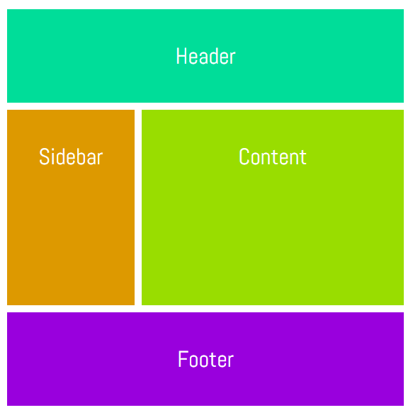
.header {
  grid-column: head-col-start / head-col-end;
  grid-row: head-row-start / head-row-end;
}

.sidebar {
  grid-column: head-col-start / content-col-start;
  grid-row: head-row-end / content-row-end;
}

.content {
  grid-column: content-col-start / head-col-end;
  grid-row: head-row-end / content-row-end;
}

.footer {
  grid-column: head-col-start / head-col-end;
  grid-row: content-row-end / footer-row-end;
}
Although we had to write more CSS than usual, now just looking at the CSS will give us an idea of where an element is located.
尽管我们不得不编写比平时更多CSS,但是现在只要看一下CSS,就可以使我们了解元素的位置。
See the Pen Using Named Lines by SitePoint (@SitePoint) on CodePen.
见笔使用命名线由SitePoint( @SitePoint上) CodePen 。
#6使用具有通用名称和span关键字的命名行 (#6 Using Named Lines with a Common Name and the span Keyword)
In the previous method, all lines had different names marking the starting, midpoint or the end of an element. For example, “content-col-start” and “content-col-mid” marked the starting and mid point of the content section of our webpage. If the content section covered a few more rows, we would have to come up with additional line names like “content-col-mid-one”, “content-col-mid-two” and so on.
在以前的方法中,所有行都有不同的名称来标记元素的开始,中点或结束。 例如,“ content-col-start”和“ content-col-mid”标记了我们网页内容部分的起点和中点。 如果内容部分涵盖了更多行,我们将不得不提出其他行名称,例如“ content-col-mid-one”,“ content-col-mid-two”等等。
In situations like these, we can just use a common name like “content” for all grid lines of our content section and then use the span keyword to specify how many of those lines an element spans. We can also just mention a number along with the line name to set the number of rows or columns an element would span.
在这种情况下,我们可以对内容部分的所有网格线使用通用名称(例如“ content”),然后使用span关键字来指定元素跨越多少行。 我们还可以随行名称一起提及数字,以设置元素将跨越的行数或列数。
Using this method, the CSS would look like this:
使用此方法,CSS将如下所示:
.selector {
  grid-row: row-name row-start-number/ row-name row-end-number;
  grid-column: col-name col-start-number / span col-name col-to-span;
}
Like the last method, this one also requires you to modify the CSS of your grid container.
与最后一种方法一样,该方法也需要您修改网格容器CSS。
.container {
  display: grid;
  grid-gap: 10px;
  grid-template-columns: [one-eighty] 180px [one-eighty] 180px [one-eighty] 180px;
  grid-template-rows: [head-row] auto [content-row] auto [content-row] auto [content-row] auto [footer-row] auto;
}
Each of the named column lines has the same name representing their width in pixels and each named row line represents the rows covered by a specific section of the webpage. In this demo, I have introduced an advertisement section just under the sidebar. Here is the CSS:
每条命名的列线都具有相同的名称,以像素为单位表示其宽度,而每条命名的行线则代表网页的特定部分所覆盖的行。 在此演示中,我在侧边栏下方介绍了广告部分。 这是CSS:
.header {
  grid-column: one-eighty 1 / one-eighty 4;
  grid-row: head-row / content-row 1;
}

.sidebar {
  grid-column: one-eighty 1 / one-eighty 2;
  grid-row: content-row 1 / content-row 2;
}

.advert {
  grid-column: one-eighty 1 / one-eighty 2;
  grid-row: content-row 2 / content-row 3;
}

.content {
  grid-column: one-eighty 2 / one-eighty 4;
  grid-row: content-row 1 / span content-row 2;
}

.footer {
  grid-column: one-eighty 1 / span one-eighty 3;
  grid-row: content-row 3 / footer-row;
}
See the Pen Using Named Lines with Span by SitePoint (@SitePoint) on CodePen.
见笔使用与跨度命名线由SitePoint( @SitePoint上) CodePen 。
#7使用命名网格区域 (#7 Using Named Grid Areas)
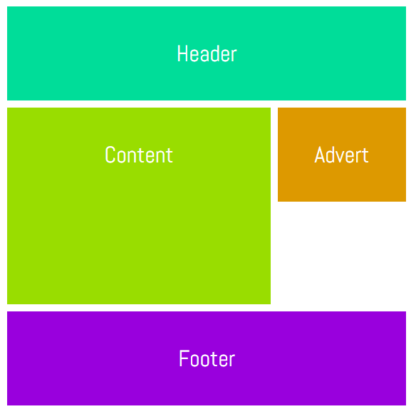
Instead of using lines, we can also place elements by assigning names to different areas. Again, we will have to make some changes to the CSS of our grid container.
除了使用线条,我们还可以通过将名称分配给不同的区域来放置元素。 同样,我们将不得不对网格容器CSS进行一些更改。
The CSS for our container should now look like this:
现在,我们容器CSS应该如下所示:
.wrapper {
  display: grid;
  grid-gap: 10px;
  grid-template-columns: 180px  180px  180px;
  grid-template-areas:  "header  header   header"
                        "content content  advert"
                        "content content  ......"
                        "footer  footer   footer";
}
A single dot (.) or a sequence of dots will create an empty cell with nothing in it. All the strings need to have the same number of columns. That’s why we had to add the dots instead of leaving it completely blank. For now, the named grid area can only be rectangular. However, this may change in future versions of the spec. Let’s take a look at the CSS of all our elements.
单个点( . )或点序列将创建一个没有任何内容的空单元格。 所有字符串必须具有相同的列数。 这就是为什么我们必须添加点而不是将其完全空白。 目前,命名的网格区域只能是矩形。 但是,这可能会在规范的将来版本中发生变化。 让我们看一下所有元素CSS。
.header {
  grid-area: header;
}

.content {
  grid-area: content;
}

.advert {
  grid-area: advert;
}

.footer {
  grid-area: footer;
}
Once you have defined all the grid areas, assigning them to various elements is pretty straightforward. Keep in mind that you can’t use any special characters while assigning names to areas. Doing so will make the declaration invalid.
定义所有网格区域后,将它们分配给各种元素非常简单。 请记住,在为区域分配名称时不能使用任何特殊字符。 这样做会使声明无效。
See the Pen Using Named Grid Areas by SitePoint (@SitePoint) on CodePen.
见笔使用命名网格地域由SitePoint( @SitePoint上) CodePen 。
结论 (Conclusion)
That’s it! We have covered seven different methods of laying out elements using the CSS grid layout. Is there any tip that you would like to share with other readers regarding this article? Which of these methods would you prefer to use in your own projects? Let us know in the comments.
而已! 我们已经介绍了使用CSS网格布局对元素进行布局的七种不同方法。 您是否想与其他读者分享有关此文章的提示? 您希望在自己的项目中使用以下哪种方法? 让我们在评论中知道。
翻译自: https://www.sitepoint.com/seven-ways-you-can-place-elements-using-css-grid-layout/
css 网格布局


 1102
1102

 被折叠的 条评论
为什么被折叠?
被折叠的 条评论
为什么被折叠?
 到【灌水乐园】发言


