


The visual style that has come to be associated with the term Web 2.0 has exploded in popularity; everywhere you look, corporate sites, web service sites, ecommerce sites, and even personal blogs are making use of clean, minimalist design coupled with fancy graphic effects. If you’d like to jump on the bandwagon, this is the article for you! Using Photoshop, I’ll show you how to add Web 2.0 graphic goodness to your site design using non-destructive techniques. It may even take your site from boring to trendy!
与Web 2.0术语相关联的视觉样式已Swift普及。 在您看到的所有地方,公司网站,Web服务网站,电子商务网站,甚至个人博客都在使用简洁,简约的设计以及精美的图形效果。 如果您想紧追潮流,这是适合您的文章! 我将使用Photoshop向您展示如何使用无损技术将Web 2.0图形优点添加到您的网站设计中。 它甚至可能使您的网站从无聊到时髦!
I won’t assume too much, nor should it matter if you’re not using the latest version of Photoshop. If you’re a Photoshop veteran, no doubt you’ll be happy skimming through the first few tips while we cover the basics. But I’ll be surprised if Photoshop whizzes don’t learn at least something along the way.
我不会承担太多,如果您不使用最新版本的Photoshop,也不要紧。 如果您是Photoshop的资深人士,那么当我们介绍基础知识时,毫无疑问,您将很高兴浏览前几个技巧。 但是,如果Photoshop的狂风在整个过程中至少没有学到什么,我会感到惊讶。
Oh, and one other thing — whenever I mention a tool for which a keyboard shortcut can be used, I’ve indicated that shortcut key in parentheses. If you’re a keyboard junkie, you’ll know that mastering these shortcuts is a real time-saver.
哦,还有另一件事-每当我提到可以使用键盘快捷键的工具时,我都会在括号中指出该快捷键。 如果您是键盘迷,那么您会知道掌握这些快捷键是真正的节省时间。
Let’s get started then, shall we?
那我们开始吧,好吗?
创建一个简单的渐变 (Creating a Simple Gradient)
One of the easiest effects to achieve in Photoshop is the subtle gradient. Looking at any mix of Web 2.0 sites, you’ll see gradients used as page backgrounds, behind a top banner or header area, on interface bars, and in different shapes (see starbursts, below).
在Photoshop中实现最简单的效果之一就是微妙的渐变。 查看Web 2.0网站的各种组合,您会看到渐变用作页面背景,顶部横幅或标题区域之后,界面栏上以及不同的形状(请参见下面的爆炸形)。
One of the easiest ways to make a gradient effect is to apply a layer style to an existing layer. Here’s a quick series of steps for creating a rectangle that has a gradient.
产生渐变效果的最简单方法之一是将图层样式应用于现有图层。 这是创建具有渐变的矩形的一系列快速步骤。
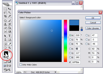
1. Set a base color for your rectangle by clicking the color patch in the toolbar, as shown in Figure 1, and selecting the color that you’d like to use.
1.通过单击工具栏中的色块,为矩形设置基本颜色,如图1所示,然后选择要使用的颜色。
2. To create a rectangle shape, select the rectangle shape tool (keyboard shortcut: U) and draw a rectangle on your canvas by clicking, dragging, and releasing, as illustrated in Figure 2.
2.要创建矩形,请选择矩形工具(键盘快捷键:U),然后通过单击,拖动和释放在画布上绘制一个矩形,如图2所示。

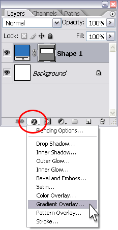
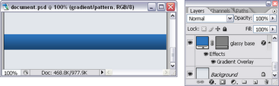
3. In the Layers palette, click the layer effect icon and select Gradient Overlay, like I’ve done in Figure 3.
3.在“图层”面板中,单击图层效果图标,然后选择“渐变叠加”,如图3所示。
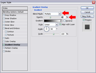
4. For a simple gradient, change the Blend Mode to Multiply and lower the Opacity to about 40%. Click OK. (The Multiply blend mode allows the black/white gradient — which you can see in the color patch — to simply darken the existing color. Lowering the opacity keeps the color from getting too dark.)
4.对于简单的渐变,将混合模式更改为乘,并将不透明度降低到大约40%。 单击确定。 (“乘以混合”模式允许黑白渐变(您可以在色块中看到)仅使现有颜色变暗。降低不透明度可防止颜色变得太深。)
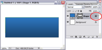
5. Figure 5 shows the completed gradient effect on the rectangle. What’s particularly handy is the fact that you can edit the effect at any time by double-clicking the effect icon (circled below) next to the layer name in the Layers palette.
5.图5显示了矩形上已完成的渐变效果。 特别方便的事实是,您可以随时双击“图层”调板中图层名称旁边的效果图标(如下图所示)来编辑效果。
Variations
变化
- Set the blend mode to Screen in the Layer Style dialog box. This will lighten the base color instead of darkening it. 在“图层样式”对话框中将混合模式设置为“屏幕”。 这会使底色变亮而不是变暗。
- Click the gradient color patch in the Layer Style dialog box to edit the gradient. Drag the bottom color sliders to adjust how quickly the gradient fades. 单击“图层样式”对话框中的渐变色块以编辑渐变。 拖动底部的颜色滑块以调整渐变的褪色速度。
- Set the blend mode to Normal in the Layer Style dialog box, and click the gradient color patch to edit the gradient. You can pick one of the preset gradients, or edit and add color patches to the bottom of the gradient editor to create your own customized gradient. If you set the blend mode to Normal, the custom gradient completely overlays your shape, so it doesn’t even matter what the original color of your rectangle was! 在“图层样式”对话框中将混合模式设置为“普通”,然后单击渐变色块以编辑渐变。 您可以选择一种预设的渐变,也可以编辑色块并将其添加到渐变编辑器的底部,以创建自己的自定义渐变。 如果将混合模式设置为“普通”,则自定义渐变会完全覆盖您的形状,因此,矩形的原始颜色甚至都不重要!
- You can apply a Layer Style to any layer, not just to rectangles. This means that you can apply this technique to rounded rectangles, circles, stars — you can apply a gradient overlay to anything that you create on a layer. 您可以将图层样式应用于任何图层,而不仅仅是矩形。 这意味着您可以将这种技术应用于圆角的矩形,圆形,星形-您可以将渐变叠加层应用于在图层上创建的任何内容。
创建背景渐变 (Creating a Background Gradient)
What if you want to apply a gradient to something like the Background layer, which doesn’t allow for layer effects? Well, first fill the background layer with your desired base color. Then, change your foreground color to the new color that you want to use for your gradient. Select the Gradient Tool, which is part of the Paint Bucket flyout menu (keyboard shortcut G).
如果要对诸如Background图层之类的图层应用渐变,该渐变不允许图层效果怎么办? 好吧,首先用所需的基础色填充背景层。 然后,将前景色更改为要用于渐变的新颜色。 选择“渐变工具”,它是“颜料桶”弹出菜单的一部分(键盘快捷键G)。

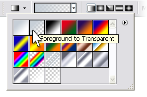
In the Options bar, choose the Foreground to Transparent gradient.
在选项栏中,选择“前景到透明”渐变。
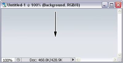
Make sure that you have the Background layer selected in the Layers palette. Then click near the top of the Background layer, and hold the mouse button down. Hold down the Shift key (this constrains the gradient effect to the vertical axis), drag downwards, and then release the mouse button in the point at which you want the gradient to end. Your Background layer now has a gradient applied!
确保在“图层”调板中选择了“背景”图层。 然后单击“背景”层顶部附近,并按住鼠标按钮。 按住Shift键(将渐变效果限制在垂直轴上),向下拖动,然后在要结束渐变的点上释放鼠标按钮。 现在,您的背景图层已应用了渐变!
创建条纹背景 (Creating Striped Backgrounds)
Another nice Web 2.0 effect is the application of a striped background. Similar to gradients, striped backgrounds can be applied to page backgrounds, headers, banners, and shapes. They can even be combined with gradients for a stunning effect.
Web 2.0的另一个不错的效果是条纹背景的应用。 与渐变类似,条纹背景可以应用于页面背景,标题,横幅和形状。 它们甚至可以与渐变结合使用,以获得惊人的效果。
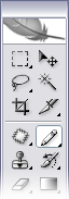
1. First, you need a striped pattern to work with. Create a new document that’s only 4×4 pixels in size. Set the foreground color to black and select the Pencil tool, as shown in Figure 9.
1.首先,您需要使用条纹图案。 创建一个仅4×4像素的新文档。 将前景色设置为黑色,然后选择“铅笔”工具,如图9所示。
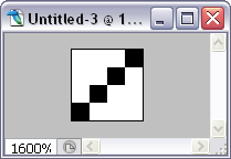
2. Zoom in, if you need to, and draw a diagonal line like the one in Figure 10.
2.如果需要,请放大并绘制一条对角线,如图10所示。
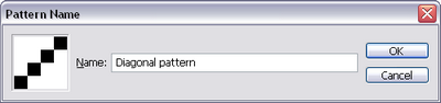
3. Type Ctrl-A (PC) or Command-A (Mac) to select the entire canvas. Go to Edit > Define Pattern. In the dialog box, type a name for the brush (e.g. “Diagonal pattern”) and click OK (see Figure 10). You can close the pattern document without saving if you want — you don’t need it anymore.
3.键入Ctrl-A(PC)或Command-A(Mac)选择整个画布。 转到编辑>定义图案。 在对话框中,为画笔输入一个名称(例如“对角线图案”),然后单击“确定”(见图10)。 如果需要,您可以关闭模式文档而无需保存-不再需要它。
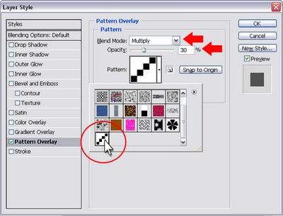
4. Create another rectangle, click the Layer Style icon and choose Pattern Overlay. Change the Blend Mode to Multiply, the Opacity to 30%, and choose your new diagonal pattern from the pattern drop-down. If your settings window looks like Figure 12, you’re good to go — click OK.
4.创建另一个矩形,单击“图层样式”图标,然后选择“图案叠加”。 将混合模式更改为正片叠底,将不透明度更改为30%,然后从图案下拉列表中选择新的对角线图案。 如果您的设置窗口如图12所示,那就很好了-单击“确定”。
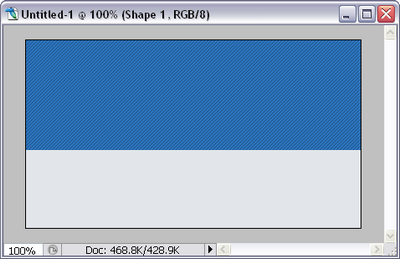
5. As Figure 13 shows, a striped pattern is now applied to the rectangle.
5.如图13所示,现在将条纹图案应用于矩形。
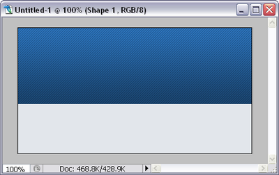
For some extra Web 2.0 goodness, apply a gradient overlay layer effect as well:
为了获得更多Web 2.0的好处,请同时应用渐变叠加层效果:
透明层 (Transparent Layers)
Creating layers that are slightly transparent is very easy. Simply select the layer that you want to be transparent in the Layers palette, then change the opacity level by changing the percentage or by dragging the slider. In Figure 15 below, the white rectangle has been made slightly transparent so that you can see the striped gradient background behind it — perfect for, say, a navigation bar.
创建稍微透明的图层非常容易。 只需在“图层”调板中选择要透明的图层,然后通过更改百分比或拖动滑块来更改不透明度级别。 在下面的图15中,白色矩形已变得稍微透明,因此您可以看到其后面的条纹渐变背景-非常适合例如导航栏。
微妙的思考 (Subtle Reflections)
Now that you have some great backgrounds, let’s apply some Web 2.0 effects to text and objects. One of the effects you may have seen a lot of is the standard reflection. This effect can be created with either a text layer, shape layer, or a graphic layer.
现在您已经有了一些不错的背景,让我们将一些Web 2.0效果应用于文本和对象。 您可能已经看到很多效果之一是标准反射。 可以使用文本层,形状层或图形层来创建此效果。
1. The first step is to duplicate your layer. Drag on the layer in the Layers palette and drop it on top of the “new layer” icon at the bottom of the palette (shown in Figure 16).
1.第一步是复制您的图层。 将其拖到“图层”调板中的层上,并将其放在调板底部的“新层”图标上方(如图16所示)。

2. This creates a copy of the layer, which you can now flip upside down. With the copied layer selected, type Ctrl-T (Command-T on Mac) to “transform” the shape. You’ll see a boundary box with handles on the corners and sides appear around your layer. Click on the top handle and, holding the Shift key, drag downward to flip the text vertically like that shown in Figure 17.
2.这将创建该图层的副本,您现在可以将其上下翻转。 选择复制的图层后,键入Ctrl-T(在Mac上为Command-T)以“变换”形状。 您会看到一个边界框,其拐角处和侧面都有手柄,并出现在图层周围。 单击顶部手柄,然后按住Shift键,向下拖动以垂直翻转文本,如图17所示。
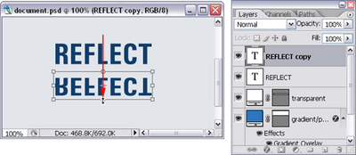
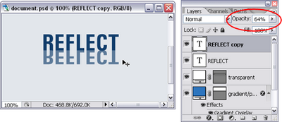
3. Double-click inside the bounding box to commit the transformation, then change to the Move tool (V) and move the layer up to meet the bottom of the original layer. Lower the opacity slightly, as I’ve done in Figure 18.
3.在边界框内双击以提交转换,然后更改为“移动”工具(V)并向上移动层以使其与原始层的底部相交。 稍微降低不透明度,如图18所示。
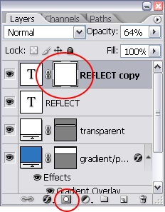
4. To add another level of visual interest, add a layer mask to fade out the bottom part of the reflection. Click the Add Layer Mask icon at the bottom of the Layers palette. As shown in Figure 19, you’ll see a linked blank square attached to your layer.
4.要增加另一层次的视觉趣味,请添加图层蒙版以淡出反射的底部。 单击“图层”调板底部的“添加图层蒙版”图标。 如图19所示,您将看到一个链接的空白正方形附加到您的图层。
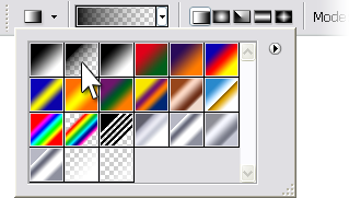
5. Set your foreground color to black and select the gradient tool (G), choosing the Foreground to Transparent option in the options bar.
5.将前景色设置为黑色,然后选择渐变工具(G),然后在选项栏中选择“前景色为透明”选项。
6. Click on the white mask thumbnail in the Layers palette to make sure you’re going to edit it, then click a little below the bottom of your reflected layer. Hold the Shift key, and drag upwards until you’re just about at the top of your layer. Release your mouse button, and you’ll see that a gradient has been completed on the mask layer, as shown in Figure 21. The black areas of the mask hide the layer, so the gradient effectively fades out your reflected layer.
6.单击“图层”调板中的白色蒙版缩略图,以确保要对其进行编辑,然后单击反射层底部下方的一点。 按住Shift键,然后向上拖动直到您刚好位于图层的顶部。 释放鼠标按钮,您将看到在遮罩层上完成了渐变,如图21所示。遮罩的黑色区域隐藏了该层,因此渐变有效地淡出了反射层。

Tip: You can add a layer mask to any layer for a similar faded effect. Or, add a layer mask and then use a paint or shape tool to hide part of a layer — black will completely hide the area you paint, and different shades of grey will provide different levels of opacity!
提示:您可以在任何图层上添加图层蒙版以获得类似的褪色效果。 或者,添加图层蒙版,然后使用绘画或形状工具隐藏图层的一部分-黑色将完全隐藏您绘制的区域,而不同的灰色阴影将提供不同级别的不透明度!
玻对象 (Glassy Objects)
Glassy buttons and bars are another common way for Web 2.0 sites to add eye candy to a design. Let’s start with an easy glassy bar.
玻璃状的按钮和条是Web 2.0网站向设计添加视觉效果的另一种常用方法。 让我们从一个简单的玻璃吧开始。
1. Start with an existing rectangular shape for the base of your bar. This can be a solid color, but for added depth you may want to start with a gradient bar or even a slightly transparent bar like the gradient rectangle that we created earlier.
1.从现有的矩形底部开始。 这可以是纯色,但是要增加深度,您可能要从渐变条甚至稍微透明的条开始,例如我们之前创建的渐变矩形。
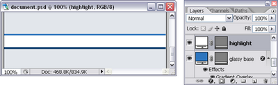
2. Draw a white rectangle shape that’s slightly shorter than the base shape. This is your highlight layer.
2.绘制一个比基本形状稍短的白色矩形。 这是您的突出显示层。
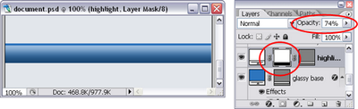
3. Add a layer mask to fade out the bottom portion of the highlight layer, and lower the opacity to achieve a glassy highlight effect:
3.添加图层蒙版以淡出高光层的底部,并降低不透明度以达到玻璃般的高光效果:
Creating a basic glassy button or shape involves a similar process — start with a gradient shape layer, add a white highlight layer with an appropriate shape that’s slightly smaller, then fade out the highlight layer with a layer mask. If you’d like to see a step-by-step description of how to do this, check out the excerpt from my book, The Photoshop Anthology, which uses a few different examples to describe how to create glassy buttons.
创建基本的玻璃状按钮或形状需要进行类似的过程-从渐变形状图层开始,添加具有适当形状的白色高光图层,该形状稍小一些,然后使用图层蒙版淡出高光图层。 如果您想逐步了解如何执行此操作,请查看我的书 《 Photoshop Anthology》 的摘录 ,其中使用了一些不同的示例来描述如何创建玻璃状按钮。
摘要 (Summary)
In this article, we learned a number of Photoshop techniques for creating Web 2.0 visual effects.
在本文中,我们学习了许多用于创建Web 2.0视觉效果的Photoshop技术。
As you can see, creating these effects for your own site is very easy! In the next article, we’re going to add a few more techniques to our arsenal, so that you can ensure your site designs are modern and slick.
如您所见,为您自己的网站创建这些效果非常简单! 在下一篇文章中 ,我们将向我们的军械库中添加更多技术,以便您可以确保您的网站设计现代而流畅。
I’ve also created a master document that you can download, which includes all of these effects so that you can pick apart the layers and layer styles to better understand how it’s all done.
我还创建了一个可下载的主文档 ,其中包含所有这些效果,以便您可以区分图层和图层样式以更好地了解其完成方式。


 1050
1050

 被折叠的 条评论
为什么被折叠?
被折叠的 条评论
为什么被折叠?
 到【灌水乐园】发言


