


 本文介绍了WordPress 4.5引入的响应式视图功能,该功能允许用户在桌面浏览器中模拟网站在不同设备上的显示效果,如桌面、平板和智能手机。在主题定制器中,开发者可以快速预览和测试响应式布局,而无需保存更改或使用真实移动设备。文章详细讲解了如何启用和使用响应式视图,如何选择要显示的视图,以及如何自定义视图大小。此外,还讨论了创建新响应视图和设置JavaScript触发器的方法,以便在视图变化时执行特定操作。
wordpress响应慢
We can’t ignore the mobile world when we have a website. For instance, if your articles are shared on social networks, chances are these links will be seen on a smartphone.
当我们拥有一个网站时,我们不能忽视移动世界。 例如,如果您的文章在社交网络上共享,则这些链接很可能会在智能手机上看到。
If you want visitors to engage with your website, you need to provide a good experience on mobile. You have to use a responsive theme.
如果希望访问者与您的网站互动,则需要在移动设备上提供良好的体验。 您必须使用自适应主题。
In WordPress 4.5, a new responsive view was introduced in the Theme Customizer. This article will cover what is the responsive view in the Theme Customizer, why it’s useful and, finally, how to use it as a developer.
在WordPress 4.5中,主题自定义程序中引入了新的响应视图。 本文将介绍主题定制器中的响应式视图,它为何有用以及最后如何将其用作开发人员。
什么是响应式观点 (What Is the Responsive View)
The responsive view allows you to visualize your website in another format than the one you’re currently using. For instance, you will be able to see how your website is displayed on a smartphone, directly in your desktop browser, without the need to use a real mobile device.
响应式视图使您可以以不同于当前使用的格式显示网站。 例如,您可以直接在桌面浏览器中查看智能手机上的网站显示方式,而无需使用真实的移动设备。
It’s really useful, as you can test on a smaller device changes you make in your theme with the Theme Customizer, without having to save them first. That means you won’t break anything just because you needed to test on a mobile device.
这非常有用,因为您可以使用主题定制器在较小的设备上测试对主题所做的更改,而不必先保存它们。 这意味着您不会因为需要在移动设备上进行测试而破坏任何东西。
Basically, the only thing the responsive view will do is reduce the frame where you view your website. It’s more or less what happens when you resize your browser’s window, or when you use your browser’s own responsive view.
基本上,响应式视图唯一要做的就是减少查看网站的框架。 调整浏览器窗口的大小或使用浏览器自己的响应视图时,或多或少会发生什么。
Changing the window’s size (or the viewport’s size in the case of the browser’s responsive view) is enough to see what your website looks like on a smaller devices. However, there’s an issue when you’re using the Theme Customizer: the sidebar (the customizer itself) will also be resized. If you want to test on very small devices like a smartphone, it’s not really practical.
更改窗口的大小(或在浏览器响应视图的情况下,更改视口的大小)足以查看您的网站在较小设备上的外观。 但是,使用主题自定义程序时会出现问题:侧栏(自定义程序本身)也将被调整大小。 如果您想在非常小的设备(例如智能手机)上进行测试,那是不实际的。
The advantage of using the Theme Customizer’s responsive view is that only the website’s preview is resized: the only thing which is resized is the only thing you want to test. You can then test changes, faster and easier.
使用主题定制器的响应式视图的优点是,仅调整了网站的预览大小:调整大小的唯一内容是您要测试的唯一内容。 然后,您可以更快,更轻松地测试更改。
Moreover, a classical user won’t necessarily know that there’s a responsive view in their browser, and they won’t necessarily have the habits to resize their browser’s window to test the view. As the Theme Customizer’s responsive view is easy and clear to use, it’s a good tool.
此外,经典用户不一定知道他们的浏览器中有响应视图,他们也不一定会习惯于调整浏览器窗口的大小来测试视图。 由于主题定制器的响应视图易于使用且清晰易用,因此它是一个很好的工具。
如何使用响应视图 (How To Use the Responsive View)
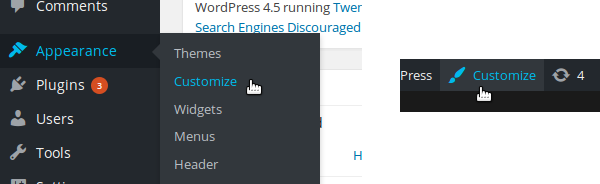
To use the responsive view you need to be in the Theme Customizer. To access it you can use the ‘Customize’ entry in the WordPress dashboard under the ‘Appearance’ menu. You can also use the “Customize” button in the top bar present on every page of your website once you’re logged in.
要使用响应视图,您需要位于主题定制器中。 要访问它,您可以使用WordPress仪表板中“外观”菜单下的“自定义”条目。 登录后,您还可以使用网站每一页顶部栏中的“自定义”按钮。
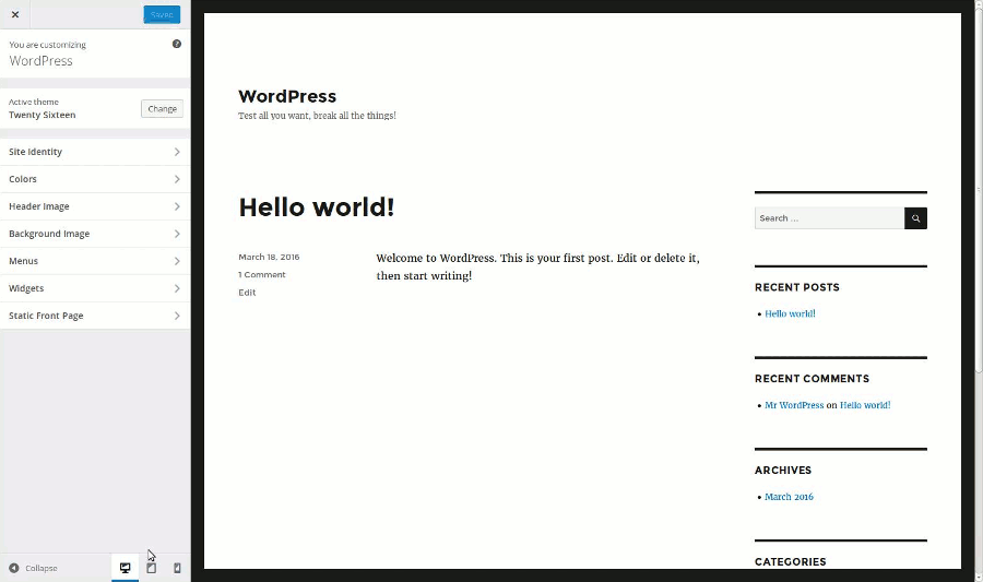
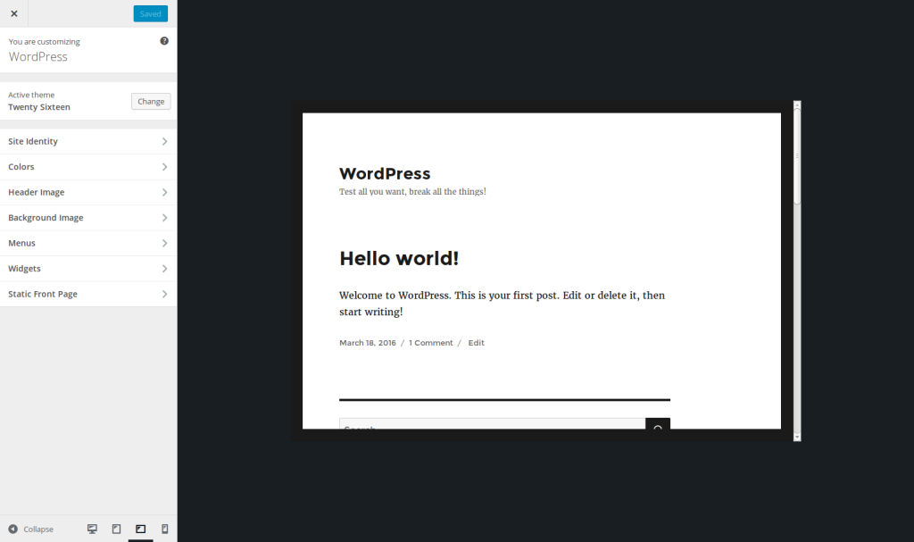
The Theme Customizer is split into two parts: the website’s preview on the right, and the sidebar on the left to change the details. At the bottom of this sidebar you can find the buttons allowing you to enable the responsive view.
主题定制器分为两部分:右侧是网站的预览,左侧是用于更改详细信息的侧栏。 在此侧栏的底部,您可以找到用于启用响应式视图的按钮。
Several formats are available: by default we find the desktop view, the tablet view (in portrait mode) and the smartphone view (also in portrait mode). To enable a view, you have to click on the corresponding button. The website’s preview will then be resized, without needing to do anything more.
有几种格式可用:默认情况下,我们找到桌面视图,平板电脑视图(纵向)和智能手机视图(也纵向)。 要启用视图,您必须单击相应的按钮。 然后,将调整网站的预览大小,而无需执行其他任何操作。
Let’s be clear, in case you’re wondering, these buttons won’t resize your website itself. They are just a way to preview what your website looks like on smaller devices. If you enable the smartphone view, a user visiting your website will continue to see it in full size!
让我们清楚一点,以防万一您想知道这些按钮不会改变您网站的大小。 它们只是预览较小设备上的网站外观的一种方法。 如果启用智能手机视图,则访问您的网站的用户将继续以完整尺寸查看它!
选择要显示的视图 (Choosing the Views to Show)
If you’re developing a theme, either for you or for sharing it (or both!), you have to make it responsive. As a developer, you’ll want to use your browser’s tools also to test the responsiveness of your theme, as they are more complete than the Theme Customizer’s responsive view.
如果您正在为自己或共享主题(或两者都有)开发主题,则必须使其具有响应性。 作为开发人员,您还希望使用浏览器的工具来测试主题的响应能力,因为它们比主题定制器的响应视图更完整。
However, this view will be preferred by your users, as it’s more comfortable to navigate with the Theme Customizer. That’s why you can’t ignore this responsive view.
但是,您的用户将首选此视图,因为使用“主题定制器”进行导航更加舒适。 这就是为什么您不能忽略此响应式视图的原因。
The good news is that you don’t have to do anything to enable the responsive view: once a user has updated their WordPress installation to Version 4.5 (or higher), they will be able to use it. However, you can manage the available views, if you need it.
好消息是,您无需执行任何操作即可启用响应式视图:用户将WordPress安装更新到版本4.5(或更高版本)后,他们将可以使用它。 但是,如果需要,您可以管理可用视图。
For instance, if your theme is not responsive, you can disable the responsive view. You can also disable a specific view: if for some reason your theme can only be used on a mobile phone, you can only enable this view and even disable the desktop view. Another possible application is simply choosing the default view.
例如,如果您的主题没有响应,则可以禁用响应视图。 您还可以禁用特定视图:如果出于某种原因您的主题只能在手机上使用,则只能启用此视图,甚至禁用桌面视图。 另一个可能的应用程序只是选择默认视图。
To manage the responsive views, you can use the customize_previewable_devices filter. The function used in this filter must admit one parameter (the available views) and return the views to show. Below is the basic code to implement in the functions.php file of your theme:
要管理响应视图,可以使用customize_previewable_devices过滤器。 此过滤器中使用的函数必须允许一个参数(可用视图)并返回要显示的视图。 以下是在主题的functions.php文件中实现的基本代码:
<?php
add_filter('customize_previewable_devices', function($devices){
    return $devices;
});
?>
which is equivalent to (if you prefer):
等效于(如果您愿意):
<?php
function manage_previewable_devices($devices) {
    return $devices;
}
add_filter('customize_previewable_devices', 'manage_previewable_devices');
?>
To manage the devices we need to know what is contained in the variable $devices. It’s an associative array listing the views. By default it’s set to:
要管理设备,我们需要知道变量$devices包含什么。 它是列出视图的关联数组。 默认情况下,它设置为:
Array
(
    [desktop] => Array
        (
            [label] => Enter desktop preview mode
            [default] => true
        )
    [tablet] => Array
        (
            [label] => Enter tablet preview mode
        )
    [mobile] => Array
        (
            [label] => Enter mobile preview mode
        )
)
Once WordPress applied the customize_previewable_devices filter, it will list the views following this array. The first entry having the default key set to true will be the default view (even if there are other entries that have this key set to true). The label entries are not displayed on the screen, not even in a title attribute. They are used by screen readers for example. Chances are great that you don’t need to change their values.
一旦WordPress应用了customize_previewable_devices过滤器,它将在此数组之后列出视图。 default键设置为true的第一个条目将是默认视图(即使还有其他将此键设置为true条目)。 label条目不会显示在屏幕上,甚至不会显示在title属性中。 例如,屏幕阅读器会使用它们。 您无需更改其值的可能性就很大。
If you want to disable a view, you have to remove the corresponding entry. For example, if you want to disable the tablet view, use the following line of code in the function called by the filter:
如果要禁用视图,则必须删除相应的条目。 例如,如果要禁用平板电脑视图,请在过滤器调用的函数中使用以下代码行:
<?php
unset($devices['tablet']);
?>
To disable the responsive view, return an empty array:
要禁用响应视图,请返回一个空数组:
<?php
$devices = array();
// OR:
return array();
?>
Finally, to change the default view, we need to do two things: setting the default attribute of the current default view to false, then setting the default attribute of the view we want to set as default to true. For example, with the following code, the users will always see the mobile view by default.
最后,要更改默认视图,我们需要做两件事情:在设置default当前默认视图属性为false ,则设置default我们要设置为默认的视图属性true 。 例如,使用以下代码,默认情况下,用户将始终看到移动视图。
<?php
$devices['desktop']['default'] = false;
$devices['mobile']['default'] = true;
?>
自定义不同视图的大小 (Customizing the Sizes of the Different Views)
The desktop view will take all the available space, as we would expect it to. However, maybe you wonder what are the different sizes used by the other views.
桌面视图将占用所有可用空间,正如我们期望的那样。 但是,也许您想知道其他视图使用的不同大小是什么。
The mobile view simulates a screen in portrait mode. It’s set to 320 × 480 pixels. The tablet view, also in portrait mode, simulates a screen of 6 × 9 inches (between 10 and 11 inches in diagonal).
移动视图模拟纵向模式下的屏幕。 设置为320×480像素。 数位板视图也在纵向模式下,模拟了6×9英寸(对角线在10到11英寸之间)的屏幕。
These are the default values. They are set in a CSS file and you can’t customize them through the filter we used above. However, if you really want to customize these sizes, it’s possible by using your own CSS file, without editing a WordPress core file (which is never recommended).
这些是默认值。 它们设置在CSS文件中,您无法通过上面使用的过滤器自定义它们。 但是,如果您确实要自定义这些大小,则可以使用自己CSS文件,而无需编辑WordPress核心文件(从不推荐)。
Create a new CSS file in your theme’s folder. I named it custom-responsive-views.css and placed it at the root of my theme’s folder but feel free to choose whatever you want for these details.
在主题文件夹中创建一个新CSS文件。 我将其命名为custom-responsive-views.css并将其放置在主题文件夹的根目录中,但可以随时选择所需的详细信息。
Then, in the functions.php file of your theme, use the admin_enqueue_scripts action to enqueue your style.
然后,在主题的functions.php文件中,使用admin_enqueue_scripts操作使样式入队。
<?php
add_action('admin_enqueue_scripts', function() {
    wp_enqueue_style('custom-responsive-views', get_template_directory_uri() . '/custom-responsive-views.css');
});
?>
Now WordPress will read this file and the changes will be taken into account. Let’s take a concrete example and assume that you want to display the tablet view in landscape mode. Then you can use the following CSS code in the file you just created.
现在,WordPress将读取该文件,并将更改考虑在内。 让我们举一个具体的例子,并假设您要以横向模式显示平板电脑视图。 然后,您可以在刚创建的文件中使用以下CSS代码。
.preview-tablet .wp-full-overlay-main {
    margin: auto 0 auto -4.5in;
    width: 9in;
    height: 6in;
}
As you can see, don’t forget to adapt the margin, to always center the view. If you want to customize the mobile view, use the .preview-mobile class instead of the .preview-tablet one. The desktop view uses the .preview-desktop class. Thanks to these simple CSS rules, you can choose the size you want for the different views. Below is the tablet view I obtain with the above CSS.
如您所见,不要忘记调整边距,以始终将视图居中。 如果要自定义移动视图,请使用.preview-mobile类而不是.preview-tablet类。 桌面视图使用.preview-desktop类。 由于这些简单CSS规则,您可以为不同的视图选择所需的大小。 以下是通过上述CSS获得的平板电脑视图。
创建一个新的响应视图 (Creating a New Responsive View)
Contrary to built-in browsers tools, WordPress’ responsive view doesn’t allow the resizing of the view. That means that the user won’t be able to resize the mobile view if they want to see a bigger device for instance.
与内置浏览器工具相反,WordPress的自适应视图不允许调整视图的大小。 这意味着,例如,用户如果想查看更大的设备,将无法调整移动视图的大小。
Maybe we will see such a feature in the future. In the meantime, if you really want to provide a bigger mobile view or a landscape mode for the tablet view without overriding the default views, it’s still possible by creating your own view.
也许将来我们会看到这样的功能。 同时,如果您确实想为平板电脑视图提供更大的移动视图或横向模式而不覆盖默认视图,则可以通过创建自己的视图来实现。
To do that, let’s return in our callback function called by the filter customize_previewable_devices. As we saw above, WordPress will list all the entries in the $devices array as buttons. Then, to create a new view, add your own entry, as below.
为此,让我们返回由过滤器customize_previewable_devices调用的回调函数。 正如我们在上面看到的,WordPress将列出$devices数组中的所有条目作为按钮。 然后,要创建新视图,请添加您自己的条目,如下所示。
<?php
$devices['tablet-landscape'] = array(
    'label' => 'Enter tablet preview mode (landscape)'
);
?>
You can choose this view as the default one if you want to, by adding the key default set to true (but don’t forget to disable the current default view as we saw above).
您可以通过添加default设置为true将此视图选择为默认视图(但不要忘记禁用当前的默认视图,如我们在上面看到的)。
With this entry, WordPress will generate the corresponding button, with the right JavaScript callback: when the button is hit, the website preview will automatically take the right CSS class. In the example above for instance, the preview will get the class preview-tablet-landscape.
使用此条目,WordPress将生成相应的按钮,并带有正确JavaScript回调:单击该按钮时,网站预览将自动采用正确CSS类。 例如,在上面的示例中,预览将获得类preview-tablet-landscape 。
We have a problem here: the button we created is near to be invisible. You can find it if you know where to search, but it’s not really what we want. We need to add some CSS to display it the right way (i.e. the way other buttons are displayed). We will use the CSS file we created in the previous part to do that.
我们这里有一个问题:我们创建的按钮几乎是不可见的。 如果您知道要搜索的位置,就可以找到它,但这并不是我们真正想要的。 我们需要添加一些CSS以正确显示它(即其他按钮的显示方式)。 我们将使用在上一部分中创建CSS文件来执行此操作。
The icon displayed in the button is in a :before pseudo-element. Your button can be found thanks to the name you provided. With the example above, the CSS to use to retrieve our button’s icon is .wp-full-overlay-footer .devices .preview-tablet-landscape:before. Then, all you have to do is indicate the content, an icon to display. WordPress’ buttons use the Dashicons font. You can retrieve the whole list of available icons on WordPress Developer Resources website.
按钮中显示的图标位于:before伪元素中。 由于您提供的名称,可以找到您的按钮。 在上面的示例中,用于检索按钮图标CSS是.wp-full-overlay-footer .devices .preview-tablet-landscape:before 。 然后,您要做的就是指示内容和要显示的图标。 WordPress的按钮使用Dashicons字体。 您可以在WordPress开发人员资源网站上检索可用图标的整个列表。
In our example, we have a tablet so we choose the icon f471. The CSS is then as below.
在我们的示例中,我们有一个平板电脑,所以我们选择图标f471 。 CSS如下所示。
.wp-full-overlay-footer .devices .preview-tablet-landscape:before {
    content: '\f471';
}
However, our tablet is in landscape mode while the tablet shown in the icon is in portrait mode. We will here use the power of CSS to transform the icon: with the CSS below, the tablet is now shown in landscape mode.
但是,我们的平板电脑处于横向模式,而图标中显示的平板电脑则处于纵向模式。 我们将在这里使用CSS的功能来变换图标:使用下面CSS,平板电脑现在以横向模式显示。
.wp-full-overlay-footer .devices .preview-tablet-landscape:before {
    transform: scaleX(-1) rotate(0.25turn);
    content: '\f471';
}
You still need to do one thing: defining the size corresponding to your new view. This can be achieved the same way we changed a view above, thanks to the same CSS file. Below are the CSS rules corresponding to our tablet in landscape mode.
您仍然需要做一件事:定义与新视图相对应的大小。 由于使用了相同CSS文件,因此可以通过更改上面的视图的相同方法来实现。 以下是与我们的平板电脑在横向模式下相对应CSS规则。
.preview-tablet-landscape .wp-full-overlay-main {
    margin: auto 0 auto -4.5in;
    width: 9in;
    height: 6in;
    max-height: 100%;
    max-width: 100%;
    left: 50%;
}
设置JavaScript触发器 (Setting a JavaScript Trigger)
It’s possible to define a JavaScript function that’ll be called each time the responsive view is changed. It’s useful if, for example, your theme reacts to the resize event. In the Theme Customizer, the window is not resized by itself, so this event won’t be triggered.
可以定义每次更改响应视图时都会调用JavaScript函数。 例如,如果您的主题对resize事件有React,这将很有用。 在主题定制器中,窗口本身不会调整大小,因此不会触发此事件。
You can then use the function wp.customize.previewedDevice.bind(). This callback can use an argument: a string representing the new view. For instance, if the view changes to the mobile one, this string will be mobile. In the case of the view we created above, it will be tablet-landscape.
然后,您可以使用功能wp.customize.previewedDevice.bind() 。 该回调可以使用一个参数:一个表示新视图的字符串。 例如,如果视图更改为可移动视图,则此字符串将为mobile 。 对于我们上面创建的视图,它将是tablet-landscape 。
Below is an example which displays the new view in the console.
下面是在控制台中显示新视图的示例。
wp.customize.previewedDevice.bind(function(new_device) {
    console.log('Reponsive view has been changed to: ' + new_device);
});
This code can be put in a JavaScript file and enqueued thanks to the wp_enqueue_script() function. The action admin_enqueue_scripts we used above to enqueue our custom CSS is perfect for this call.
wp_enqueue_script()函数,可以将此代码放入JavaScript文件并排队。 上面我们用来使自定义CSS入队的admin_enqueue_scripts操作非常适合此调用。
<?php
add_action('admin_enqueue_scripts', function() {
    wp_enqueue_style('custom-responsive-views', get_template_directory_uri() . '/custom-responsive-views.css');
    wp_enqueue_script('responsive-views-callback', get_template_directory_uri() . '/responsive-views-callback.js', array(), false, true);
});
?>
See our article about properly including JavaScript files in WordPress if you need more help with the meaning of the arguments we used.
如果您需要更多有关我们所使用参数的含义的帮助,请参阅我们的文章,了解如何在WordPress中正确包含JavaScript文件 。
结束语 (Closing Words)
The Theme Customizer’s responsive view is useful for the end user who wants to easily see their changes in all the available devices. Disabling some views and adding your own views can be achieved fairly easily. It’s just the first version of this feature. Maybe we’ll see some new things in future versions, like view resizing for instance.
对于希望在所有可用设备中轻松查看其更改的最终用户,主题定制器的响应式视图非常有用。 禁用某些视图并添加自己的视图可以很容易地实现。 这只是此功能的第一个版本。 也许我们会在将来的版本中看到一些新内容,例如调整视图大小。
If you want to retrieve the examples we created in this article, I created an example plugin you can download right here. Note that this plugin exists for only one reason: it’s simpler (and clearer) to provide an example plugin than an example theme. However, playing with the Theme Customizer as we do in this plugin is theme-related functionality, so it should always be done in a theme.
如果您想检索我们在本文中创建的示例,我创建了一个示例插件,您可以在此处下载。 请注意,此插件的存在仅出于一个原因:提供示例插件比示例主题更简单(更清晰)。 但是,像在此插件中一样使用主题定制器是与主题相关的功能,因此应始终在主题中完成。
翻译自: https://www.sitepoint.com/responsiveness-in-the-wordpress-theme-customizer/
wordpress响应慢


 444
444

 被折叠的 条评论
为什么被折叠?
被折叠的 条评论
为什么被折叠?
 到【灌水乐园】发言


