


This article was peer reviewed by Adrian Sandu, Giulio Mainardi and Tom Hodgins. Thanks to all of SitePoint’s peer reviewers for making SitePoint content the best it can be!
本文由Adrian Sandu,Giulio Mainardi和Tom Hodgins进行了同行评审。 感谢所有SitePoint的同行评审人员使SitePoint内容达到最佳状态!
We are all familiar with using media queries in CSS to change the appearance of an element based on screen width. Element queries are similar to media queries, however, now the responsive conditions apply to individual elements on a web page instead of the viewport. For example, you can now apply different style rules to an element based on its own width, the number of characters that it contains or how much the user has scrolled.
我们都熟悉在CSS中使用媒体查询来根据屏幕宽度更改元素的外观。 元素查询类似于媒体查询,但是,现在响应条件适用于网页上的单个元素,而不是视口。 例如,您现在可以根据元素的宽度,元素包含的字符数或用户滚动多少来将不同的样式规则应用于元素。
为什么我们需要元素查询? (Why Do We Need Element Queries?)
As I mentioned in the introduction, element queries can help you style elements based on a number of properties instead of just the width and height of the viewport. Other than that, there are a few other situations where the library can prove to be of great use.
正如我在简介中所提到的,元素查询可以帮助您根据许多属性而不是仅视口的宽度和高度来设置元素的样式。 除此之外,还可以在其他一些情况下证明该库很有用。
Let’s say you have just created a beautiful responsive layout where all the elements fit together perfectly. Now, you are asked to add another column to the web page alongside existing ones. This will reduce the space available for all columns.
假设您刚刚创建了一个漂亮的响应式布局,其中所有元素完美地融合在一起。 现在,要求您在网页的现有栏旁边添加另一栏。 这将减少所有列的可用空间。
Your images and text which had perfect proportions for an 800px wide column on 1366px wide viewport may not look so good inside a 600px wide column on the same viewport. In such cases, the viewport width has not changed at all but individual columns are narrower because they had to make space for the sidebar. Using element queries instead of media queries in situations like this one can save you a lot of time because you won’t have to rewrite the CSS every time there is a change in the layout.
对于在1366像素宽的视口中的800像素宽的列具有完美比例的图像和文本,在同一视口中的600像素宽的列中可能看起来不太好。 在这种情况下,视口宽度根本没有改变,但是各个列较窄,因为它们必须为侧边栏腾出空间。 在这种情况下,使用元素查询而不是媒体查询可以节省大量时间,因为您不必在布局发生每次更改时都重写CSS。
In the following demo, if we have a smaller viewport (narrower than 500px), we set the image width to 100% and move it all into a single column. However, on a larger viewport, if you click on the “Add Sidebar” button, the width of our main column reduces significantly without any change in viewport width. Therefore, the image looks too small because the viewport width has not changed.
在下面的演示中,如果我们有一个较小的视口(窄于500像素),则将图像宽度设置为100%,并将其全部移动到单个列中。 但是,在较大的视口中,如果单击“添加侧栏”按钮,则主列的宽度将显着减小,而视口宽度不会发生任何变化。 因此,图像看起来太小,因为视口宽度没有改变。
See the Pen Adding More Columns to a Layout by SitePoint (@SitePoint) on CodePen.
见笔添加更多列的布局由SitePoint( @SitePoint上) CodePen 。
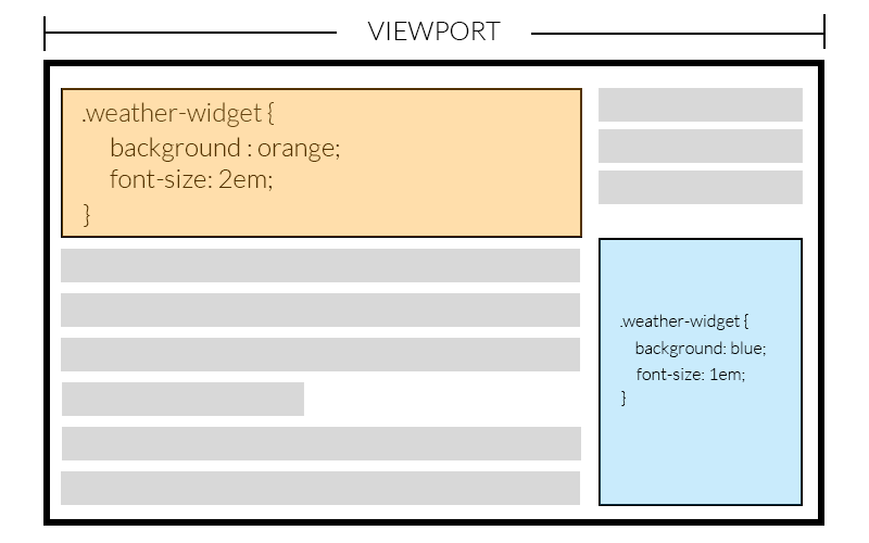
Now, let’s assume you are creating a widget or plugin and you are using media queries to make it responsive. The problem here is that the widget can be inside a container whose width is equal to the viewport or a container whose width is just one-fourth of the viewport. If the width of the widget depends on the width of its container, relying on the size of the viewport to style it properly won’t work. Element queries can now come to the rescue! Element queries can work well here because they use the widget’s own width to style it.
现在,假设您正在创建窗口小部件或插件,并且正在使用媒体查询使之响应。 这里的问题是,小部件可以位于宽度等于视口的容器内,也可以位于宽度仅为视口的四分之一的容器内。 如果小部件的宽度取决于其容器的宽度,则依靠视口的大小正确设置其样式将无法正常工作。 元素查询现在可以解决! 元素查询在这里可以很好地工作,因为它们使用窗口小部件自己的宽度来设置其样式。
In the image below, the same widget has been placed twice on a web page. You can see that the viewport width is the same but the width of these two widgets is different. Since the style rules are being applied based on the width of widget, both of them fit perfectly in the layout.
在下图中,同一小部件已在网页上放置了两次。 您可以看到视口宽度相同,但是这两个小部件的宽度不同。 由于样式规则是根据窗口小部件的宽度来应用的,因此它们两个都非常适合布局。
Using element queries, the responsive conditions for an element become independent of the page layout. Therefore, you can create and style components like navigation bars and tables without worrying about surrounding elements. This means that a pricing table created for website A can be used directly in website B. It can be of immense help when you are creating templates.
使用元素查询,元素的响应条件变得独立于页面布局。 因此,您可以创建和设置导航栏和表格等组件的样式,而不必担心周围的元素。 这意味着为网站A创建的定价表可以直接在网站B中使用。在创建模板时,它可以提供极大的帮助。
EQCSS入门 (Getting Started with EQCSS)
To use element queries in your projects, you will have to include EQCSS.js in your HTML. You can download the file from their GitHub repository or link directly to the minified file hosted on CDNjs.
要在项目中使用元素查询,您必须在HTML中包含EQCSS.js。 您可以从其GitHub存储库下载文件,或直接链接到CDNjs上托管的缩小文件 。
The plugin supports all modern browsers including IE9 and above. If you intend to support IE8, you will also have to include a polyfill in your project. The polyfill needs to be included before the actual plugin.
该插件支持所有现代浏览器,包括IE9及更高版本。 如果打算支持IE8,则还必须在项目中包含一个polyfill 。 需要在实际插件之前包含polyfill。
<!‐‐[if lt IE 9]>
  <script src="https://cdnjs.cloudflare.com/ajax/libs/eqcss/1.4.0/EQCSS-polyfills.min.js"></script>
<![endif]‐‐>
<script src="https://cdnjs.cloudflare.com/ajax/libs/eqcss/1.4.0/EQCSS.min.js"></script>
Once you have included the necessary files, you can start using EQCSS in your projects. There are two ways to do so. The easier one is to just write EQCSS in your regular CSS inside <style> or <link> tags. The other method is to separately include EQCSS styles inside a <script> tag with a custom type like this:
包含必要的文件后,就可以在项目中开始使用EQCSS。 有两种方法可以这样做。 较简单的方法是只在常规CSS中的<style>或<link>标记中编写EQCSS。 另一种方法是将EQCSS样式单独包含在<script>标记内,并具有如下自定义类型:
<script type=text/eqcss>
/* Put your EQCSS here */
</script>

or

<script type="text/eqcss" src="path/to/styles.eqcss"></script>
By default, the script executes and calculates all the styles once the content loads and after that, on resize and scroll events. Starting from version 1.2, the plugin has also started listening to input, click, mouseup and mousemove events as well. For scroll events, if the query is applied to either the body or html, the scroll event is attached to the window. In other cases, the scroll event is attached to the element specified in the query.
默认情况下,一旦内容加载,此脚本将在resize和scroll事件之后执行并计算所有样式。 从1.2版开始,该插件还开始监听input , click , mouseup和mousemove事件。 对于scroll事件,如果将查询应用于body或html ,则滚动事件将附加到window 。 在其他情况下,滚动事件将附加到查询中指定的元素。
If you need to recalculate the styles based on any other event, you can call EQCSS.apply().
如果需要基于任何其他事件重新计算样式,则可以调用EQCSS.apply() 。
写作元素查询 (Writing Element Queries)
The syntax of element queries closely resembles that of media queries. For example, each element query begins with @element followed by at least one selector that the styles are applied to.
元素查询的语法与媒体查询的语法非常相似。 例如,每个元素查询都以@element开头,后跟至少一个应用于样式的选择器。
@element {selector} and {condition} {
  /* All your valid CSS */
}
The image in the first demo that I created above could be made to fill the width of our container completely using the following query:
我在上面创建的第一个演示中的图像可以使用以下查询来完全填充容器的宽度:
@element ".content" and (max-width: 480px) {
  .content img {
    width: 100%;
  }
}
With the above query, as soon as the width of our content goes below 480px, all the images inside it are set to have a width of 100%. The only problem now is that EQCSS recalculates styles only when the browser resizes or there is a click or scroll event. In our case, we will have to call EQCSS.apply() inside our “click” event for the button. Here is a demo to show how well our image adapts to the addition of another column (you might need to reduce the size of your SitePoint window if the element still isn’t below 480px):
通过上述查询,只要我们的内容宽度低于480px,其中的所有图片都将被设置为100%的宽度。 现在唯一的问题是,仅当浏览器调整大小或发生单击或滚动事件时,EQCSS才会重新计算样式。 在我们的例子中,我们将不得不在按钮的“ click”事件内调用EQCSS.apply() 。 这是一个演示,演示了我们的图像如何适应添加另一列(如果元素仍不低于480px,您可能需要减小SitePoint窗口的大小):
See the Pen Managing More Columns with EQCSS by SitePoint (@SitePoint) on CodePen.
见笔管理与EQCSS更多列由SitePoint( @SitePoint上) CodePen 。
Conditions inside element queries are not limited to the width and height of the element. You can also style an element based on the number of characters inside it. One example that comes to mind is the card based layout on SitePoint’s homepage. All the cards under the featured section have the same width and height but the length of the card’s title can vary. When the title is too long to fit inside the card, you can use EQCSS to reduce its font size:
元素查询中的条件不限于元素的宽度和高度。 您还可以根据元素中的字符数设置样式。 我想到的一个例子是SitePoint主页上基于卡片的布局。 “特色”部分下的所有卡具有相同的宽度和高度,但卡标题的长度可以变化。 如果标题太长而无法放入卡中,则可以使用EQCSS减小其字体大小:
@element ".card h2" and (min-characters: 50) {
  $this {
    font-size: 1em;
  }
}
See the Pen Card Layout With Headings by SitePoint (@SitePoint) on CodePen.
请参见CodePen上带有 SitePoint( @SitePoint ) 标题的笔式卡片布局 。
Some of you might have noticed that I used $this instead of .card h2 here. That’s because using .card h2 will change the font size of all card headings and $this will only change the font size of headings that have more characters than the specified limit. Other selectors similar to $this are $parent , $prev and $next. All these selectors are collectively called meta-selectors.
你们中有些人可能已经注意到,我在这里使用$this而不是.card h2 。 这是因为使用.card h2会更改所有卡片标题的字体大小,而$this只会更改字符数超过指定限制的标题的字体大小。 其他类似于$this选择器是$parent , $prev和$next 。 所有这些选择器统称为元选择器 。
使用元素查询 (Using Element Queries)
Before deciding to give element queries a shot, SitePoint readers will likely want to know how the plugin actually works so they can decide for themselves if it is the right solution for their project (and understand how to avoid using it incorrectly). Here’s what it’s up to behind the scenes:
在决定对元素进行查询之前,SitePoint读者可能会想知道插件的实际工作方式,以便他们可以自己决定该插件是否适合他们的项目(并了解如何避免不正确地使用它)。 这是幕后情况:
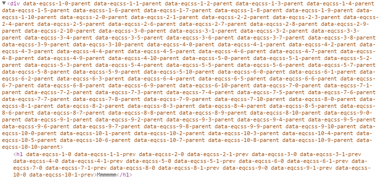
It loops through all element queries and finds the elements targeted by each query. After that, it loops through all those elements and assigns a unique identifier in the form of an attribute to each of them. The format of that identifier is data-eqcss-{element-query-index}-{matched-element-index}. To identify the parent of an element, a data attribute is added to the parent which is obtained by adding -parent to the element’s identifier. Similar attributes are also added to the previous and next sibling. Finally, each element and its query is matched against all the possible conditions like min-height, max-height, min-scroll-x and so on to apply proper styles to it.
它遍历所有元素查询,并找到每个查询所针对的元素。 之后,它将遍历所有这些元素,并以属性的形式为每个元素分配一个唯一的标识符。 该标识符的格式为data-eqcss-{element-query-index}-{matched-element-index} 。 为了标识元素的父级,将数据属性添加到父级,该属性是通过将-parent添加到元素的标识符而获得的。 类似的属性也会添加到上一个和下一个兄弟中。 最后,将每个元素及其查询与所有可能的条件(如min-height , max-height , min-scroll-x等)匹配,以对其应用适当的样式。
The styles are added inside the <head> of the document. Throttling ensures that EQCSS.apply() is not called more than once every 200ms (the default timeout value). Unlike resize, input and click events, scroll events are only listened on elements which are using a scroll element query.
样式添加在文档的<head>内。 节流可确保每200ms(默认超时值)不多次调用EQCSS.apply() )。 与调整大小,输入和单击事件不同,滚动事件仅在使用滚动元素查询的元素上侦听。
Since the styles for different elements are computed using JavaScript, this means that the performance depends on the number of elements to which the styles are being applied. With too many elements, there is noticeable lag in both Firefox and Edge. The performance has improved in the latest versions of Firefox and is expected to get better in future.
由于不同元素的样式是使用JavaScript计算的,因此这意味着性能取决于应用样式的元素数量。 由于元素过多,Firefox和Edge都存在明显的滞后。 在最新版本的Firefox中,性能有所提高,并且有望在将来得到更好的提高。
Ideally, the plugin should be adding one or two EQCSS data attributes per element. If you are not using them carefully, you might end up with a single element having tens of EQCSS attributes which will make the markup very messy. You don’t want your markup to end up like this image:
理想情况下,插件应为每个元素添加一个或两个EQCSS数据属性。 如果您没有仔细使用它们,则可能会得到具有数十个EQCSS属性的单个元素,这会使标记非常混乱。 您不希望标记最终像下面这样:
Please keep in mind that you don’t have to add any of these attributes manually in your original HTML. They are added automatically by the plugin at the time it runs.
请记住,您不必在原始HTML中手动添加任何这些属性。 它们会在插件运行时自动添加。
Debugging element queries is a bit difficult compared to debugging media queries. At present, browsers are only aware of media queries — not element queries, so they only know about the styles that EQCSS has applied.
与调试媒体查询相比,调试元素查询有些困难。 当前,浏览器仅了解媒体查询,而不了解元素查询,因此它们仅了解EQCSS应用的样式。
After reading about all these features, it might be tempting to completely replace media queries with element queries. Please avoid doing so. Firstly, media queries will run faster than element queries, as they rely on JavaScript to compute the styles. Using too many element queries can cause your site’s performance to take a dive (in Firefox and IE).
在阅读了所有这些功能之后,可能很想用元素查询完全替换媒体查询。 请避免这样做 。 首先,媒体查询比元素查询运行得更快,因为它们依靠JavaScript来计算样式。 使用过多的元素查询会导致您的网站性能下降(在Firefox和IE中)。
(As a side note: In 2015, the plugin worked smoothly in Firefox. However, at the start of 2016, they made some changes in the browser which resulted in the performance drop of the plugin and the developers had to add EQCSS.throttle() to the library to control how often the plugin recomputes the styles.
(请注意:2015年,该插件在Firefox中运行正常。但是,在2016年初,他们在浏览器中进行了一些更改,导致该插件的性能下降,开发人员必须添加EQCSS.throttle()到库中,以控制插件重新计算样式的频率。
Secondly, media queries are not used just to style elements on a screen. They are also used to provide styles for other media types and features. As one example of this — you still need media queries to dictate the styles applied to a web page for printing.
其次,媒体查询不仅仅用于在屏幕上设置样式。 它们还用于为其他媒体类型和功能提供样式。 例如,您仍然需要媒体查询来决定应用于网页的样式以进行打印。
结论 (Conclusion)
EQCSS is a great tool when used properly. It helps you do a lot of things that are not possible with media queries. Performance can be an issue when there are a lot of elements on a web page but on the plus side, the syntax is similar to media queries so the learning curve isn’t too steep.
正确使用EQCSS是一个很好的工具。 它可以帮助您完成媒体查询无法完成的许多工作。 当网页上有很多元素时,性能可能是一个问题,但从正面看,语法类似于媒体查询,因此学习曲线不太陡。
In future, browsers may gain features like ResizeObserver which will help the developers create better plugins for the min-width, max-width, min-height, and max-height conditions and Houdini which will let them add support directly into the browser. The developers will be working on creating a plugin which will take advantage of all these features but they plan to continue supporting the current EQCSS plugin too. Their aim is to develop a family of plugins which each suit the specific browsers we are looking to support.
将来,浏览器可能会获得ResizeObserver之类的功能 ,该功能将帮助开发人员针对min-width , max-width , min-height和max-height条件以及Houdini创建更好的插件,这将使他们直接向浏览器添加支持。 开发人员将致力于创建一个可利用所有这些功能的插件,但他们也计划继续支持当前的EQCSS插件。 他们的目的是开发一系列插件,每个插件都适合我们希望支持的特定浏览器。
What’s your opinion about this library? Have you used it in any of your projects? Let us know in the comments.
您对该图书馆有何看法? 您在任何项目中都使用过它吗? 让我们在评论中知道。
翻译自: https://www.sitepoint.com/eqcss-a-javascript-plugin-to-write-element-queries/


 1152
1152


 被折叠的 条评论
为什么被折叠?
被折叠的 条评论
为什么被折叠?
 到【灌水乐园】发言


