


This article was sponsored by Microsoft. Thank you for supporting the sponsors who make SitePoint possible.
本文由Microsoft赞助。 感谢您支持使SitePoint成为可能的赞助商。
Welcome back to our series of articles using Microsoft’s modern IDE: Visual Studio Community 2015 to quickly design and build an attractive, functional site for a client. If you missed the last instalment, check it out here.
欢迎使用Microsoft的现代IDE返回我们的系列文章:Visual Studio Community 2015,为客户快速设计和构建一个有吸引力的功能站点。 如果您错过了最后一期,请在此处查看 。
Now that Andy has the website front page available, he can begin building out the site a little more. This will involve implementing an email signup form, as well as contact and about pages.
现在,Andy拥有了网站首页,他可以开始建立更多网站了。 这将涉及实施电子邮件注册表格以及联系方式和关于页面。
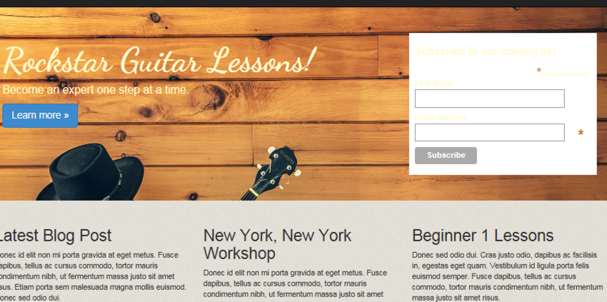
We’ll start with an email signup form then move into creating some additional pages. The email signup form will be front and center on the homepage. It will be placed on the right side of the jumbotron, where there is some empty space available.
我们将从电子邮件注册表单开始,然后进入创建其他页面。 电子邮件注册表格将位于首页的前面和中间。 它将被放置在超大加速器的右侧,那里有一些可用空间。
For the email signup form, we’ll use a form from MailChimp. Andy is using his client’s MailChimp account and will use an existing list for the homepage. Everyone that signs up on the homepage will go into this list.
对于电子邮件注册表单,我们将使用MailChimp中的表单。 Andy正在使用其客户的MailChimp帐户,并将使用现有的主页列表。 在首页上签名的每个人都将进入此列表。
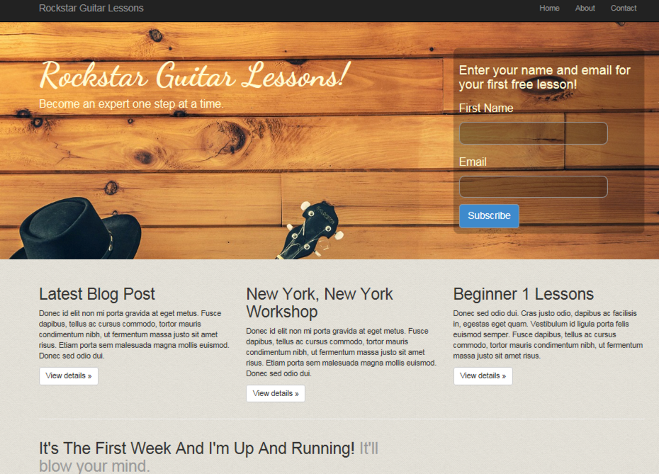
Our signup form will be designed to look like this:
我们的注册表单将设计如下:
从MailChimp获取代码 (Getting Code from MailChimp)
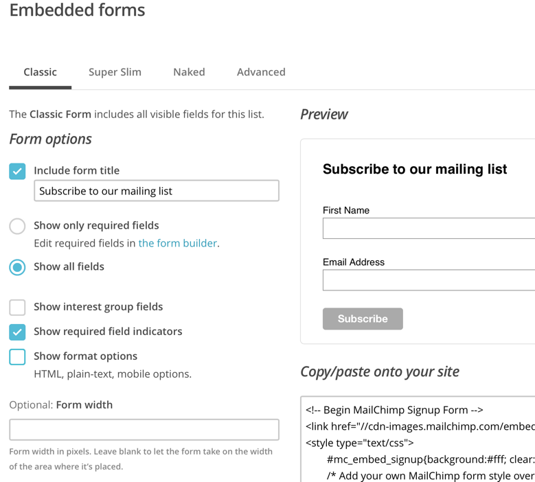
Once logged into MailChimp, select the list you want people added to. Click Signup Forms. Click embedded forms. Classic style is fine. The client wants to capture first name and email address. MailChimp actually has these as the default so we can leave things as they are.
登录MailChimp后,选择您希望人们添加到的列表。 单击注册表单。 单击嵌入式表单。 古典风格很好。 客户想要捕获名字和电子邮件地址。 MailChimp实际上将这些作为默认设置,因此我们可以保留原样。
Your screen in MailChimp should look like the following:
您在MailChimp中的屏幕应如下所示:
Copy the HTML. This is what we’ll paste into the jumbotron. In the jumbotron under this line:
复制HTML。 这就是我们将粘贴到超长加速器中的内容。 在这行下面的巨无霸中:
<p><a class="btn btn-primary btn-lg" href="#" role="button">Learn more »</a></p>Add the MailChimp form code. If you run the app, it should look like the following:
添加MailChimp表单代码。 如果您运行该应用程序,则它应如下所示:
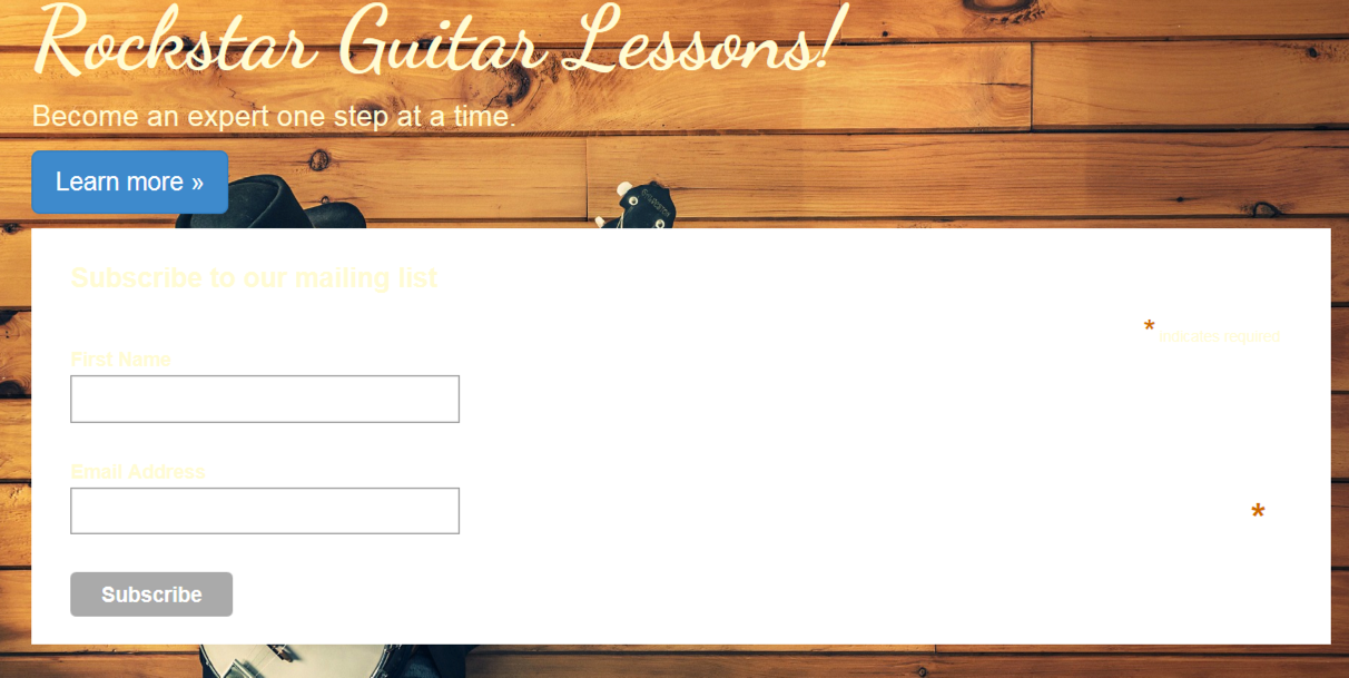
Obviously this isn’t what we want it to look like but this is good a starting point. From here, we’ll format the form using Bootstrap and get everything aligned properly.
显然,这不是我们想要的样子,但这是一个很好的起点。 从这里开始,我们将使用Bootstrap格式化表单,并使所有内容正确对齐。
使用Bootstrap修改注册表单 (Modifying Signup Form With Bootstrap)
With the current formatting, we’ve lost our responsive design. The site title needs to be left while the signup form goes to the right. They should also be on the same row. Bootstrap will help us get things back in order.
使用当前的格式,我们已经失去了响应式设计。 注册表单移至右侧时,网站名称仍需保留。 它们也应该在同一行。 Bootstrap将帮助我们使事情恢复正常。
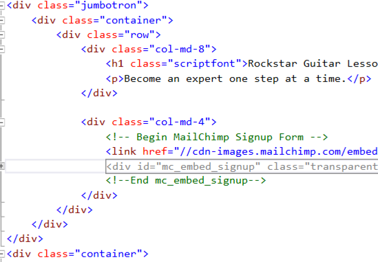
We can add a couple of columns. Surround the jumbotron with a
我们可以添加几列。 用
and the MailChimp code with a
和带有
. This formatting means the site title text will take up 2/3 of the jumbotron while the signup format takes up 1/3.
。 这种格式意味着网站标题文本将占巨型广告的2/3,而注册格式则占1/3。
Your code should look like the following:
您的代码应如下所示:
Remember, Bootstrap is using a 12 grid system. 8 + 4 = 12 and you can see from these numbers how we get 2/3 and 1/3.
记住,Bootstrap使用的是12网格系统。 8 + 4 = 12,您可以从这些数字中看到如何得到2/3和1/3。
If you run the site, you’ll see we have two columns and our responsive web design is back.
如果您运行该网站,您会看到我们有两列,而我们的响应式网页设计又回来了。
Next, we’ll begin polishing the signup form UI so it blends in better with the site.
接下来,我们将开始完善注册表单用户界面,使其与网站更好地融合在一起。
UI抛光 (UI Polishing)
Rather than going through lots of little steps, it will be easier to display what the finished MailChimp modifications should look like. Then we can step through. Replace your current MailChimp code with the following:
与其执行许多小步骤,不如显示出已完成的MailChimp修改外观。 然后我们可以逐步解决。 将您当前的MailChimp代码替换为以下内容:
<!-- Begin MailChimp Signup Form -->
<link href="//cdn-images.mailchimp.com/embedcode/classic-081711.css" rel="stylesheet" type="text/css">
<div id="mc_embed_signup" class="transparent-background soft-border-radius">
<form action="#" method="post" id="mc-embedded-subscribe-form" name="mc-embedded-subscribe-form" class="validate" target="_blank" novalidate>
  <div id="mc_embed_signup_scroll">
  <h3>Enter your name and email for<br /> your first FREE lesson!</h3>

  <div class="mc-field-group">
  <label for="mce-FNAME" class="not-bold">First Name </label>
  <input type="text" value="" name="FNAME" class="transparent-background soft-border-radius" id="mce-FNAME">
  </div>
  <div class="mc-field-group">
  <label for="mce-EMAIL" class="not-bold">Email </label>
  <input type="email" value="" name="EMAIL" class="required email transparent-background soft-border-radius" id="mce-EMAIL">
  </div>


  <div id="mce-responses" class="clear">
  <div class="response" id="mce-error-response" style="display:none"></div>
  <div class="response" id="mce-success-response" style="display:none"></div>
  </div>
  <!-- real people should not fill this in and expect good things - do not remove this or risk form bot signups-->
  <div style="position: absolute; left: -5000px;"><input type="text" name="b_f27f671242f9376d66eb9034e_a5f924c1e8" tabindex="-1" value=""></div>

  <input type="submit" class="btn btn-primary btn-lg" value="Subscribe" name="subscribe" />

  </div>
  </form>
</div>
<!--End mc_embed_signup-->
I’ve added a few lines of space in the code to better help break up the form for discussion.
我在代码中添加了几行空格,以更好地帮助拆分表单进行讨论。
There are a few custom classes that we’ll create, which include not-bold, transparent-background, and soft-border-radius. We define these classes in site.css.
我们将创建一些自定义类,其中包括not-bold , transparent-background和soft-border-radius 。 我们在site.css定义这些类。
Since most of the MailChimp code is the same as what we copied from MailChimp, let’s discuss what’s going on with these custom classes.
由于大多数MailChimp代码与我们从MailChimp复制的代码相同,因此让我们讨论一下这些自定义类的情况。
not-bold is defined as follows:
not-bold定义如下:
.not-bold {
    font-weight:normal;
}
It simply removes bold letters. This is used to de-emphasize the form field labels. Our call to action is bolded. If the form field labels are also bolded, the eye will struggle a little to figure out where to focus. Worse case scenario: people simply give up and bypass our signup form.
它只是删除粗体字母。 这用于取消强调表单字段标签。 我们的行动呼吁以黑体显示。 如果表单字段标签也加粗,则眼睛会费力地找出要聚焦的位置。 更糟糕的情况是:人们只是放弃并绕过我们的注册表单。
The screenshot below shows the use of .not-bold
下面的屏幕截图显示了.not-bold的用法
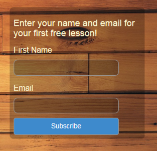
transparent-background provides semi transparency to the form background and input fields, providing a little more depth to our design. It is defined as:
transparent-background为表单背景和输入字段提供半透明性,为我们的设计提供了更多的深度。 它定义为:
.transparent-background {
   background-color: rgba(0, 0, 0, 0.25)
}
rgba simply means red, green, blue and alpha. Alpha sets opacity. The lower this value, the more transparent. Values can range from 0 to 1.
rgba只是指红色,绿色,蓝色和Alpha。 Alpha设置不透明度。 该值越低,越透明。 值的范围可以从0到1 。
soft-border-radius makes our form and input fields express a little elegant detail with rounded corners. This class is defined as:
soft-border-radius使我们的表单和输入字段表达带有圆角的优雅细节。 此类定义为:
.soft-border-radius {
  border-radius: 10px;
}
Finally, we have a full-width blue button. .max-width helps us here. Not only does the blue provide great contrast and brings the eye right to it, but the large size makes it irresistible for clicking. .max-width is defined as:
最后,我们有一个全角蓝色按钮。 .max-width在这里帮助我们。 蓝色不仅提供了很好的对比度并吸引了人们的目光,而且大尺寸使其难以抗拒。 .max-width定义为:
.max-width {
width:100%;
}
Adding the above classes to site.css and pasting in the above form code should result in the same signup form as shown above.
将上面的类添加到site.css并粘贴上面的表单代码应该会产生与上面所示相同的注册表单。
谢谢页面 (Thank You Page)
When users sign up, it’s usually nice to provide a confirmation page to let them know everything went well. How many times have you signed up to someone’s list only to be greeted by an extremely unimaginative thank you page?
当用户注册时,通常最好提供一个确认页面,让他们知道一切顺利。 您签署过几次某人的名单,却被一个极富想象力的“谢谢”页面打招呼?
Andy knows his client is a true artist and wants to go the extra mile. This means not skimping by using a some stock thank you page. However, we’ll keep things consistent by using the same color scheme and theme from the home page.
安迪(Andy)知道他的客户是位真正的艺术家,并且希望再加倍努力。 这意味着不要使用一些库存的谢谢页面来跳过。 但是,我们将通过使用主页上的相同配色方案和主题来使内容保持一致。
To create the thank you page, open Controllers/HomeController.cs. Add the following:
要创建感谢页面,请打开Controllers/HomeController.cs 。 添加以下内容:
public IActionResult ThankYou()
    {
        ViewBag.Message = "Your thank you page.";

        return View();
    }
Because this is an MVC app, when someone types in /Home/ThankYou, it will hit the above method. Of course, we aren’t expecting anyone to type in the thank you page since this will be produced as a confirmation from signing up to our client’s email list.
因为这是一个MVC应用程序,所以当有人输入/Home/ThankYou ,它将执行上述方法。 当然,我们不希望任何人键入“谢谢”页面,因为这将作为注册我们客户的电子邮件列表的确认。
We need a view for this method to serve up. Open the Views/Home folder and make a copy of Contact.cshtml. Rename the copied file to ThankYou.cshtml.
我们需要一个视图来使这种方法起作用。 打开Views/Home文件夹,并复制一个Contact.cshtml 。 将复制的文件重命名为ThankYou.cshtml 。
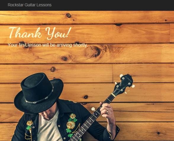
Our thank you page will basically be the jumbotron from the home page. Clear out the code in ThankYou.cshtml, leaving only the ViewBag code at the top. Paste in the following:
我们的“谢谢”页面基本上将是主页上的“巨无霸”。 清除ThankYou.cshtml的代码,仅在顶部保留ViewBag代码。 粘贴以下内容:
<div class="jumbotron jumbotron-tall">
<div class="container">
    <h1 class="scriptfont">Thank You!</h1>
    <p>Your first lesson will be arriving shortly.</p>
</div>
</div>
Making a copy of the Contact page allows us to take full advantage of the existing page structure. We’ll have our familiar navigation and footer without needing to do anything.
复制联系人页面使我们可以充分利用现有页面结构。 我们将无需任何操作就可以拥有熟悉的导航和页脚。
You probably noticed the class jumbotron-tall. This is a new class, which adds some extra height to the thank you page. Otherwise, we’d end up with a fairly short strip running across the top. It wouldn’t have been too impressive.
您可能注意到了“ jumbotron-tall类。 这是一个新类,它在“谢谢”页面上增加了一些额外的高度。 否则,我们最终会在顶部出现一条很短的条。 不会太令人印象深刻。
The larger image looks great and gives some additional air time to our artist (i.e. client).
较大的图像看起来很棒,并为我们的艺术家(即客户)增加了播放时间。
jumbotron-tall is defined as:
jumbotron-tall定义为:
.jumbotron-tall {
min-height:800px;
}
Your final thank you page should look like the following:
最后的“谢谢”页面应如下所示:
联系页面 (Contact Page)
We want to give potential customers an opportunity to contact our client directly through his site. This is where the contact page will come. We’ll follow the basic outline as above to create the contact page. Our final page will look like the following:
我们希望给潜在客户一个机会,通过他的网站直接与我们的客户联系。 这是联系页面所在的位置。 我们将按照上面的基本概述创建联系页面。 我们的最后一页将如下所示:
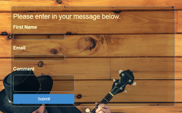
Open Views/Home and you’ll notice there is already a Contact.cshtml. Just as we did earlier with the thank you page, clear out everything except the top ViewBag code. We’re going to use the jumbotron again. We’ll use two columns as before except the right side will be empty. This lets our contact form align more to the left.
打开Views/Home ,您会注意到已经有一个Contact.cshtml 。 就像我们之前在“感谢页面”中所做的一样,清除除顶部ViewBag代码之外的所有内容。 我们将再次使用超大加速器。 我们将像以前一样使用两列,除了右侧为空。 这使我们的联系表更左对齐。
There are a few new CSS classes we’re going to introduce that will also effect our homepage. The first class is:
我们将介绍一些新CSS类,它们也会影响我们的主页。 第一类是:
.button-xl {
width:100%;
margin-top:10px;
}
This is specifically for the blue button at the bottom of the form. Adding this class will create a wider button and add a little space between the top of the button and bottom of the comment box. We can also apply this class to our homepage button.
这专用于表单底部的蓝色按钮。 添加此类将创建一个更宽的按钮,并在按钮顶部和注释框底部之间添加一些空间。 我们也可以将此类应用于我们的主页按钮。
Next up is a modification to an existing class:
接下来是对现有类的修改:
.soft-border-radius {
border-radius: 10px;
border: 1px solid #999
}
For this form, we’ll be using a structure similar to the MailChimp form code. But we aren’t going to use MailChimp’s CSS since we aren’t using their signup form.
对于此表单,我们将使用类似于MailChimp表单代码的结构。 但是我们不会使用MailChimpCSS,因为我们不会使用它们的注册表单。
One thing the MailChimp CSS provided was darker borders around the input fields. That is now gone. To compensate, we’re adding a border inside soft-border-radius, which will have the same effect.
MailChimp CSS提供的一件事是输入字段周围的边框较暗。 现在不见了。 为了补偿,我们在soft-border-radius内添加了一个边框,其效果相同。
In the contact form, we’ve added a comment textarea box. This box can have scrollbars, which by default will be fairly white. This brighter color will create a large contrast with our darker colors. To help the scrollbars blend in better, we need to modify the textarea:
在联系表单中,我们添加了一个注释textarea框。 此框可以具有滚动条,默认情况下将为白色。 这种较亮的颜色将与我们较暗的颜色形成较大的对比度。 为了帮助滚动条更好地融合,我们需要修改textarea :
textarea {
scrollbar-arrow-color:#333;
scrollbar-base-color:#333;
scrollbar-darkshadow-color:#333;
scrollbar-shadow-color:#333;
color:#fffad5;
}
Notice the color of fffad5, which changes our comment field text from black to a brighter yellow. We’re doing the same for the input field:
注意fffad5的颜色,它将我们的注释字段文本从黑色更改为较亮的黄色。 我们对输入字段执行相同的操作:
input {
color:#fffad5;
}
All of the above CSS classes go into site.css.
以上所有CSS类都放入site.css 。
Now we can move on to the form code.
现在,我们可以继续执行表单代码。
<div class="jumbotron">
<div class="container">
 <div class="row">
 <div class="col-md-8">
   <div class="transparent-background soft-border-radius">
   <form action="#" method="post" class="form-format" target="_blank" novalidate>
   <div>
   <h2>Please enter in your message below.</h2>

   <div>
   <label for="FNAME">First Name </label><br />
   <input type="text" value="" name="FNAME" class="transparent-background soft-border-radius" id="FNAME">
   </div>
   <div>
   <label for="EMAIL">Email </label><br />
   <input type="email" value="" name="EMAIL" class="transparent-background soft-border-radius" id="EMAIL">
   </div>

   <div>
   <label for="COMMENT">Comment </label><br />
   <textarea value="" cols="30" rows="3" name="comment" class="transparent-background soft-border-radius" id="COMMENT">  </textarea>
   </div>
   <div>
   <input type="submit" class="btn btn-primary btn-lg button-xl" value="Submit" name="submit" />
   </div>
   </div>
   </form>
   </div>
   </div>

 <div class="col-md-4">
 </div>
 </div>
 </div>
</div>
You might notice some similarities with the MailChimp form. This is actually a modified version of that form. The contact form sits in the left column, which is col-md-8 wide. This creates a 2/3 wide column since our right column is col-md-4. Remember, 8 + 4 = 12, which is the number of columns making up our 12 column grid in Bootstrap.
您可能会注意到与MailChimp表单有些相似之处。 这实际上是该表格的修改版本。 联系表格位于左栏,其宽度为col-md-8 。 由于我们的右列是col-md-4,因此这将创建2/3宽的列。 请记住,8 + 4 = 12,这是在Bootstrap中构成12列网格的列数。
摘要 (Summary)
Andy’s client now has a great looking signup form that’s sure to attract signups. He’s also added a contact form that blends in well with the overall theme of the site. At this point, Andy’s client is off to a great start.
Andy的客户现在拥有漂亮的注册表单,肯定会吸引注册者。 他还添加了一个联系表单,该表单与网站的整体主题完美融合。 至此,安迪的客户有了一个良好的开端。
Coming up next, we’ll add a way for customers to purchase lessons. Andy’s client recognizes that mobile is a large part of the web now. He wants to ensure the mobile site provides a great user experience. One part of this is sending notifications once a new lesson is available.
接下来,我们将为客户提供购买课程的方式。 安迪(Andy)的客户意识到,移动已成为网络的重要组成部分。 他希望确保移动网站提供出色的用户体验。 其中的一部分是一旦有新课程可用,就发送通知。
Andy has some exciting features to build out for the website. We’re going to continue following along and watching over his shoulder as everything comes together.
安迪(Andy)具有一些令人兴奋的功能,可用于网站。 我们将继续跟随并注视着他的肩膀,一切都融为一体。
翻译自: https://www.sitepoint.com/design-develop-microsoft-community-2015-email-contact-pages/


 572
572

 被折叠的 条评论
为什么被折叠?
被折叠的 条评论
为什么被折叠?
 到【灌水乐园】发言


