


jekyll链接设置
I was recently working on a small Jekyll project and wanted to see whether it would be possible to have a very component-ized approach driven by a styleguide, despite the fact that Liquid (the template engine behind Jekyll) is not meant to do that.
我最近正在做一个小型的Jekyll项目,想看看是否有可能采用样式指南来驱动非常组件化的方法,尽管事实上Liquid (Jekyll背后的模板引擎)并不能做到这一点。
I found it out it is doable (not without some struggling though) and I’d like to show you how so you can consider using a similar approach in your next Jekyll project.
我发现它是可行的(尽管并非毫无困难),我想向您展示如何在下一个Jekyll项目中考虑使用类似的方法。
There is quite a bit of setup around this example, so I recommend you check the live demo then follow along with this boilerplate on GitHub.
这个示例周围有很多设置,所以我建议您检查实时演示,然后在GitHub上跟随此样板 。
为什么要使用风格指南? (Why a Styleguide?)
When working on a site or application, it is good practice to try finding common UI patterns so they can be extracted and reused across the platform. This helps maintenance, scaling and reduces overall complexity.
在网站或应用程序上工作时,最好尝试查找常见的UI模式,以便可以在平台上提取并重用它们。 这有助于维护,扩展并降低整体复杂性。
When pushed further, this practice can lead to the creation of a “styleguide” (or “style guide”). Very broadly speaking and according to Wikipedia, a styleguide is:
进一步推动时,这种做法可以导致创建“样式指南”(或“样式指南”)。 概括地说, 根据Wikipedia ,样式指南为:
[A] set of standards for the writing and design of documents, either for general use or for a specific publication, organization, or field. A style guide establishes and enforces style to improve communication.
[A]一组用于一般用途或特定出版物,组织或领域的文档编写和设计标准。 样式指南建立并执行样式以改善沟通。
Now, there is no one way to do a styleguide. Ask 10 people in this industry, you will have 10 different answers. I guess that’s also the beauty of it. Some people will tell you a styleguide should not be technical, some will tell you it should. Some will call it a pattern library… and so on.
现在,没有一种方法可以制作样式指南。 询问这个行业的10个人,您将有10个不同的答案。 我想那也是它的美丽。 有人会告诉您样式指南不应该是技术性的,有些人会告诉您它应该是技术性的。 有些人将其称为模式库……等等。
If you ask me, a component styleguide should explain what a component does, how to use it, and provide an example. That is what I expect from such a document.
如果您问我,组件样式指南应解释组件的功能,如何使用它,并提供示例。 这就是我对此类文件的期望。
Note: if you are interested in reading more about styleguides and everything related to them, have a look at styleguides.io.
注意:如果您有兴趣阅读有关样式指南及其相关内容的更多信息,请访问styleguides.io 。
Jekyll中的组件 (Components in Jekyll)
I am getting more and more used to working with React and there is one thing I really like about it — everything, even the smallest chunk of UI, is (or could be) a component. As you will soon realize, this very concept drove my research here.
我越来越习惯于使用React,并且我真的很喜欢它-一切,即使是最小的UI块,都是(或者可能是)一个组件。 您很快就会意识到,这个概念推动了我的研究。
Any interface module that could theoretically be reusable ended up in its own file, inside a components folder in the Jekyll _includes folder.
理论上可以重用的任何接口模块最终都会在Jekyll _includes文件夹中的components文件夹内的自己文件中。
my-project/
|
|– _includes/
|   |
|   |– components/
|   |   |
|   |   |– button.html
|   |   |– header.html
|   |   |– headline.html
|   |   |– nav.html
|   |   |– footer.html
|   |   |– …
|– …
As an example, let’s build the button component together (button.html). The minimum our button component should have is a type attribute, a class attribute and some content.
作为示例,让我们一起构建按钮组件( button.html )。 我们的按钮组件至少应具有type属性, class属性和一些内容。
We’ll give a default class to the button that can be extended through the class include parameter to make it more flexible. We’ll also define the default type to button, just in case it is not being passed in.
我们将为按钮提供一个默认类,可以通过class include参数对其进行扩展,以使其更加灵活。 我们还将定义默认type为button ,以防万一它没有被传入。
Last but not least, we’ll make sure not to render the button if no content is being passed.
最后但并非最不重要的一点是,如果没有内容传递,我们将确保不呈现按钮。
Note: in Jekyll, include parameters can be accessed through the include object.
注意:在Jekyll中,可以通过include对象访问include参数。
{% assign class = "c-button " | append: include.class %}
{% assign type = include.type | default: "button" %}
{% assign content = include.content %}

{% if content %}
  <button class="{{ class }}" type="{{ type }}">{{ content }}</button>
{% endif %}
This file is then included through an {% include %} Liquid block when used in pages, customised with include parameters. Ultimately, this means pages are basically nothing but generic containers including components.
当在页面中使用{% include %}自定义页面时,该文件会通过{% include %} Liquid块包含在内 。 最终,这意味着页面基本上只是包含组件的通用容器。
{% include components/button.html
  type = "submit"
  content = "Get in touch"
%}
构建样式指南 (Building the Styleguide)
To build the styleguide itself, we will need several things:
要构建样式指南本身,我们需要做一些事情:
A Jekyll collection for all documented components.
所有记录的组件的Jekyll集合 。
- An entry per component in the collection. 集合中每个组件的条目。
- A styleguide page. 样式指南页面。
- A layout dedicated to the styleguide. 专用于样式指南的布局。
创建专用的Jekyll集合 (Creating a Dedicated Jekyll Collection)
First, let’s setup the collection in the configuration:
首先,让我们在配置中设置集合:
# Styleguide settings
collections:
  styleguide:
    output: true

defaults:
  -
    scope:
      path: ""
      type: "styleguide"
    values:
      layout: "default"
This tells Jekyll that we will have entries from our styleguide collection in a _styleguide folder at project’s root level. Each documented component will have a matching file (using the default layout).
这告诉Jekyll,我们将在项目根目录的_styleguide文件夹中_styleguide来自styleguide集合的条目。 每个记录的组件将具有一个匹配的文件(使用default布局)。
my-project/
|
|– _includes/
|   |
|   |– components/
|   |   |
|   |   |– button.html
|   |   |– header.html
|   |   |– headline.html
|   |   |– nav.html
|   |   |– footer.html
|   |   |– …
|
|– _styleguide/
|   |
|   |– button.html
|   |– header.html
|   |– headline.html
|   |– nav.html
|   |– footer.html
|   |– …
|
|– …
每个组件一个条目 (An Entry Per Component)
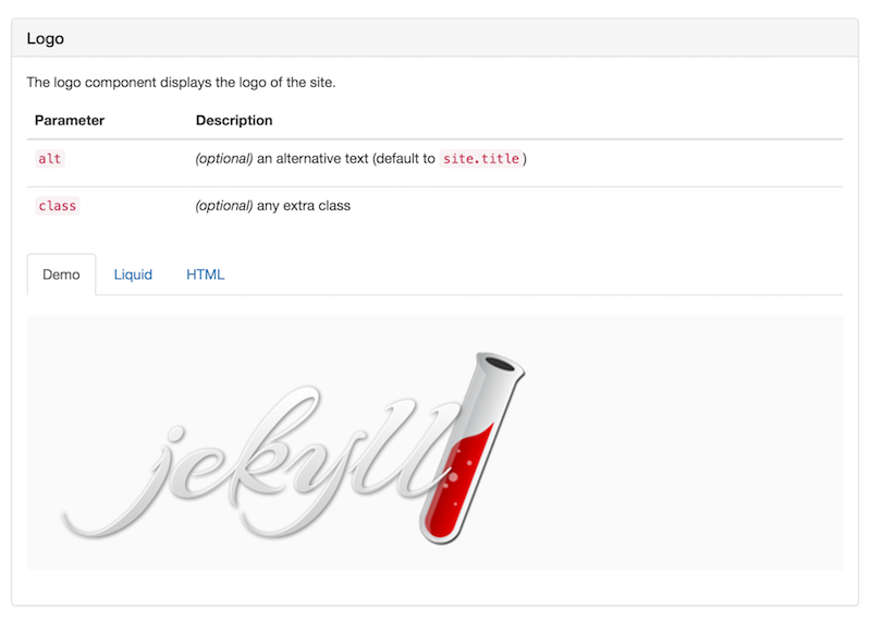
Let’s create the page for our button component (_styleguide/button.html). This page is not really meant to be seen on its own; it is intended to show all the information we need to be able to display everything about the component in the styleguide page.
让我们为按钮组件( _styleguide/button.html )创建页面。 此页面并不是真正要单独查看; 它旨在显示我们所需的所有信息,以便能够在样式指南页面中显示有关组件的所有信息。
What we need is a description of the UI module, the parameters it accepts when included, and an example. The content of the page itself will be a proper Liquid include, and this is what will be rendered as a demo inside an iframe.
我们需要的是UI模块的描述,包含该模块时接受的参数以及一个示例。 页面本身的内容将是适当的Liquid包含,这将在iframe中呈现为演示。
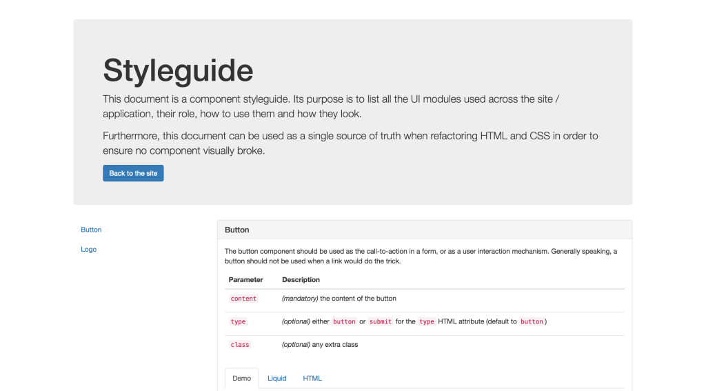
---
description: |
  The button component should be used as the call-to-action in a form, or as a
  user interaction mechanism. Generally speaking, a button should not be used
  when a link would do the trick.
parameters:
  content: "*(mandatory)* the content of the button"
  type: "*(optional)* either `button` or `submit` for the `type` HTML attribute
        (default to `button`)"
  class: "*(optional)* any extra class"
example: |
  {% include components/button.html
    type = "button"
    content = "Click me"
    class = "pretty-button"
  %}
---

{% include components/button.html
  type = "button"
  content = "Click me"
  class = "pretty-button"
%}
Note: in YAML, the pipe symbol indicates the beginning of a literal style value.
注意:在YAML中,竖线符号表示文字样式值的开始。
“样式指南”页面 (A “Styleguide” Page)
We now need to create the page for the styleguide. To make it easy (and because I think this is the perfect occasion for it), I added Bootstrap to this page to make it easier to style and faster to build. This page consists of three sections:
现在,我们需要为样式指南创建页面。 为了简化操作(并且因为我认为这是完美的选择),我在此页面上添加了Bootstrap ,以使其更易于样式化和构建速度。 该页面包括三个部分:
- A header that introduces the styleguide. 标题,介绍样式指南。
- A sidebar for the navigation. 导航的侧栏。
- A main content area displaying all the entries of our collection. 一个主要内容区域,显示我们集合的所有条目。
To avoid having a page too long and bloated with logic, I recommend having each of these sections in a partial, living in a _includes/styleguide folder.
为避免页面过长并充满逻辑,我建议将每个部分放在_includes/styleguide文件夹中的一部分中。
my-project/
|
|– _includes/
|   |
|   |– components/
|   |   |
|   |   |– button.html
|   |   |– header.html
|   |   |– headline.html
|   |   |– nav.html
|   |   |– footer.html
|   |   |– …
|   |
|   |– styleguide/
|   |   |
|   |   |– component.html   # HTML for a component display
|   |   |– header.html      # Styleguide header
|   |   |– navigation.html  # Styleguide navigation
|
|– _styleguide/
|   |
|   |– button.html
|   |– header.html
|   |– headline.html
|   |– nav.html
|   |– footer.html
|   |– …
|
|– …
The reason I recommend this is that it makes the code for our page quite clean and makes it pretty obvious about what it does.
我之所以建议这样做,是因为它使我们页面的代码非常干净,并使它的工作变得很明显。
---
layout: styleguide
---

<div class="container">

  <!-- Styleguide header introducing the content -->
  {% include styleguide/header.html %}

  <div class="row">

    <!-- Styleguide aside navigation -->
    <div class="col-md-3">
      {% include styleguide/navigation.html %}
    </div>

    <!-- Styleguide main content area -->
    <div class="col-md-9">
      {% for component in site.styleguide %}
        {% include styleguide/component.html
          component = component
        %}
      {% endfor %}
    </div>

  </div>

</div>
Here is the header (_includes/styleguide/header.html):
这是标题( _includes/styleguide/header.html ):
<div class="jumbotron">
  <h1>{{ page.title | default: "Styleguide" }}</h1>

  <p>
    This document is a component styleguide. Its purpose is to list all the UI
    modules used across the site / application, their role, how to use them and
    how they look.
  </p>

  <p>
    Furthermore, this document can be used as a single source of truth when
    refactoring HTML and CSS in order to ensure no component visually broke.
  </p>

  <a href="/" class="btn btn-primary">Back to the site</a>
</div>
Here is the navigation (_includes/styleguide/navigation.html):
这是导航( _includes/styleguide/navigation.html ):
<div class="scrollspy">
  <div class="s-styleguide-aside hidden-xs hidden-sm">
    <ul class="nav">
      {% for component in site.styleguide %}
        {% assign component_name = component.slug | replace: "-", " " | capitalize %}
        <li>
          <a href="#{{ component.slug }}">{{ component_name }}</a>
        </li>
      {% endfor %}
    </ul>
  </div>
</div>
Note: if the name of your components do not necessarily match their file name (slug), you could add a title or name key to each of them instead.
注意:如果组件的名称不一定与它们的文件名( slug )匹配,则可slug每个组件添加title或name键。
And finally, here is the HTML for a component showcase (_includes/styleguide/component.html), which is admittedly the most complex part of this page:
最后,这是组件展示HTML( _includes/styleguide/component.html ),它无疑是此页面中最复杂的部分:
{% assign component = include.component %}
{% assign iframe_source = component.url | prepend: site.baseurl %}
{% assign slug = component.slug %}
{% assign title = slug | replace: "-", " " | capitalize %}
{% assign description = component.description | markdownify %}
{% assign html_code = component.content %}
{% assign liquid_code = component.example %}
{% assign parameters = component.parameters %}
{% assign tab_name = slug | append: "-" | append: "-tab" %}

<div class="s-styleguide-showcase" id="{{ slug }}">

  <div class="panel panel-default">
    <div class="panel-heading">
      <h2 class="panel-title">{{ title }}</h2>
    </div>

    <div class="panel-body">
      {{ description }}

      <!-- Component include parameters -->
      <table class="table">
        <thead>
          <tr>
            <th>Parameter</th>
            <th>Description</th>
          </tr>
        </thead>
        <tbody>
        {% for parameter in parameters %}
          {% assign parameter_name = parameter[0] %}
          {% assign parameter_desc = parameter[1] | markdownify %}
          <tr>
            <td><code>{{ parameter_name }}</code></td>
            <td>{{ parameter_desc }}</td>
          </tr>
        {% endfor %}
        </tbody>
      </table>

      <!-- Nav tabs -->
      <ul class="nav nav-tabs" role="tablist">
        <li role="presentation" class="active">
          <a href="#{{ tab_name }}-demo" aria-controls="{{ tab_name }}-demo" role="tab" data-toggle="tab">Demo</a>
        </li>
        <li role="presentation">
          <a href="#{{ tab_name }}-liquid" aria-controls="{{ tab_name }}-liquid" role="tab" data-toggle="tab">Liquid</a>
        </li>
        <li role="presentation">
          <a href="#{{ tab_name }}-html" aria-controls="{{ tab_name }}-html" role="tab" data-toggle="tab">HTML</a>
        </li>
      </ul>

      <!-- Tab panes -->
      <div class="tab-content">

        <div role="tabpanel" class="tab-pane active" id="{{ tab_name }}-demo">
          <iframe src="{{ iframe_source }}" title="{{ title }}"></iframe>
        </div>

        <div role="tabpanel" class="tab-pane" id="{{ tab_name }}-liquid">
          {% highlight liquid %}{{ liquid_code }}{% endhighlight %}
        </div>

        <div role="tabpanel" class="tab-pane" id="{{ tab_name }}-html">
          {% highlight html %}{{ html_code }}{% endhighlight %}
        </div>

      </div>
    </div>
  </div>

</div>
“样式指南”布局 (A “Styleguide” Layout)
This step is not really mandatory. Your styleguide page could definitely use the default layout for your site. In our case, since it needs to include Bootstrap assets and handlers, it is different enough to deserve a separate layout.
这一步并不是必须的。 您的styleguide页面肯定可以使用网站的默认布局。 在我们的例子中,由于它需要包括Bootstrap资产和处理程序,因此它的区别足以应得单独的布局。
It needs to include:
它需要包括:
- The main stylesheet from Bootstrap. Bootstrap的主要样式表。
- jQuery since it is a Bootstrap dependency. jQuery,因为它是Bootstrap依赖项。
- The main JavaScript file from Bootstrap. Bootstrap中的主要JavaScript文件。
- A script to resize iframes based on their content. 用于根据iframe的内容调整其大小的脚本。
- A script to initialize the affix navigation. 用于初始化词缀导航的脚本。
The
data-spy="scroll"anddata-target=".scrollspy"attributes on thebodyelement to enhance the navigation.body元素上的data-spy="scroll"和data-target=".scrollspy"属性可增强导航。
Since there is quite a bit of JavaScript to make the styleguide work perfectly, it might be worth adding a file for that in _includes/styleguide/scripts.html doing just that:
由于有很多JavaScript可以使样式指南正常工作,因此值得在_includes/styleguide/scripts.html为此添加一个文件:
<!-- jQuery -->
<script
  src="https://code.jquery.com/jquery-2.2.4.min.js"
  integrity="sha256-BbhdlvQf/xTY9gja0Dq3HiwQF8LaCRTXxZKRutelT44="
  crossorigin="anonymous"></script>

<!-- Bootstrap -->
<script
  src="https://maxcdn.bootstrapcdn.com/bootstrap/3.3.6/js/bootstrap.min.js"
  integrity="sha384-0mSbJDEHialfmuBBQP6A4Qrprq5OVfW37PRR3j5ELqxss1yVqOtnepnHVP9aJ7xS"
  crossorigin="anonymous"></script>

<!-- Iframes resizing -->
<script type='text/javascript'>
  $(function () {
    $('iframe').on('load', function () {
      var height = this.contentWindow.document.body.offsetHeight + 'px'
      $(this).css('height', height)
    })
  })
</script>

<!-- Affix sidebar initialisation -->
<script>
  var $nav = $('.c-styleguide-aside')

  $nav.affix({
    offset: { top: $nav.offset().top }
  })
</script>
包装东西 (Wrapping Things up)
That’s it folks! I hope you enjoyed this experiment and have considered the benefits of having a living styleguide in your projects.
就是这样! 我希望您喜欢这个实验,并考虑了在项目中使用生活风格指南的好处。
Because of Liquid, Jekyll is not the easiest playground to create such a document, but as you can see, it is still is possible to end up with a lovely solution.
由于Liquid,Jekyll并不是创建此类文档的最容易的平台,但是正如您所看到的,最终还是有可能得到一个不错的解决方案的。
Admittedly, there is quite a bit of groundwork to do to setup this styleguide, but from there adding new components turns out to be super simple:
诚然,设置此样式指南需要做大量的基础工作,但是从那里添加新的组件却变得非常简单:
Create your component in
_includes/components/.在
_includes/components/创建您的组件。Create a matching page in
_styleguide/and fill all the information you need.在
_styleguide/创建一个匹配页面,并填写您需要的所有信息。- Done! ✨ 做完了! ✨
If you have any idea on how to improve things, be sure to share your thoughts in the comments, or even contribute to the demo on GitHub.
如果您对如何改进有任何想法,请确保在评论中分享您的想法,甚至参与GitHub上的演示 。
翻译自: https://www.sitepoint.com/setting-up-a-living-styleguide-in-jekyll/
jekyll链接设置


 4399
4399


 被折叠的 条评论
为什么被折叠?
被折叠的 条评论
为什么被折叠?
 到【灌水乐园】发言


