owc报表控件 数据透视表
Recently, I enrolled in an online Infographics and data visualization course, and the classes started last week. In one of my homework assignments, I used this trick to link pivot chart title to report filter.
最近,我参加了在线信息图表和数据可视化课程 ,并且上周开始了课程。 在我的一项家庭作业中,我使用此技巧将数据透视图标题链接到报表过滤器。
数据可视教练 (Data Viz Instructor)

The instructor is Alberto Cairo, who wrote The Functional Art: An Introduction to Information Graphics and Visualization. He uploaded the first two chapters of his book for us to read during week one, and I really enjoyed it. There was some history, some theory, and plenty of graphics, to illustrate the text.
讲师是Alberto Cairo,他写了《功能艺术:信息图形和可视化入门》。 他上传了本书的前两章供我们在第一周阅读,我真的很喜欢。 有一些历史,一些理论和大量的图形来说明文本。
改善信息图 (Improve the Infographic)
One of the assignments this week was to suggest improvements to an infographic on Social Web Involvement. There are 16 countries in the infographic, overlaid on a world map, and it's difficult to read or understand the data.
本周的任务之一是建议改进“社交网络参与”信息图表。 信息图中有16个国家/地区,覆盖在世界地图上,很难读取或理解数据。
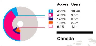
Here is a small section of the graphic, showing data for Canada. Do you have a headache yet, just from looking at that tiny section?
这是图形的一小部分,显示了加拿大的数据。 您只是看着那微小的部分而感到头疼吗?
创建数据透视表 (Create a Pivot Table)
To experiment with the data, and see how I could improve on the presentation, I put data for a few of the countries into a table in Excel.
为了试验数据,并查看如何改进显示效果,我将一些国家/地区的数据放入Excel的表格中 。
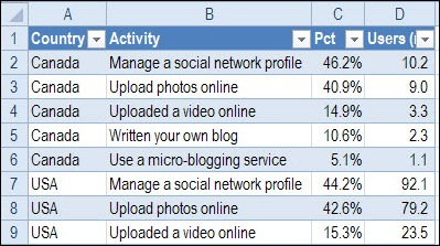
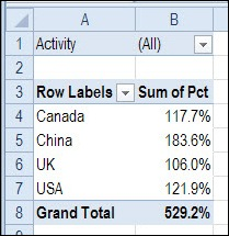
Next, I created a pivot table from the Excel table, with:
接下来,我从Excel表中创建了一个数据透视表,其中包括:
- Country as a Row label 国家作为行标签
- Activity as a Report Filter 活动作为报告过滤器
- Percentage in the Values area (formatted as Percentage, with 1 decimal). 值区域中的百分比(格式为百分比,带1个小数)。
创建数据透视图 (Create a Pivot Chart)
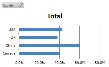
Based on the pivot table, I created a bar chart, that shows the total percentages for each country.
基于数据透视表,我创建了一个条形图,该条形图显示了每个国家/地区的总百分比。
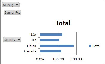
To improve its appearance, I made the following changes:
为了改善外观,我进行了以下更改:
- Click the Ribbon's Layout tab, click Legend, and click None 单击功能区的布局选项卡,单击图例,然后单击无
- On the Ribbon's Analyze tab, click Field Buttons, and turn off the Axis and Value buttons – leave the Report Filter button on 在功能区的“分析”选项卡上,单击“字段按钮”,然后关闭“轴”和“值”按钮-将“报表过滤器”按钮保留在
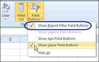
Then, instead of showing all the activities lumped together, I could select a specific activity from the drop down list.
然后,可以从下拉列表中选择一个特定的活动,而不是将所有活动都显示在一起。
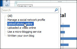
However, the chart doesn't show which activity has been selected – the chart title just says "Total".
但是,该图表不会显示已选择了哪个活动–图表标题仅显示“总计”。
更新图表标题 (Update the Chart Title)
Instead of showing "Total", I'd like the chart title to change when I select one of the activities. To fix that, I'll link the chart title to the Report Filter cell.
我希望在选择活动之一时更改图表标题,而不是显示“总计”。 为了解决这个问题,我将图表标题链接到“报表过滤器”单元格。
-
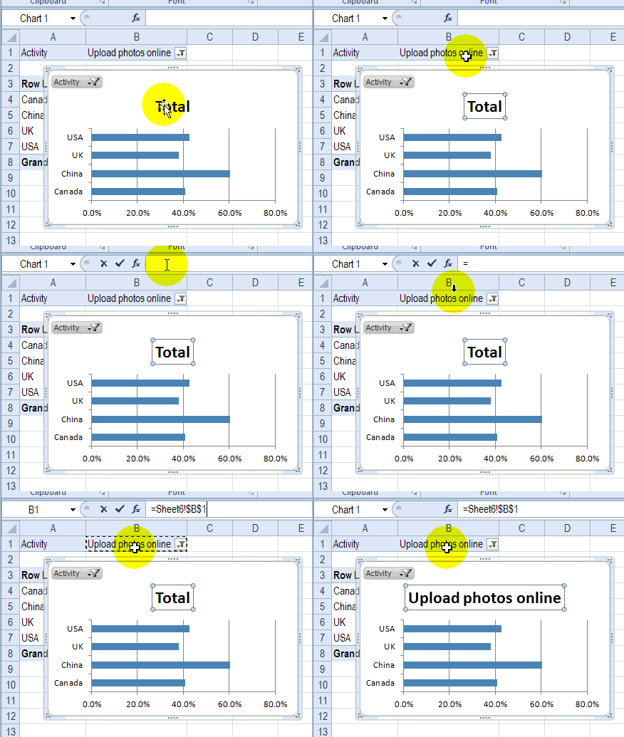
- Click on the chart title, to select it 单击图表标题,将其选中
- Click in the Formula bar, and type an = 在公式栏中单击,然后键入=
- Click on the Report Filter cell – B1 in this example 单击“报告过滤器”单元格–在此示例中为B1
- Press Enter, to complete the formula 按Enter键以完成公式
图表标题自动更新 (Chart Title Updates Automatically)
Now, if I select an activity in either the pivot table or the pivot chart, the chart title updates automatically, to show which activity has been selected.
现在,如果我在数据透视表或数据透视图中选择了一个活动,则图表标题将自动更新,以显示已选择了哪个活动。
If you'd like to show a special heading if (All) or (Multiple Items) is shown in the Report Filter cell, you can create a formula, and link the chart title to that cell.
如果要在“报表过滤器”单元格中显示(全部)或(多个项目)时显示特殊标题,则可以创建一个公式,然后将图表标题链接到该单元格。
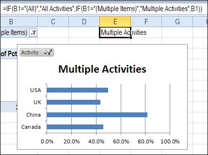
In the screen shot below, the following formula is in cell E1, and the chart title is linked to E1.
在下面的屏幕截图中,以下公式位于单元格E1中,并且图表标题链接到E1。
=IF(B1="(All)","All Activities",IF(B1="(Multiple Items)","Multiple Activities",B1))
= IF(B1 =“(所有)”,“所有活动”,IF(B1 =“(多个项目)”,“多个活动”,B1))
And now I'd better get back to my homework! ________________
现在,我最好回到我的作业中! ________________
翻译自: https://contexturesblog.com/archives/2012/11/06/link-pivot-chart-title-to-report-filter/
owc报表控件 数据透视表


 3626
3626

 被折叠的 条评论
为什么被折叠?


