


css抠图

Disclaimer: This event is fake, it’s made up. I got the name from a generator, I recommend not going. But if you do, don’t you dare @ me! 😉
免责声明:此事件是伪造的,它是虚假的。 我是从发电机那里获得的名称,建议不要使用。 但是如果你这样做,你不敢@我! 😉
In this article, I’ll show you how to create an accessible and responsive layout using semantic HTML and modern CSS. As a bonus, we’ll add some spice with a little bit of JavaScript to make the design feel more alive. We’ll be covering the following:
在本文中,我将向您展示如何使用语义HTML和现代CSS创建可访问且响应式的布局。 作为奖励,我们将添加一些香料和一些JavaScript,以使设计更生动。 我们将介绍以下内容:
- Accessible and semantic HTML 可访问的语义HTML
- Responsive design 响应式设计
- Flexbox 弹性盒
- CSS Grid CSS网格
- Clip-path 剪切路径
As a bonus, we’ll look at how to bring the layout to live by adding a subtle parallax scroll effect.
作为奖励,我们将研究如何通过添加微妙的视差滚动效果使布局生动起来。
The inspiration for the design comes from this poster and the cubist-style portraits by Brno Del Zou.
设计的灵感来自于这张海报和布尔诺·德尔·祖(Brno Del Zou)的立体主义风格肖像。
You can skip to the sections that most interest you, or follow along on our journey of building the entire layout. This article is for developers of all experience levels. So, if I’m covering something you already know, you can simply skip ahead, no hard feelings.
您可以跳到您最感兴趣的部分,或者继续我们构建整个布局的过程。 本文适用于所有经验水平的开发人员。 因此,如果我涵盖了您已经知道的内容,那么您可以简单地跳过而不会感到难过。
入门 (Getting Started)
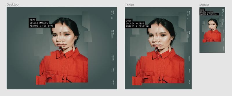
For following along visually, have a look at the Figma file here, that lays out the desktop, tablet, and mobile designs.
为了直观地进行跟踪,请在此处查看Figma文件,其中列出了台式机,平板电脑和移动设计。
Note that I’ll be using rems for units instead of pixels. In case a user zooms in, it’ll keep the design and fonts scalable. Our root pixel size is 16px, so the formula for wanting to know how many rems a pixel value would be is to divide the pixel size by 16. So, if we wanted to convert 20px into rems, we’d calculate 20 / 16 = 1.25rem.
请注意,我将以rems为单位而不是像素。 如果用户放大,它将保持设计和字体的可伸缩性。 我们的根像素大小为16px,因此要知道像素值多少个rems的公式是将像素大小除以16。因此,如果我们想将20px转换为rems,我们将计算20/16 = 1.25雷姆
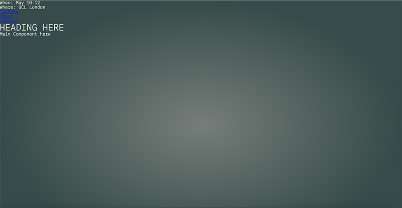
First, let’s build out the basic layout that involves a <header> that contains a <nav> element and adjacent to the header, we have a <main> element which houses the heading and main component (the magazine cutout).
首先,让我们构建一个包含<header>的基本布局,该<header>包含一个<nav>元素,并且与该header相邻,我们有一个<main>元素,用于容纳标题和主要组件(弹匣切口)。
Here’s the HTML structure:
这是HTML结构:
<body class="site">
  <header class="site__header">
    <p>When: <span class="block">May 10-12</span></p>
    <p>Where: <span class="block">UCL London</span></p>
     <nav class="site__nav">
      <ul class="site__nav-list">
        <li><a class="site__nav-link" href="/">Tickets</a></li>
        <li><a class="site__nav-link"  href="/">About</a></li>
        <li><a class="site__nav-link"  href="/">Contact</a></li>
      </ul>
    </nav>
  </header>

  <main class="main">
    <div class="container">
        <h1 class="heading">
          heading here
        </h1>

        <div>Main Component here</div>
    </div>
  </main>
</body>
身体 (Body)
Let’s cover the body element’s styles which have a background radial gradient:
让我们介绍一下具有背景径向渐变的body元素的样式:
.site {
  background: radial-gradient(50% 50% at 50% 50%, rgba(123, 131, 126, 0.9) 0%, rgba(54, 75, 73, 0.9) 100%), #364b49;
  color: #FFF;
  height: 100%;
  min-height: 120vh; // we’re adding an extra 20vh here for scrolling purposes we'll use later
}
This line is the gradient: background: radial-gradient(50% 50% at 50% 50%, rgba(123, 131, 126, 0.9) 0%, rgba(54, 75, 73, 0.9) 100%), #898989;. If you’re unfamiliar with background gradients, the first argument 50% 50% indicates the width and height of the inner shape and at 50% 50% refers to the x and y position of the container. Next, the rgba value is the color with a .1 value of transparency and the color starts from the middle of the circle (0%). The next rgba value indicates the last color which starts at the very end (100%). Finally, the last value of #364b49is the background color that shows beneath the gradient since we’re using a little bit of the transparency in the alpha channel for the two gradient values. And just like that, we have an ambient radial-gradient! Neat!
这条线是渐变: background: radial-gradient(50% 50% at 50% 50%, rgba(123, 131, 126, 0.9) 0%, rgba(54, 75, 73, 0.9) 100%), #898989; 。 如果你不熟悉背景梯度,第一个参数50% 50%表示内部形状的宽度和高度,以及at 50% 50%是指容器的x和y位置。 接下来,rgba值是透明度值为.1的颜色,该颜色从圆圈的中间(0%)开始。 下一个rgba值表示最后一个颜色(从100%开始)。 最后, #364b49的最后一个值是在渐变下方显示的背景色,因为我们在alpha通道中使用了一些透明度作为两个渐变值。 就像这样,我们有一个环境径向渐变! 整齐!
Next, we place a min-height on the body to span at least 120% of the viewport. This allows the gradient to cover the entire screen, but don’t stare too closely at it… it can read your thoughts.
接下来,我们在身体上放置一个最小高度,以跨越至少120%的视口。 这样可以使渐变色覆盖整个屏幕,但不要太凝视它……它可以读懂您的想法。
导航 (Navigation)
Next, let’s cover the <nav> and its styles:
接下来,让我们介绍<nav>及其样式:
<header class="site__header">
    <p>When: <span class="block">May 10-12</span></p>
    <p>Where: <span class="block">UCL London</span></p>
     <nav class="site__nav">
      <ul class="site__nav-list">
        <li><a class="site__nav-link" href="/tickets">Tickets</a></li>
        <li><a class="site__nav-link"  href="/about">About</a></li>
        <li><a class="site__nav-link"  href="/contact">Contact</a</li>
      </ul>
    </nav>
 </header>
We’re using the <header> element here since it contains a group of information about the site which makes up important conference details and the navigation to all of the links. In the case that a screen reader is reading it, it’s concise and accessible to the user.
我们在这里使用<header>元素,因为它包含有关该站点的一组信息,这些信息构成重要的会议详细信息以及所有链接的导航。 在屏幕阅读器正在阅读的情况下,它简洁明了并且可供用户访问。
Ok, let’s talk about the styles now. What’s required of this component is the following:
好的,让我们现在谈谈样式。 该组件的要求如下:
- Spread elements across the height of the viewport 将元素分布在视口的整个高度
- Align items at their top 在项目顶部对齐
- Fix it to the window 固定在窗户上
- Display the text on its side 在侧面显示文字
CSS that requires equal spacing and can align at the top or center is a perfect use case for Flexbox. We don’t have to do too much in order to get that.
需要相等间距并且可以在顶部或中心对齐CSS是Flexbox的理想用例。 为了达到这个目的,我们不必做太多的事情。
For the parent element .site__header and the .site__nav-list, we’ll add this flex style:
对于父元素.site__header和.site__nav-list ,我们将添加以下flex样式:
.site__header,
.site__nav-list {
  display: flex;
}
What this does is lay out the direct children of the elements to situate beside each other and align at the top of the elements.For the direct children of .site__header, we want them to grow to fill the available space by adding the following:
这样做是将元素的直接子元素布置为彼此相邻并对齐元素的顶部。对于.site__header的直接子元素,我们希望它们增加以下内容以填充可用空间:
.site__header > * {
  flex: 1 1 auto;
}
The flex property is a shorthand property for flex children. The three values stand for flex-grow, flex-shrink, and flex-basis. These values indicate to grow to the available space and be able to shrink/get smaller if need be, and auto is the default value which tells the browser to look at the element’s width or height property rather than specifying a particular width value like a percentage.
flex属性是flex子代的简写属性。 这三个值代表flex-grow , flex-shrink和flex-basis 。 这些值表示可以增加到可用空间,并且可以根据需要缩小/缩小,而auto是默认值,它告诉浏览器查看元素的width或height属性,而不是指定特定的宽度值(例如百分比) 。
Finally for the .site__nav-list, we’ll add justify-content: space-between so the elements spread out equally among the available space.
最后,对于.site__nav-list ,我们将添加justify-content: space-between以便元素在可用空间之间平均分配。
.site__nav-list {
  justify-content: space-between;
}
Alright, now let’s finish the header by turning it on its side and fixing it to the window!
好吧,现在让我们通过旋转侧边并将其固定在窗口上来完成标题!
.site__header {
  height: 100%;
  padding: 1.25rem 0;
  position: fixed;
  right: 1.25rem;
  top: 0;
  writing-mode: vertical-rl;
}
In order for the text to turn 90 degrees, we give the writing-mode property the value of vertical-rl. The writing-mode property determines if lines of text are horizontal, vertical, and what direction the blocks should be laid out.
为了使文本旋转90度,我们给writing-mode属性设置了vertical-rl的值。 Writing-mode属性确定文本行是水平,垂直还是应该以何种方向放置块。
Next, we fix the position of the header which means the element stays at a specific point relative to the window as one scrolls, so the user always sees it and never scrolls away from it. It’s best practice to put at least one Y or X value for fixed and absolute positioned elements. We have our Y value of top: 0, and the X value of right: 1.25rem to move it to the top and right of the window. Then we want to have some padding on both ends so the text doesn’t hit the sides of the window by adding `1.25rem` which is equal to 20px.
接下来,我们固定标题的位置,这意味着元素在滚动时相对于窗口停留在特定点,因此用户始终可以看到它,而不会滚动离开它。 最佳做法是为固定和绝对定位的元素至少放置一个Y或X值。 我们将Y值的top: 0 ,将X值的设置为right: 1.25rem ,将其移至窗口的顶部和右侧。 然后,我们希望在两端都有一些填充,以使文本不会通过添加等于20px的1.25rem到达窗口的两侧。
Note: since we’re dealing with a different writing mode, we have a padding-top and bottom instead of padding-left/right as the element now behaves as a vertical element. And to get the header to span the entire height of the body, we add 100% to the height property.
注意:由于我们正在处理不同的书写方式,因此我们具有padding-top和bottom而不是padding-left / right,因为该元素现在表现为垂直元素。 为了使标头跨越整个身体的高度,我们在height属性中添加了100% 。
See the Pen Magazine Cutout Basic Layout – 1 by Bri Camp Gomez (@brianacamp) on CodePen.light
请参阅CodePen .light上的Pen Magazine Cutout基本布局– 1由Bri Camp Gomez( @brianacamp )提供。
主要成分 (Main Component)
What we have so far is a responsive foundation of a fixed navigation and background. Great job for making it all this way, dear reader. Now let’s cover the <h1> and the grid cutout section.
到目前为止,我们所拥有的是固定导航和背景的响应式基础。 亲爱的读者,做到这一点真是太好了。 现在让我们介绍<h1>和网格切口部分。
Our HTML looks as follows:
我们HTML如下所示:
<main class="main">
<div class="container">
<h1 class="heading">
<mark>2020</mark>
<br />
<mark>Golden Makers</mark>
<br />
<mark>Awards & Ceremony</mark>
</h1>
<div>Magazine cutout</div>
</div>
</main> For the <main> element we have the following styles:
对于<main>元素,我们具有以下样式:
.main {
  padding: 5rem 0;
  display: flex;
  justify-content: center; // centers content horizontally
  align-items: center; // centers content vertically
  min-height: 100vh; // make content at least as tall as the viewport
  width: 100%;
}

.container {
  position: relative;
}
标题 (Heading)
If we look at the desktop, tablet, and mobile designs we notice that the heading is on top of the cutout component for desktop and tablet indicating it’s out of the document flow, and on mobile, it’s back in the normal document flow. We’ll implement this via the position property and a media query. Since we’re going to absolutely position the heading, we need to add position: relative to its parent element so the heading position value is relative to the .container vs the window.
如果我们查看台式机,平板电脑和移动设备的设计,我们会注意到标题位于台式机和平板电脑的抠图组件的顶部,表明该文档不在文档流中,而在移动设备上,它又回到了普通文档流中。 我们将通过position属性和媒体查询来实现。 由于我们要绝对定位标题,因此我们需要添加position: relative对于其父元素,以便标题位置值相对于.container与窗口。
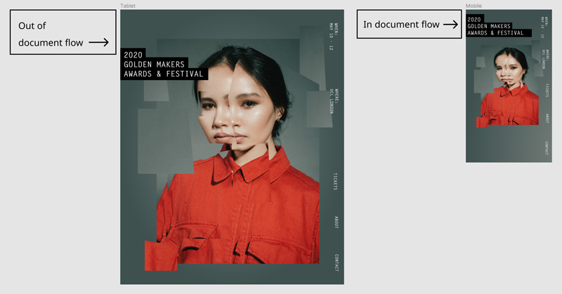
To implement this layout we’ll leave it a static positioned element (which means it’s in the normal document flow), and then absolutely position it on screens larger than 40rem (640px) and above. We position it 6rem (92px) from the top of the <main> element and to be exactly on the left edge as we’ll need that for tablet and mobile screens.
要实现此布局,我们将其放置在静态位置(这意味着它在常规文档流中),然后将其绝对定位在大于40rem(640px)或更高的屏幕上。 我们将其放置在<main>元素顶部的6rem(92px)处,并且正好位于平板电脑和移动屏幕所需的左边缘。
.heading {
  font-size: 1.5rem;
  text-transform: uppercase;
  margin-bottom: 2rem;

  @media screen and (min-width: 40rem) {
    font-size: 2rem;
    left: 0;
    position: absolute;
    top: 6rem;
    z-index: 10; // to be on top of grid
  }
}
We also slightly change font sizes to be 1.5rem on mobile and 2rem on larger screens:
我们还将移动2rem上的字体大小略微更改为1.5rem ,在大屏幕1.5rem字体大小更改为1.5rem :
For the heading, we’re using the <mark> HTML element for the highlight styles instead of a <span> since it’s a little more semantic. It’s how we get the background color to show beneath the text.
对于标题,我们将<mark> HTML元素用于突出显示样式,而不是<span>因为它具有更多的语义。 这就是我们如何使背景颜色显示在文本下方。
mark {
  color: #FFF;
  background-color: #000;
  line-height: 1.35;
  padding: .375rem;
}
See the Pen Magazine Cutout Basic Layout – 2 by Bri Camp Gomez (@brianacamp) on CodePen.light
请参阅CodePen .light上的Pen Magazine Cutout基本布局– 2由Bri Camp Gomez( @brianacamp )撰写。
杂志抠图 (Magazine Cutout)
Now it’s time for the magazine cutout. Since there’s a lot of images overlapping each other, we’re going to use CSS Grid. Wahoo, let’s get started!
现在是时候剪裁杂志了。 由于有很多图像相互重叠,因此我们将使用CSS Grid。 Wahoo,让我们开始吧!
Alright, let’s take a look at how we can best implement this via a grid.
好吧,让我们看一下如何通过网格最好地实现这一点。

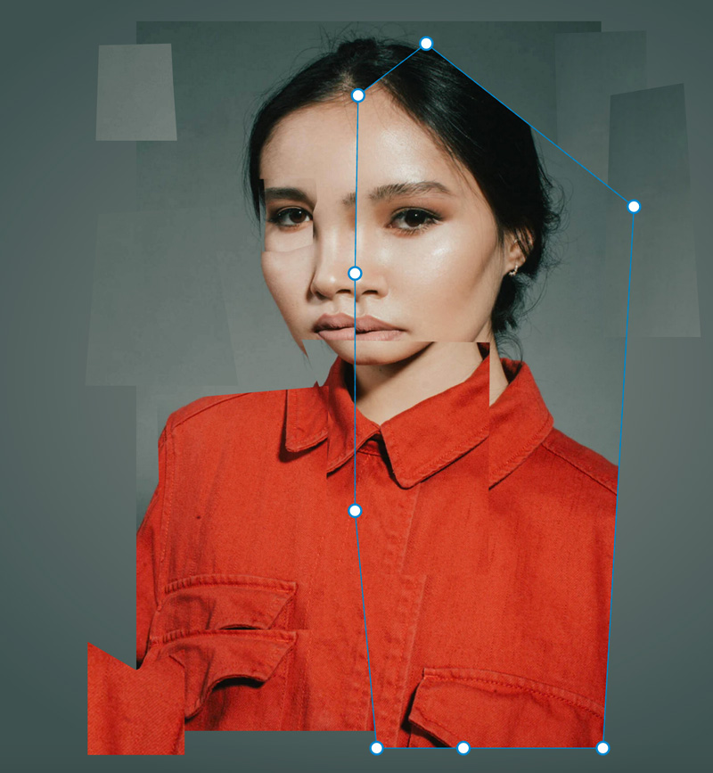
This image shows us the grid and clip-path outlines of the images so we can easily see what’s happening here with the different layers. The design allows us to divide the grid into 12 equal columns. Perfect! This image will be our rough guide for where to put each item in the grid.
此图像向我们显示了图像的网格和剪切路径轮廓,因此我们可以轻松地查看不同图层在这里发生的情况。 该设计使我们可以将网格划分为12个相等的列。 完善! 此图像将是我们将每个项目放置在网格中的位置的粗略指南。
Let’s set up the starting HTML structure:
让我们设置开始HTML结构:
<div class="grid-container" aria-hidden="true">
  <div class="grid" aria-hidden="true">
     <div class="grid__item">
       <img src="" alt="">
     </div>
  </div>
</div>
We have a parent div that’ll contain the grid and its styles with an aria-hidden=“true" attribute which tells screenreaders to not add this element and its children to the Accessibility Tree or in other words, skip over this element because it’s purely for decoration. If you’d like to learn more about when to use aria-hidden=“true” or role=“presentation”, I encourage reading this wonderful article explaining the differences and when to use what.
我们有一个父div,它将包含带有aria-hidden=“true"属性的网格及其样式,该属性告诉屏幕阅读器不要将此元素及其子元素添加到“可访问性树”中,换句话说,跳过该元素是因为它是如果您想更多地了解何时使用aria-hidden=“true”或role=“presentation” ,那么我鼓励阅读这篇精彩的文章,以解释区别以及何时使用。
For the grid styles we’ll add:
对于网格样式,我们将添加:
.grid-container {
  margin: 0 auto; // centers itself horizontally
  padding: 0 10%;
  max-width: 65rem; // restricts the grid from getting too big
}

.grid {
  display: grid;
  grid-template-columns: repeat(12, 1fr);
  grid-template-rows: repeat(12, 1fr);
  position: relative;
}
In order for the grid to act like a grid, we define the display property as, well, grid. Next, we want to be explicit about how many columns and rows we want for this grid since we’ll be laying out the images at a particular column and row value.
为了使网格能够像网格一样工作,我们将display属性定义为grid 。 接下来,由于我们将以特定的列和行值对图像进行布局,因此我们希望明确说明此网格需要多少列和行。
This line: grid-template-columns: repeat(12, 1fr) means to make 12 equal columns with the available space of 1fr. fr is a flexible unit that indicates the fraction of the available space in the grid. To learn more, I’d recommend reading this article and this article to see different fr unit use cases.
此行: grid-template-columns: repeat(12, 1fr)表示制作12个相等的列,可用空间为1fr 。 fr是一个灵活的单位,表示网格中可用空间的一部分。 要了解更多信息,建议您阅读本文和本文以了解不同的fr单位使用案例。
The same goes for grid-template-rows; we’ll want 12 equally spaced rows. This allows the images to scale beautifully and keep their positions in the grid once the browser is resized. Lastly, we add position: relative for the ability to overlap images which we’ll be covering soon.
grid-template-rows ; 我们需要12行等距的行。 一旦调整了浏览器的大小,这可以使图像缩放精美并保持其在网格中的位置。 最后,我们添加position: relative ,以实现我们将要覆盖的重叠图像的功能。
Let’s look at the assets needed for this:
让我们看一下所需的资产:
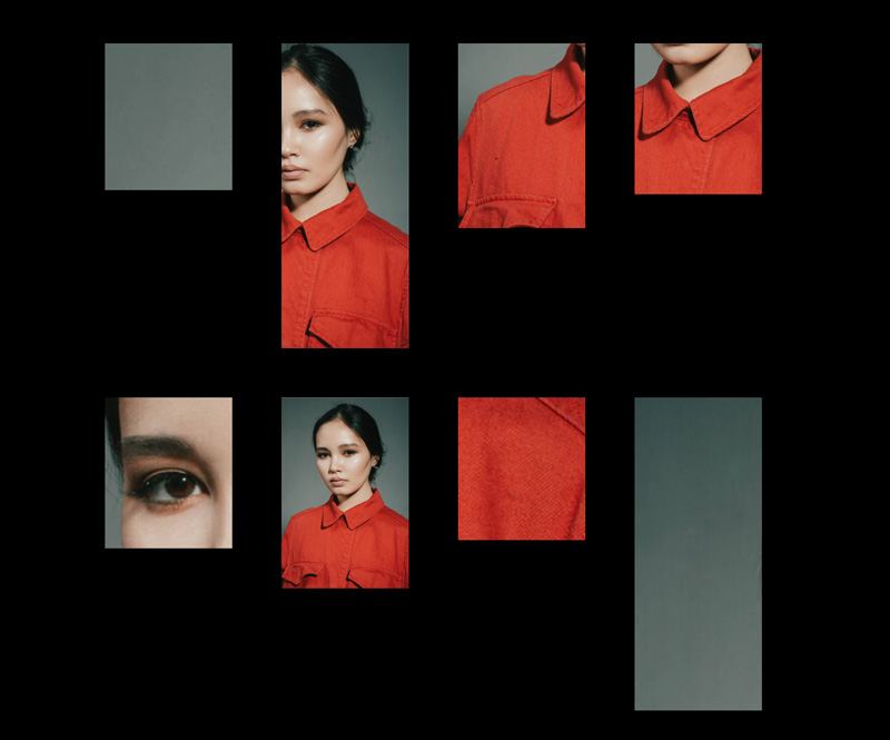
Since we’re dealing with images, we’ll want them to act as a block-level element and take up the entire space of the container. So we’ll add this to all of our images:
由于我们正在处理图像,因此我们希望它们充当块级元素并占用容器的整个空间。 因此,我们将其添加到所有图像中:
img {
  display: block;
  width: 100%;
}
Next, we add the .grid__item children elements with their specific classes and placements. I will write about a couple of them so you can see the thinking behind them.
接下来,我们添加.grid__item子元素及其特定的类和位置。 我将写一些关于它们的文章,以便您了解它们背后的想法。
<div class="grid__item grid__item--bg">
  <img src="https://s3-us-west-2.amazonaws.com/s.cdpn.io/110238/codrops-portrait.jpg">
</div>
.grid__item--bg {
grid-column: 2 / span 9;
z-index: 0;
grid-row: 1 / -1;
}For each .grid__item element, we have 3 very important properties that we’ll use to place the element where we want in the grid and where in the z-stack we want it to reside.
对于每个.grid__item元素,我们有3个非常重要的属性,我们将使用它们将元素放置在网格中所需的位置以及希望其在z堆栈中的位置。
The grid-column property is a shorthand that takes the grid-column-start and grid-column-end property values separated by a “/“. Let’s take grid-column: 2 / span 9. This rule says to start at the second grid-line and span 9 columns. I recommend using Firefox’s dev tools when you’re working with grid so you can easily see the grid lines. The grid-row property acts very similarly to grid-column; it’s a shorthand property that combines grid-row-start and grid-row-end. This line grid-row: 1 / -1 says start at grid-row 1, and stretch all the way to the end which is -1. It’s the same as saying grid-row: 1 / span 12. Last we have the z-index property to be at the very bottom or background of the grid which is what we get with the value of 0.
grid-column属性是使用由“ /”分隔的grid-column-start和grid-column-end属性值的简写。 让我们以grid-column: 2 / span 9 。 该规则说从第二条网格线开始并跨越9列。 我建议在使用网格时使用Firefox的开发工具,以便您可以轻松地看到网格线。 grid-row属性的行为与grid-column非常相似; 这是一个组合grid-row-start和grid-row-end的简写属性。 这行grid-row: 1 / -1表示从网格行1开始,一直延伸到最后的-1。 就像说grid-row: 1 / span 12 。 最后,我们将z-index属性设置在网格的最底端或背景处,即值为0时得到的结果。
Another grid__item is a half portrait:
另一个grid__item是半张画像:
<div class="grid__item grid__item--portrait-half">
   <img src="https://s3-us-west-2.amazonaws.com/s.cdpn.io/110238/codrops-portrait-half.jpg" alt="">
</div>
We do very close to what we did with the background but shift it to the right of the grid:
我们非常接近于背景,但是将其移至网格的右侧:
.grid__item--portrait-half {
  grid-column: 6 / span 6;
  z-index: 1;
  grid-row: 1 / -1;
}
We start at grid-line 6 and span 6 columns, make it stretch the entire height of the grid with the grid-row property, and with a higher z-index than the background, so it sits right on top of the background.
我们从第6条网格线开始,跨度为6列,利用grid-row属性使其延伸到整个网格高度,并且z-index高于背景,因此它位于背景顶部。
Since there are a total of 10 grid elements I won’t list them all out here but here’s a demo so you can see what I did for each and every one of them:
由于总共有10个网格元素,因此我不会在此处列出所有网格元素,但是这里有一个演示,您可以看到我对每个元素所做的事情:
See the Pen Magazine Cutout – Sans Clip Path – 3 by Bri Camp Gomez (@brianacamp) on CodePen.light
请参阅CodePen .light上的Pen Magazine Cutout – Sans Clip Path – 3 by Bri Camp Gomez( @brianacamp )。
剪切路径 (Clip-path)
Now we want to add the clip-paths to make the cutout shapes appear on the images. Cool cool, but what’s a clip-path?
现在,我们想添加剪切路径以使切口形状出现在图像上。 酷酷,但是剪切路径是什么?
I’m glad you asked! A clip-path is a clipping area that determines what part of an element can be seen. What’s inside of the area is shown, while what’s outside of the area is hidden. Clip-paths can take several values, but we’re going to use the polygon shape for the most part.
我很高兴你问! 剪切路径是一个剪切区域,它确定可以看到元素的哪一部分。 显示区域内部的内容,而隐藏区域外部的内容。 剪切路径可以采用多个值,但是大多数情况下我们将使用多边形形状。
The anatomy of a clip-path property value is this:
剪辑路径属性值的剖析如下:
clip-path: polygon(x1 y1, x2 y2, x3 y3);You can add more than 3 x/y values, which we’ll be doing for our images. Since it can be complicated to write out clip-path values by hand, I find it necessary to use clip-path tools that make clip-path shapes. I like to use Clippy and Firefox’s dev tools to create the clip-paths because they both make it incredibly easy to get the exact shapes you want and give you the values for it. So nice!
您可以添加3个以上的x / y值,我们将对图像进行添加。 由于手工写出剪切路径值可能很复杂,因此我发现有必要使用制作剪切路径形状的剪切路径工具。 我喜欢使用Clippy和Firefox的dev工具来创建剪切路径,因为它们都使获取所需的精确形状并为其提供值非常容易。 太赞了!
In order to make this shape:
为了使这种形状:
It consists of these values: the first point value (the white dots in the above photo) indicates 5% from the left and 10% from the top, then the second point is 27% from the left and 3% from the top, and so on and so forth for all of the points.
它由以下值组成:第一个点值(上图中的白色点)表示从左侧5%到顶部10%,然后第二个点从左侧27%到顶部3%,以及对于所有要点等等。
.grid__item--portrait-half {
  clip-path: polygon(5% 10%, 27% 3%, 94% 25%, 84% 98%, 39% 98%, 11% 98%, 4% 66%, 4% 34%);
}
I apply different clip-paths to each element to make each image look cutout and unique. I highly recommend experimenting with the different points, it’s loads of fun!
我对每个元素应用了不同的剪切路径,以使每个图像看起来都十分独特。 我强烈建议您尝试不同的地方,这很有趣!
See the Pen Magazine Cutout – With Clip Path – 4 by Bri Camp Gomez (@brianacamp) on CodePen.light
参见CodePen .light上的Bri Camp Gomez( @brianacamp )撰写的《 Pen Magazine Cutout –带剪辑路径》 -4
And there you have it, a responsive, accessible layout that employs modern CSS and semantic HTML. You’re probably thinking, cool, but how can we spice this up a bit? In the next section, we’ll make the image’s layers come alive!
在那里,您可以使用现代CSS和语义HTML进行响应式,可访问的布局。 您可能在想,很酷,但是我们如何为它加些味呢? 在下一节中,我们将使图像的图层变得生动起来!
奖励:互动和动画 (Bonus: Interactivity and Animation)
To get this spice party started there are a two things we could do:
要启动这个香料聚会,我们可以做两件事:
1. Add some fun little parallax
1.添加一些有趣的小视差
2. Animate the clip-path on hover with the transition property
2.使用过渡属性对悬停时的剪辑路径进行动画处理
I recommend doing one instead of both. As much as I love animation, there’s a fine line between a little spice and completely over the top psychopathic.
我建议做一个而不是两个都做。 尽管我喜欢动画,但在一点点香料和完全超越顶级精神病患者之间还有一条细线。
We’re going to cover the first option, a little bit of parallax, since the overlapping images call for it, in my opinion! If you wanted to see an example of an animated clip-path, check out the demo in the reference section at the bottom of this article.
我认为第一种选择是视差,因为我认为重叠的图像需要它! 如果您想查看动画剪辑路径的示例,请查看本文底部参考部分中的演示。
Adding animation comes with great responsibility. We need to be mindful of users that have vestibular disorders who might get dizzy when seeing parallax. After we implement the parallax we’ll cover how to remove it if the user has their “Prefers Reduced Motion” Preference turned on via their operating system.
添加动画具有重大责任。 我们需要注意患有前庭疾病的用户,他们在看到视差时可能会头晕。 实施视差后,我们将介绍如何在用户通过操作系统打开“偏好降低运动”偏好设置后将其删除。
This section will cover a basic implementation of the very small parallax library called rellax.js. We only need one line of JavaScript to make it happen, which is great!
本节将介绍名为rellax.js的非常小的视差库的基本实现。 我们只需要一行JavaScript就能实现它,这太好了!
Depending on your project, you can import the library via npm/yarn or add the minified file itself in your project. We’re going to go with the latter by way of their CDN. So, before the end of the closing body tag we’ll add:
根据您的项目,您可以通过npm / yarn导入库,也可以将缩小的文件本身添加到项目中。 我们将通过CDN与后者一起使用。 因此,在结束body标签结束之前,我们将添加:
<script src="https://cdnjs.cloudflare.com/ajax/libs/rellax/1.10.0/rellax.min.js"></script>In our JavaScript file, all we need to do to instantiate the Rellax object in the following line:
在我们JavaScript文件中,我们需要在以下行中实例化Rellax对象:
const rellax = new Rellax(‘.js-rellax');There are many options you can also pass in via JavaScript but for our purposes, we only need this line. We’ll handle the different scrolling speeds in the HTML.
您也可以通过JavaScript传递许多选项,但出于我们的目的,我们只需要此行。 我们将处理HTML中的不同滚动速度。
In order for Rellax to know what elements should be used for parallax we need to add the class js-rellax to them. I like to prepend js to classes that are only used in JavaScript so it’s easy to tell if it’s tied to JavaScript, i.e. if you remove that class from the HTML, something will likely break!
为了使Rellax知道应将哪些元素用于视差,我们需要向其添加js-rellax类。 我喜欢将js放在只在JavaScript中使用的类之前,因此很容易分辨它是否与JavaScript绑定,即,如果从HTML中删除该类,则可能会损坏某些内容!
We’ll add the class to the all of the elements in the .grid so it’s easy to control what we want. Next, Rellax has a handy data attribute called data-rellax-speed which handles the scrolling speed of the element. If you don’t specify the speed, it’ll fall back to its default speed of -2. It’s recommended to use the values of -10 through 10. -10 is the slowest while 10 is the fastest. In order to add a speed, we add this line to each element with a different value, for example: data-rellax-speed="3". I encourage you to play around with different speeds, I find it a ton of fun!
我们将类添加到.grid的所有元素中,以便轻松控制所需内容。 接下来,Rellax具有一个方便的数据属性,称为data-rellax-speed ,用于处理元素的滚动速度。 如果您未指定速度,它将恢复为默认速度-2 。 建议使用-10到10的值。 -10是最慢的,而10是最快的。 为了增加速度,我们将此行添加到具有不同值的每个元素,例如: data-rellax-speed="3" 。 我鼓励您以不同的速度玩耍,我发现它很有趣!
Here’s the final output:
这是最终的输出:
See the Pen Magazine Cutout – With Animation – 5 by Bri Camp Gomez (@brianacamp) on CodePen.light
参见CodePen .light上的Bri Magazine Gomez( @brianacamp )撰写的Pen Magazine Cutout – With Animation – 5 。
动画和辅助功能 (Animations and Accessibility)
For users who have vestibular (or inner ear) disorders, where they can get dizzy by seeing animations they can tell their operating systems to reduce motion in their system preferences. Wonderfully, there’s a media query that captures that information and is called prefers-reduced-motion and takes the values of no-preference and reduce. Read more about where the browsers look for various operating systems here: prefers-reduced-motion on MDN
对于患有前庭(或内耳)疾病的用户,他们可以通过观看动画而感到头昏眼花,可以告诉操作系统降低系统偏好设置中的动作。 奇妙的是,有一个媒体查询可捕获该信息,称为“ prefers-reduced-motion并采用no-preference和reduce的值。 在此处阅读有关浏览器在何处查找各种操作系统的更多信息:MDN上的“ preferred -reduced-motion ”
Since we’re not animating anything via CSS and only JS, we’ll detect the media query via JavaScript and kill the parallax animations if the media query is set to reduce.
由于我们没有通过CSS和JS进行动画处理,因此如果媒体查询设置为reduce ,我们将通过JavaScript检测媒体查询并杀死视差动画。
To turn off the animations for users who prefer reduced motion we’ll add these two lines of code:
要为喜欢减少动作的用户关闭动画,我们将添加以下两行代码:
// grabs the media query
const motionMediaQuery = window.matchMedia('(prefers-reduced-motion: reduce)');

// if there is a prefers-reduced-motion media query set to reduce, destroy animations
if (motionMediaQuery.matches) rellax.destroy();
Read more about the topic here: Move Ya! Or maybe, don’t, if the user prefers-reduced-motion!
在此处阅读有关该主题的更多信息: Move Ya! 或者,如果用户更喜欢减少运动,那就不要!
See the Pen Final Magazine Cutout – With Accessible Animation – 6 by Bri Camp Gomez (@brianacamp) on CodePen.light
请参阅CodePen .light上的Pen Final Magazine Cutout –具有可访问的动画– Bri Camp Gomez( @brianacamp )撰写的6
If you made it this far, you get 5 gold stars! This was a full tutorial that builds from a Figma file, is responsive, uses modern CSS, semantic HTML, and accessible animations. I hope you enjoyed it!
如果到目前为止,您将获得5个金星! 这是一个完整的教程,它是从Figma文件构建的,具有响应能力,使用现代CSS,语义HTML和可访问的动画。 我希望你喜欢它!
资源和积分 (Resources & Credits)
Image from Unsplash
图片来自Unsplash
Move Ya! Or maybe, don’t, if the user prefers-reduced-motion!
prefers-reduced-motion on MDN
css抠图


 扫一扫
扫一扫
 3974
3974

 被折叠的 条评论
为什么被折叠?
被折叠的 条评论
为什么被折叠?
 到【灌水乐园】发言


