


css标题样式
In this tutorial I’m hoping to give you some ideas and inspiration for your current and future projects!
在本教程中,我希望为您当前和将来的项目提供一些想法和启发!
Today, we are going to talk about headings and titles. When you put some content on the web (or on a paper), you have to set up some kind of structure. And this is where you need headings: to give sense to your content.
今天,我们将讨论标题和标题。 当您在网络上(或纸上)放置一些内容时,必须建立某种结构。 这就是您需要标题的地方:使您的内容有意义。
We all know how difficult it is to find the appropriate title for the right content, and frankly I’m not good at it so this won’t be the point of the article. Instead, we are going to talk about design.
我们都知道找到合适内容的适当标题很困难,并且坦率地说我不擅长,所以本文不会重点讨论。 相反,我们将讨论设计。
How to design a good title, or a good arborescence of titles? I didn’t think much about it until then so I thought it could be a nice exercise, so here we are. I tried to create a few sets of headings, each one with its own feeling.
如何设计一个好标题,或好标题树? 在那之前我没有考虑太多,所以我认为这可能是一个不错的练习,所以我们来了。 我尝试创建一些标题,每个标题都有自己的感觉。
A few notes before we start:
我们开始之前的一些注意事项:
Every font used in this tutorial is a free font from Google WebFonts.
本教程中使用的每种字体都是Google WebFonts的免费字体。
- You won’t see any vendor prefixes in the CSS snippets, but you will, of course, find them in the files. 您不会在CSS片段中看到任何供应商前缀,但是您当然会在文件中找到它们。
- I use the box-model where [width] = [element-width] + [padding] + [borders]. I activate it with the following snippet: 我使用其中[宽度] = [元素宽度] + [填充] + [边框]的盒子模型。 我使用以下代码段激活它:
*, *:after, *:before {
	box-sizing: border-box;
}
I don’t think there is much need for an explanation about the markup used in the demos: I used 4 titles, from h1 to h4.
我认为没有必要对演示中使用的标记进行解释:我使用了4种标题,从h1到h4。
Why not h5 and h6 you say? Simply because it’s not very usual to have such a depth for normal websites. But if you have one which requires those levels of headings, please be sure to include some styles for them as well. 😉
为什么不说h5和h6? 仅仅是因为在普通网站上拥有如此高的深度并不是很平常。 但是,如果您有一个需要这些标题级别的标题,请确保也为它们添加一些样式。 😉
关于垂直节奏的几句话 (A few words on vertical rhythm)
什么是垂直节奏?(What is vertical rhythm?)
Vertical rhythm is a very important thing when it comes to web design. It is the concept implying consistent spacing between elements on a page, especially typographic elements.
当涉及到网页设计时,垂直节奏非常重要。 此概念表示页面上的元素(尤其是印刷元素)之间的间距一致。
When you write a blog post which is divided into multiple sections like this one, you may want to have proportional spacing around each element, such as titles, paragraphs, images, lists, etc.
当您写博客文章时,像这样分成多个部分,您可能希望每个元素(例如标题,段落,图像,列表等)周围都有成比例的间距。
Let me quote Richard Rutter from his great 24 Ways article on vertical rhythm:
让我引用理查德·鲁特(Richard Rutter)在他的《 24种竖向节奏》的出色文章中:
On the Web, vertical rhythm – the spacing and arrangement of text as the reader descends the page – is contributed to by three factors: font size, line height and margin or padding. All of these factors must calculated with care in order that the rhythm is maintained.
在网络上,垂直节奏(即阅读者下移页面时文本的间距和排列)是由三个因素造成的:字体大小,行高,边距或填充。 为了保持心律,必须仔细计算所有这些因素。
Since I’m not a vertical rhythm expert, I decided to not reinvent the wheel and go with a few lines of CSS as a default base to write my demos.
由于我不是垂直节奏专家,所以我决定不重新发明轮子,而是使用几行CSS作为默认示例来编写演示。
CSS中的垂直节奏 (Vertical rhythm in CSS)
h1 {
    font-size: 36px;
    line-height: 40px;
}

h2 {
    font-size: 30px;
    line-height: 40px;
}

h3 {
    font-size: 24px;
    line-height: 40px;
}

h4 {
    font-size: 18px;
    line-height: 20px;
}

/* Won't be used here */

h5 {
    font-size: 14px;
    line-height: 20px;
}

h6 {
    font-size: 12px;
    line-height: 20px;
}
I also gave a few styles to paragraphs to make them fit to the headings. But we are going to focus on the headings only here.
我还为段落提供了一些样式,使它们适合标题。 但是,我们将仅在此处关注标题。
Now that we have covered the basics of our exercise, we can create a few sets of headings!
现在,我们已经涵盖了练习的基础知识,我们可以创建一些标题!
Note that each heading will have its styles defined individually, so you will see a lot of repetition of styles among the headings. When you write your styles, you should of course summarize them to avoid repetition.
请注意,每个标题将分别定义其样式,因此您将在标题中看到很多样式重复。 在编写样式时,您当然应该总结一下样式,以避免重复。
例子1 (Example 1)
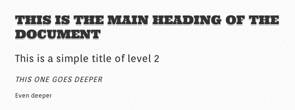
Let’s start with something pretty simple. Not much involved here, just a few font styles.
让我们从一些简单的事情开始。 这里涉及的并不多,只是一些字体样式。
Fonts used: Ultra (sans-serif), Orienta (sans-serif).
使用的字体: Ultra(sans-serif),Orienta(sans-serif)。
.demo-1 .main h1 {
	margin: 1em 0 0.5em 0;
	color: #343434;
	font-weight: normal;
	font-family: 'Ultra', sans-serif;
	font-size: 36px;
	line-height: 42px;
	text-transform: uppercase;
	text-shadow: 0 2px white, 0 3px #777;
}

.demo-1 .main h2 {
	margin: 1em 0 0.5em 0;
	color: #343434;
	font-weight: normal;
	font-size: 30px;
	line-height: 40px;
	font-family: 'Orienta', sans-serif;
}

.demo-1 .main h3 {
	margin: 1em 0 0.5em 0;
	color: #343434;
	font-size: 22px;
	line-height: 40px;
	font-weight: normal;
	text-transform: uppercase;
	font-family: 'Orienta', sans-serif;
	letter-spacing: 1px;
	font-style: italic;
}

.demo-1 .main h4 {
	margin: 1em 0 0.5em 0;
	color: #343434;
	font-size: 18px;
	line-height: 20px;
	font-weight: normal;
	font-family: 'Orienta', sans-serif;
}
Okay, it was pretty straightforward. Let’s try something a little more detailed.
好吧,这很简单。 让我们尝试一些更详细的内容。
例子2 (Example 2)
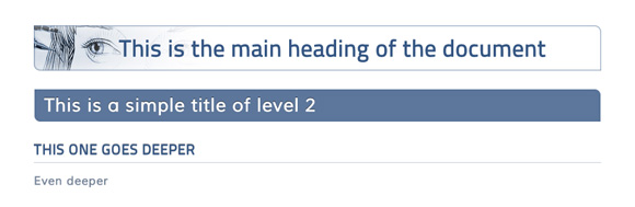
This examples shows how to add something to the background of your heading, be it solid color or even an image. The large inset white box shadow for the h1 will ensure that the image does not “collide” with the headline text when we view it on a small screen. The left padding has a percentage value for the same reason: when the viewport becomes very small, we want to keep the padding relative to the width, i.e. keep it fluid.
本示例说明了如何在标题背景中添加某些内容,无论是纯色还是图像。 h1的较大的插入白框阴影将确保当我们在小屏幕上查看图像时,图像不会与标题文本“冲突”。 出于相同的原因,左侧的填充具有百分比值:当视口变得非常小时,我们要相对于宽度保持填充,即保持其流畅。
Fonts used: Titillium Web (sans-serif), Muli (sans-serif).
使用的字体: Titillium Web(sans-serif),Muli(sans-serif)。
CSS (The CSS)
.demo-2 .main h1 {
	margin: 1em 0 0.5em 0;
	font-weight: 600;
	font-family: 'Titillium Web', sans-serif;
	position: relative;
	font-size: 36px;
	line-height: 40px;
	padding: 15px 15px 15px 15%;
	color: #355681;
	box-shadow:
		inset 0 0 0 1px rgba(53,86,129, 0.4),
		inset 0 0 5px rgba(53,86,129, 0.5),
		inset -285px 0 35px white;
	border-radius: 0 10px 0 10px;
	background: #fff url(../images/bartoszkosowski.jpg) no-repeat center left;
}

.demo-2 .main h2 {
	margin: 1em 0 0.5em 0;
	font-weight: normal;
	position: relative;
	text-shadow: 0 -1px rgba(0,0,0,0.6);
	font-size: 28px;
	line-height: 40px;
	background: #355681;
	background: rgba(53,86,129, 0.8);
	border: 1px solid #fff;
	padding: 5px 15px;
	color: white;
	border-radius: 0 10px 0 10px;
	box-shadow: inset 0 0 5px rgba(53,86,129, 0.5);
	font-family: 'Muli', sans-serif;
}

.demo-2 .main h3 {
	margin: 1em 0 0.5em 0;
	font-weight: 600;
	font-family: 'Titillium Web', sans-serif;
	position: relative;
	text-shadow: 0 -1px 1px rgba(0,0,0,0.4);
	font-size: 22px;
	line-height: 40px;
	color: #355681;
	text-transform: uppercase;
	border-bottom: 1px solid rgba(53,86,129, 0.3);
}

.demo-2 .main h4 {
	margin: 1em 0 0.5em 0;
	font-weight: 600;
	font-family: 'Titillium Web', sans-serif;
	position: relative;
	font-size: 18px;
	line-height: 20px;
	color: #788699;
	font-family: 'Muli', sans-serif;
}
例子3(Example 3)
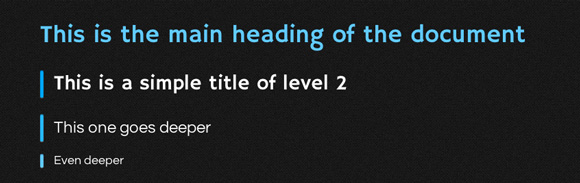
I thought it could be a good idea to have a darkish demo. Many sites are using a pretty dark template, like Compass or CodePen.
我认为有一个黑暗的演示可能是一个好主意。 许多网站使用的模板很暗,例如Compass或CodePen 。
Once again, I picked an electric blue to go with the dark gray background, but you could do with whatever pleases you. Anyway, I really suggest a punchy color.
再次,我选择了深蓝色背景的电蓝色,但是您可以随便做什么。 无论如何,我真的建议您使用一种有力的颜色。
Fonts used: Hammersmith One (sans-serif), Questrial (sans-serif).
使用的字体: Hammersmith One(sans-serif),Questrial(sans-serif)。
CSS (The CSS)
.demo-3 .main h2:after,
.demo-3 .main h3:after,
.demo-3 .main h4:after {
	position: absolute;
	content: "";
	left: 0;
	top: 0;
	bottom: 0;
	width: 5px;
	border-radius: 2px;
	box-shadow:
		inset 0 1px 1px rgba(0,0,0,0.5),
		0 1px 1px rgba(255,255,255,0.3);
}

.demo-3 .main h2:after { background: #0AF; }
.demo-3 .main h3:after { background: #3BF; }
.demo-3 .main h4:after { background: #6Cf; }

.demo-3 .main h1 {
	font-size: 36px;
	line-height: 40px;
	margin: 1em 0 .6em 0;
	font-weight: normal;
	color: white;
	font-family: 'Hammersmith One', sans-serif;
	text-shadow: 0 -1px 0 rgba(0,0,0,0.4);
	position: relative;
	color: #6Cf;
}

.demo-3 .main h2 {
	margin: 1em 0 .6em 0;
	padding: 0 0 0 20px;
	font-weight: normal;
	color: white;
	font-family: 'Hammersmith One', sans-serif;
	text-shadow: 0 -1px 0 rgba(0,0,0,0.4);
	position: relative;
	font-size: 30px;
	line-height: 40px;
}

.demo-3 .main h3 {
	margin: 1em 0 .6em 0;
	padding: 0 0 0 20px;
	font-weight: normal;
	color: white;
	font-family: 'Hammersmith One', sans-serif;
	text-shadow: 0 -1px 0 rgba(0,0,0,0.4);
	position: relative;
	font-size: 24px;
	line-height: 40px;
	font-family: 'Questrial', sans-serif;
}

.demo-3 .main h4 {
	margin: 1em 0 .6em 0;
	padding: 0 0 0 20px;
	font-weight: normal;
	color: white;
	font-family: 'Hammersmith One', sans-serif;
	text-shadow: 0 -1px 0 rgba(0,0,0,0.4);
	position: relative;
	font-size: 18px;
	line-height: 20px;
	font-family: 'Questrial', sans-serif;
}
为什么不设边界?(Why not a border?)
Very good question, my lord! At first, I did use a left border for this demo. It worked like a charm, was fully compatible back to IE1 or something (!).
很好的问题,我的主! 最初,我确实为该演示使用了左边框。 它像一种魅力一样工作,完全兼容IE1或其他东西(!)。
Then I wanted to add a subtle light effect to this border. And maybe rounded corners. How am I going to do that? With a pseudo-element of course! Design purpose, no extra markup, perfect use case!
然后,我想在此边框上添加微妙的灯光效果。 甚至是圆角。 我该怎么做? 当然有伪元素! 设计目的,没有额外的标记,完美的用例!
What about old browsers you say? Yup, IE6 and IE7 won’t see your magnificent border. From there, you have 2 options:
您说的旧浏览器怎么样? 是的,IE6和IE7将看不到您的华丽边框。 从那里,您有2个选择:
- Give those browsers a left border as a fallback 给这些浏览器一个左边界作为后备
- Don’t give a damn since it’s a purely visual issue.别该死,因为这纯粹是视觉问题。
I think I’d give the border. 😉
我想我给边界。 😉
例子4 (Example 4)
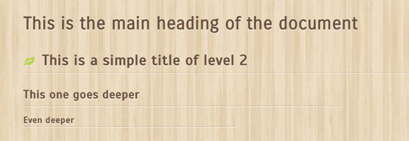
I heard you like wood. Right?
我听说你喜欢木头。 对?
Note: the little leaf on the second level of the title is from FontAwesome. The icon font was “constructed” using Fontello.
注意:标题第二级上的小叶子来自FontAwesome 。 图标字体是使用Fontello “构建”的。
Fonts used: Scada (sans-serif), Carrois Gothic (sans-serif).
使用的字体: Scada(sans-serif),Carrois Gothic(sans-serif)。
CSS (The CSS)
.demo-4 .main h1 i,
.demo-4 .main h2 i,
.demo-4 .main h3 i,
.demo-4 .main h4 i {
	padding-right: 10px;
	color: #A8D13B;
	font-size: 0.8em;
}

.demo-4 .main h2:after,
.demo-4 .main h3:after,
.demo-4 .main h4:after {
	position: absolute;
	content: "";
	height: 1px;
	border-radius: 2px;
	left: 0;
	bottom: 0;
	box-shadow:
		0 -1px 0 rgba(0,0,0,0.1),
		0 1px 0 rgba(255,255,255,0.6);
}

.demo-4 .main h2:after { width: 100%; }
.demo-4 .main h3:after { width:  75%; }
.demo-4 .main h4:after { width:  50%; }

.demo-4 .main h1 {
	margin: 1em 0 0.75em;
	padding: 0 0 5px 0;
	color: #6B5344;
	font-weight: normal;
	position: relative;
	text-shadow: 0 2px 0 rgba(255,255,255,0.5);
	font-size: 36px;
	line-height: 40px;
	font-family: 'Carrois Gothic', sans-serif;
}

.demo-4 .main h2 {
	margin: 1em 0 0.75em;
	padding: 0 0 5px 0;
	color: #6B5344;
	font-weight: normal;
	font-family: 'Scada', sans-serif;
	position: relative;
	text-shadow: 0 2px 0 rgba(255,255,255,0.5);
	font-size: 30px;
	line-height: 40px;
}

.demo-4 .main h3 {
	margin: 1em 0 0.75em;
	padding: 0 0 5px 0;
	color: #6B5344;
	font-weight: normal;
	font-family: 'Scada', sans-serif;
	position: relative;
	text-shadow: 0 2px 0 rgba(255,255,255,0.5);
	font-size: 24px;
	line-height: 40px;
}

.demo-4 .main h4 {
	margin: 1em 0 0.75em;
	padding: 0 0 5px 0;
	color: #6B5344;
	font-weight: normal;
	font-family: 'Scada', sans-serif;
	position: relative;
	text-shadow: 0 2px 0 rgba(255,255,255,0.5);
	font-size: 18px;
	line-height: 20px;
}
又为什么不设边界?(Why not a border, again?)
It’s pretty much the same reason as for the previous demo. I didn’t use a bottom border because we can’t set a width to it and I wanted the underline to be smaller as you go deeper in title levels.
这与上一个演示的原因几乎相同。 我没有使用底部边框,因为我们无法为其设置宽度,并且我希望随着标题级别的增加,下划线会变小。
One solution would have been to set a width to the titles in order to make the bottom-border behave accordingly, but it’s pretty dirty and could be problematical in long titles.
一种解决方案是设置标题的宽度,以使底部边框具有相应的行为,但是这很脏,在长标题中可能会出现问题。
So pseudo-element. Plus, the browser support for pseudo-elements is pretty good nowadays.
如此伪元素。 另外,现在浏览器对伪元素的支持非常好。
例子5 (Example 5)
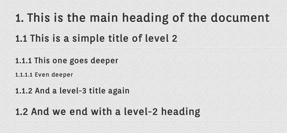
I think this example is a very good one because it makes the perfect use case for CSS counters. Yes, counters with CSS. I’m sure a few of you don’t even know we could do this kind of magic tricks with CSS!
我认为这个例子是一个很好的例子,因为它为CSS计数器提供了完美的用例。 是的,使用CSS计数器。 我敢肯定,你们当中的一些人甚至都不知道我们可以用CSS做这种魔术!
Fonts used: Orienta (sans-serif).
使用的字体: Orienta(sans-serif)。
关于CSS计数器的一句话 (A word on CSS counters)
To put it simple, CSS (2.1!) provides us a way to assign a counter to a type of element, incrementing or decrementing it at each occurrence. Then, with pseudo-elements we can display this counter accordingly.
简而言之,CSS(2.1!)为我们提供了一种为元素类型分配计数器的方法,该方法在每次出现时递增或递减。 然后,使用伪元素,我们可以相应地显示此计数器。
There are 2 properties regarding counters (counter-reset and counter-increment) and 2 values for the content property (counter() and counters()).
关于计数器有2个属性(计数器重置和计数器增量),而内容属性有2个值(counter()和counters())。
Basically, you reset the counter on the wrapper, and then you increment it on the children. And since a good demo is always better than a long read, please have a look below.
基本上,您在包装器上重置了计数器,然后在子项上对其进行了递增。 而且由于良好的演示总是比阅读本书更好,因此请在下面查看。
CSS (The CSS)
.demo-5 .main {
	counter-reset: section-1, section-2, section-3, section-4;
}

.demo-5 .main h1 {
	margin: 0.8em 0 0.5em 0;
	color: #333;
	font-weight: normal;
	font-family: 'Orienta', sans-serif;
	font-size: 36px;
	line-height: 40px;
	counter-increment: section-1;
	counter-reset: section-2 section-3 section-4;
}

.demo-5 .main h2 {
	margin: 0.8em 0 0.5em 0;
	color: #333;
	font-weight: normal;
	font-family: 'Orienta', sans-serif;
	font-size: 30px;
	line-height: 40px;
	counter-increment: section-2;
	counter-reset: section-3 section-4;
	border-bottom: 1px solid #fff;
	box-shadow: 0 1px 0 rgba(0,0,0,0.1);
	padding-bottom: 10px;
}

.demo-5 .main h3 {
	margin: 0.8em 0 0.5em 0;
	color: #333;
	font-weight: normal;
	font-family: 'Orienta', sans-serif;
	font-size: 24px;
	line-height: 40px;
	counter-increment: section-3;
	counter-reset: section-4;
}

.demo-5 .main h4 {
	margin: 0.8em 0 0.5em 0;
	color: #333;
	font-weight: normal;
	font-family: 'Orienta', sans-serif;
	font-size: 18px;
	line-height: 20px;
	counter-increment: section-4;
}

.demo-5 .main h1:before { content: counter(section-1) ". "; }
.demo-5 .main h2:before { content: counter(section-1) "." counter(section-2) " "; }
.demo-5 .main h3:before { content: counter(section-1) "." counter(section-2) "." counter(section-3) " "; }
.demo-5 .main h4:before { content: counter(section-1) "." counter(section-2) "." counter(section-3) "." counter(section-4) " "; }
To sum up: each level of title increments its own counter and displays (thanks to the :before pseudo-element) it and all the counters of upper levels of headings.
概括起来:标题的每个级别都会增加其自己的计数器,并显示(由于:before伪元素)标题和所有较高级别标题的计数器。
For further readings about CSS counters, please refer to:
有关CSS计数器的更多信息,请参阅:
例子6(Example 6)
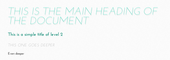
This is a light example with some color. Headings don’t always need to have a heavy font weight; we can also create impact with a very light font if we make it large enough and captivating using color and text shadows.
这是一个带有一些颜色的浅色示例。 标题不一定总是需要很重的字体。 如果我们将字体设置得足够大,并使用颜色和文字阴影来吸引人,那么我们也可以使用非常浅的字体来产生影响。
This example also show how uppercase and italics can be used.
此示例还显示了如何使用大写和斜体。
Fonts used: Josefin Sans (sans-serif).
使用的字体: Josefin Sans(sans-serif)。
CSS (The CSS)
.demo-6 .main h1 {
	margin: 1em 0 0.5em 0;
	font-weight: 100;
	text-transform: uppercase;
	color: #00caa6;
	font-style: italic;
	font-family: 'Josefin Sans', sans-serif;
	font-size: 58px;
	line-height: 54px;
	text-shadow: 2px 5px 0 rgba(0,0,0,0.2);
}

.demo-6 .main h2 {
	margin: 1em 0 0.5em 0;
	color: #148773;
	font-size: 26px;
	line-height: 40px;
	font-weight: bold;
	font-family: 'Josefin Sans', sans-serif;
}

.demo-6 .main h3 {
	margin: 1em 0 0.5em 0;
	color: #343434;
	font-size: 22px;
	line-height: 40px;
	font-weight: 100;
	text-transform: uppercase;
	font-family: 'Josefin Sans', sans-serif;
	letter-spacing: 1px;
	font-style: italic;
}

.demo-6 .main h4 {
	margin: 1em 0 0.5em 0;
	color: #343434;
	font-size: 18px;
	line-height: 20px;
	font-weight: bold;
	font-family: 'Josefin Sans', sans-serif;
}
CSS预处理器呢?(What about CSS pre-processors?)
It occurred to me that mixins from CSS pre-processors (whichever you are using) can be very useful when it comes to such repetitive CSS. Actually, we could build simple functions accepting parameters to ease our life.
在我看来,来自CSS预处理器(无论您使用的是哪种)的mixin在涉及此类重复CSS时非常有用。 实际上,我们可以构建简单的函数来接受参数以简化我们的生活。
Let me show you what I mean with a LESS version of our first demo.
让我告诉您使用我们的第一个演示的LESS版本的含义。
html {
    font-size: 62.5%;
}

.headings(@font, @size, @lh, @ls, @style, @transform) {
   margin: 1em 0 0.5em 0;

   /* REM calculations */
   @sizeREM: @size/10;
   @lhREM: @lh/10;

   /* Fallbacks */
   font-size: ~"@{size}px";
   line-height: ~"@{lh}px";

   /* Font styles */
   font-size: ~"@{sizeREM}rem";
   line-height: ~"@{lhREM}rem";
   font-family: @font~", sans-serif";
   font-style: @style;
   color: #343434;
   letter-spacing: ~"@{ls}px";
   text-transform: @transform;
}

h1 {
    .headings(Ultra, 36, 42, 0, normal, uppercase);
    text-shadow: 0 2px white, 0 3px #777;
}

h2 { .headings(Orienta, 30, 40, 0, normal, capitalize); }
h3 { .headings(Orienta, 22, 40, 1, italic, uppercase); }
h4 { .headings(Orienta, 18, 20, 0, normal, capitalize); }
Note: the font-size declaration on the html element is to trigger a base 10 convertion. Default size is 16px. 16 * 62.5 / 100 = 10. From there, convertion to rem is way easier.
注意:html元素上的font-size声明将触发以10为底的转换。 默认大小为16像素。 16 * 62.5 / 100 =10。从那里开始,转换到rem更容易。
I took the time to add the declarations for both rem and px units in the mixin, and with a little more work we could even tweak a bit our function to use the shorthand property for font settings (font).
我花了一些时间在mixin中添加rem和px单位的声明,通过做更多的工作,我们甚至可以调整一下功能,以将简写属性用于字体设置( font )。
Here is the syntax for LESS, but you could do something very similar with Sass/SCSS or Stylus. I’m just used to LESS. 🙂
这是LESS的语法,但是您可以使用Sass / SCSS或Stylus做一些非常相似的事情。 我只是习惯了。 🙂
最后的话 (Final words)
As a final word, I’d like to stress the fact typography really matters a lot in the web, at least as much as in print. It’s even more true when it comes to blogs, and editorial content.
最后,我想强调的是,排版实际上在网络上非常重要,至少与印刷上一样重要。 当涉及到博客和社论内容时,情况更是如此。
As further readings, I’d recommend:
作为进一步的阅读,我建议:
Typography is the Foundation of Web Design on Smashing Magazine
On Web Typography on A List Apart
Technical Web Typography: Guidelines and Techniques on Smashing Magazine
Web Design is 95% Typography on Information Architects
Thanks a lot for reading this article and as always, please share any related concepts or comment. 🙂
非常感谢您阅读本文,并且一如既往,请分享任何相关概念或评论。 🙂
翻译自: https://tympanus.net/codrops/2012/11/02/heading-set-styling-with-css/
css标题样式


 7855
7855


 被折叠的 条评论
为什么被折叠?
被折叠的 条评论
为什么被折叠?
 到【灌水乐园】发言


