


Hi guys! Today we are going to see another great example of how to use the power of CSS3. We will start by creating a very cool and realistic 3D ball with pure CSS3 properties, and add a little CSS3 animations for giving the ball a “bouncing” effect.
嗨,大家好! 今天,我们将看到另一个有关如何使用CSS3的强大示例。 我们将首先创建一个具有纯CSS3属性的非常酷且逼真的3D球,并添加一些CSS3动画以使该球具有“弹跳”效果。
Please note: the result of this tutorial will only work as intended in browsers that support the respective CSS properties.
请注意:本教程的结果只能在支持各自CSS属性的浏览器中按预期工作。
HTML (The HTML)
Let’s start with some very basic HTML:
让我们从一些非常基本HTML开始:
<div id="ballWrapper">
	<div id="ball"></div>
	<div id="ballShadow"></div>
</div>
What we have here are 3 simple DIV elements. “#ballWrapper” is the main DIV which wraps the ball. This DIV will determine the ball’s position and height on the screen. Next, we have the “#ball” element which is the ball markup, and finally there is the “#ballShadow” which holds the ball’s shadow separately from the ball itself.
我们这里有3个简单的DIV元素。 “ #ballWrapper ”是包裹球的主要DIV。 该DIV将确定球在屏幕上的位置和高度。 接下来,我们有“ #ball ”元素,它是球的标记,最后是“ #ballShadow ”,它使球的阴影与球本身分开。
CSS (The CSS)
Note that we won’t be using vendor prefixes in the tutorial. You will, of course, find them in the files.
注意,在本教程中我们不会使用供应商前缀。 您当然会在文件中找到它们。
First, we’ll want to set a basic width and height to our ‘#ballWrapper’ DIV. It will help us position it to the center of the screen:
首先,我们要为'#ballWrapper'DIV设置基本宽度和高度。 这将帮助我们将其放置在屏幕中央:
#ballWrapper {
	width: 140px;
	height: 300px;
	position: fixed;
	left: 50%;
	top: 50%;
	margin: -150px 0 0 -70px;
}
Note that I gave the DIV both top and left position properties of ‘50%’, and a negative top and left margin which is calculated to be exactly half of the original height and width of the DIV. That way we can center the ball on the screen.
请注意,我给DIV的顶部和左侧位置属性均为'50%',并且给定的负顶部和左侧边距为正值,该宽度恰好是DIV原始高度和宽度的一半。 这样我们就可以将球对准屏幕中心。
Next in line, let’s give our ball some styles (grow up, it’s not that funny… :])
接下来,让我们给球一些样式(长大,这不是那么有趣……:])
#ball {
	width: 140px;
	height: 140px;
	border-radius: 70px;
	background: linear-gradient(top,  rgba(187,187,187,1) 0%,rgba(119,119,119,1) 99%);
	box-shadow: inset 0 -5px 15px rgba(255,255,255,0.4),
				inset -2px -1px 40px rgba(0,0,0,0.4),
				0 0 1px #000;
}
We are giving the ball equal width and height and a ‘border-radius’ property with a value of ’70px’ (which is half of the original width and height we’ve set) so it will be a ball and not an oval shape.
我们给球一个相等的宽度和高度,并赋予'border-radius'属性,其值为'70px'(是我们设置的原始宽度和高度的一半),因此它将是一个球而不是椭圆形。

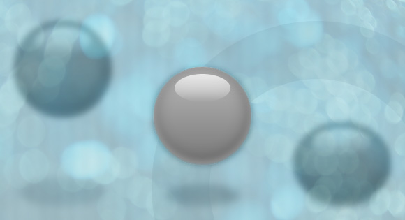
Another thing you’ll notice is the background. I gave the ball’s element a linear background and 3 different box shadow levels so it would get the 3D effect. The first box shadow level is for the
您会注意到的另一件事是背景。 我给了球的元素一个线性的背景和3个不同的盒子阴影等级,这样就可以得到3D效果。 第一个框阴影级别是针对球底部的 dark shadowing at the bottom of the ball (see image). Then, we have the second level that is responsible for the blurry glow – again, at the bottom of the ball. Finally the third level is a hardly noticeable blurry shadow behind the contours of the ball. 深色阴影的(请参见图片)。 然后,我们在球的底部有了第二个层,它负责模糊的发光。 最后,第三级是在球的轮廓后面几乎看不到的模糊阴影。

If you take a look at the ball you’ll notice that there is another small oval shape on top of the ball that gives it a reflection effect. Here is how I created it:
如果您看一下球,您会注意到在球的顶部还有另一个小的椭圆形形状,使其具有反射效果。 这是我创建它的方式:
#ball::after {
	content: "";
	width: 80px;
	height: 40px;
	position: absolute;
	left: 30px;
	top: 10px;
	background: linear-gradient(top,  rgba(232,232,232,1) 0%,rgba(232,232,232,1) 1%,rgba(255,255,255,0) 100%);
	border-radius: 40px / 20px;
}
I used the CSS pseudo element ::after and gave it a linear gradient with an opacity. In addition, I’ve set the border radius to ’40px / 20px’ so it has an oval shape.
我使用了CSS伪元素:: after,并给了它一个不透明的线性渐变。 另外,我将边框半径设置为“ 40px / 20px”,因此它具有椭圆形的形状。
Next, let’s handle the ball’s shadow:
接下来,让我们处理球的阴影:
 #ballShadow {
	width: 60px;
	height: 75px;
	position: absolute;
	z-index: 0;
	bottom: 0;
	left: 50%;
	margin-left: -30px;
	background: rgba(20, 20, 20, .1);
	box-shadow: 0px 0 20px 35px rgba(20,20,20,.1);
	border-radius: 30px / 40px;
}
Again, I used the same properties for centering the shadow, but this time I pinned it to the bottom of ‘#ballWrapper’. I also added a semi-transparent background to it, a fitting box shadow and a border radius.
同样,我使用了相同的属性来使阴影居中,但是这次我将其固定在“ #ballWrapper”的底部。 我还向其中添加了半透明的背景,合适的阴影和边框半径。
弹跳动画 (The bouncing animation)
Now let’s take a look at the fun stuff…
现在,让我们看一下有趣的东西……
I’ll start by adding the animation property to our ball:
首先,将animation属性添加到我们的球中:
#ball {
	animation: jump 1s infinite;
}
All I did was to define the animation’s name (jump), the animation’s duration (1 second) and how many times the animation will happen – in our case we use ‘infinite’ which means that it will run forever.
我所做的就是定义动画的名称( jump ),动画的持续时间(1秒)以及动画将发生多少次–在我们的例子中,我们使用“无限”,这意味着它将永远运行。
The animation itself:
动画本身:
@keyframes jump {
	0% {
		top: 0;
	}
	50% {
		top: 140px;
		height: 140px;
	}
	55% {
		top: 160px;
		height: 120px;
		border-radius: 70px / 60px;
	}
	65% {
		top: 120px;
		height: 140px;
		border-radius: 70px;
	}
	95% {
		top: 0;
	}
	100% {
		top: 0;
	}
}
So, basically what I’m doing here is to play with the ‘top’ position property of the ball. Starting from 0, through 160 and back to 0. You’ll notice that in the middle of the animation I’m also playing with the ‘border-radius’ property – that way I handle the “impact” of the ball on the ground.
所以,基本上我在这里要做的就是玩球的“最高”位置属性。 从0开始,一直到160,然后回到0。您会注意到,在动画的中间,我还在玩'border-radius'属性-这样我就可以处理地面上的球的“撞击” 。
And now the ball’s shadow; first let’s add the shadow’s relevant animation property:
现在球的影子; 首先让我们添加阴影的相关动画属性:
#ballShadow {
	animation: shrink 1s infinite;
}
I used the same values that I used with the ball, only with a different keyframes animation called shrink which looks as follows:
我使用了与球相同的值,只是使用了一个不同的关键帧动画,称为“缩小” ,如下所示:
@-keyframes shrink {
	0% {
		bottom: 0;
		margin-left: -30px;
		width: 60px;
		height: 75px;
		background: rgba(20, 20, 20, .1);
		box-shadow: 0px 0 20px 35px rgba(20,20,20,.1);
		border-radius: 30px / 40px;
	}
	50% {
		bottom: 30px;
		margin-left: -10px;
		width: 20px;
		height: 5px;
		background: rgba(20, 20, 20, .3);
		box-shadow: 0px 0 20px 35px rgba(20,20,20,.3);
		border-radius: 20px / 20px;
	}
	100% {
		bottom: 0;
		margin-left: -30px;
		width: 60px;
		height: 75px;
		background: rgba(20, 20, 20, .1);
		box-shadow: 0px 0 20px 35px rgba(20,20,20,.1);
		border-radius: 30px / 40px;
	}
}
In the shadow’s animation I played with different properties then in the ball’s animation. In order to give it all a realistic effect when it comes to the ball’s distance from the floor, I needed to animate the shadow width, height and opacity. While the ball is close to the floor, the shadow needs to be darker and smaller. When the ball jumps up, the shadow should be lighter and bigger.
在阴影的动画中,我使用了与球的动画不同的属性。 为了在球距地面的距离上赋予所有逼真的效果,我需要设置阴影宽度,高度和不透明度的动画。 当球靠近地板时,阴影需要更深,更小。 当球跳起来时,阴影应该更浅,更大。
Last, but not least, let’s add the “click effect” to the ball which makes it appear as if it moves away from us when we click and hold. To achieve this effect, all we have to use is the ‘:active‘ pseudo-class, add a transition and play with the CSS3 transform ‘scale’ property like this:
最后但并非最不重要的一点,让我们在球上添加“点击效果”,使它看起来像是当我们单击并按住时,它离开了我们。 为了达到这种效果,我们只需要使用' :active '伪类,添加一个过渡并像这样使用CSS3转换'scale'属性即可:
#ballWrapper {
	transform: scale(1);
	transition: all 5s linear 0s;
}

#ballWrapper:active {
	transform: scale(0);
}
The transition from a transform value of scale(1) to scale(0) will make it look as if the element is moving away from you.
从scale(1)到scale(0)的转换值的过渡将使其看起来好像元素正在远离您。
翻译自: https://tympanus.net/codrops/2012/05/22/creating-an-animated-3d-bouncing-ball-with-css3/


 652
652


 被折叠的 条评论
为什么被折叠?
被折叠的 条评论
为什么被折叠?
 到【灌水乐园】发言


