


鼠标悬停大小缩略图片切换
Today we want to show you how to create some exciting 3D hover effects using CSS3 and jQuery. This idea is inspired by the cool hover effect that you can find on the page of the Google SketchUp Showcase.
今天,我们想向您展示如何使用CSS3和jQuery创建一些令人兴奋的3D悬停效果。 这个想法的灵感来自您可以在Google SketchUp Showcase页面上找到的炫酷悬停效果。
In our examples, we’ll use thumbails that will reveal some more information on hover. We will create a structure with jQuery that will allow making the image appear as folded or bended when we hover over it. For the hover effects we will use CSS 3D transforms.
在我们的示例中,我们将使用缩略图来显示有关悬停的更多信息。 我们将使用jQuery创建一个结构,当我们将鼠标悬停在该结构上时,该结构将使该图像显示为折叠或弯曲。 对于悬停效果,我们将使用CSS 3D变换。
The images used in the demos are by Angelo González and they are licensed under the Creative Commons Attribution 2.0 Generic (CC BY 2.0) License.
演示中使用的图像由AngeloGonzález提供,并根据知识共享署名2.0通用(CC BY 2.0)许可获得许可。
We will omit vendor prefixes in this tutorial. But you’ll of course find them in the files.
在本教程中,我们将省略供应商前缀。 但是,您当然会在文件中找到它们。
标记 (The Markup)
The markup for the thumbnail structure will be as follows:
缩略图结构的标记如下:
<div id="grid" class="main">
<div class="view">
<div class="view-back">
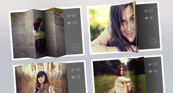
<span data-icon="A">566</span>
<span data-icon="B">124</span>
<a href="http://www.flickr.com/photos/ag2r/5439506585/in/photostream">→</a>
</div>
<img src="images/1.jpg" />
</div>
<div class="view">
<!-- ... -->
</div>
<!-- ... -->
</div>
Each thumbnail goes into a division with another division for the details (view-back). The structure that we want to create for each division with the class view using JavaScript is the following:
每个缩略图分为一个分区,另一个分区用于细节(查看)。 我们要使用JavaScript使用类视图为每个部门创建的结构如下:
<div class="view">

	<div class="view-back">
		<!-- ... -->
	</div>

	<div class="slice s1" style="background-image: url(images/1.jpg); ">
		<span class="overlay"></span>

		<div class="slice s2" style="background-image: url(images/1.jpg); ">
			<span class="overlay"></span>

			<div class="slice s3" style="background-image: url(images/1.jpg); ">
				<span class="overlay"></span>

				<div class="slice s4" style="background-image: url(images/1.jpg); ">
					<span class="overlay"></span>

					<div class="slice s5" style="background-image: url(images/1.jpg); ">
						<span class="overlay"></span>
					</div><!-- /s5 -->

				</div><!-- /s4 -->

			</div><!-- /s3 -->

		</div><!-- /s2 -->

	</div><!-- /s1 -->

</div><!-- /view -->
Each slice will have the respective image as it’s background image and since we have a nested structure, this will allow us to control the effect. Additionally, we’ll add an overlay span that we’ll use to make the effects more realistic.
每个切片将具有各自的图像作为背景图像,并且由于我们具有嵌套结构,因此可以控制效果。 此外,我们将添加一个覆盖范围,以使效果更加逼真。
Our JavaScript function looks as follows:
我们JavaScript函数如下所示:
$.fn.hoverfold = function( args ) {

	this.each( function() {

		$( this ).children( '.view' ).each( function() {

			var $item 	= $( this ),
				img		= $item.children( 'img' ).attr( 'src' ),
				struct	= '<div class="slice s1">';
					struct	+='<div class="slice s2">';
						struct	+='<div class="slice s3">';
							struct	+='<div class="slice s4">';
								struct	+='<div class="slice s5">';
								struct	+='</div>';
							struct	+='</div>';
						struct	+='</div>';
					struct	+='</div>';
				struct	+='</div>';

			var $struct = $( struct );

			$item.find( 'img' ).remove().end().append( $struct ).find( 'div.slice' ).css( 'background-image', 'url(' + img + ')' ).prepend( $( '<span class="overlay" ></span>' ) );

		} );

	});

};
Now we can have a lot of hover fun! Let’s first define some common styles and then we’ll go through the first example.
现在,我们可以获得很多悬停乐趣! 让我们先定义一些常见的样式,然后再看第一个示例。
CSS (The CSS)
Let’s define the style for the view divisions. What’s important here is that we add perspective:
让我们定义视图划分的样式。 这里重要的是我们添加了透视图:
.view {
	width: 316px;
	height: 216px;
	margin: 10px;
	float: left;
	position: relative;
	border: 8px solid #fff;
	box-shadow: 1px 1px 2px rgba(0,0,0,0.05);
	background: #333;
	perspective: 500px;
}
The slices will need some 3D properties and a transition:
切片将需要一些3D属性和过渡:
.view .slice{
	width: 60px;
	height: 100%;
	z-index: 100;
	transform-style: preserve-3d;
	transform-origin: left center;
	transition: transform 150ms ease-in-out;

}
The part of the description that get’s revealed when we push the slices to the side will have the following style:
当我们将切片推到一边时,显示的描述部分将具有以下样式:
.view div.view-back{
	width: 50%;
	height: 100%;
	position: absolute;
	right: 0;
	background: #666;
	z-index: 0;
}
Let’s style the spans and the link:
让我们设置跨度和链接的样式:
.view-back span {
	display: block;
	float: right;
	padding: 5px 20px 5px;
	width: 100%;
	text-align: right;
	font-size: 16px;
	color: rgba(255,255,255,0.6);
}

.view-back span:first-child {
	padding-top: 20px;
}

.view-back a {
	display: bock;
	font-size: 18px;
	color: rgba(255,255,255,0.4);
	position: absolute;
	right: 15px;
	bottom: 15px;
	border: 2px solid rgba(255,255,255,0.3);
	border-radius: 50%;
	width: 30px;
	height: 30px;
	line-height: 22px;
	text-align: center;
	font-weight: 700;
}

.view-back a:hover {
	color: #fff;
	border-color: #fff;
}
For the icon before the spans we’ll use an icon font that we’ve created with Fontello. Since we have added a data-icon attribute to the spans, we can use the pseudo-class :before to display it:
对于跨度之前的图标,我们将使用由Fontello创建的图标字体。 由于我们在跨度中添加了data-icon属性,因此可以使用伪类:before来显示它:
.view-back span[data-icon]:before {
    content: attr(data-icon);
    font-family: 'icons';
    color: #aaa;
	color: rgba(255,255,255,0.2);
	text-shadow: 0 0 1px rgba(255,255,255,0.2);
	padding-right: 5px;
}
All, except the first slice, need to be moved to the right (remember, we have a nested structure):
除第一个切片外,所有其他都需要向右移动(请记住,我们有一个嵌套结构):
.view .s2,
.view .s3,
.view .s4,
.view .s5 {
	transform: translateX(60px);
}
Let’s set the respective background positions of each slice for the background image:
让我们为背景图像设置每个切片的各自背景位置:
.view .s1 {
	background-position: 0px 0px;
}
.view .s2 {
	background-position: -60px 0px;
}
.view .s3 {
	background-position: -120px 0px;
}
.view .s4 {
	background-position: -180px 0px;
}
.view .s5 {
	background-position: -240px 0px;
}
The overlays will initially have an opacity of 0 and we’ll add a transition and change the opacity level on hover:
叠加层的初始不透明度为0,我们将添加一个过渡并在悬停时更改不透明度级别:
.view .overlay {
	width: 60px;
	height: 100%;
	opacity: 0;
	position: absolute;
	transition: opacity 150ms ease-in-out;
}

.view:hover .overlay {
	opacity: 1;
}
Let’s just fix the position and z-index for the image (just so that we don’t see the back part on top and for the fallback). And we’ll also add a transition for browsers that don’t support 3D transforms:
让我们仅固定图像的位置和z-index(只是为了避免在顶部和后退看到后部)。 我们还将为不支持3D转换的浏览器添加一个过渡:
.view img {
	position: absolute;
	z-index: 0;
	transition: left 0.3s ease-in-out;
}
In case we see that a browser does not support all those fancy 3D properties, we’ll simply load an additional stylesheet called fallback.css which will have the following content:
如果我们发现浏览器不支持所有这些精美的3D属性,我们将简单加载一个名为fallback.css的附加样式表,该样式表将包含以下内容:
.view {
	overflow: hidden;
}

.view:hover img {
	left: -85px;
}

.view div.view-back {
	background: #666;
}
This will make the image slide to the left when we hover.
当我们悬停时,这会使图像向左滑动。
Now, let’s take a look at the example!
现在,让我们看一个例子!
例 (Example)
For this example we will want to create a folding effect. For that we’ll adjust the perspective value of the view division and the transition for all the divisions:
对于此示例,我们将要创建折叠效果。 为此,我们将调整视图分区的透视图值和所有分区的过渡:
.view {
	perspective: 1050px;
}

.view div {
	transition: all 0.3s ease-in-out;
}
The second, third, forth and fifth slice will be translated and rotated in 3D, creating the fold effect:
第二,第三,第四和第五个切片将以3D方式平移和旋转,从而产生折叠效果:
.view:hover .s2{
	transform: translate3d(59px,0,0) rotate3d(0,1,0,-45deg);
}
.view:hover .s3,
.view:hover .s5{
	transform: translate3d(59px,0,0) rotate3d(0,1,0,90deg);
}
.view:hover .s4{
	transform: translate3d(59px,0,0) rotate3d(0,1,0,-90deg);
}
Each of these slices will be moved to the left. It should be the value of their widths but we want to avoid showing a little gap, so we use 59px. The second slice will be rotated -45 degrees, making it turn towards the left. The forth slice rotates the other way and the third and fifth will both rotate 90 degrees. Remember, we are in a nested structure. Once we rotate a parent, the children will all be rotated.
这些切片中的每一个都将向左移动。 它应该是它们的宽度值,但我们要避免显示一些间隙,因此我们使用59px。 第二个切片将旋转-45度,使其向左旋转。 第四片以另一种方式旋转,第三片和第五片都将旋转90度。 记住,我们处于嵌套结构中。 一旦我们旋转了父母,所有的孩子都会被旋转。
To make things look a bit more realistic, we’ll add some gradients to the overlays:
为了使外观看起来更逼真,我们将向叠加层添加一些渐变:
.view .s2 > .overlay {
	background: linear-gradient(right, rgba(0,0,0,0.05) 0%,rgba(0,0,0,0) 100%);
}

.view .s3 > .overlay {
	background: linear-gradient(left, rgba(255,255,255,0) 0%, rgba(255, 255, 255, 0.2) 100%);
}

.view .s4 > .overlay {
	background: linear-gradient(right, rgba(0,0,0,0.6) 0%,rgba(0,0,0,0.2) 100%);
}

.view .s5 > .overlay {
	background: linear-gradient(left, rgba(0,0,0,0.8) 0%,rgba(0,0,0,0) 100%);
}
The detail part of the thumbnail that get’s revealed when we hover, will also have a background gradient, since we want to simulate a shadow falling on it:
当我们将鼠标悬停时显示的缩略图的细节部分也将具有背景渐变,因为我们要模拟掉落在其上的阴影:
.view div.view-back{
	background: linear-gradient(left, #0a0a0a 0%,#666666 100%);
}
And that’s it! Check out the other examples and go nuts! There are many different possibilities for fooling around with this. I hope you find it inspiring!
就是这样! 看看其他示例并发疯! 鬼混有很多不同的可能性。 希望您能从中得到启发!
Check out Richard Bennett’s version that works on a click/touch event.
查看可用于单击/触摸事件的Richard Bennett的版本。
翻译自: https://tympanus.net/codrops/2012/06/18/3d-thumbnail-hover-effects/
鼠标悬停大小缩略图片切换


 73
73

 被折叠的 条评论
为什么被折叠?
被折叠的 条评论
为什么被折叠?
 到【灌水乐园】发言


