


餐厅练习
Applying CSS 3D transforms to components can bring some more realism to normally flat web elements. We’ve experimented with some simple concepts for restaurant websites and came up with a 3D folded menu (a real menu, not a “web” menu). The result is a restaurant website template where the menu will open by unfolding. Clicking the linked items will reveal a modal overlay which contains some more info.
将CSS 3D转换应用于组件可以为通常平坦的Web元素带来更多真实感。 我们已经为餐厅网站尝试了一些简单的概念,并提出了3D折叠菜单(实际菜单,而不是“网络”菜单)。 结果是餐厅网站模板,其中菜单将通过展开打开。 单击链接的项目将显示一个模式叠加层,其中包含一些更多信息。
Since this “flyer” structure requires a decent amount of space, and, although we will make this responsive, we’ll add a media query for smaller screens where everything will fall back to a simplified stacked structure. The same will be applied for browsers that don’t support 3D transforms.
由于这种“传单”结构需要相当大的空间,尽管我们会对此做出响应,但我们将为较小的屏幕添加媒体查询,在此屏幕上所有内容都将退回到简化的堆叠结构。 不支持3D转换的浏览器也将采用同样的方法。
The thumbnails and delicious recipes are by Michael Natkin from herbivoracious.com (all the ones that have a link).
缩略图和美味的食谱是由迈克尔·纳金从herbivoracious.com (所有有联系的那些)。
Alright, so let’s get started!
好吧,让我们开始吧!
The CSS will not contain any vendor prefixes, but you will find them in the files.
CSS将不包含任何供应商前缀,但是您可以在文件中找到它们。
标记 (The Markup)
Our structure will consist of a main container with the class “rm-container” and we’ll have a wrapper inside. The wrapper will contain the three panels. Initially, we only want to see the cover of the folded menu; that is the division with the class “rm-cover”. The last panel is the one with the class “rm-right”. The middle panel is the one we see in the middle when we open the menu:
我们的结构将包含一个主容器,其类别为“ rm-container”,并且内部将包含一个包装器。 包装器将包含三个面板。 最初,我们只想看折叠菜单的封面; 这是“ rm-cover”类的划分。 最后一个面板是“ rm-right”类的面板。 中间面板是打开菜单时我们在中间看到的面板:
<div id="rm-container" class="rm-container">

	<div class="rm-wrapper">
		<div class="rm-cover"></div>
		<div class="rm-middle"></div>
		<div class="rm-right"></div>
	</div><!-- /rm-wrapper -->

</div><!-- /rm-container -->
Inside of the rm-cover and the rm-right division, we will have a front- and a backface:
在rm-cover和rm-right分区的内部,我们将有一个正面和一个背面:
<div class="rm-front">

	<div class="rm-content">
		<!-- Some content -->
	</div><!-- /rm-content -->

</div><!-- /rm-front -->

<div class="rm-back">

	<div class="rm-content">
		<!-- Some content -->
	</div><!-- /rm-content -->

	<div class="rm-overlay"></div>

</div><!-- /rm-back -->
We’ll also add an element for an overlay gradient that will give the menu parts a bit more realism. Note that the front will be empty in the last element.
我们还将为叠加渐变添加一个元素,这将使菜单部分更具真实感。 请注意,前面的最后一个元素将为空。
The middle part of the menu will simply have another wrapper inside, no front or back part:
菜单的中间部分将只是内部有另一个包装器,没有前部或后部:
<div class="rm-inner">

	<div class="rm-content">
		<!-- Some content -->
	</div><!-- /rm-content -->

	<div class="rm-overlay"></div>

</div><!-- /rm-inner -->
We will never see the back part of this part of the menu, so we won’t need that structure.
我们将永远不会看到菜单这部分的背面,因此我们不需要那种结构。
The content will consist of some text elements, like definition lists for the dishes and headlines:
内容将包含一些文本元素,例如菜式和标题的定义列表:
<div class="rm-content">

	<h4>Appetizers</h4>

	<dl>
		<dt>Bella's Artichokes</dt>
		<dd>Roasted artichokes with chipotle aioli and cream cheese</dd>

		<dt><a href="http://herbivoracious.com/2011/11/crostini-with-young-pecorino-grilled-figs-and-arugula-mint-pesto-recipe.html" class="rm-viewdetails" data-thumb="images/1.jpg">Green Love Crostini</a></dt>
		<dd>Crostini with young pecorino, grilled figs and arugula & mint pesto</dd>

		<dt>Focaccia di Carciofi</dt>
		<dd>Artichoke focaccia with fresh thyme</dd>

		<!-- ... -->
	</dl>

	<h4>Salads & More</h4>

	<dl>
		<!-- ... -->
	</dl>

</div><!-- /rm-content -->
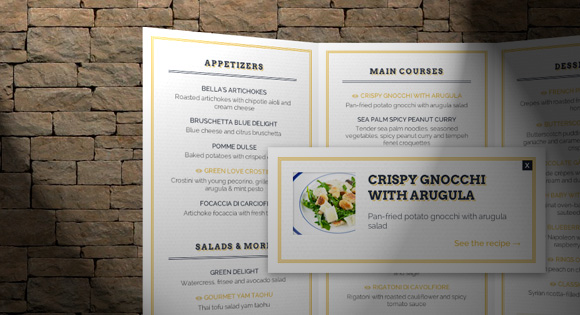
Notice the anchor with the class “rm-viewdetails” and the data attribute “data-thumb”. We will use this as the content for a modal overlay box that will appear when clicking on the link:
请注意具有“ rm-viewdetails”类和数据属性“ data-thumb”的锚点。 我们将其用作模式链接框的内容,该框将在单击链接时出现:
<div class="rm-modal">
	<div style="background-image: url(images/1.jpg)" class="rm-thumb"></div>
	<h5>Green Love Crostini</h5>
	<p>Crostini with young pecorino, grilled figs and arugula & mint pesto</p>
	<a href="http://herbivoracious.com/2011/11/crostini-with-young-pecorino-grilled-figs-and-arugula-mint-pesto-recipe.html">See the recipe</a>
	<span class="rm-close-modal">x</span>
</div>
It will contain the same headline and description that we get from the followed dd element (definition description), the thumbnail that we get from the data-attribute and the link.
它将包含从后面的dd元素获得的相同标题和描述(定义描述),从data-attribute和链接获得的缩略图。
And that’s the HTML, now, let’s take a look at the style.
这就是HTML,现在让我们看一下样式。
Note that we won’t go into the styling of the text elements or inner content parts. Instead we will focus on the 3D structure, transition classes and media queries.
请注意,我们将不涉及文本元素或内部内容部分的样式。 相反,我们将专注于3D结构,过渡类和媒体查询。

CSS (The CSS)
We want to make the whole thing fluid, so we will give the main container a percentage width, and, since we want some 3D awesomeness, some perspective:
我们要使整个事物变得流畅,因此我们将给主容器指定一个百分比宽度,并且由于我们需要一些3D效果,因此需要一些透视图:
.rm-container {
	width: 33%;
	height: 700px;
	max-width: 370px;
	margin: 0 auto 40px auto;
	position: relative;
	perspective: 1600px;
	color: #2a323f;
}
The wrapper and its children divisions (the cover, middle part and right part) will all have the full width and height and we’ll position them absolutely:
包装器及其子部分(封面,中间部分和右侧部分)将具有完整的宽度和高度,我们将对其进行绝对定位:
.rm-wrapper,
.rm-wrapper > div {
	width: 100%;
	height: 100%;
	left: 0;
	top: 0;
	position: absolute;
	text-align: center;
	transform-style: preserve-3d;
}
Since we will be working in 3D perspective, we want the transform style of these elements to be “preserve-3d”.
由于我们将以3D透视图进行工作,因此我们希望这些元素的变换样式为“ preserve-3d”。
The cover needs a higher z-index than all the other parts and we’ll set the transform origin to be on the left edge (left center). The transition delay is for when we close the menu. The transition to the open state will contain another value, but let’s look at that a bit later:
封面需要的z-index值高于其他所有部分,我们将转换原点设置在左边缘(左中心)。 转换延迟用于关闭菜单时。 到打开状态的转换将包含另一个值,但让我们稍后再看:
.rm-wrapper .rm-cover {
	z-index: 100;
	transform-origin: 0% 50%;
	transition-delay: 0.2s;
}
The middle part will have the lowest z-index of all three parts and we’ll add a subtle box shadow:
中间部分的z-index值在所有三个部分中均最低,我们将添加一个细微的框阴影:
.rm-wrapper .rm-middle {
	z-index: 50;
	box-shadow: 0 4px 10px rgba(0,0,0,0.7);
}
The right most part will have a z-index that is higher than the middle part one but lower than the cover one. The transform origin will be on the right edge (right center) and there will be no transition delay when we close the menu:
最右边的部分的z索引高于中间部分,但低于封面1。 转换原点将位于右边缘(右中心),并且当我们关闭菜单时将没有过渡延迟:
.rm-wrapper .rm-right {
	z-index: 60;
	transform-origin: 100% 50%;
	transition-delay: 0s;
}
The inner divisions which are the ones with the classes “rm-front”, “rm-back” and “rm-inner” will have a paper texture as background and we’ll add a inset box shadow that will simulate a multi-line decorative border:
内部划分为“ rm-front”,“ rm-back”和“ rm-inner”类,将纸张纹理作为背景,我们将添加一个内嵌框阴影以模拟多行装饰边框:
.rm-wrapper > div > div {
	background: #fff url(../images/white_paperboard.jpg);
	width: 100%;
	height: 100%;
	position: absolute;
	padding: 30px;
	box-shadow:
		inset 0 0 0 16px #fff,
		inset 0 0 0 17px #e6b741,
		inset 0 0 0 18px #fff,
		inset 0 0 0 19px #e6b741,
		inset 0 0 0 20px #fff,
		inset 0 0 0 21px #e6b741;
}
Now, let’s add the important 3D properties. The front and the back face need backface-visibility set to hidden:
现在,让我们添加重要的3D属性。 正面和背面需要将背面可见性设置为隐藏:
.rm-container .rm-front,
.rm-container .rm-back {
	backface-visibility: hidden;
}
Let’s rotate the backfaces so that they are behind the front parts:
让我们旋转背面,使其位于前部后面:
.rm-container .rm-back {
	transform: rotateY(-180deg);
}
The overlay will generally be an almost transparent gradient from light to a bit darker:
叠加层通常是从光到暗一点的几乎透明的渐变:
.rm-overlay {
	position: absolute;
	width: 100%;
	height: 100%;
	top: 0;
	left: 0;
	pointer-events: none;
	background: linear-gradient(to right, rgba(0,0,0,0) 0%, rgba(0,0,0,0.05) 100%);
}
For the middle overlay we will turn the gradient to the other side:
对于中间的叠加层,我们将渐变转到另一侧:
.rm-middle .rm-overlay {
	background: linear-gradient(to right, rgba(0,0,0,0) 64%, rgba(0,0,0,0.05) 100%);
}
Let’s add some padding the the content divisions:
让我们在内容分区中添加一些填充:
.rm-content {
	padding: 20px;
}
The modal layer will be invisible: we’ll set the opacity to 0, the pointer-event to none and we’ll translate it on the Z-axis:
模态层将不可见:我们将不透明度设置为0,将指针事件设置为none,然后将其在Z轴上平移:
.rm-modal {
	position: absolute;
	z-index: 10000;
	width: 120%;
	margin-left: -10%;
	top: 50%;
	padding: 40px;
	background: #fff url(../images/white_paperboard.jpg);
	box-shadow:
		inset 0 0 0 16px #fff,
		inset 0 0 0 17px #e6b741,
		inset 0 0 0 18px #fff,
		inset 0 0 0 19px #e6b741,
		inset 0 0 0 20px #fff,
		inset 0 0 0 21px #e6b741,
		0 4px 20px rgba(0,0,0,0.4);
	opacity: 0;
	pointer-events: none;
	transform: translateZ(1000px);
}
The idea is to reveal the modal when we click on one of the links on the menu. We’ll scale the menu down and make the modal appear from “above”. This concept is inspired by Hakim El Hattab’s modal concept Avgrund.
这个想法是当我们单击菜单上的链接之一时显示模态。 我们将菜单缩小,并使模态从“上方”出现。 这个概念受到Hakim El Hattab的情态概念Avgrund的启发。
Let’s add some transitions and define some classes for opening the menu.
让我们添加一些转换并定义一些类来打开菜单。
First, we’ll give a transition to the wrapper (for scaling it when opening the modal) and to the children of the wrapper, i.e. our three menu parts (for animating the “opening”/rotation):
首先,我们将给包装器(在打开模态时缩放它)和包装器的子项(即,我们的三个菜单部分(用于动画“打开” /旋转)动画)过渡:
The modal will also have a transition for the transformation (to scale down) and its opacity:
模态还将具有用于转换(按比例缩小)及其不透明度的过渡:
.rm-modal {
	transition:
		transform 0.6s ease-in-out,
		opacity 0.6s ease-in-out;
}
The idea is to add a class called “rm-open” which will trigger the menu to unfold. This class will be added with JavaScript when we click on the “View the menu” link.
想法是添加一个称为“ rm-open”的类,该类将触发菜单展开。 当我们单击“查看菜单”链接时,将使用JavaScript添加此类。
When adding the class, we will define what will happen to all the elements when we open the menu.
添加类时,我们将定义打开菜单时所有元素的作用。
The children of the wrapper will all get a box shadow:
包装器的子级都将获得一个框阴影:
.rm-container.rm-open .rm-wrapper > div {
	box-shadow: 0 4px 5px -3px rgba(0,0,0,0.6);
}
The cover will rotate (without any delay) -180 degrees on the Y-axis. Since we defined the transform origin to be on the left center, it will open to the left:
盖板将在Y轴上旋转(无任何延迟)-180度。 由于我们将变换原点定义为位于左中心,因此它将向左打开:
.rm-container.rm-open .rm-cover {
	transform: rotateY(-180deg);
	transition-delay: 0s;
}
The right part will rotate 180 degrees, but here we will add a transition delay of 0.2s because we want the cover to open a bit first:
右侧部分将旋转180度,但是在这里我们将添加0.2s的过渡延迟,因为我们希望盖子先打开一点:
.rm-container.rm-open .rm-right {
	transform: rotateY(180deg);
	transition-delay: 0.2s;
}
When we click on one of the menu item that is an anchor, we will add another class called “rm-in” to the container and move the wrapper down on the Z-axis:
当我们单击菜单项中的一个作为锚点时,我们将向容器添加另一个名为“ rm-in”的类,并在Z轴上向下移动包装器:
.rm-container.rm-in .rm-wrapper {
	transform: translateZ(-500px);
}
The cover and the right part will be rotated a bit more to the inside:
盖子和右侧部分将向内旋转一些:
.rm-container.rm-in .rm-cover {
	transform: rotateY(-150deg);
}

.rm-container.rm-in .rm-right {
	transform: rotateY(150deg);
}
We need to set the transition delay to 0 seconds for this case:
在这种情况下,我们需要将转换延迟设置为0秒:
.rm-container.rm-in .rm-cover,
.rm-container.rm-in .rm-right,
.rm-container.rm-nodelay .rm-right {
	transition-delay: 0s;
}
The class “rm-nodelay” is an extra class that we’ll need for the right menu part when we close the modal. Remember, it had a transition delay for when we open the menu.
“ rm-nodelay”类是一个额外的类,当我们关闭模态时,我们将在右侧菜单部分中使用该类。 请记住,当我们打开菜单时会有一个过渡延迟。
The modal will appear by translating it to 0px on the Z-axis and increasing the opacity to 1:
通过将其模态转换为Z轴上的0px并将不透明度增加到1来显示模态:
.rm-container.rm-in .rm-modal {
	transform: translateZ(0px);
	opacity: 1;
	pointer-events: auto;
}
Let’s define some media queries for smaller screens and devices. The first media query will simply resize the wrapper:
让我们为较小的屏幕和设备定义一些媒体查询。 第一个媒体查询将简单地调整包装器的大小:
@media screen and (max-width: 1110px) {
	.rm-container {
		height: 800px;
	}
}
Since we made the wrapper fluid, it will need a larger height in order to contain the text.
由于我们使包装纸具有流动性,因此需要更大的高度才能容纳文本。
From 960 pixels on, we no longer want to show the menu as a folded flyer but as normal, scrollable content. For that, we’ll simply set the height of the wrapper to auto, give it 100% of width and define a maximum width:
从960像素开始,我们不再希望将菜单显示为折叠的传单,而是显示为正常的可滚动内容。 为此,我们只需将包装器的高度设置为auto,为其设置100%的宽度并定义最大宽度:
@media screen and (max-width: 960px) {

	.rm-container {
		width: 100%;
		height: auto;
		max-width: 460px;
	}
All the inner divisions will no longer be absolute, but relative and we’ll give them 100% of width and set the height to auto:
所有的内部划分将不再是绝对的,而是相对的,我们将为其赋予100%的宽度并将高度设置为auto:
	.rm-wrapper,
	.rm-wrapper > div,
	.rm-wrapper > div > div {
		position: relative;
		width: 100%;
		height: auto;
	}
The content divisions will need some margin:
内容划分将需要一些余量:
	.rm-wrapper > div > div{
		margin-bottom: 10px;
		box-shadow:
			inset 0 0 0 16px #fff,
			inset 0 0 0 17px #e6b741,
			inset 0 0 0 18px #fff,
			inset 0 0 0 19px #e6b741,
			inset 0 0 0 20px #fff,
			inset 0 0 0 21px #e6b741,
			0 3px 5px rgba(0,0,0,0.2);
	}
Let’s remove the rotations:
让我们删除旋转:
	.rm-container .rm-back,
	.rm-container.rm-open .rm-cover,
	.rm-container.rm-open .rm-right {
		transform: rotateY(0deg);
	}
We don’t need the overlays any more:
我们不再需要叠加层:
	.rm-overlay, .rm-middle .rm-overlay {
		display: none;
	}
And we set the position of the modal to fixed, so that it sticks on top when we scroll:
并且我们将模态的位置设置为fixed,以便在滚动时它位于顶部:
	.rm-container .rm-modal {
		position: fixed;
		width: 80%;
		top: 100px;
		left: 50%;
		margin: 0 0 0 -40%;
		transform: translateZ(0px);
		transition: opacity 0.6s ease-in-out 0s;
	}
When we click on a menu item link and the modal appears we won’t rotate anything any more:
当我们单击菜单项链接并且出现模态时,我们将不再旋转任何东西:
	.rm-container.rm-in .rm-cover,
	.rm-container.rm-in .rm-right,
	.rm-container.rm-in .rm-wrapper {
		transform: rotateY(0deg);
		transition-delay: 0s;
	}
}
And that’s all the important style. For browsers that don’t support 3D transforms, we will use almost the same styling like we do for this last media query. Since we use Modernizr, we’ll just add those classes again, preceded by .no-csstransforms3d (which will be added to the body).
这就是所有重要的样式。 对于不支持3D转换的浏览器,我们将使用与上一个媒体查询几乎相同的样式。 由于我们使用Modernizr ,因此我们将再次添加这些类,然后添加.no-csstransforms3d (将添加到正文中)。
Now, let’s add some lines of JavaScript.
现在,让我们添加一些JavaScript代码。
JavaScript (The JavaScript)
We will start by caching some elements:
我们将从缓存一些元素开始:
	// main container
var $container = $( '#rm-container' ),
	// the cover, middle and right panels
	$cover = $container.find( 'div.rm-cover' ),
	$middle = $container.find( 'div.rm-middle' ),
	$right = $container.find( 'div.rm-right' ),
	// open and close elements
	$open = $cover.find('a.rm-button-open'),
	$close = $right.find('span.rm-close'),
	// the links for each recipe (photo and details)
	$details = $container.find( 'a.rm-viewdetails' ),
The events for opening/closing the menu and also for showing each item’s details (modal) are initialized:
初始化打开/关闭菜单以及显示每个项目的详细信息(模式)的事件:
init = function() {

		initEvents();

	},
initEvents = function() {

	$open.on( 'click', function( event ) {

		openMenu();
		return false;

	} );

	$close.on( 'click', function( event ) {

		closeMenu();
		return false;

	} );

	$details.on( 'click', function( event ) {

		$container.removeClass( 'rm-in' ).children( 'div.rm-modal' ).remove();
		viewDetails( $( this ) );
		return false;

	} );

},
To open/close the menu we will be adding/removing the class ‘rm-open’ from the $container. Remember, this is the class where the transitions are defined.
要打开/关闭菜单,我们将在$ container中添加/删除“ rm-open”类。 请记住,这是定义过渡的类。
Note that on close, we are also removing the classes ‘rm-nodelay’ and ‘rm-in’. These are classes that are added if we click to see the menu item’s details.
请注意,关闭时,我们还将删除“ rm-nodelay”和“ rm-in”类。 如果我们单击以查看菜单项的详细信息,则会添加这些类。
openMenu = function() {

	$container.addClass( 'rm-open' );

},
closeMenu = function() {

	$container.removeClass( 'rm-open rm-nodelay rm-in' );

},
Finally, if we click to see an item’s details, a modal box will be shown with the image and the text for that item. We translate the main container on the Z-axis (and adjust the top margin in order to center it), and slightly rotate the left and right panels:
最后,如果我们单击以查看项目的详细信息,将显示一个模式框,其中包含该项目的图像和文本。 我们在Z轴上平移主容器(并调整顶部边距以使其居中),并稍微旋转左右面板:
viewDetails = function( recipe ) {
var title = recipe.text(),
img = recipe.data( 'thumb' ),
description = recipe.parent().next().text(),
url = recipe.attr( 'href' );
var $modal = $( '
' );
$modal.appendTo( $container );
var h = $modal.outerHeight( true );
$modal.css( 'margin-top', -h / 2 );
setTimeout( function() {
$container.addClass( 'rm-in rm-nodelay' );
$modal.find( 'span.rm-close-modal' ).on( 'click', function() {
$container.removeClass( 'rm-in' );
} );
}, 0 );
};
And that’s it! I hope you enjoyed this tutorial and find it useful!
就是这样! 我希望您喜欢本教程并发现它有用!
翻译自: https://tympanus.net/codrops/2012/09/25/3d-restaurant-menu-concept/
餐厅练习


 扫一扫
扫一扫
 2万+
2万+

 被折叠的 条评论
为什么被折叠?
被折叠的 条评论
为什么被折叠?
 到【灌水乐园】发言


