


3d div带阴影
When working with 3D transformed elements, you might notice that they don’t have any shading and appear to be very flat. In real life, objects block light and have shadows. Surfaces can be matte, reflective, and everything in between. Indeed, we can do better.
使用3D变换的元素时,您可能会注意到它们没有任何阴影并且看起来非常平坦。 在现实生活中,物体会阻挡光线并产生阴影。 表面可以是粗糙的,反射的,并且介于两者之间。 确实,我们可以做得更好。
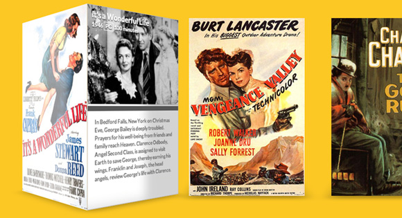
If you need to cast light onto complicated geometry, there are options available such as Photon, but they’re very processor intensive. In this article, I’ll show you a solution that can be applied to objects that only have a few faces. Our example will be a 3D movie gallery with glossy posters and, when the posters are rotated, the sides will contain matte information cards with meta data about the film.
如果您需要将光线投射到复杂的几何体上,则可以使用诸如Photon之类的选项,但是它们占用大量的处理器资源。 在本文中,我将向您展示一种可以应用于只有几个面Kong的对象的解决方案。 我们的示例将是一个带有光泽海报的3D电影画廊,当海报旋转时,侧面将包含带有有关该电影的元数据的无光泽信息卡。
标记 (The Markup)
Our page is going to have a few different parts. First, we need a simple wrapper to center everything on the page. Next, we’ll create an unordered list that will contain all of our 3D posters. We’ll add the class “stage” to the ul and “scene” to each li. In our CSS, the stage element will act as a container for the scene elements, which will be their own 3D environment with the perspective property applied.
我们的页面将包含几个不同的部分。 首先,我们需要一个简单的包装器来将所有内容置于页面中心。 接下来,我们将创建一个无序列表,其中将包含所有3D海报。 我们将在ul添加类“ stage”,在每个li添加类“ scene”。 在我们CSS中,舞台元素将充当场景元素的容器,场景元素将是它们自己的3D环境(应用了perspective属性)。
<div class="wrapper">
  <ul class="stage">
    <li class="scene"></li>
    <li class="scene"></li>
    <li class="scene"></li>
  </ul>
</div>
For each li, we need to add quite a bit of markup. This will contain our movie poster as well as all the metadata about each movie. In a more robust movie library, this could be done dynamically with some backend code. We’ll keep things simple for the purposes of this example.
对于每个li ,我们需要添加很多标记。 这将包含我们的电影海报以及每部电影的所有元数据。 在更强大的电影库中,可以使用一些后端代码动态地完成此操作。 在此示例中,我们将使事情保持简单。
<li class="scene">
  <div class="movie">
    <div class="poster"></div>
    <div class="info">
      <header>
        <h1>It's a Wonderful Life</h1>
        <span class="year">1946</span>
        <span class="rating">PG</span>
        <span class="duration">130 minutes</span>
      </header>
      <p>
        In Bedford Falls, New York on Christmas Eve, George Bailey is deeply troubled. Prayers for his well-being from friends and family reach Heaven. Clarence Odbody, Angel Second Class, is assigned to visit Earth to save George, thereby earning his wings. Franklin and Joseph, the head angels, review George's life with Clarence.
      </p>
    </div>
  </div>
</li>
Our library will contain two more movies in addition to this one. The metadata is a bit lengthy and there are also a few image assets you’ll need, but everything is included in the code download. Let’s get to styling.
除了这部电影,我们的图书馆还将包含两部电影。 元数据有点长,您还需要一些图像资源,但是所有内容都包含在代码下载中。 让我们开始造型吧。

CSS (The CSS)
Note that the CSS will not contain any vendor prefixes, but you will find them in the files.
请注意,CSS将不包含任何供应商前缀,但是您可以在文件中找到它们。
First, let’s get some of the basics out of the way. We need to center our wrapper and then remove the default list styling from the stage class.
首先,让我们了解一些基础知识。 我们需要将wrapper居中wrapper ,然后从stage类中删除默认的列表样式。
.wrapper {
	margin: 0 auto 100px auto;
	max-width: 960px;
}

.stage {
	list-style: none;
	padding: 0;
}
Next, we want to style the scene class with an explicit width and height (the same as our posters). If you’d like to provide additional detail needed for high resolution displays then you could use images that are twice as large.
接下来,我们要为场景类设置显式的宽度和高度(与海报相同)。 如果您想提供高分辨率显示所需的其他详细信息,则可以使用两倍大的图像。
The margin between each scene will provide sufficient spacing so that they don’t overlap each other. Then we’ll float all of the list items to the left so that they line up next to one another in a nice gallery. This is similar to how most top-level website navigation is created.
每个场景之间的margin将提供足够的间距,以使它们彼此不重叠。 然后,我们将所有列表项float到左侧,以便它们在一个不错的画廊中并排排列。 这类似于创建大多数顶级网站导航的方式。
Finally, we’ll add the perspective property. This will allow us to create a 3D scene in the nested elements, and the value of 1000px will give the objects a decent amount of depth. A lower value would be a bit too dramatic, but you can experiment with this and see what works best for you.
最后,我们将添加perspective属性。 这将使我们能够在嵌套元素中创建3D场景,并且1000px的值将为对象提供适当的深度。 较低的值可能会有些戏剧性,但是您可以对此进行试验并查看最适合您的方法。
.scene {
	width: 260px;
	height: 400px;
	margin: 30px;
	float: left;
	perspective: 1000px;
}
Similar .scene, we also need to set an explicit width and height on .movie. This will help each poster look correct when it’s being transformed. Next, we’ll set the transform-style to preserve-3d so that we can transform elements in 3D space. Finally, we’ll translate it along the Z plane by -130 pixels. This will give the posters a little bit more room to move around and really pop towards the viewer.
与.scene类似,我们还需要在.movie上设置明确的宽度和高度。 这将有助于在转换每个海报时使其看起来正确。 接下来,我们将转换样式设置为3-d,以便我们可以在3D空间中转换元素。 最后,我们将其沿Z平面平移-130像素。 这将使海报有更多的移动空间,并真正向观看者弹出。
.movie {
	width: 260px;
	height: 400px;
	transform-style: preserve-3d;
	transform: translateZ(-130px);
	transition: transform 350ms;
}
Here’s where the movement happens. We’ll apply a transition to the .movie class. The transition timing is set to a rapid 350ms, but if you’d like a more dramatic effect, you could slow it down.
这是运动发生的地方。 我们将对.movie类应用过渡。 过渡时间设置为快速350ms,但是如果您想要更戏剧性的效果,则可以放慢它。
Then we’ll transform each .movie on :hover. This will rotate the 3D poster along the Y axis and then move it towards the screen along the Z plane. You could rotate the poster by a full 90 degrees, but I prefer to leave it slightly offset to maintain the 3D effect while hovered.
然后,我们将每个.movie转换为:hover 。 这将使3D海报沿Y轴旋转,然后将其沿Z平面移向屏幕。 您可以将海报旋转完整的90度,但我希望将其稍微偏移以将鼠标悬停时保持3D效果。
.movie:hover {
	transform: rotateY(-78deg) translateZ(20px);
}
Observant coders will notice that, while we have translated the scene, we never actually rotated any elements that would give semblance of geometry and build an object. Let’s create each 3D poster now. Each .poster and .info card needs to be positioned absolutely, otherwise they’ll push one another out of the way. We don’t want that, because we’re going to position them using transforms. Next, we need to set an explicit dimensions on both of the classes so that each of the two sides is exactly the same.
细心的编码人员会注意到,虽然我们已经翻译了场景,但实际上我们从未旋转过任何会产生几何外观并构建对象的元素。 现在就创建每个3D海报。 每个.poster和.info卡都必须绝对放置,否则它们将相互推开。 我们不想要那样,因为我们将使用转换来定位它们。 接下来,我们需要在两个类上都设置一个明确的尺寸,以使两个面中的每一个都完全相同。
.movie .poster,
.movie .info {
  position: absolute;
  width: 260px;
  height: 400px;
  background-color: #fff;
  backface-visibility: hidden;
}
With the geometry of our posters ready, we can transform them into place. The .poster just needs to be moved 130px along the Z plane (because remember, we moved the .movie back by this amount). The background size has been set to cover so that when we apply our poster backgrounds, they’ll fill the geometry. They should anyway since they’re sized correctly, so this is really just a precautionary measure.
准备好海报的几何形状后,我们可以将其转换为适当的位置。 .poster只需要沿Z平面移动130像素(因为请记住,我们将.movie移了这个数量)。 背景尺寸已设置为可覆盖,因此当我们应用海报背景时,它们将填充几何图形。 无论如何,它们都应该正确设置尺寸,因此,这实际上只是一种预防措施。
The .info needs to be translated by the same amount as the .poster, but it also needs to be rotated. We want to form a square box, so we’ll rotate it 90 degrees. I’ve added some styling after the transformation, but this is mostly just for aesthetic reasons.
.info翻译量与.poster翻译量相同,但也需要旋转。 我们要形成一个方形框,因此我们将其旋转90度。 转换后,我添加了一些样式,但这主要是出于美学原因。
.movie .poster  {
  transform: translateZ(130px);
  background-size: cover;
  background-repeat: no-repeat;
}

.movie .info {
  transform: rotateY(90deg) translateZ(130px);
  border: 1px solid #B8B5B5;
  font-size: 0.75em;
}
We’ll use the pseudo-element ::after to create another face that will have a subtle box shadow beneath the movie box:
我们将使用伪元素::after来创建另一个在影片框下方具有微妙框阴影的面:
.movie::after {
  content: '';
  width: 260px;
  height: 260px;
  position: absolute;
  bottom: 0;
  box-shadow: 0 30px 50px rgba(0,0,0,0.3);
  transform-origin: 100% 100%;
  transform: rotateX(90deg) translateY(130px);
  transition: box-shadow 350ms;
}

.movie:hover::after {
  box-shadow: 20px -5px 50px rgba(0,0,0,0.3);
}
Further down in the CSS, we style the metadata contained inside the .info class. None of this is particularly relevant to this demo, as it’s mostly just formatting some text and imagery. The real magic happens later on.
在CSS中,我们对.info类中包含的元数据进行样式设置。 这些都与该演示没有特别关系,因为它只是格式化某些文本和图像。 真正的魔力稍后发生。
.info header {
  color: #FFF;
  padding: 7px 10px;
  font-weight: bold;
  height: 195px;
  background-size: contain;
  background-repeat: no-repeat;
  text-shadow: 0px 1px 1px rgba(0,0,0,1);
}

.info header h1 {
  margin: 0 0 2px;
  font-size: 1.4em;
}

.info header .rating {
  border: 1px solid #FFF;
  padding: 0px 3px;
}

.info p {
  padding: 1.2em 1.4em;
  margin: 2px 0 0;
  font-weight: 700;
  color: #666;
  line-height: 1.4em;
  border-top: 10px solid #555;
}
Here’s where we create our pseudo-lighting using the box-shadow property. For the .poster class, we add an inset box shadow with an X and Y offset of 0px. The blur radius will be set to 40px and the shadow is set to rgba(255,255,255,0) (which is white “shadow” set to 100% transparency). Remember, there’s a transition applied to all the children of .movie, so if we set a starting state for the shadow, we can then animate it using a :hover state.
在这里,我们使用box-shadow属性创建伪照明。 对于.poster类,我们添加一个X和Y偏移量为0px的插入框阴影。 模糊半径将设置为40px ,阴影设置为rgba(255,255,255,0) (白色的“阴影”设置为100%透明度)。 请记住,有一个过渡应用于.movie所有子级,因此,如果我们为阴影设置了起始状态,则可以使用:hover状态为其设置动画。
If we :hover over the .movie, it will reset the values of the box-shadow for the .poster and animate them with a transition. In this new state, the poster is still inset, but this time it has an X offset of 300px and an opacity of 0.8 for the white color. This will effectively move the box-shadow over top the poster with some fuzziness along the edge. The transparency will help to gel the shadow with the poster image, which will make the poster look like it has a glossy finish.
如果我们将:hover在.movie ,它将为.poster重置box-shadow的值,并为它们设置过渡动画。 在这种新状态下,海报仍处于插入状态,但是这次它的X偏移为300px,白色的不透明度为0.8。 这样可以有效地将盒子阴影移到海报的顶部,并使边缘模糊不清。 透明性将有助于使阴影与海报图像相融合,从而使海报看起来像具有光泽效果。
.movie .poster,
.movie .info,
.movie .info header {
  transition: box-shadow 350ms;
}

.movie .poster {
  box-shadow: inset 0px 0px 40px rgba(255,255,255,0);
}

.movie:hover .poster {
  box-shadow: inset 300px 0px 40px rgba(255,255,255,0.8);
}
Just like for the poster, we also want to apply a shadow to the other side of the box. For the .info panel, we want a dark shadow to disappear as the element is rotating forward and then reappear when the paper texture recedes back into the gap between each 3D poster. On our page, with the glossy poster on the left and the shadow on the right, it will make it appear as though there’s a light source coming from the left side of the page.
就像海报一样,我们也想在盒子的另一侧涂上阴影。 对于.info面板,我们希望在元素向前旋转时消失一个Undertow,然后在纸张纹理退回到每个3D海报之间的间隙时重新出现。 在我们的页面上,左边有光泽的海报,右边是阴影,它将看起来好像光源是从页面的左侧发出的。
.movie .info,
.movie .info header {
  box-shadow: inset -300px 0px 40px rgba(0,0,0,0.5);
}

.movie:hover .info,
.movie:hover .info header {
  box-shadow: inset 0px 0px 40px rgba(0,0,0,0);
}
Last but not least, we need to add the poster images and still preview images to each movie. I’ve done this using the :nth-child pseudo class, but again, this would probably be done elsewhere in a dynamic website.
最后但并非最不重要的一点是,我们需要向每个电影添加海报图像并仍然预览图像。 我已经使用:nth-child伪类完成了此操作,但是同样,这可能会在动态网站的其他位置完成。
.scene:nth-child(1) .movie .poster {
  background-image: url(../img/poster01.jpg);
}

.scene:nth-child(2) .poster {
  background-image: url(../img/poster02.jpg);
}

.scene:nth-child(3) .poster {
  background-image: url(../img/poster03.jpg);
}

.scene:nth-child(1) .info header {
  background-image: url(../img/still01.jpg);
}

.scene:nth-child(2) .info header {
  background-image: url(../img/still02.jpg);
}

.scene:nth-child(3) .info header {
  background-image: url(../img/still03.jpg);
}
You’ll notice that we’ve used Modernizr in the demo to detect support for 3D transforms and provide a simple fallback for browsers that don’t support it.
您会注意到,我们在演示中使用了Modernizr来检测对3D变换的支持,并为不支持3D变换的浏览器提供简单的备用。
That’s it! As I suggested in the intro, this technique can be applied to simple geometry. Some of you may be wondering why I didn’t use a gradient to create a more controlled shadow over top the poster images. At the time of this article, transitions cannot be applied to gradients, so while this might work for static geometry, the illusion would be broken as soon as the element is animated.
而已! 正如我在简介中所建议的那样,该技术可以应用于简单的几何体。 你们中有些人可能想知道为什么我不使用渐变在海报图像上方创建更可控的阴影。 在撰写本文时,过渡不能应用于渐变,因此虽然这可能适用于静态几何,但是一旦为元素设置动画,幻觉就会被打破。
If you have any questions, comments, or improvements on this technique, I’d love to hear about them in the comments!
如果您对此技术有任何疑问,评论或改进,我很乐意在评论中听到它们!
翻译自: https://tympanus.net/codrops/2013/08/27/3d-shading-with-box-shadows/
3d div带阴影


 扫一扫
扫一扫
 343
343

 被折叠的 条评论
为什么被折叠?
被折叠的 条评论
为什么被折叠?
 到【灌水乐园】发言


