


jquery 面板
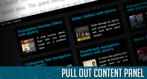
In this tutorial we will create a content panel that slides out at a predefined scroll position. It will reveal a teaser with related content and it can be expanded to full page size to show more. A custom slider allows to scroll through many items in the panel.
在本教程中,我们将创建一个内容面板,该面板可在预定义的滚动位置滑出。 它会显示带有相关内容的预告片,并且可以扩展到完整页面大小以显示更多内容。 自定义滑块允许滚动面板中的许多项目。
Depending on how many items can fit to the user’s screen, we will adapt the item container in order make the maximum number of items fit, centering it horizontally.
根据适合用户屏幕的项目数量,我们将调整项目容器,以使最大数量的项目适合并水平居中。
Since we want to use a little slider for the scrolling, we will be working with the jQuery UI library.
由于我们要使用一个小的滑块进行滚动,因此我们将使用jQuery UI库。
So, let’s get started with the markup.
因此,让我们开始进行标记。
标记 (The Markup)
The HTML will have following structure:
HTML将具有以下结构:
<div class="pc_panel" id="pc_panel">
	<div class="pc_label expand"></div>
	<div class="pc_label close"></div>
	<div class="pc_title">More on this topic</div>
	<div id="pc_wrapper">
		<div id="pc_content">
			<div class="pc_item">
				<h2>Annotation Overlay Effect with jQuery</h2>
				<img src="images/22.jpg" alt=""/>
				<p>
					A slick overlay effect that let's
					you show notes on a portfolio item
				</p>
				<div class="pc_more">
					http://tympanus.net/codrops/2010/10/12/annotation-overlay-effect/
				</div>
			</div>
			<div class="pc_item">
				...
			</div>
			...
			<div class="clear"></div>
		</div>
	</div>
	<div id="pc_slider" class="pc_slider"></div>
</div>
To add new item elements, we just need to repeat the structure of the div with the class “pc_item”. Because we will want to make the whole item clickable, we will add the link of the respective article into a div element with the class “pc_more”.
要添加新的item元素,我们只需要使用“ pc_item”类重复div的结构。 因为我们要使整个项目都可单击,所以我们将相应文章的链接添加到具有“ pc_more”类的div元素中。
In our jQuery function we will then take care of that. Of course, you can simple add an href to a link element, but we want to show you how you can trigger links to open by reading them out from an element.
然后,在我们的jQuery函数中,我们将进行处理。 当然,您可以简单地在链接元素中添加href,但是我们想向您展示如何通过从元素中读出链接来触发链接打开。
Let’s take a look at the style.
让我们看一下样式。
CSS (The CSS)
For the style, we will define the looks of the main panel and it’s content and we will also manipulate some classes of the jQuery UI elements.
对于样式,我们将定义主面板的外观及其内容,还将操纵jQuery UI元素的某些类。
Let’s start with the main panel:
让我们从主面板开始:
.pc_panel{
	position:fixed;
	background:transparent url(../images/bgSlide.png) repeat top left;
	color:#fff;
	font-size:11px;
	line-height:14px;
	width:100%;
	right:0px;
	display:none;
	font-family:Arial, Helvetica, sans-serif;
}
We will use fixed positioning for the panel since we want to make it follow us when we scroll the page. The panel will be initially invisible and when we scroll to the trigger position, we will slide it in from the right.
我们将对面板使用固定的位置,因为我们希望在滚动页面时使其跟随我们。 面板最初是不可见的,当我们滚动到触发位置时,我们将从右侧滑动它。
In our jQuery we will set its right value to minus the window width and then we will animate it to right:0px.
在我们的jQuery中,我们将其正确的值设置为减去窗口宽度,然后将其动画为right:0px。
The little icons on the right for exanding/collapsing and for closing the teaser panel permanently will have the following style:
右侧的用于扩展/折叠和永久关闭预告片面板的小图标将具有以下样式:
.pc_label{
	width:20px;
	height:20px;
	position:absolute;
	top:0px;
	text-align:center;
	letter-spacing:2px;
	text-shadow:0px 0px 1px #fff;
	cursor:pointer;
}
.pc_panel .expand{
	background:#010101 url(../images/expand.gif) no-repeat center center;
	right:24px;
}
.pc_panel .collapse{
	background:#010101 url(../images/collapse.gif) no-repeat center center;
	right:24px;
}
.pc_panel .close{
	background:#010101 url(../images/close.gif) no-repeat center center;
	right:2px;
}
If you are using two classes on an element and you want the, let’s say, second class (in our case expand, collapse and close) to overwrite the properties of the first one, you need to make the definition for those classes more specific. That’s why we have our class “pc_label” and then we define the “stronger” classes by adding their parent (pc_panel).
如果您在元素上使用两个类,并且想让第二个类(在我们的示例中为展开,折叠和关闭)覆盖第一个类的属性,则需要使这些类的定义更加具体。 这就是为什么我们拥有类“ pc_label”,然后通过添加其父类(pc_panel)来定义“更强”类的原因。
The title for the panel will have the following style:
面板的标题将具有以下样式:
.pc_title{
	width:100%;
	height:20px;
	background:#000;
	font-size:9px;
	text-transform:uppercase;
	line-height:20px;
	text-indent:10px;
	letter-spacing:1px;
}
Each item will have the following style:
每个项目将具有以下样式:
.pc_item{
	width:200px;
	height:120px;
	cursor:pointer;
	overflow:hidden;
	background:transparent url(../images/bgSlide.png) repeat top left;
	float:left;
	margin:5px 10px 10px 10px;
	-moz-border-radius:4px;
	-webkit-border-radius:4px;
	-moz-box-shadow:0px 0px 5px #000;
	-webkit-box-shadow:0px 0px 5px #000;
	box-shadow:0px 0px 5px #000;
}
.pc_item h2{
	padding:10px 0px 10px 10px;
	font-size:14px;
	height:32px;
	color:#009ac6;
	line-height:11px;
	clear:both;
}
.pc_item p{
	text-align:justify;
	font-size:10px;
	text-shadow:1px 1px 1px #000;
	padding:0px 10px 5px 10px;
}
.pc_item img{
	width:50px;
	float:left;
	margin:0px 10px 0px 10px;
	border:4px solid #191919;
	-moz-box-shadow:0px 0px 5px #000;
	-webkit-box-shadow:0px 0px 5px #000;
	box-shadow:0px 0px 5px #000;
}
.pc_more{
	display:none;
}
When hovering over an item we will add the class “selected” to it, in order to make it look different:
将鼠标悬停在一个项目上时,我们将向其添加“ selected”类,以使其看起来与众不同:
.pc_panel .selected{
	background:#222;
}
.pc_panel .selected img{
	border:4px solid #010101;
}
The wrapper around the items needs to have the following style because we want to apply the slider on the container:
物品周围的包装物需要具有以下样式,因为我们要在容器上应用滑块:
.pc_wrapper{
	overflow:hidden;
	position:relative;
	margin-top:10px;
}
The slider itself will have an absolute position:
滑块本身将具有绝对位置:
.pc_slider{
	position:absolute;
}
We want a customized look for the slider and the little slider handle, so we will overwrite the classes that come with jQuery UI:
我们希望为滑块和小滑块手柄定制外观,因此我们将覆盖jQuery UI附带的类:
.ui-widget-content {
	background:#000;
}
.ui-state-default, .ui-widget-content .ui-state-default{
	border:none;
	background-color:#aaa;
	outline:none;
	cursor:pointer;
	height:17px;
	width:10px;
	left:0px;
	margin-bottom:-10px;
}
And, finally, a little helper class to clear the float in the end of the items so that we can work with the height of it’s container:
最后,还有一个小助手类来清除项目末尾的浮点数,以便我们可以使用容器的高度:
.clear{
	clear:both;
}
And that’s all the style. Let’s look at the jQuery.
这就是所有样式。 让我们看一下jQuery。
JavaScript (The JavaScript)
The main idea is to make the panel appear at a certain position of the page. For that we will add a id=”pc_reference” to the last paragraph of our demo page because we want the panel to appear at the end of the page and show related items to the reader.
主要思想是使面板出现在页面的特定位置。 为此,我们将id =“ pc_reference”添加到演示页面的最后一段,因为我们希望该面板出现在页面的末尾并向读者显示相关项目。
The shown panel will be of a specific height, revealing only the first row of related items/articles. When the user then expands the panel, it will occupy the full page and the user can use a scroll to see all items.
所显示的面板将具有特定的高度,仅显示相关项目/文章的第一行。 然后,当用户展开面板时,它将占据整个页面,并且用户可以使用滚动条查看所有项目。
We want to have the possibility to expand the panel but also to remove it completely, since it could be annoying to the user (every time he scrolls past the specific trigger, it will appear).
我们希望能够扩展面板,但也可以完全删除面板,因为这可能会使用户感到烦恼(每次他滚动经过特定触发器时,都会出现)。
Let’s first define some variables:
首先定义一些变量:
//window width and height
var window_w 					= $(window).width();
var window_h 					= $(window).height();
//the main panel div
var $pc_panel = $('#pc_panel');
//the wrapper and the content divs
var $pc_wrapper					= $('#pc_wrapper');
var $pc_content					= $('#pc_content');
//the slider / slider div
var $pc_slider					= $('#pc_slider');
//the element reference - reaching this element
//activates the panel
var $pc_reference 				= $('#pc_reference');

var maxWidth,maxHeight,marginL;
Now, we will call the function buildPanel(), that already constructs the panel like it will look, when we expand it:
现在,我们将调用函数buildPanel() ,该函数已经在构造面板时将其扩展为外观:
buildPanel();

function buildPanel(){
	$pc_panel.css({'height': window_h + 'px'});
	hidePanel();
	//we want to display the items in a grid.
	//we need to calculate how much width and height
	//the wrapper should have.
	//we also want to display it centered, so we need to calculate
	//the margin left of the wrapper

	//First, lets see how much of height:
	//maxHeight = Math.floor((window_h-20)/135)*135;
	//20 => pc_titles height
	//135 => 125 of each items height plus its margin (10)
	maxHeight 		= Math.floor((window_h-20)/135)*135;
	//maxWidth = Math.floor((window_w-35)/220)*220;
	//220 = item width + margins (left and right)
	maxWidth 		= Math.floor((window_w-35)/220)*220;
	marginL  		= (window_w - maxWidth)/2;
	$pc_wrapper.css({
		'width' 		: maxWidth + 20 + 'px',
		'height'		: maxHeight +'px',
		'margin-left' 	: marginL + 'px'
	});

	//innitialize the slider
	try{
		$pc_slider.slider('destroy');
	}catch(e){}
	//total_scroll is the number of how much we can scroll
	var total_scroll = $pc_content.height()-maxHeight;
	//add a slider to scroll the content div
	//hidden until the panel is expanded
	if(total_scroll > 0){
		$pc_slider.slider({
			orientation	: 'vertical',
			max			: total_scroll,
			min			: 0,
			value		: total_scroll,
			slide		: function(event, ui) {
				$pc_wrapper.scrollTop(Math.abs(ui.value-total_scroll));
			}
		}).css({
			'height'	: maxHeight -40 + 'px',//40 extra
			'left'		: maxWidth + 20 + marginL + 'px',
			'top'		: 30 + 20 + 'px',
			//30 = 20 of title + 10 margin, 20 extra
			'display'	: 'none'
		});
	}
}
Initially, we want to hide the panel outside of the viewport on the right side, so we define the following function:
最初,我们希望将面板隐藏在右侧视口之外,因此我们定义以下功能:
function hidePanel(){
	//165 => 20 pc_title + 120 item + margins
	$pc_panel.css({
		'right'	: -window_w + 'px',
		'top'	: window_h - 165 + 'px'
	}).show();
	try{
		//position the slider in the beginning
		slideTop();
	}catch(e){}
	$pc_slider.hide();
	$pc_panel.find('.collapse')
	.addClass('expand')
	.removeClass('collapse');
}
For our custom slider that will let us scroll through the items, we will define a function that resets it by sliding it all to the top:
对于允许我们滚动项目的自定义滑块,我们将定义一个函数,将其全部滑动到顶部来重置它:
function slideTop(){
	var total_scroll 	= $pc_content.height()-maxHeight;
	$pc_wrapper.scrollTop(0);
	$pc_slider.slider('option', 'value', total_scroll );
}
Now, we want to define what happens when we reach the element that has the ID “pc_reference” while we scroll our page. We need to get the distance from the top to slide the panel out at the right position, and hide it, if we are more up than the trigger again:
现在,我们要定义在滚动页面时到达ID为“ pc_reference”的元素时会发生什么。 我们需要获得与顶部的距离,以便将面板滑到正确的位置,然后将其隐藏起来(如果我们再次超出触发器的高度):
$(window).bind('scroll',function(){
	var distanceTop = $pc_reference.offset().top - window_h;
	if($(window).scrollTop() > distanceTop){
		if(parseInt($pc_panel.css('right'),10) == -window_w)
			$pc_panel.stop().animate({'right':'0px'},300);
	}
	else{
		if(parseInt($pc_panel.css('right'),10) == 0)
			$pc_panel.stop().animate({'right': -window_w + 'px'},300,function(){
				hidePanel();
			});
	}
}).bind('resize',function(){
	//on resize calculate the windows dimentions again,
	//and build the panel accordingly
	window_w 			= $(window).width();
	window_h 			= $(window).height();
	buildPanel();
});
When we click on the expand button, we animate the panel to the size of the window and reset the custom slider and show it:
当单击扩展按钮时,我们将面板设置为窗口大小的动画,并重置自定义滑块并显示它:
$pc_panel.find('.expand').bind('click',function(){
	var $this = $(this);
	$pc_wrapper.hide();
	$pc_panel.stop().animate({'top':'0px'},500,function(){
		$pc_wrapper.show();
		slideTop();
		$pc_slider.show();
		$this.addClass('collapse').removeClass('expand');
	});
})
When we click on “collapse”, we will hide the slider and minimize the panel again:
当我们单击“折叠”时,我们将隐藏滑块并再次最小化面板:
$pc_panel.find('.collapse').live('click',function(){
	var $this = $(this);
	$pc_wrapper.hide();
	$pc_slider.hide();
	$pc_panel.stop().animate({'top':window_h - 165 + 'px'},500,function(){
		$pc_wrapper.show();
		$this.addClass('expand').removeClass('collapse');
	});
});
Clicking “close” will make the panel disappear permanently:
单击“关闭”将使该面板永久消失:
$pc_panel.find('.close').bind('click',function(){
	$pc_panel.remove();
	$(window).unbind('scroll').unbind('resize');
});
And finally, we want to add a hover effect to the items, and open a new window with the right location when the user clicks on it:
最后,我们要向项目添加悬停效果,并在用户单击它时在正确的位置打开一个新窗口:
$pc_wrapper.find('.pc_item').hover(
function(){
	$(this).addClass('selected');
},
function(){
	$(this).removeClass('selected');
}
).bind('click',function(){
	window.open($(this).find('.pc_more').html());
});
And that’s it! We hope you enjoyed the tutorial and find it useful!
就是这样! 我们希望您喜欢本教程并发现它有用!
翻译自: https://tympanus.net/codrops/2010/11/01/pull-out-content-panel/
jquery 面板


 扫一扫
扫一扫
 654
654

 被折叠的 条评论
为什么被折叠?
被折叠的 条评论
为什么被折叠?
 到【灌水乐园】发言


