


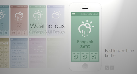
Today we will be creating a little app showcase with a neat effect. The idea is to show a mobile device with a screenshot of an app and when clicking on the device, a grid appears, showing some more screenshots. The effect is very subtle: the device moves back and the grid fades in and scales up. When clicking on another screenshot, the device image gets updated and the grid disappears again.
今天,我们将创建一个具有整洁效果的小应用程序展示柜。 这样做的目的是向移动设备显示一个应用程序的屏幕截图,并在该设备上单击时会出现一个网格,其中显示了更多屏幕截图。 效果非常微妙:设备向后移动,网格逐渐变暗并放大。 单击另一个屏幕截图时,设备图像将更新,并且网格再次消失。
The beautiful iPhone mockup used in the demo is by Jakub Kejha
演示中使用的美丽iPhone样机由Jakub Kejha设计
Let’s get started with the markup.
让我们开始标记。
标记 (The Markup)
The HTML will consist of a main wrapper that contains a heading, a division for the device and a division for the grid:
HTML将包含一个主包装,其中包含一个标题,一个设备分区和一个网格分区:
<div id="ac-wrapper" class="ac-wrapper">
	<h2>Weatherous <span>Concept & UI Design</span></h2>
	<div class="ac-device">
		<a href="#"><img src="images/screen1.jpg"/></a>
		<h3 class="ac-title">Gentrify small batch umami retro vegan</h3>
	</div>
	<div class="ac-grid">
		<a href="#"><img src="images/screen1.jpg"/><span>Gentrify small batch umami retro vegan</span></a>
		<a href="#"><img src="images/screen2.jpg"/><span>Chambray squid semiotics</span></a>
		<a href="#"><img src="images/screen3.jpg"/><span>Fashion axe blue bottle</span></a>
		<a href="#"><img src="images/screen4.jpg"/><span>Photo booth single-origin coffee</span></a>
		<a href="#"><img src="images/screen5.jpg"/><span>Flexitarian synth keytar blog master</span></a>
		<a href="#"><img src="images/screen6.jpg"/><span>Next level retro flexitarian freegan</span></a>
		<a href="#"><img src="images/screen7.jpg"/><span>Pour-over superious meggings terry</span></a>
		<a href="#"><img src="images/screen8.jpg"/><span>Seitan william vinyl chillwave</span></a>
	</div>
</div>
Once we click on a grid item, we will update the content of the device container. We will also make the span for each grid item appear on hover.
单击网格项后,我们将更新设备容器的内容。 我们还将使每个网格项目的跨度显示在悬停上。
Let’s style everything.
让我们样式化一切。
CSS (The CSS)
Note that the CSS will not contain any vendor prefixes, but you will find them in the files. In this tutorial we will be going through the style of demo 1.
请注意,CSS将不包含任何供应商前缀,但是您可以在文件中找到它们。 在本教程中,我们将演示演示1的样式。
So let’s start with the main wrapper. This will be the container that will have perspective. The origin will not be in the center but a bit more up:
因此,让我们从主包装开始。 这将是具有透视图的容器。 原点不在中心,而是更多一点:
.ac-wrapper {
	width: 100%;
	position: relative;
	perspective: 1000px;
	perspective-origin: 50% 25%;
}
The heading will be positioned absolutely on the left side of the device:
标题将绝对位于设备的左侧:
.ac-wrapper h2 {
	top: 20%;
	width: 50%;
	position: absolute;
	font-weight: 300;
	font-size: 4em;
	text-align: right;
	padding: 0 180px 0 50px;
}
Let’s give a slightly different look to the span:
让我们对跨度进行一些稍许不同的外观:
.ac-wrapper h2 span {
	display: block;
	font-size: 60%;
	color: #c0c0c0;
}
The device will have the iPhone mockup as a background image and we will set the right dimensions. This container will need to preserve the 3D transforms and we’ll add a transition to it. Later, we’ll define a “transition classes” that will contain the properties for the altered states.
该设备将iPhone样机作为背景图像,我们将设置正确的尺寸。 该容器将需要保留3D变换,我们将为其添加一个过渡。 稍后,我们将定义一个“过渡类”,其中将包含已更改状态的属性。
.ac-device {
	background: url(../images/iPhone.png) no-repeat;
	width: 288px;
	height: 611px;
	margin: 0 auto;
	position: relative;
	transition: all 0.3s ease;
	transform-style: preserve-3d;
}
The screenshot will be inside of an anchor and we’ll set the dimensions here and position it to fit into the mockup:
屏幕截图将位于锚点内部,我们将在此处设置尺寸并将其放置到适合模型的位置:
.ac-device a {
	height: 440px;
	width: 249px;
	display: inline-block;
	margin: 85px 0 0 20px;
}

.ac-device a img {
	display: block;
}
The title for each screenshot once it’s in the mockup view will be positioned absolutely on the right side of the device:
每个屏幕快照的截图标题一旦进入模型视图,将完全位于设备的右侧:
.ac-device h3 {
	position: absolute;
	font-size: 2.5em;
	left: 100%;
	width: 100%;
	top: 60%;
	margin-left: 30px;
	font-weight: 300;
	color: #888;
}
Now, let’s style the grid. We want to display a total of eight items so a row will have four items. Let’s set a fitting width, make it absolute and center it by setting a negative left margin (half of its width) and a left value of 50%. The initial opacity is 0 and since the grid is displayed and covering the device, we’ll set the pointer events to none so that we can’t click on it when it’s invisible. We’ll also add a transition and translate it -350px on the Z axis:
现在,让我们为网格设置样式。 我们希望总共显示八个项目,所以一行将有四个项目。 让我们设置一个合适的宽度,通过设置负的左边距(宽度的一半)和50%的左值来使其绝对和居中。 初始不透明度为0,由于显示了网格并覆盖了设备,因此我们将指针事件设置为none以便在其不可见时无法单击它。 我们还将添加一个过渡并将其在Z轴上平移-350px:
.ac-grid {
	position: absolute;
	width: 620px;
	left: 50%;
	margin-left: -310px;
	height: 100%;
	z-index: 1000;
	top: 0;
	opacity: 0;
	pointer-events: none;
	transform-style: preserve-3d;
	transition: all 0.3s ease;
	transform: translateZ(-350px);
}
The anchors in the grid will be floated left and the images inside will be set to 100% width. This will come in handy later on when we apply some media queries:
网格中的锚点将向左浮动,并且内部图像将设置为100%宽度。 稍后我们应用一些媒体查询时,这将派上用场:
.ac-grid a {
	width: 145px;
	display: block;
	position: relative;
	float: left;
	margin: 10px 5px;
	cursor: pointer;
}

.ac-grid a img {
	display: block;
	width: 100%;
}
The span for the description will be positioned absolutely on top of the anchor and we’ll fade it in and move it a bit on hover:
说明的范围将完全位于锚点的顶部,我们将其淡入并在悬停时稍微移动一下:
.ac-grid a span {
	position: absolute;
	height: 100%;
	width: 100%;
	left: 0;
	top: 0;
	text-transform: uppercase;
	padding: 3em 1em 0;
	z-index: 100;
	color: #ddd;
	background: rgba(0,0,0,0.4);
	font-weight: 700;
	opacity: 0;
	transform: translateY(-5px);
	transition: all 0.2s ease;
}

.ac-grid a:hover span {
	opacity: 1;
	transform: translateY(0);
}
Next, we’ll define the “transition classes”. When we click on the device, we’ll apply a class to the wrapper which will trigger the fading in and scaling up of the grid and the moving back of the device:
接下来,我们将定义“过渡类”。 当我们单击设备时,我们将对包装器应用一个类,这将触发网格的淡入和放大以及设备的后退:
.ac-wrapper.ac-gridview .ac-device {
	transform: translateZ(-350px);
	opacity: 0.6;
}

.ac-wrapper.ac-gridview .ac-grid {
	transform: translateZ(0px);
	opacity: 1;
	pointer-events: auto;
}
Once the grid is there, we also set the pointer-events to auto again.
一旦网格存在,我们还将指针事件再次设置为auto 。
Our layout has some absolutely positioned elements and we’ll need to take care of them on smaller screens. The idea is that we will switch the main heading to the right side first and then center everything once the screen is very small. The second media query takes care of the grid structure. Here we will set a fluid width for both, the grid and the anchors:
我们的布局中有一些绝对定位的元素,我们需要在较小的屏幕上照顾它们。 这个想法是,我们将首先将主标题切换到右侧,然后在屏幕很小的时候将所有内容居中。 第二个媒体查询负责网格结构。 在这里,我们将为网格和锚点设置流体宽度:
@media screen and (max-width: 63.875em) {
	.ac-wrapper {
		font-size: 60%;
		width: 100%;
		padding: 0 20px;
	}

	.ac-device {
		margin: 0;
		width: 100%;
	}

	.ac-device h3 {
		width: 50%;
		left: 290px;
	}

	.ac-wrapper h2 {
		left: 308px;
		padding: 0;
		text-align: left;
		margin-left: 30px;
	}
}

@media screen and (max-width: 39.8125em) {
	.ac-grid {
		width: 90%;
		left: 5%;
		margin-left: 0;
		padding-top: 150px;
	}

	.ac-grid a {
		width: 22%;
	}
}

@media screen and (max-width: 35.6875em) {
	.ac-wrapper {
		padding: 0 20px 100px;
	}

	.ac-wrapper h2 {
		width: 100%;
		text-align: center;
		margin: 0 0 1em;
		top: 0;
		left: auto;
		position: relative;
	}

	.ac-device {
		margin: 0 auto;
		width: 288px;
	}

	.ac-device h3 {
		position: relative;
		margin: 0;
		left: auto;
		width: 100%;
		top: 100px;
		display: block;
		text-align: center;
	}
}
And that’s all the style! Let’s take a look at the JavaScript.
这就是所有样式! 让我们看一下JavaScript。
JavaScript (The JavaScript)
Let’s start by caching some elements and initialize some variables:
让我们开始缓存一些元素并初始化一些变量:
	var $el = $( '#ac-wrapper' ),
		// device element
		$device = $el.find( '.ac-device' ),
		// the device image wrapper
		$trigger = $device.children( 'a:first' ),
		// the screens
		$screens = $el.find( '.ac-grid > a' ),
		// the device screen image
		$screenImg = $device.find( 'img' ),
		// the device screen title
		$screenTitle = $device.find( '.ac-title' ),
		// HTML Body element
		$body = $( 'body' );
We will bind the events to the device’s image wrapper (anchor) and to the screen elements.
我们将事件绑定到设备的图像包装器(锚)和屏幕元素。
	function init() {
		// show grid
		$trigger.on( 'click', showGrid );
		// when a grid´s screen is clicked, show the respective image on the device
		$screens.on( 'click', function() {
			showScreen( $( this ) );
			return false;
		} );
	}
When the device’s image is clicked, the grid is shown. For this to happen the class “ac-gridview” has to be added to the ac-wrapper element:
单击设备的图像后,将显示网格。 为此,必须将类“ ac-gridview”添加到ac-wrapper元素中:
	function showGrid() {
		$el.addClass( 'ac-gridview' );
		// clicking somewhere else on the page closes the grid view
		$body.off( 'click' ).on( 'click', function() { showScreen(); } );
		return false;
	}
When a screen element is clicked we remove the “ac-gridview” class from the ac-wrapper element, and update both, image source and title on the respective elements:
单击屏幕元素时,我们从ac-wrapper元素中删除了“ ac-gridview”类,并在相应元素上同时更新了图像源和标题:
	function showScreen( $screen ) {
		$el.removeClass( 'ac-gridview' );
		if( $screen ) {
			// update image and title on the device
			$screenImg.attr( 'src', $screen.find( 'img' ).attr( 'src' ) );
			$screenTitle.text( $screen.find( 'span' ).text() );
		}
	}
For the third demo we also want to offer the possibility to navigate through the screenshots without having to open the grid. Depending to the direction we are navigating, the next screen will either scale up / fade in (navigating to the next screen) or move up / fade in (navigating to the previous screen). The same logic applies to the current screenshot. In order for this to work, we need to add the next/previous screen’s image to the DOM right before the current screen’s image (both images being absolute). When the transition ends we remove the old one:
对于第三个演示,我们还希望提供无需打开网格即可浏览屏幕截图的可能性。 根据我们导航的方向,下一个屏幕将放大/淡入(导航到下一个屏幕),或者上移/淡入(导航到上一个屏幕)。 相同的逻辑适用于当前屏幕截图。 为了使其正常工作,我们需要将下一个/上一个屏幕的图像添加到DOM,就在当前屏幕图像之前(两个图像都是绝对的)。 过渡结束后,我们将删除旧的过渡:
	function navigate( direction ) {

		// if currently animating return
		if( animating ) {
			return false;
		}

		animating = true;

		// update current
		if( direction === 'next' ) {
			current = current < screensCount - 1 ? ++current : 0;
		}
		else if( direction === 'prev' ) {
			current = current > 0 ? --current : screensCount - 1;
		}

		// next screen to show
		var $nextScreen = $screens.eq( current );

		// if css transitions support:
		if( support ) {

			// append new image to the device and set the transition and initial style
			var $nextScreenImg = $( '


    ' ).css( {
				transition : 'all 0.5s ease',
				opacity : 0,
				transform : direction === 'next' ? 'scale(0.9)' : 'translateY(100px)'
			} ).insertBefore( $screenImg );

			// update title
			$screenTitle.text( $nextScreen.find( 'span' ).text() );

			setTimeout( function() {

				// current image fades out / new image fades in
				$screenImg.css( {
					opacity : 0,
					transform : direction === 'next' ? 'translateY(100px)' : 'scale(0.9)'
				} ).on( transEndEventName, function() { $( this ).remove(); } );

				$nextScreenImg.css( {
					opacity : 1,
					transform : direction === 'next' ? 'scale(1)' : 'translateY(0px)'
				} ).on( transEndEventName, function() {
					$screenImg = $( this ).off( transEndEventName );
					animating = false;
				} );

			}, 25 );

		}
		else {
			// update image and title on the device
			$screenImg.attr( 'src', $nextScreen.find( 'img' ).attr( 'src' ) );
			$screenTitle.text( $nextScreen.find( 'span' ).text() );
			animating = false;
		}

	}
' ).css( {
transition : 'all 0.5s ease',
opacity : 0,
transform : direction === 'next' ? 'scale(0.9)' : 'translateY(100px)'
} ).insertBefore( $screenImg );
// update title
$screenTitle.text( $nextScreen.find( 'span' ).text() );
setTimeout( function() {
// current image fades out / new image fades in
$screenImg.css( {
opacity : 0,
transform : direction === 'next' ? 'translateY(100px)' : 'scale(0.9)'
} ).on( transEndEventName, function() { $( this ).remove(); } );
$nextScreenImg.css( {
opacity : 1,
transform : direction === 'next' ? 'scale(1)' : 'translateY(0px)'
} ).on( transEndEventName, function() {
$screenImg = $( this ).off( transEndEventName );
animating = false;
} );
}, 25 );
}
else {
// update image and title on the device
$screenImg.attr( 'src', $nextScreen.find( 'img' ).attr( 'src' ) );
$screenTitle.text( $nextScreen.find( 'span' ).text() );
animating = false;
}
}
This navigation concept was introduced by Evan You and you can check it out here, or watch the video.
这种导航概念是由Evan You提出的,您可以在此处查看或观看视频。
And that’s all! We hope you enjoyed this tutorial and find it inspiring!
就这样! 希望您喜欢本教程并从中获得启发!
翻译自: https://tympanus.net/codrops/2013/04/01/app-showcase-with-grid-overlay/


 963
963


 被折叠的 条评论
为什么被折叠?
被折叠的 条评论
为什么被折叠?
 到【灌水乐园】发言


