


 本文介绍如何使用Elastislide创建一个响应式图像库,该库带有Vue支持的缩略图轮播。教程详细展示了HTML、CSS和JavaScript的实现过程,包括使用jQuery Touchwipe插件实现移动设备和键盘导航。

vue带缩略图的轮播图插件
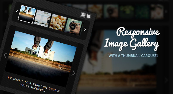
Today we want to show you how to create a responsive image gallery with a thumbnail carousel using Elastislide. Inspired by Twitter’s “user gallery” and upon a request to show an integration of Elastislide, we want to implement a responsive gallery that adapts to the view-port width. The gallery will have a view switch that allows to view it with the thumbnail carousel or without. We’ll also add the possibility to navigate with the keyboard.
今天,我们想向您展示如何使用Elastislide用缩略图轮播创建响应式图像库。 受Twitter的“用户画廊”的启发,并应要求显示Elastislide的集成,我们希望实现一个适应视口宽度的响应画廊。 画廊将具有一个视图开关,可以使用或不使用缩略图轮播对其进行查看。 我们还将添加使用键盘导航的可能性。
We’ll use the jQuery Touchwipe Plugin that will make it possible to navigate the images by “wiping” on the iPhone and iPad.
我们将使用jQuery Touchwipe插件,通过在iPhone和iPad上“擦拭”来导航图像。
The images in the demo are by über-talented Sherman Geronimo-Tan and you can find his Flickr photostream here: Sherman Geronimo-Tan’s Flickr Photostream The photos are licensed under the Creative Commons Attribution 2.0 Generic (CC BY 2.0) License.
演示中的图像是由über-talentedSherman Geronimo-Tan制作的,您可以在这里找到他的Flickr照片流: Sherman Geronimo-Tan的Flickr照片流这些照片均根据Creative Commons Attribution 2.0 Generic(CC BY 2.0)许可进行许可。
So, let’s do it!
所以,让我们开始吧!
标记 (The Markup)
For the HTML structure we’ll have a main wrapper with the class “rg-gallery”. We’ll also give it the same ID. In another div with the class “rg-thumbs” we’ll add the structure of the Elastislide carousel:
对于HTML结构,我们将有一个主包装,带有“ rg-gallery”类。 我们还将为其赋予相同的ID。 在“ rg-thumbs”类的另一个div中,我们将添加Elastislide轮播的结构:
<div id="rg-gallery" class="rg-gallery">
	<div class="
最低0.47元/天 解锁文章


 1592
1592

 被折叠的 条评论
为什么被折叠?
被折叠的 条评论
为什么被折叠?
 到【灌水乐园】发言


