


css伪元素和伪类
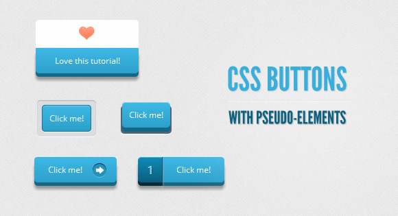
Hola, amigos. For the last month or so, I’ve been experimenting with the power of CSS pseudo-elements, specially when it comes to mixing them with buttons and that way recreating some great effects that were only possible to do with sprites, in the past.
Hola,朋友。 在过去的一个月左右的时间里,我一直在尝试CSS伪元素的功能,特别是在将它们与按钮混合时,这种方式重新创建了一些过去只能用精灵实现的效果。
In this tutorial, I’ll show you how to create buttons with a twist, using just one anchor tag per button and the great power of CSS.
在本教程中,我将向您展示如何创建扭曲的按钮,每个按钮仅使用一个锚标记以及CSS的强大功能。
The font used is ‘Open Sans’ by Steve Matteson.
使用的字体是Steve Matteson的“ Open Sans”。
Disclaimer: I’ll not be using CSS vendor prefixes in this tutorial or else it would be crazy long, but you will find them in the downloadable files.
免责声明:我不会在本教程中使用CSS供应商前缀,否则可能会很长一段时间,但是您可以在可下载的文件中找到它们。
I avoided CSS transitions since, right now, Firefox is the only browser that supports them on pseudo-elements. Plus, I believe that these buttons work just fine without them.
我避免了CSS转换,因为Firefox是目前唯一支持伪元素的浏览器。 另外,我相信如果没有它们,这些按钮也可以正常工作。
标记 (Markup)
The structure of all these buttons needs just one anchor tag for it to work, since we will be creating the other elements with the ::before pseudo-class.
所有这些按钮的结构只需要一个锚标记就可以使用,因为我们将使用:: before伪类创建其他元素。
Click me!
例子1(Example 1)
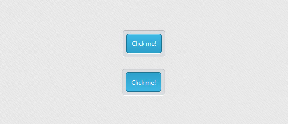
I think this is the easiest one, with a very regular CSS.
我认为这是最简单的方法,使用非常常规CSS。
CSS (CSS)
First of all, we will give the general style of the button, including its active state. It is important to notice the relative positioning, since it will help us later with the positioning of the ::before element:
首先,我们将给出按钮的一般样式,包括其活动状态。 重要的是要注意相对位置,因为它将在以后帮助:: before元素的位置:
.a_demo_one {
	background-color:#ba2323;
	padding:10px;
	position:relative;
	font-family: 'Open Sans', sans-serif;
	font-size:12px;
	text-decoration:none;
	color:#fff;
	border: solid 1px #831212;
	background-image: linear-gradient(bottom, rgb(171,27,27) 0%, rgb(212,51,51) 100%);
	border-radius: 5px;
}

.a_demo_one:active {
	padding-bottom:9px;
	padding-left:10px;
	padding-right:10px;
	padding-top:11px;
	top:1px;
	background-image: linear-gradient(bottom, rgb(171,27,27) 100%, rgb(212,51,51) 0%);
}
Then, we create the gray container using the ::before pseudo-element. Absolute positioning makes our life easier to, believe it or not, position our element:
然后,我们使用:: before伪元素创建灰色容器。 绝对定位使我们的生活更容易(无论您相信与不相信)定位我们的元素:
.a_demo_one::before {
	background-color:#ccd0d5;
	content:"";
	display:block;
	position:absolute;
	width:100%;
	height:100%;
	padding:8px;
	left:-8px;
	top:-8px;
	z-index:-1;
	border-radius: 5px;
	box-shadow: inset 0px 1px 1px #909193, 0px 1px 0px #fff;
}
例子2(Example 2)
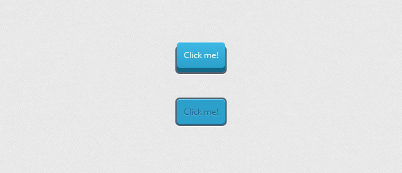
This one is a little bit more complex because of the 3D’ish look. This button is outside of its ‘container’, but when you click it, it goes down:
由于3D风格的外观,这一点要复杂一些。 此按钮位于其“容器”之外,但是单击时会下降:
CSS (CSS)
.a_demo_two {
	background-color:#6fba26;
	padding:10px;
	position:relative;
	font-family: 'Open Sans', sans-serif;
	font-size:12px;
	text-decoration:none;
	color:#fff;
	background-image: linear-gradient(bottom, rgb(100,170,30) 0%, rgb(129,212,51) 100%);
	box-shadow: inset 0px 1px 0px #b2f17f, 0px 6px 0px #3d6f0d;
	border-radius: 5px;
}

.a_demo_two:active {
	top:7px;
	background-image: linear-gradient(bottom, rgb(100,170,30) 100%, rgb(129,212,51) 0%);
	box-shadow: inset 0px 1px 0px #b2f17f, inset 0px -1px 0px #3d6f0d;
	color: #156785;
	text-shadow: 0px 1px 1px rgba(255,255,255,0.3);
	background: rgb(44,160,202);
}
And here’s the tricky part:
这是棘手的部分:
Since the position of the pseudo-element depends on its parent, once the parent moves down a few pixels, you have to move up the pseudo-element that same amount of pixels.
由于伪元素的位置取决于其父元素,因此一旦父元素下移几个像素,您就必须将伪元素上移相同数量的像素。
.a_demo_two::before {
	background-color:#072239;
	content:"";
	display:block;
	position:absolute;
	width:100%;
	height:100%;
	padding-left:2px;
	padding-right:2px;
	padding-bottom:4px;
	left:-2px;
	top:5px;
	z-index:-1;
	border-radius: 6px;
	box-shadow: 0px 1px 0px #fff;
}

.a_demo_two:active::before {
	top:-2px;
}
例子3(Example 3)
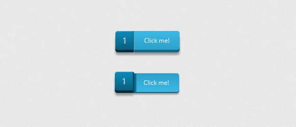
I think this one is my favorite since it was the first one I ever made this way and people seem to really like it. It is a divided button that “breaks” once you click it.
我认为这是我的最爱,因为这是我有史以来第一个这样做的,人们似乎非常喜欢它。 这是一个分开的按钮,单击后会“断开”。
CSS (CSS)
Again, the first thing we have to do is create the lighter part. In here, you’ll notice a right margin, this is in order to compensate for the width of the pseudo-element if you want to center the button. You don’t need it if that is not a problem for you.
同样,我们要做的第一件事是创建较轻的部分。 在这里,您会注意到一个右边距,如果您想使按钮居中,这是为了补偿伪元素的宽度。 如果那不是您的问题,则不需要它。
.a_demo_three {
	background-color:#3bb3e0;
	font-family: 'Open Sans', sans-serif;
	font-size:12px;
	text-decoration:none;
	color:#fff;
	position:relative;
	padding:10px 20px;
	border-left:solid 1px #2ab7ec;
	margin-left:35px;
	background-image: linear-gradient(bottom, rgb(44,160,202) 0%, rgb(62,184,229) 100%);
	border-top-right-radius: 5px;
	border-bottom-right-radius: 5px;
	box-shadow: inset 0px 1px 0px #2ab7ec, 0px 5px 0px 0px #156785, 0px 10px 5px #999;
}

.a_demo_three:active {
	top:3px;
	background-image: linear-gradient(bottom, rgb(62,184,229) 0%, rgb(44,160,202) 100%);
	box-shadow: inset 0px 1px 0px #2ab7ec, 0px 2px 0px 0px #156785, 0px 5px 3px #999;
}
And then the pseudo-element’s CSS:
然后是伪元素CSS:
.a_demo_three::before {
	content:"·";
	width:35px;
	max-height:29px;
	height:100%;
	position:absolute;
	display:block;
	padding-top:8px;
	top:0px;
	left:-36px;
	font-size:16px;
	font-weight:bold;
	color:#8fd1ea;
	text-shadow:1px 1px 0px #07526e;
	border-right:solid 1px #07526e;
	background-image: linear-gradient(bottom, rgb(10,94,125) 0%, rgb(14,139,184) 100%);
	border-top-left-radius: 5px;
	border-bottom-left-radius: 5px;
	box-shadow:inset 0px 1px 0px #2ab7ec, 0px 5px 0px 0px #032b3a, 0px 10px 5px #999 ;
}

.a_demo_three:active::before {
	top:-3px;
	box-shadow:inset 0px 1px 0px #2ab7ec, 0px 5px 0px 0px #032b3a, 1px 1px 0px 0px #044a64, 2px 2px 0px 0px #044a64, 2px 5px 0px 0px #044a64, 6px 4px 2px #0b698b, 0px 10px 5px #999 ;
}
例子4(Example 4)
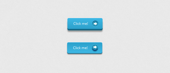
This time, we will use the pseudo-element as a pointer, using one image as a background, though you can use some of those great icon fonts.
这次,我们将使用伪元素作为指针,以一幅图像作为背景,尽管您可以使用其中的一些图标字体。
CSS (CSS)
.a_demo_four {
	background-color:#4b3f39;
	font-family: 'Open Sans', sans-serif;
	font-size:12px;
	text-decoration:none;
	color:#fff;
	position:relative;
	padding:10px 20px;
	padding-right:50px;
	background-image: linear-gradient(bottom, rgb(62,51,46) 0%, rgb(101,86,78) 100%);
	border-radius: 5px;
	box-shadow: inset 0px 1px 0px #9e8d84, 0px 5px 0px 0px #322620, 0px 10px 5px #999;
}

.a_demo_four:active {
	top:3px;
	background-image: linear-gradient(bottom, rgb(62,51,46) 100%, rgb(101,86,78) 0%);
	box-shadow: inset 0px 1px 0px #9e8d84, 0px 2px 0px 0px #322620, 0px 5px 3px #999;
}

.a_demo_four::before {
	background-color:#322620;
	background-image:url(../images/right_arrow.png);
	background-repeat:no-repeat;
	background-position:center center;
	content:"";
	width:20px;
	height:20px;
	position:absolute;
	right:15px;
	top:50%;
	margin-top:-9px;
	border-radius: 50%;
	box-shadow: inset 0px 1px 0px #19120f, 0px 1px 0px #827066;
}

.a_demo_four:active::before {
	top:50%;
	margin-top:-12px;
	box-shadow: inset 0px 1px 0px #827066, 0px 3px 0px #19120f, 0px 6px 3px #382e29;
}
例子5(Example 5)
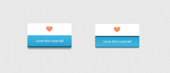
This example is a bit cheesy, I know, but you can use it in so many and really useful ways.
我知道这个例子有点俗气,但是您可以以很多非常有用的方式使用它。
CSS (CSS)
.a_demo_five {
	background-color:#9827d3;
	width:150px;
	display:inline-block;
	font-family: 'Open Sans', sans-serif;
	font-size:12px;
	text-decoration:none;
	color:#fff;
	position:relative;
	margin-top:40px;
	padding-bottom:10px;
	padding-top:10px;
	background-image: linear-gradient(bottom, rgb(168,48,232) 100%, rgb(141,32,196) 0%);
	border-bottom-right-radius: 5px;
	border-bottom-left-radius: 5px;
	box-shadow: inset 0px 1px 0px #ca73f8, 0px 5px 0px 0px #6a1099, 0px 10px 5px #999;
}

.a_demo_five:active {
	top:3px;
	background-image: linear-gradient(bottom, rgb(168,48,232) 0%, rgb(141,32,196) 100%);
	box-shadow: inset 0px 4px 1px #7215a3, 0px 2px 0px 0px #6a1099, 0px 5px 3px #999;
}

.a_demo_five::before {
	background-color:#fff;
	background-image:url(../images/heart.gif);
	background-repeat:no-repeat;
	background-position:center center;
	border-left:solid 1px #CCC;
	border-top:solid 1px #CCC;
	border-right:solid 1px #CCC;
	content:"";
	width:148px;
	height:40px;
	position:absolute;
	top:-30px;
	left:0px;
	margin-top:-11px;
	z-index:-1;
	border-top-left-radius: 5px;
	border-top-right-radius: 5px;
}

.a_demo_five:active::before {
	top: -33px;
	box-shadow: 0px 3px 0px #ccc;
}
到底(In the end)
And well, this is it, for now. Remember that these buttons are still kind of experimental, so not every browser supports them that well.
好吧,就是这样。 请记住,这些按钮仍然是试验性的,因此并非每个浏览器都很好地支持它们。
Thank you for reading this tutorial and I hope that you find it useful.
感谢您阅读本教程,希望对您有所帮助。
翻译自: https://tympanus.net/codrops/2012/01/11/css-buttons-with-pseudo-elements/
css伪元素和伪类


 517
517


 被折叠的 条评论
为什么被折叠?
被折叠的 条评论
为什么被折叠?
 到【灌水乐园】发言


