


navigator 带参数
Today we’ll show you how to create a content navigator with CSS only. The idea is to have several slides or content layers that we’ll show or hide using the :target pseudo-class. With CSS transitions we can make the slides appear in a fancy way. We’ll also make the whole thing responsive.
今天,我们将向您展示如何仅使用CSS创建内容导航器。 这个想法是有几个幻灯片或内容层,我们将使用:target伪类显示或隐藏它们。 使用CSS过渡,我们可以使幻灯片以精美的方式显示。 我们还将使整个过程具有响应能力。
The images used in the demo are by super-talented Karrie Nodalo. Check out her Flickr photostream. The images are licensed under the Creative Commons Attribution 2.0 Generic License.
该演示中使用的图像由才华横溢的Karrie Nodalo制作。 看看她的Flickr照片流。 这些图像已根据知识共享署名2.0通用许可获得许可。
Please note: the result of this tutorial will only work as intended in browsers that support the CSS properties in use.
请注意:本教程的结果只能在支持使用CSS属性的浏览器中按预期工作。
In the following we’ll be going through demo 3. Let’s do it!
接下来,我们将演示3 。 我们开始做吧!
标记 (The Markup)
For each of the different slides that will either contain a set of links, sub-slides or some content, we will have a division with the class cn-slide. For the sub-slide that will contain two link boxes in a row we’ll add another class called cn-slide-sub. The content slides will simply have the general class cn-slide like all the others.
对于将包含一组链接,子幻灯片或某些内容的每张不同的幻灯片,我们将使用cn-slide类进行划分。 对于将连续包含两个链接框的子幻灯片,我们将添加另一个名为cn-slide-sub的类。 内容幻灯片将像其他所有幻灯片一样具有通用类cn-slide 。
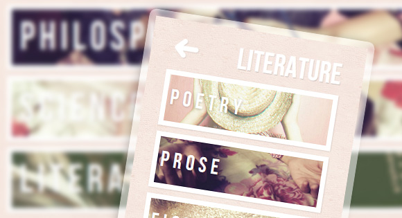
There will be one main slide that will have links to three sub-slides. Then, each of the sub-slides will have four links, each one pointing to a content slide. So, all together we have one main slide, three sub-slides and twelve content slides:
将有一个主幻灯片,该幻灯片将链接到三个子幻灯片。 然后,每个子幻灯片将具有四个链接,每个链接都指向一个内容幻灯片。 因此,总共有一张主幻灯片,三张子幻灯片和十二张内容幻灯片:
<section class="cn-container">

	<div class="cn-slide" id="slide-main">
		<h2>Explore this</h2>
		<nav>
			<a href="#slide-1">Philosphy</a>
			<a href="#slide-2">Science</a>
			<a href="#slide-3">Literature</a>
		</nav>
	</div>

	<!-- Slide 1 and sub-slides -->
	<div class="cn-slide ts-slide-sub" id="slide-1">
		<h2>Philosophy</h2>
		<a href="#slide-main" class="cn-back">Back</a>
		<nav>
			<a href="#slide-1-1">Epistemology</a>
			<a href="#slide-1-2">Metaphysics</a>
			<a href="#slide-1-3">Aesthetics</a>
			<a href="#slide-1-4">Ethics</a>
		</nav>
	</div>

	<div class="cn-slide" id="slide-1-1">
		<h2>Epistemology</h2>
		<a href="#slide-1" class="cn-back">Back</a>
		<div class="cn-content">
			<p>Some text</p>
		</div>
	</div>

	<div class="cn-slide" id="slide-1-2">
		<h2>Metaphysics</h2>
		<!-- ... -->
	</div>

	<div class="cn-slide" id="slide-1-3">
		<!-- ... -->
	</div>

	<div class="cn-slide" id="slide-1-4">
		<!-- ... -->
	</div>

	<!-- Slide 2 and Sub-slides -->
	<!-- ... -->

</section>
The sub-slides and the slides with content will have a link back to their previous “layer”. So, all the content slides of the “Philosophy” part will link back to “slide-1” which is the sub-slide of “Philosophy”.
子幻灯片和包含内容的幻灯片将具有指向其先前“层”的链接。 因此,“哲学”部分的所有内容幻灯片都将链接回“幻灯片1”,这是“哲学”的子幻灯片。
Let’s take a look at the CSS!
让我们看一下CSS!
CSS (The CSS)
The main container will have a min-width and a max-width which will allow us using a percentage for the width but guarantee that it will not become too big or too small:
主容器将具有最小宽度和最大宽度,这将允许我们使用百分比作为宽度,但要确保它不会变得太大或太小:
.cn-container{
	width: 60%;
	min-width: 300px;
	max-width: 820px;
	margin: 10px auto 0 auto;
	text-align: left;
	position: relative;
}
The main headline will be placed absolutely and we will make it fade in and scale up when “opening” a slide. The transition will have a delay because we want it to appear after all the link boxes:
主要标题将绝对放置,当“打开”幻灯片时,我们将使其淡入并放大。 过渡会有延迟,因为我们希望它出现在所有链接框之后:
.cn-container h2{
	font-family: 'BebasNeueRegular', 'Arial Narrow', Arial, sans-serif;
	color: #fff;
	position: absolute;
	z-index: 10000;
	text-shadow:
		0 0 1px rgba(255,255,255,0.8),
		1px 1px 1px rgba(0,0,0,0.2);
	font-size: 80px;
	line-height: 80px;
	top: 0px;
	right: 0px;
	white-space: nowrap;
	opacity: 0;
	transform: scale(0);
	transition: all 0.5s linear 0.7s;
}
.cn-container .cn-slide:target h2{
	opacity: 1;
	transform: scale(1);
}
The slides will also be placed absolutely. We’ll set the initial opacity of the slides to 0 and show it once we know that it’s the target:
幻灯片也将绝对放置。 我们将幻灯片的初始不透明度设置为0,并在知道它是目标后将其显示:
.cn-slide{
	text-align: center;
	position: absolute;
	left: 0px;
	padding-top: 80px;
	margin: 0 5%;
	width: 90%;
	opacity: 0;
}
.cn-slide:target{
	opacity: 1;
	z-index: 1000;
}
Note that in some other demos we are using the transitions on the slides. Here we will use sequential transitions on the link elements.
请注意,在其他一些演示中,我们使用幻灯片上的过渡效果。 在这里,我们将在链接元素上使用顺序转换。
Now, let’s take a look at the link elements. They will all have a single background image which we will later define for each element. By default, we’ll give 1.jpg as the background image. Initially, the opacity and scale will be 0. We add a transition for the two properties and also for the box-shadow which we need when we hover the element:
现在,让我们看一下链接元素。 它们都将具有单个背景图像,稍后我们将为每个元素定义背景图像。 默认情况下,我们将1.jpg作为背景图像。 最初,不透明度和缩放比例将为0。我们为这两个属性以及悬停元素时需要的框阴影添加了一个过渡:
.cn-slide nav a{
	text-align: left;
	display: block;
	font-family: 'BebasNeueRegular', 'Arial Narrow', Arial, sans-serif;
	border: 8px solid #fff;
	padding: 2%;
	font-size: 66px;
	letter-spacing: 7px;
	text-shadow: 0px 5px 0px rgba(182,105,135,0.4);
	color: #fff;
	line-height: 66px;
	outline: none;
	margin: 0 0 10px 0;
	box-shadow: 1px 1px 3px rgba(0,0,0,0.1);
	background: #fff url(../images/1.jpg) no-repeat center center;
	background-size: 100%;
	background-clip: padding-box;
	opacity: 0;
	transform: scale(0);
	transition:
		opacity 0.4s linear,
		transform 0.4s linear,
		box-shadow 0.3s ease-in-out;
}
.cn-slide nav a:hover{
	box-shadow: 1px 2px 4px rgba(0,0,0,0.2);
}
The target slide’s link elements will fade in and scale up to 1:
目标幻灯片的链接元素将淡入并按比例缩放至1:
.cn-slide:target nav a{
	opacity: 1;
	transform: scale(1);
}
Let’s define a transition delay for the elements, so that they appear one after the other:
让我们为元素定义过渡延迟,以使它们一个接一个地出现:
.cn-slide nav a:nth-child(2){
	transition-delay: 0.3s, 0.3s, 0s;
}
.cn-slide nav a:nth-child(3){
	transition-delay: 0.6s, 0.6s, 0s;
}
.cn-slide nav a:nth-child(4){
	transition-delay: 0.9s, 0.9s,0s;
}
As you can see, the last delay will be of 0 seconds since this is the delay for the box-shadow transition, the one that get’s applied on hover.
如您所见,最后一个延迟将为0秒,因为这是框阴影过渡的延迟,该延迟应用于悬停。
The link elements in the sub-slides will have a width of 42% because we want two to fit into a row:
子幻灯片中的链接元素的宽度为42%,因为我们希望两个元素适合一行:
.cn-slide-sub nav a{
	width: 42%;
	display: inline-block;
	font-size: 40px;
}
To create a little gap between the elements, we’ll give a right margin to the odd children:
为了在元素之间留出一点缝隙,我们将给奇数个孩子适当的边距:
.cn-slide-sub nav a:nth-child(odd){
	margin-right: 5px;
}
The slides with a content area are the “final” ones and we’ll also add a transition to that division:
具有内容区域的幻灯片是“最终”幻灯片,我们还将向该分区添加过渡:
.cn-content{
	background: #80B8CE url(../images/1.jpg) no-repeat center center;
	background-size: cover;
	text-align: left;
	padding: 20px 20px 5px;
	box-shadow: 1px 1px 3px rgba(0,0,0,0.1);
	border: 8px solid #fff;
	margin-top: 5px;
	cursor: pointer;
	opacity: 0;
	transform: scale(0);
	transition: all 0.6s linear;
}
.cn-slide:target .cn-content{
	opacity: 1;
	transform: scale(1);
}
Each content area will, just like their corresponding link elements, have a background image that we will define later.
每个内容区域都会像它们相应的链接元素一样,具有一个背景图像,稍后我们将对其进行定义。
The paragraphs will also have a transition which will be applied when we click on the content. With the :active pseudo-class we can let the user view the background of the content div by clicking on it (and keeping it clicked):
这些段落还将具有一个过渡,当我们单击内容时将应用该过渡。 使用:active伪类,我们可以让用户通过单击内容div的背景(并保持单击状态)来查看其背景:
.cn-content p{
	line-height: 24px;
	text-shadow: 1px 1px 1px rgba(255,255,255,0.9);
	color: rgba(103,59,77,0.9);
	padding: 15px 20px;
	margin-bottom: 10px;
	background: rgba(255,255,255,0.96);
	font-style: italic;
	border-top: 7px solid rgba(103,59,77,0.6);
	user-select: none;
	transform: scale(1);
	transition: all 0.3s linear;
}
.cn-content:active p{
	transform: scale(0);
}
The back arrow will be sliding in from the left. We set it to -100px initially and to 3px when a slide is the target:
向后箭头将从左侧滑入。 我们最初将其设置为-100px,将幻灯片作为目标时设置为3px:
.cn-back{
	outline: none;
	text-indent: -9000px;
	width: 49px;
	height: 42px;
	background: transparent url(../images/arrow.png) no-repeat center center;
	position: absolute;
	top: 22px;
	left: -100px;
	cursor: pointer;
	opacity: 0;
	transition: all 0.4s ease-in-out 1s;
}
.cn-slide:target .cn-back{
	left: 3px;
	opacity: 1;
}
Now, let’s define the background images for each link element. With the very helpful attribute selector, we can specify which element will have what background image. We will look at what the href value is and define the image:
现在,让我们为每个链接元素定义背景图像。 使用非常有用的属性选择器,我们可以指定哪个元素将具有什么背景图像。 我们将查看href值是什么并定义图像:
/* Main Items */
.cn-slide nav a[href="#slide-1"]{
	background-image: url(../images/1.jpg);
}
.cn-slide nav a[href="#slide-2"]{
	background-image: url(../images/2.jpg);
}
.cn-slide nav a[href="#slide-3"]{
	background-image: url(../images/3.jpg);
}

/* Items and sub-items of slide 1*/
.cn-slide nav a[href="#slide-1-1"],
#slide-1-1 .cn-content {
	background-image: url(../images/4.jpg);
}
.cn-slide nav a[href="#slide-1-2"],
#slide-1-2 .cn-content {
	background-image: url(../images/5.jpg);
}
.cn-slide nav a[href="#slide-1-3"],
#slide-1-3 .cn-content {
	background-image: url(../images/6.jpg);
}
.cn-slide nav a[href="#slide-1-4"],
#slide-1-4 .cn-content {
	background-image: url(../images/7.jpg);
}

/* Items and sub-items of slide 2 ... */
/* ... */

/* Items and sub-items of slide 3 ... */
/* ... */
Finally, we will define some media queries to fix the layout when we view this on a smaller screen. You can of course define the standard media queries for common devices but here we will simply check when our liquid layout breaks and define a rule for that “breaking-point”. In our case, that’s 1060 pixel and 900 pixel. We will adjust the font size and allow the sub-slides to have one item in a row:
最后,当我们在较小的屏幕上查看布局时,我们将定义一些媒体查询来修复布局。 您当然可以定义常见设备的标准媒体查询,但是在这里,我们仅检查液体布局何时中断,并为该“断点”定义规则。 在我们的例子中,这是1060像素和900像素。 我们将调整字体大小,并允许子幻灯片连续包含一项:
@media screen and (max-width: 1060px){
	.cn-slide-sub nav a{
		font-size: 28px;
	}
}
@media screen and (max-width: 900px){
	.cn-container h2{
		font-size: 48px;
		line-height: 95px;
	}
	.cn-slide nav a{
		font-size: 38px;
	}
	.cn-slide-sub nav a{
		width: auto;
		font-size: 36px;
		display: block;
	}
	.cn-slide-sub nav a:nth-child(odd){
		margin-right: 0px;
	}
}
演示版(Demos)
And that’s it! I hope you enjoyed this tutorial and find it useful! There are many possibilities for the transitions, just experiment!
就是这样! 我希望您喜欢本教程并发现它有用! 进行转换的可能性很多,只需尝试一下即可!
翻译自: https://tympanus.net/codrops/2012/03/23/responsive-content-navigator-with-css3/
navigator 带参数


 扫一扫
扫一扫

 被折叠的 条评论
为什么被折叠?
被折叠的 条评论
为什么被折叠?
 到【灌水乐园】发言


