


 本文介绍了如何在Excel中添加、格式化和扩展趋势线来预测未来数据。趋势线帮助可视化数据趋势,如线性、指数、对数和移动平均线。文章详细说明了如何为单个或多个数据系列添加趋势线,以及如何显示R平方值以评估趋势线与数据的吻合度。

excel图表的标尺线

You can add a trendline to a chart in Excel to show the general pattern of data over time. You can also extend trendlines to forecast future data. Excel makes it easy to do all of this.
您可以将趋势线添加到Excel中的图表中,以显示一段时间内数据的一般模式。 您还可以扩展趋势线以预测未来数据。 Excel使所有这些操作变得容易。
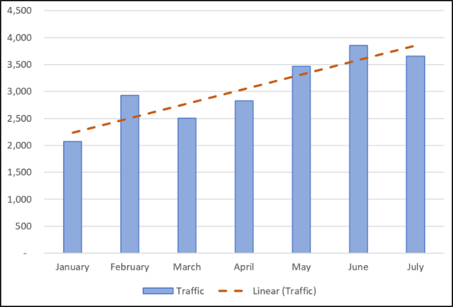
A trendline (or line of best fit) is a straight or curved line which visualizes the general direction of the values. They’re typically used to show a trend over time.
趋势线(或最佳拟合线)是可视化值的大致方向的直线或曲线。 它们通常用于显示一段时间内的趋势。
In this article, we’ll cover how to add different trendlines, format them, and extend them for future data.
在本文中,我们将介绍如何添加不同的趋势线,设置其格式并将其扩展以用于将来的数据。
添加趋势线 (Add a Trendline)
You can add a trendline to an Excel chart in just a few clicks. Let’s add a trendline to a line graph.
只需单击几下即可将趋势线添加到Excel图表中。 让我们向折线图添加趋势线。
Select the chart, click the “Chart Elements” button, and then click the “Trendline” checkbox.
选择图表,单击“图表元素”按钮,然后单击“趋势线”复选框。
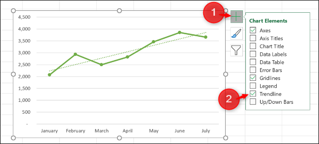
This adds the default Linear trendline to the chart.
这会将默认的线性趋势线添加到图表中。
There are different trendlines available, so it’s a good idea to choose the one that works best with the pattern of your data.
有不同的趋势线可用,因此最好选择一个与数据模式最匹配的趋势线。
Click the arrow next to the “Trendline” opt
 最低0.47元/天 解锁文章


 5584
5584


 被折叠的 条评论
为什么被折叠?
被折叠的 条评论
为什么被折叠?
 到【灌水乐园】发言


