


flexbox
Today we are going to build a grid with flexbox, and you are either going to fall in love with flexbox or simply love it a little bit more once you see how easy it is to create and use a grid using flexbox.
今天,我们将使用flexbox构建一个网格,一旦您了解了使用flexbox创建和使用网格的难易程度,您要么爱上了flexbox,要么只是稍微爱上了它。
Today I am going to use Less to create this grid just so we have a little more flexibility and also of course for the loops we will use to create to columns.
今天,我将使用Less来创建此网格,以便使我们具有更大的灵活性,当然还有用于创建列的循环的灵活性。
我们将要建设的 (What we will be building)
The grid we will be building here today will have the following specifications:
我们今天将在此处构建的网格具有以下规格:
- Multiple breakpoints to be completely responsive and flexible in a variety of screen sizes. 多个断点可在各种屏幕尺寸下完全响应并具有灵活性。
- The ability to set each row as a column or a row by using flex-direction. 通过使用flex-direction将每一行设置为一列或一行的能力。
- A flexible number of columns, by default we will be creating a 12 column grid but you can change that at any time in the Less files. 灵活的列数,默认情况下,我们将创建一个12列的网格,但是您可以随时在Less文件中更改它。
- Responsive offset classes in order to allow anyone who uses this grid to add them depending on the breakpoint the browser is currently in. 响应偏移量类,以便允许使用此网格的任何人根据浏览器当前所在的断点添加它们。
- Hidden classes for each of these breakpoints. 每个这些断点的隐藏类。
- Configurable gutters and container width. 可配置的装订线和容器宽度。
- Helper classes to help with various things like alignment. 帮助器类可帮助您进行诸如对齐之类的各种操作。
By these points, you can see that we will create a grid that anyone can use and change for all their projects. That's mainly why I started coding Flexy, to have something to use everywhere even though the designs and spacing weren't always the same. What I will try to accomplish with this grid is something for every project, big or small, and at least in the Less community, I feel like it's something that's lacking. So if you thing this an awesome idea like I do let's get started.
通过以上几点,您可以看到我们将创建一个网格,任何人都可以使用并更改其所有项目。 这就是为什么我开始对Flexy进行编码的原因,以便即使设计和间距并不总是相同,也可以在各处使用某些东西。 对于每个项目,无论大小,我都会尝试使用此网格来完成,至少在Less社区中,我感觉这是缺少的东西。 因此,如果您觉得这是一个很棒的想法,例如我,那就让我们开始吧。
要求 (Requirements)
In this article, we will use Less to create our grid and because of that, you will need to install Node and Less.
在本文中,我们将使用Less来创建网格,因此,您将需要安装Node和Less 。
To install Node you can either head over to their download page or if you have brew installed you can just open the terminal and install it with brew:
要安装Node,您可以转到其下载页面,或者如果您已安装brew,则可以打开终端并使用brew安装它:
brew install nodeAfter installing node you can install Less with npm (the package manager that comes with node). To install Less head over to the terminal and type:
安装节点后,您可以使用npm(节点随附的软件包管理器)安装Less。 要将less head over安装到终端并输入:
npm install-g lessThat's all we need to get started building our grid.
这就是我们开始构建网格所需要的。
为什么要使用更少? (Why use Less?)
You may be wondering why I am using Less over sass to create this grid. Well, Less has some great looping functionality that we will get into that makes it perfect to create grid system and any functionality that requires looping actually. I also feel like Less doesn't really get the love it deserves from many people so I'm attempting to change that and create a more advanced look at it so you can see all the functionality it has under the hood and maybe you'll start loving it too.
您可能想知道为什么我要使用Less over sass来创建此网格。 好吧,Less具有一些很棒的循环功能,使我们可以完美地创建网格系统以及任何实际需要循环的功能。 我也觉得Less并没有真正得到很多人应有的爱,所以我试图改变这一点,并对其进行更高级的研究,以便您可以了解它背后的所有功能,也许您会也开始喜欢它。
启动我们的网格 (Starting our grid)
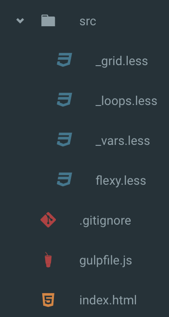
In this tutorial, we will have the following folder structure:
在本教程中,我们将具有以下文件夹结构:
We will also have a dist folder where we will compile our Less into one CSS file. For that task, I am using gulp and in order to install gulp and gulp-less please run:
我们还将有一个dist文件夹,在其中将Less编译为一个CSS文件。 对于该任务,我使用的是gulp,为了安装gulp和无gulp,请运行:
npm install--save-dev gulp gulp-lessAfter this has installed you will need to create a Gulpfile (gulpfile.js) and create a Less task, like this:
安装完成后,您将需要创建一个Gulpfile( gulpfile.js )并创建一个Less任务,如下所示:
var gulp = require('gulp');
var less = require('gulp-less');
var path = require('path');

gulp.task('less', function () {
  return gulp.src('./src/flexy.less')
    .pipe(less({
      paths: [ path.join(__dirname, 'less', 'includes') ]
    }))
    .pipe(gulp.dest('./dist'));
});
This will run our Gulp task to compile Less files to CSS. For more info on Gulp:
这将运行我们的Gulp任务以将Less文件编译为CSS。 有关Gulp的更多信息:
Using Gulp as a Build System Automate Your Tasks Easily with Gulp.js
使用Gulp作为构建系统, 通过Gulp.js轻松自动执行任务
Moving to the flexy.less file all I am doing in it is load all the other Less files:
移动到flexy.less文件,我正在做的就是加载所有其他Less文件:
// flexy.less

@import "_vars.less";
@import "_loops.less";
@import "_grid.less";
As soon as you create these files you can simply run:
创建这些文件后,您只需运行即可:
gulp lessAnd our files will be compiled, of course for now it simply creates an empty file because we are loading empty files but soon we will be generating flexbox goodness in this flexy.css file. Now that all the setup is done we can start creating our grid and actually start writing some flexbox goodness.
并且我们的文件将被编译,当然现在它只是创建一个空文件,因为我们正在加载空文件,但是不久之后,我们将在这个flexy.css文件中生成flexbox goodness。 现在所有的设置都完成了,我们可以开始创建网格并开始写一些flexbox了。
网格命名 (The grid naming)
One thing we still have to decide is what to call our classes in the grid and off course you can change this in your own grid but I decided to go in the simplest way possible:
我们仍然需要决定的一件事是在网格中如何调用我们的类,当然,您可以在自己的网格中进行更改,但是我决定以最简单的方式进行:
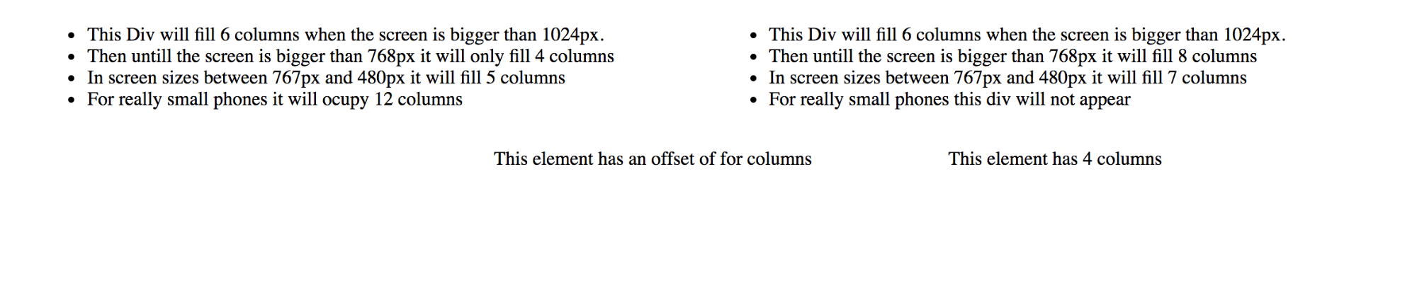
<!-- index.html -->

<!doctype html>

<html lang="en">
<head>
     <meta charset="utf-8">
     <title>Flexy</title>
     <meta name="description" content="Flexy">
     <meta name="author" content="Scotch.io">
     <link rel="stylesheet" href="dist/flexy.css">
</head>
<body>
  <section class="container">
      <div class="row">
          <div class="col-6 col-l-4 col-m-5 col-s-12">
              <ul>
                  <li>This Div will fill 6 columns when the screen is bigger than 1024px.</li>
                  <li>Then untill the screen is bigger than 768px it will only fill 4 columns</li>
                  <li>In screen sizes between 767px and 480px it will fill 5 columns</li>
                  <li>For really small phones it will ocupy 12 columns</li>
              </ul>
          </div>
          <div class="col-6 col-l-8 col-m-7 col-s-hidden">
              <ul>
                  <li>This Div will fill 6 columns when the screen is bigger than 1024px.</li>
                  <li>Then untill the screen is bigger than 768px it will fill 8 columns</li>
                  <li>In screen sizes between 767px and 480px it will fill 7 columns</li>
                  <li>For really small phones this div will not appear</li>
            </ul>
          </div>
      </div>
    <div class="row">
      <div class="col-offset-4 col-4">
        <p>This element has an offset of four columns</p>
      </div>
      <div class="col-4">
        <p>This element has 4 columns</p>
      </div>
    </div>
  </section>
</body>
</html>
These two rows will give us a lot of room to play with our grid and test all the different behaviors it can have.
这两行将为我们提供很大的空间来使用网格并测试其可能具有的所有不同行为。
The first we are going to do is create our container and row classes and let's not forget that this row can also be a column so we need to take both these possibilities, so with that in mind we write:
我们首先要做的是创建我们的容器和行类,别忘了该行也可以是一列,因此我们需要同时考虑这两种可能性,因此请记住:
//_grid.less

.container {
    width: @container-width; // Set the width to the one we will set in the variables
    display: block; // Reset the display
    margin: auto; // Always align it to the center

    // Set the directions for the row, columns and reverse versions of them using flex-direction
    .row {
        flex-direction: row;

        &.reverse {
            flex-direction: row-reverse;
        }
    }

    .column {
        flex-direction: column;

        &.reverse {
            flex-direction: column-reverse;
        }
    }

    .row,
    .column {
        box-sizing: border-box; // Set to border-box for padding and borders to count as width
        display: flex;
        flex: 0 1 auto; // In here we set the flex-shrink so that our columns are never smaller then what we set
        // Then we are setting flex-grow to one to have them grow if needed and setting our basis to auto so it fills the space it has.
        flex-wrap: wrap; // Wrap the elements so that it doesn't overflow the container
        margin-right: @gutter; // Here we place the gutters that the user can customize
        margin-left: @gutter;
    }
}
As you can see we already have two variables in here that we want the person using this grid to customize themselves so let's start by creating the default variables in our _vars.less:
如您所见,这里已经有了两个变量,我们希望使用此网格的人自定义自己,所以让我们从在_vars.less创建默认变量_vars.less :
//_vars.less

@gutter: 20px;
@container-width: 100%;
Assuming from this idea the user can now control the width of their container that will always be aligned to the center because of the margin setting and he can also set the gutter size depending on how much he wants these gutters to take on the grid.
基于此想法,用户现在可以控制其容器的宽度,该宽度将始终由于边距设置而与中心对齐,并且他还可以根据希望这些水槽在网格上放置多少来设置水槽大小。
创建我们的循环 (Creating our loops)
Now we are going to start with the fun part of our grid, let's start creating the loops that will dynamically create our classes.
现在,我们将从网格的有趣部分开始,让我们开始创建将动态创建类的循环。
Let's start simple and create the first loop, this one will create the main columns, by main I mean these will be the columns that will work no matter the screen size.
让我们开始简单并创建第一个循环,该循环将创建主要的列,主要是指无论屏幕大小,这些列都将起作用。
For that, we need a loop that takes one argument that we will call counter and this counter will be the number of columns our grid will have. What this will do is loop through the code we pass him when it's called. What I mean by this is if we have a 12 column layout this code will run 12 times and what it will do is create the class names we need and set their width.
为此,我们需要一个循环,该循环接受一个参数,该参数将被称为counter,而该counter将是网格将具有的列数。 要做的是循环调用我们传递给他的代码。 我的意思是,如果我们有12列的布局,则此代码将运行12次,并且将创建所需的类名称并设置其宽度。
The code needed for this is:
为此所需的代码是:
//_loops.less

// Call this loop when the counter is bigger than 0
.generateCols(@counter) when (@counter > 0) {
    // In here we define the width
    // and this will be the number of the column we are in divided by the number of columns we have.
    // Imagine this is column 6 and this will give us 0.5 and if multiply it by 100 we will get 50%
    @width: (@counter / @cols ) * 100;
    // Prepend the number of the column with col- to get our class
    .col-@{counter} {
        // Set flex-basis and max width to that value
        flex-basis: ~"@{width}%";
        max-width: ~"@{width}%";
    }
    // Decrease the counter by one so we don't have an infinite loop
    .generateCols((@counter - 1));
}
The loop is done but we still have to call it in order for the classes to be created and for that let's first add another variable to our _vars.less file:
循环已经完成,但是我们仍然必须调用它才能创建类,为此,我们首先将另一个变量添加到_vars.less文件中:
//_vars.less

@cols: 12;
@gutter: 20px;
@container-width: 100%;
All that's left to have to do in order to have our main columns is to actually call this loop with our default column number:
要拥有我们的主要列,剩下要做的就是使用我们的默认列号实际调用此循环:
// _grid.less

    [class^="col-"] {
        box-sizing: border-box; // Se to border-box for padding and borders to count as width
        // Set flex-grow and shrink to 0 so that these columns always have the size we tell them in the loop
        flex-grow: 0;
        flex-shrink: 0;
        padding-right: @gutter / 2; // Set paddings to half the gutter for a little spacing
        padding-left: @gutter / 2;
    }

    // Call our loop
    .generateCols(@cols);
Let's look at this code, shall we?
让我们看一下这段代码,好吗?
The first thing I did is select all the elements that have a class that starts with col- and add the default styles that will apply to every column. After that, I called the generateCols loop and pass it the @cols that in this case will be 12 and this will generate all our 12 classes.
我要做的第一件事是选择具有以col-开头的类的所有元素,并添加将应用于每一列的默认样式。 之后,我调用了generateCols循环,并将@cols传递给了@cols ,在这种情况下将为12,这将生成我们所有的12个类。
If you have been coding along you will see that our columns work and in the browser, you will see something like this:
如果您一直在进行编码,您将看到我们的列有效,并且在浏览器中,您将看到类似以下内容:

We have our column classes done and now for this main loop we still need to generate our offset classes so let's just add these lines:
我们已经完成了列类,现在对于这个主循环,我们仍然需要生成偏移类,因此我们只需添加以下几行:
// _loops.less

// Loop for normal cols
.generateCols(@counter) when (@counter > 0) {
    @width: (@counter / @cols ) * 100;
    .col-@{counter} {
        flex-basis: ~"@{width}%";
        max-width: ~"@{width}%";
      }

      // After our main columns
      // add this to create our offset columns
      .col-offset-@{counter} {
        margin-left: ~"@{width}%";
      }
 .generateCols((@counter - 1));
}
Now if you compile the code by running gulp less and open up our index.html you will see something like this:
现在,如果通过gulp less运行gulp less并打开我们的index.html来编译代码,您将看到类似以下内容:
So now all our main classes are done and so are our offset classes.
现在,我们所有的主类都已完成,偏移类也已完成。
Our grid is functional now but if you try to resize the page you can see that we don't quite get the responsive classes working only the main ones and we will get into creating those classes and some other helper ones in the next part of this article.
我们的网格现在可以正常工作了,但是如果您尝试调整页面的大小,您会发现我们没有使响应式类仅工作于主要类,我们将在下一部分中创建这些类和其他一些帮助类。文章。
结论 (Conclusion)
In this part, we already got a look at some of the looping functionality that Less offers to aid in the creation of grid systems and when we come back to create the rest of our grid you will see just how much we can do with these loops and with Less in general. Stay tuned for the second part.
在这一部分中,我们已经了解了Less提供的一些循环功能,以帮助创建网格系统,当我们回到创建其余网格时,您将看到我们可以用这些循环做多少事情并且一般来说较少。 请继续关注第二部分。
翻译自: https://scotch.io/tutorials/build-a-grid-with-flexbox-with-less
flexbox


 扫一扫
扫一扫
 148
148

 被折叠的 条评论
为什么被折叠?
被折叠的 条评论
为什么被折叠?
 到【灌水乐园】发言


