


火种 ctf
SwiftUI for the first time — a totally new way of creating and working with UI elements in iOS and macOS (also iPadOS) apps. It felt like Christmas in the summer. It's new, it's declarative, it's sexy! And now, just a few weeks after iOS 13 has been released, we can start to use SwiftUI in all our projects. Let's learn how to use this amazing tool that Apple gave us, to create the classic Tinder-esque Swipe Cards. SwiftUI ,这是在iOS和macOS(也包括iPadOS)应用程序中创建和使用UI元素的全新方法。 感觉像夏天的圣诞节。 它是新的,是声明性的,是性感的! 现在,仅在iOS 13发布几周之后,我们就可以开始在所有项目中使用SwiftUI。 让我们学习如何使用Apple提供给我们的惊人工具来创建经典的Tinder风格的刷卡。In this article, I would like to show you how to achieve a Tinder-like card view and behavior (swipe to action), with just a few lines of code.
在本文中,我想向您展示如何仅用几行代码就能实现类似Tinder的卡片视图和行为(轻拂以行动)。
To achieve this, we need to do the following things, in order:
为此,我们需要执行以下操作:
- Create UserView 创建用户视图
- Create NavigationView 创建NavigationView
- Create BottomBarView 创建BottomBarView
- Create SwipeView 创建SwipeView
- Put all this together inside ContentView 将所有内容放到ContentView中
So let's get started.
因此,让我们开始吧。
使用者检视 (UserView)
UserView is built from two subviews, one is NameView which contains the user name, age, and hobbies, and the second view is just an avatar view that displays the user's profile picture.
UserView由两个子视图构建,一个是NameView ,其中包含用户名,年龄和爱好,第二个视图只是一个头像视图,用于显示用户的个人资料图片。
struct NameView: View {
    let name: String
    let age: Int
    let hobby: String

    var body: some View {
        VStack(alignment: .leading) {
            Spacer()
            Text("\(name), \(age)")
                .font(.title)
                .fontWeight(.semibold)
                .foregroundColor(.white)
            Text(hobby)
                .font(.system(size: 16))
                .fontWeight(.regular)
                .foregroundColor(.white)
        }
        .padding()
    }
}
First, we need to define the NameView, this will represent the user name, age, and hobby. NameView is conforming to the View protocol, which is used to define custom views in SwiftUI. The view protocol has only one requirement and that's defining the body property which should return the view structure and describes its behavior. You can check more about the View protocol in the official Apple documentation.
首先,我们需要定义NameView ,它将代表用户名,年龄和爱好。 NameView符合View协议,该协议用于在SwiftUI中定义自定义视图。 视图协议只有一个要求,那就是定义body属性,该属性应返回视图结构并描述其行为。 您可以在Apple官方文档中 查看有关View协议的更多信息。
Let's break down the objects that we use to define this View:
让我们分解一下用于定义此View的对象:
VStack which acts like a container for all the objects aligning them vertically
VStack像所有对象的容器一样,将它们垂直对齐
Spacer that tells SwiftUI that this view should be aligned on the bottom
间隔告诉SwiftUI,这个观点应该在底部对齐
Text which represents the label with name & age, with the following properties:
带有名称和年龄的标签的文本 ,具有以下属性:
- Second Text object that has similar properties and displays the user's hobby 具有相似属性并显示用户爱好的第二个Text对象
Please notice that we are not using a return statement here, inside the body property, but instead we are returning a VStack. SwiftUI is using the omit-return proposal implemented in Swift 5.0. You can check more about this here.
请注意,此处我们不在body属性内使用return语句,而是返回了VStack。 SwiftUI使用的是Swift 5.0中实现的省略返回提议。 您可以在此处查看有关此内容的更多信息。
头像查看 (AvatarView)
This is how AvatarView is defined:
这是AvatarView的定义方式:
struct AvatarView: View {
    let image: UIImage

    var body: some View {
        Image(uiImage: image)
            .resizable()
            .overlay(
                Rectangle()
                    .fill(LinearGradient(gradient: Gradient(colors: [.clear, .black]),
                                         startPoint: .center, endPoint: .bottom))
                    .clipped()
        )
            .cornerRadius(12.0)
    }
}
Let's dive into the components that are making this avatar unit:
让我们深入研究构成此化身单元的组件:
Image — which displays the user's picture
图片 -显示用户的图片
resizable — this method specifies that the image should resize to fit into the place where it's embedded
可调整大小 -此方法指定图像应调整大小以适合其嵌入位置
overlay(Rectangle) — here we are defining gradient that will be a nice background for NameView, this gradient starts at image center and finishes at the bottom, it has clear color at the start and black at the bottom
overlay(Rectangle) —在这里我们定义渐变,这将是NameView的一个很好的背景,该渐变从图像中心开始,在底部结束,它在开始时具有清晰的颜色,在底部具有黑色
cornerRadius — the picture will have a cornered radius
cornerRadius-图片将具有圆角半径
And now let's embed these two views into a single container view, named UserView.
现在,我们将这两个视图嵌入到一个名为UserView的容器视图中。
使用者检视 (UserView)
struct UserView: View {
    let userModel: UserModel

    var body: some View {
        ZStack(alignment: .leading) {
            AvatarView(image: userModel.image)
            NameView(name: userModel.name, age: userModel.age, hobby: userModel.hobby)
        }
        .shadow(radius: 12.0)
        .cornerRadius(12.0)
    }
}
Here's what's going on:
这是怎么回事:
ZStack — This is a stack view that will align its children's on the same axis. You can read more about ZStack here
ZStack-这是一个堆栈视图,它将其子对象对齐在同一轴上。 您可以在此处阅读有关ZStack的更多信息
AvatarView — Our avatar view containing the image provided via UserModel
AvatarView —我们的头像视图包含通过UserModel提供的图像
NameView — Our name view displaying the name based on the user model
NameView —我们的名称视图,根据用户模型显示名称
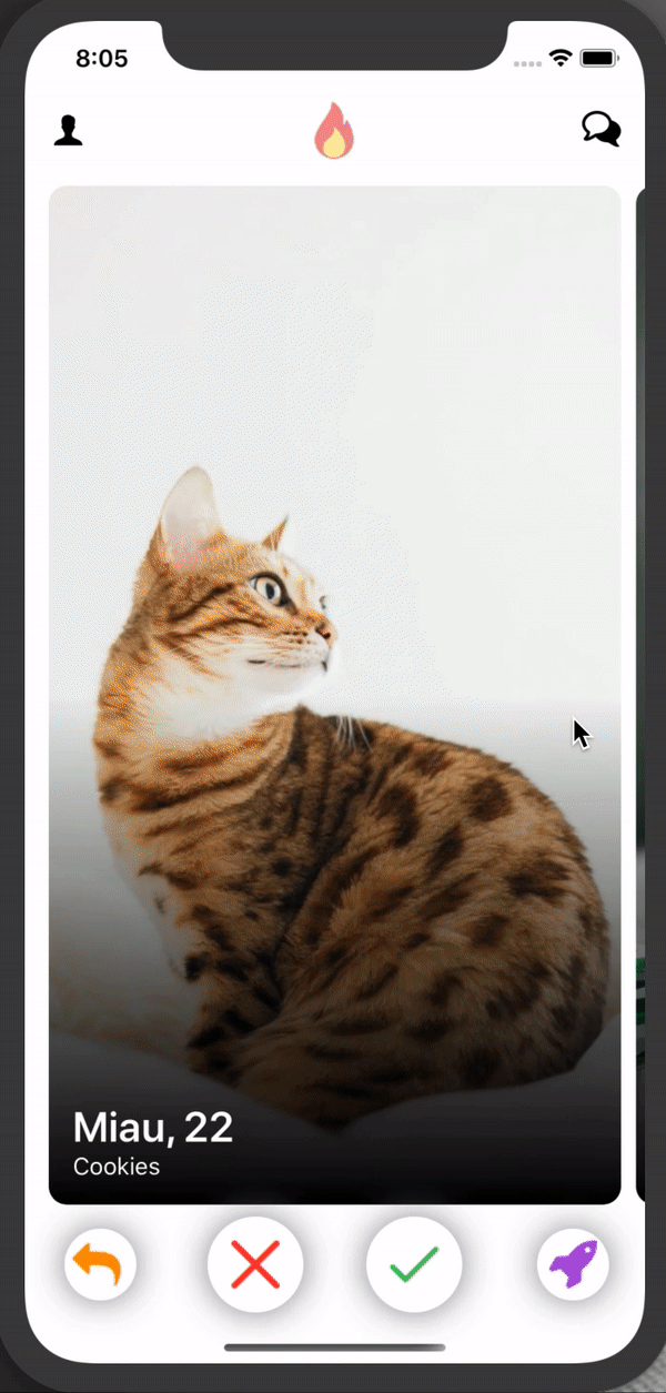
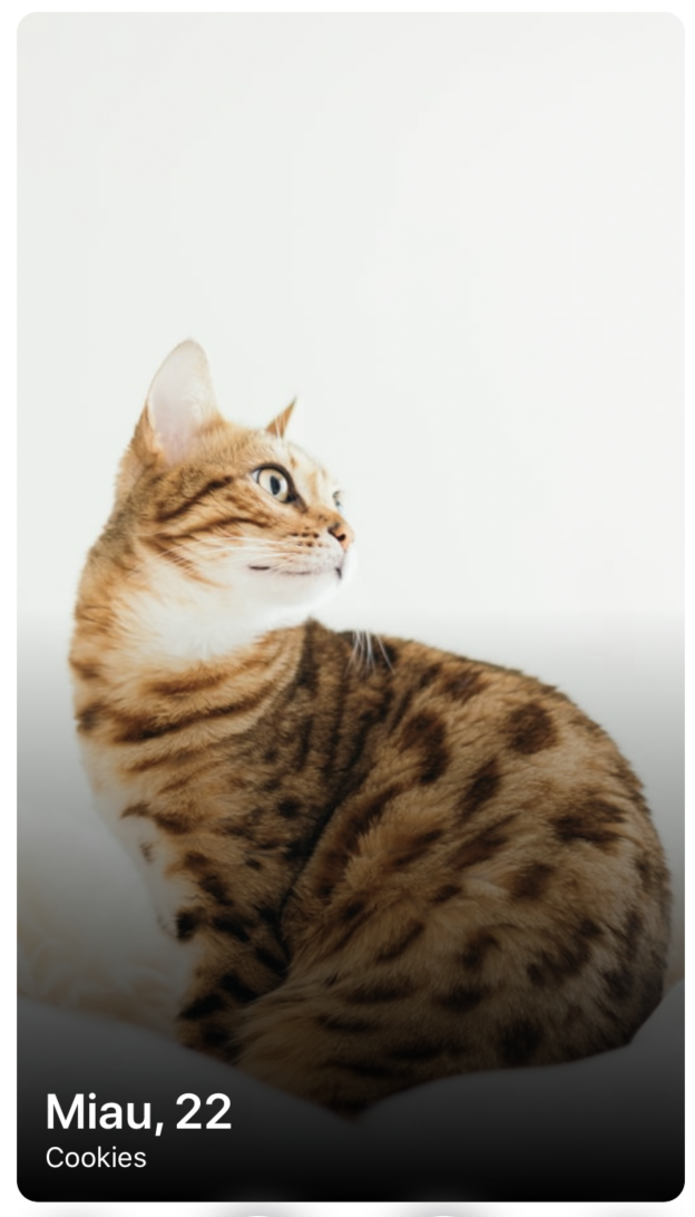
After all these steps, run the app. You will get the following screen:
完成所有这些步骤后,运行该应用程序。 您将获得以下屏幕:
Let’s add a small helper method now. Before I show you how NavigationView is defined, let's create a helper method, which looks like this:
让我们现在添加一个小的辅助方法。 在向您展示如何定义NavigationView之前,让我们创建一个辅助方法,如下所示:
struct ViewFactory {
    static func button(_ name: String, renderingMode: Image.TemplateRenderingMode = .original) -> some View {
        Button(action: {}) {
            Image(name)
                .renderingMode(renderingMode)
        }
    }
}
Here, we have defined a button factory method, that creates a new button from a given image and a rendering mode. There is no action handler, since that falls out of scope for this article.
在这里,我们定义了一个按钮工厂方法,该方法根据给定的图像和渲染模式创建一个新按钮。 没有动作处理程序,因为这超出了本文的范围。
导航视图 (NavigationView)
struct NavigationView: View {
    var body: some View {
        HStack {
            ViewFactory.button("profile_icon")
            Spacer()
            ViewFactory.button("fire_icon")
                .scaleEffect(2)
            Spacer()
            ViewFactory.button("chat_icon")
        }
    }
}
SwiftUI will automatically make the Spacers of equal width, and it will give us the following navigation view:
SwiftUI将自动使垫片的宽度相等,并为我们提供以下导航视图:
BottomBarView (BottomBarView)
struct BottomBarView: View {
    var body: some View {
        HStack {
            ViewFactory.button("back_icon", renderingMode: .template)
                .foregroundColor(.orange)
                .background(
                    GeometryReader { geometry in
                        Circle()
                            .offset(x: 2.5)
                            .foregroundColor(.white)
                            .shadow(color: .gray, radius: 12)
                            .frame(width: geometry.size.width * 1.5, height: geometry.size.height * 1.5)
                    }
            )
            Spacer()
            ...
}
In the above code snippet, we've defined the first button from our bar view. Here's what's going on:
在上面的代码片段中,我们从条形视图中定义了第一个按钮。 这是怎么回事:
ViewFactory.button — here we are using our helper method to define button with image with renderingMode .template which allows you to put a custom color for this image
ViewFactory.button —在这里我们使用我们的辅助方法来定义带有renderMode .template图像的按钮,该按钮允许您为该图像放置自定义颜色
.foregroundColor — defining the color of our view
.foregroundColor —定义视图的颜色
.background — this method defines the given object's background view
.background —此方法定义给定对象的背景视图
GeometryReader — a container view that defines its content as a function of its own size and coordinate space. We are using this to get the current size of a button and define the background circle with the given frame. Learn more about Geometry Readers here.
GeometryReader —一个容器视图,根据其自身大小和坐标空间定义其内容。 我们使用它来获取按钮的当前大小,并使用给定的框架定义背景圆。 在此处了解有关几何阅读器的更多信息。
Circle — defines the background shape
圆 —定义背景形状
.offset — circle x-axis offset
.offset —圆x轴偏移
.foregroundColor — circle tint color
.foregroundColor —圆圈色调颜色
.shadow — circle shadow
.shadow-圆形阴影
.frame — defines the circle frame using the geometry reader's size (here we are defining a background circle, 1.5x bigger than the current button)
.frame —使用几何读取器的尺寸定义圆框(这里我们定义一个背景圆,比当前按钮大1.5倍)
Now let's implement the rest of the buttons:
现在让我们实现其余的按钮:
struct BottomBarView: View {
    var body: some View {
        HStack {
            ViewFactory.button("back_icon", renderingMode: .template)
                .foregroundColor(.orange)
                .background(
                    GeometryReader { geometry in
                        Circle()
                            .offset(x: 2.5)
                            .foregroundColor(.white)
                            .shadow(color: .gray, radius: 12)
                            .frame(width: geometry.size.width * 1.5, height: geometry.size.height * 1.5)
                    }
            )
            Spacer()
            ViewFactory.button("close_icon", renderingMode: .template)
                .foregroundColor(.red)
                .background(
                    GeometryReader { geometry in
                        Circle().foregroundColor(.white)
                            .frame(width: geometry.size.width * 2, height: geometry.size.height * 2)
                            .shadow(color: .gray, radius: 12)
                    }
            )
            Spacer()
            ViewFactory.button("approve_icon", renderingMode: .template)
                .foregroundColor(.green)
                .background(
                    GeometryReader { geometry in
                        Circle()
                            .foregroundColor(.white)
                            .shadow(color: .gray, radius: 12)
                            .frame(width: geometry.size.width * 2, height: geometry.size.height * 2)
                    }
            )
            Spacer()
            ViewFactory.button("boost_icon", renderingMode: .template)
                .foregroundColor(.purple)
                .background(
                    GeometryReader { geometry in
                        Circle()
                            .foregroundColor(.white)
                            .shadow(color: .gray, radius: 12)
                            .frame(width: geometry.size.width * 1.5, height: geometry.size.height * 1.5)
                    }
            )
        }
        .padding([.leading, .trailing])
    }
}
And as a result we now have this beautiful view:
结果,我们现在有了这个美丽的景色:

滑动查看 (SwipeView)
This section is for more advanced SwiftUI. This is really where things get interesting. We would like to implement the swipe gesture on the action view. This behavior is a nice use case for a PageViewController, but this view controller will be history soon, so this is where we can show the real power of SwiftUI.
本节适用于更高级的SwiftUI。 这确实是让事情变得有趣的地方。 我们想在动作视图上实现滑动手势。 此行为是PageViewController的一个很好的用例,但是此视图控制器将很快成为历史,因此我们可以在这里展示SwiftUI的真正功能。
So let's see how SwipeView is implemented:
因此,让我们看看SwipeView是如何实现的:
struct SwipeView: View {
    @State private var offset: CGFloat = 0
    @State private var index = 0

    let users = [...]
    let spacing: CGFloat = 10

    var body: some View {
        GeometryReader { geometry in
            return ScrollView(.horizontal, showsIndicators: true) {
                HStack(spacing: self.spacing) {
                    ForEach(self.users) { user in
                        UserView(userModel: user)
                            .frame(width: geometry.size.width)
                    }
                }
            }
            .content.offset(x: self.offset)
            .frame(width: geometry.size.width, alignment: .leading)
            .gesture(
                DragGesture()
                    .onChanged({ value in
                        self.offset = value.translation.width - geometry.size.width * CGFloat(self.index)
                    })
                    .onEnded({ value in
                        if -value.predictedEndTranslation.width > geometry.size.width / 2, self.index < self.users.count - 1 {
                            self.index += 1
                        }
                        if value.predictedEndTranslation.width > geometry.size.width / 2, self.index > 0 {
                            self.index -= 1
                        }
                        withAnimation { self.offset = -(geometry.size.width + self.spacing) * CGFloat(self.index) }
                    })
            )
        }
    }
}
Here we have used a few new interesting SwiftUI concepts:
在这里,我们使用了一些新的有趣的SwiftUI概念:
@ State — A persistent value of a given type, through which a view reads and monitors the value, which means that whenever this property will change, the view will be reloaded to adjust to the given state update. You can check more about State here.
@ State —给定类型的持久值,视图通过该值读取并监视该值,这意味着只要此属性发生更改,就将重新加载视图以适应给定的状态更新。 您可以在此处查看有关State的更多信息。
DragGesture — this object will be used to recognize every swipe that user makes on screen. You can read more about this here: developer.apple.com/documentation/swiftui/draggesture
DragGesture-此对象将用于识别用户在屏幕上进行的每一次滑动。 您可以在这里阅读有关此内容的更多信息: developer.apple.com/documentation/swiftui/draggesture
@ State private var offset: CGFloat = 0 — this property will be used to define the current scroll view offset when users swipe over the screen
@ State private var offset:CGFloat = 0-当用户在屏幕上滑动时,此属性将用于定义当前滚动视图的偏移量
@ State private var index = 0 — this property defines which user view is currently on the screen
@ State private var index = 0-此属性定义屏幕上当前正在显示的用户视图
ScrollView — horizontal scroll view without indicators, that will be a container for our user view
ScrollView —不带指示器的水平滚动视图,它将作为我们用户视图的容器
HStack — horizontal stack view which contains all user views
HStack —包含所有用户视图的水平堆栈视图
content.offset(self.offset) — it is creating a connection between the offset state and the scroll view content offset. This means that whenever the offset property will change, the scroll view offset will also be updated
content.offset(self.offset) —它正在偏移状态和滚动视图内容偏移之间创建连接。 这意味着,每当offset属性改变时,滚动视图的偏移量也会被更新。
We are enumerating over the existing users by creating a UserView for each element:
我们通过为每个元素创建一个UserView来枚举现有用户:
.frame — here we are defining the scroll view frame that should fit the screen's width, and should be aligned properly to its container
.frame —在这里,我们定义的滚动视图框架应适合屏幕的宽度,并应与其容器正确对齐
.gesture — here we are adding our DragGesture object
.gesture —在这里我们添加了DragGesture对象
onChanged() — this block is invoke whenever user starts and is in time of dragning gesture, here we are calculating current user view offset that follows users finger
onChanged() -每当用户启动并且处于拖动手势时都会调用此块,此处我们正在计算跟随用户手指的当前用户视图偏移量
onEnded() — here we are informed when drag gesture ends, here we need to calculate if user would like to swipe this view (left or right), or maybe this gesture was marked, and user would like to stay on this screen
onEnded() -在此我们将在拖动手势结束时收到通知,在这里我们需要计算用户是否要滑动该视图(向左或向右),或者是否已标记了此手势,并且用户希望停留在此屏幕上
withAnimation — this closure is invoked with animation, and allows to change offset smothly
withAnimation —该闭包与动画一起调用,并允许平滑地更改偏移量
内容查看 (ContentView)
struct ContentView: View {
    var body: some View {
        VStack {
            NavigationView()
                .padding(.bottom)
            SwipeView()
                .padding(.bottom)
            BottomBarView()
        }
        .padding()
    }
}
Our content view is extremely simple at this point — it composes all created the views we previously created, inside a vertical stack (VStack). For the NavigationView and SwipeView we have added some default padding on the bottom, and the whole VStack has paddings added to all edges.
此时,我们的内容视图非常简单-它在垂直堆栈( VStack )内构成了我们先前创建的所有视图。 对于NavigationView和SwipeView,我们在底部添加了一些默认填充,并且整个VStack的所有边缘都添加了填充。
That's it. Done. This is how our app looks like now:
而已。 做完了 这是我们的应用现在的样子:
最后的想法 (Final thoughts)
As we can see SwiftUI is very powerful tool, it gives us an easy way to define and manipulate UI in a short declarative code. React Native developers would recognize this declarative paradigm right away.
如我们所见,SwiftUI是一个非常强大的工具,它为我们提供了一种在简短的声明性代码中定义和操作UI的简便方法。 React Native开发人员会立即认识到这种声明式范例。
But remember: SwiftUI is still under development and can be extremely unstable for now. If you would like to check all code base for this project you can find it on Github.
但是请记住:SwiftUI仍在开发中,目前可能非常不稳定。 如果您想检查该项目的所有代码库,可以在Github上找到它。
If you have any thoughts or questions about SwiftUI, feel free to share them in comments. Also, if you've enjoyed this article, please share it with your community to help us spread the word!
如果您对SwiftUI有任何想法或问题,请随时在评论中分享。 另外,如果您喜欢这篇文章,请与您的社区分享,以帮助我们传播信息!
火种 ctf


 扫一扫
扫一扫

 被折叠的 条评论
为什么被折叠?
被折叠的 条评论
为什么被折叠?
 到【灌水乐园】发言


