


In this article, we will explore the Flow Map chart in Power BI Desktop. Power BI is helpful to visualize the data through various form of the inbuilt and the custom charts. We have explored few such important charts in previous articles. Below is the list of articles for reference
在本文中,我们将探索Power BI Desktop中的流程图。 Power BI通过各种形式的内置图表和自定义图表有助于可视化数据。 在先前的文章中,我们仅探索了几个如此重要的图表。 以下是供参考的文章列表
- Enlighten World Flag Slicer in Power BI Desktop 在Power BI桌面中启发世界国旗切片器
- Power BI desktop Mekko Charts Power BI桌面Mekko图表
- Hexbin Scatterplot in Power BI Desktop Power BI Desktop中的Hexbin散点图
- Power BI Desktop Pulse Charts Power BI桌面脉冲图
- Word Cloud generator in Power BI Desktop Power BI Desktop中的词云生成器
- Candlestick chart for stock data analysis 烛台图,用于库存数据分析
Let us understand the flow map chart using an example of airlines. An airline connects multiple cities together. In this scenario, you can consider one origin and the multiple destinations. For example, flights operate from origin airport and connect to multiple destinations across the world. Therefore, if we want to represent this kind of data or object movement, we need to use the flow control chart in Power BI Desktop.
让我们以航空公司为例来了解流程图。 一家航空公司将多个城市连接在一起。 在这种情况下,您可以考虑一个起点和多个目的地。 例如,航班从始发机场运营,并连接到世界各地的多个目的地。 因此,如果要表示这种数据或对象移动,则需要使用Power BI Desktop中的流控制图。
在Power BI Desktop中导入流程图的数据 (Import data for Flow Map Chart in Power BI Desktop)
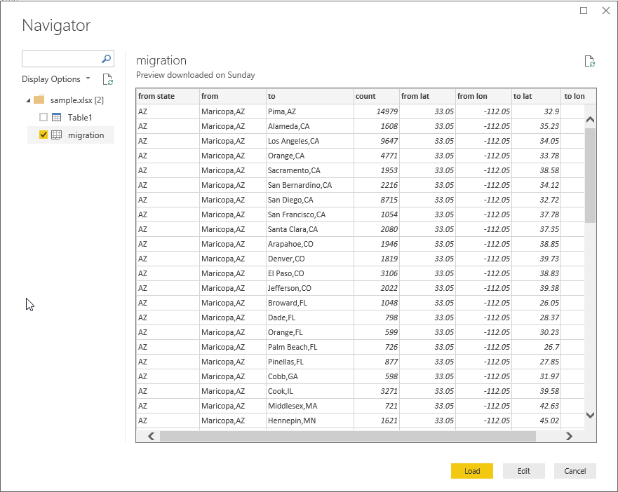
In this article, we will use the sample data from GitHub. You can click on this link and download the excel sheet containing the sample data. Below is the screenshot of the excel file. You can see in the screenshot that our data contains below fields.
在本文中,我们将使用GitHub中的示例数据。 您可以单击此链接并下载包含示例数据的Excel工作表。 以下是excel文件的屏幕截图。 您可以在屏幕快照中看到我们的数据包含以下字段。
Import this excel sheet using Excel data source.
使用Excel数据源导入此excel工作表。
- Get Data -> Excel 获取数据-> Excel
Provide the location of the excel file and view the sample data.
提供excel文件的位置并查看示例数据。
Once you click on ‘Load’, it creates the data model and creates data set accordingly.
单击“加载”后,它将创建数据模型并相应地创建数据集。
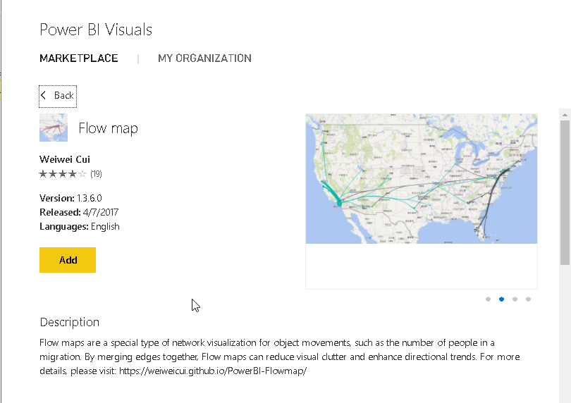
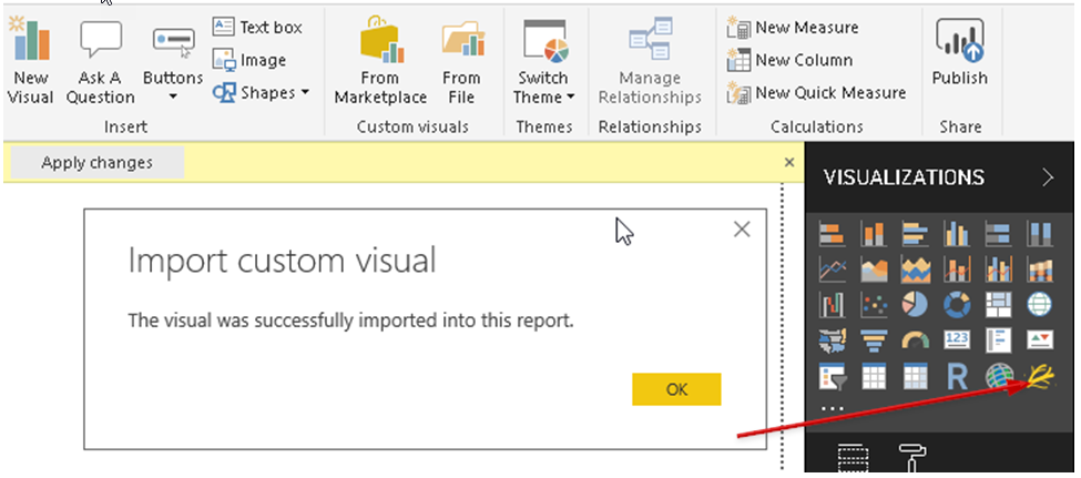
We have the data set in place for our visual. Now, we will import the ‘Flow Map’ from the marketplace. You can click on the eclipse icon and then on Import from the marketplace.
我们已经为视觉提供了数据集。 现在,我们将从市场上导入“流程图”。 您可以单击Eclipse图标,然后单击“从市场导入”。
Search flow maps chart in the marketplace. You can go over the description ‘Flow-style visualization that depicts the movement of objects among geo-locations.’
在市场中搜索流程图。 您可以查看描述“流式可视化,描绘对象在地理位置之间的移动”。
Add the visual to the visualizations area. The icon of the flow map also depicts the flow process.
将视觉效果添加到可视化区域。 流程图的图标还描述了流程。
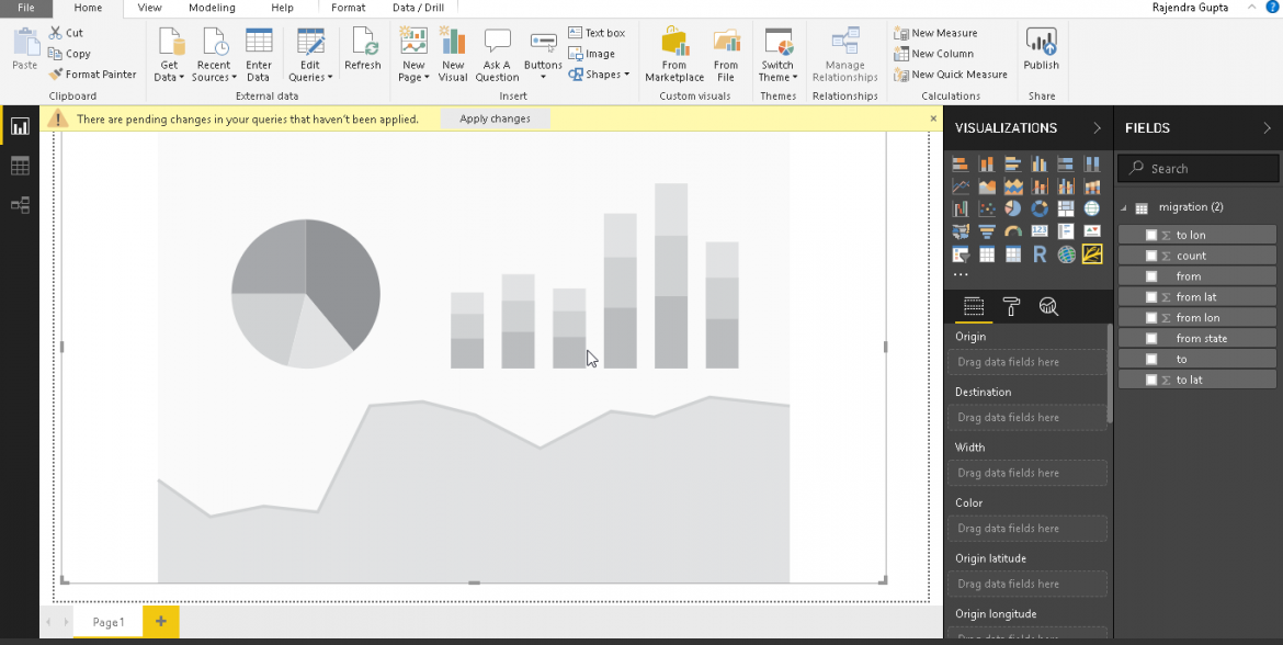
Click on the flow map visual icon. Adjust the height and width to have a better visual.
单击流程图可视图标。 调整高度和宽度,以获得更好的视觉效果。
 最低0.47元/天 解锁文章


 615
615


 被折叠的 条评论
为什么被折叠?
被折叠的 条评论
为什么被折叠?
 到【灌水乐园】发言


