


 本文详细介绍了如何在Power BI中创建和使用自定义形状地图,包括从头开始创建自定义地图、转换shapefile为TopoJSON格式、数据清洗以及将数据与地图匹配的过程。通过示例,作者演示了如何展示欧洲机场旅客数量,并提供了资源下载链接。
power bi自定义地图
介绍 (Introduction)
This is the third article of a series dedicated to discovering geographic maps in Power BI.
这是致力于在Power BI中发现地理地图的系列文章的第三篇。
In the ToC below the article you can find out references to the previous articles and the project’s goal.
在文章下面的目录中,您可以找到对先前文章和项目目标的引用。
In the previous article, I gave you an overview of what a shape map is, which files it’s made of and I showed you how to use the standard built-in maps available in Power BI. Now it’s time to dig into the way to create your own shape map from the scratch and to display it in Power BI.
在上一篇文章中,我概述了形状图,构成的文件,并向您展示了如何使用Power BI中可用的标准内置图。 现在是时候研究从头开始创建自己的形状贴图并将其显示在Power BI中的方法了。
自定义形状图 (Custom shape maps)
In order to use custom shape maps the same rule as built-in applies: there must be a matching field between data and maps attributes. It means that you must know the data definition under the hood of your maps or at least you must be capable of opening and reading a shape map’s data table.
为了使用自定义形状贴图,将使用与内置形状贴图相同的规则:数据和贴图属性之间必须有一个匹配字段。 这意味着您必须了解地图背景下的数据定义,或者至少必须能够打开和读取形状地图的数据表。
To demonstrate custom shape maps let’s say we want to display the number of airport passengers in Europe, ranked by country.
假设要演示自定义形状图,我们要显示按国家/地区排名的欧洲机场旅客数量。
First thing we need a shape map. You can download a sample from the bottom of the page; a .zip file called Europe_countries_shp_custom.zip.
首先,我们需要一个形状图。 您可以从页面底部下载示例。 一个名为Europe_countries_shp_custom.zip的.zip文件。
Unzip the archive and use Excel (or another spreadsheet) to open the file Europe_countries_shp_custom.dbf. It is the table file for the shape that encodes all data description.
解压缩归档文件,然后使用Excel(或其他电子表格)打开文件Europe_countries_shp_custom.dbf 。 它是用于编码所有数据描述的形状的表文件。
Columns ISO2 and ISO3 are the most interesting as they contain the ISO code for every country. Rather than the country name, we must take care that in our dataset there’s a field with the same ISO code.
ISO2和ISO3列是最有趣的列,因为它们包含每个国家的ISO代码。 除了国家名称以外,我们还必须注意数据集中的字段具有相同的ISO代码。
The .zip archive holds the shapefile definition, but we need a TopoJSON file for using in Power BI.
.zip归档文件包含shapefile定义,但是我们需要一个TopoJSON文件才能在Power BI中使用。
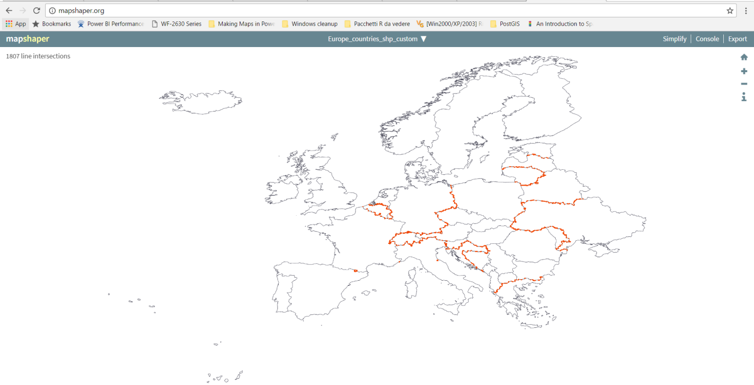
Open a browser and go to www.mapshaper.org an online converter.
打开浏览器,然后访问在线转换器www.mapshaper.org 。
Click on the word select in the page box and pick up the .zip shapefile you want to convert, then click Import. Remember: the whole .zip archive not only the .shp file.
单击页面框中的单词select并选择要转换的.zip shapefile,然后单击Import 。 请记住:整个.zip存档不仅是.shp文件。
Mapshaper imports the file and shows you a preview.
Mapshaper会导入文件并显示预览。
Click Export and choose the TopoJSON format. Save the. json file on your hard disk.
单击导出,然后选择TopoJSON格式。 保存。 硬盘上的json文件。
A good reference for where to find out shape maps, is Christopher Finlan’s blog. He created some geographic maps to use for Mobile Report Publisher. But they can apply to Power BI as well, once converted to TopoJSON.
Christopher Finlan的博客很好地找到了形状图。 他创建了一些地理地图以用于Mobile Report Publisher。 但是,一旦转换为TopoJSON,它们也可以应用于Power BI。
Alternatively, there are some TopoJSON map already formatted from David Eldersveld. He started creating and collecting some maps for the community. You can download them from his GitHub repository.
另外,还有一些已经由David Eldersveld格式化的TopoJSON映射。 他开始为社区创建和收集一些地图。 您可以从他的GitHub存储库下载它们。
Ok, up to this point we’ve got a map: now we need some data and we collect them from Wikipedia.
好的,到目前为止,我们已经有了一张地图:现在,我们需要一些数据,并从Wikipedia收集它们。
First step, the list of top 100 busiest airports in Europe.
第一步,列出欧洲最繁忙的100个机场。
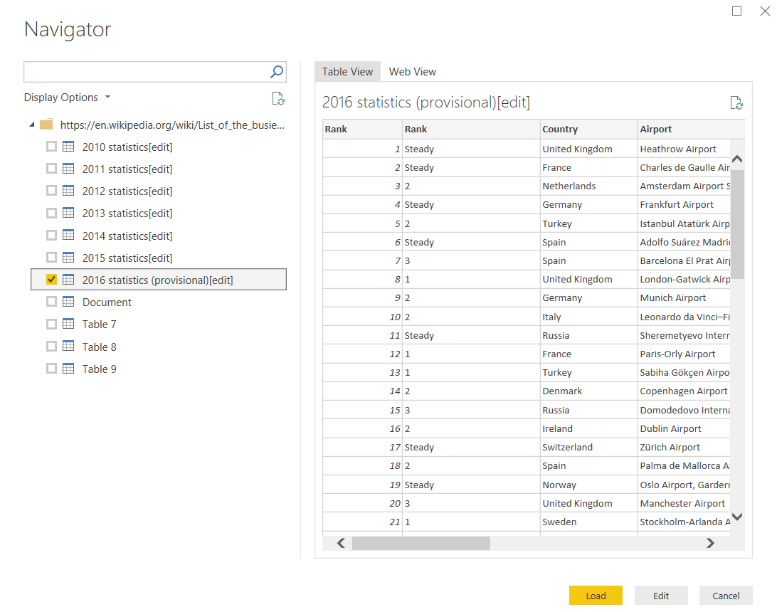
Open Power BI then select Get Data > Web. In the window insert the following URL: List of the busiest airports in Europe
打开Power BI,然后选择“ 获取数据”>“ Web” 。 在窗口中,输入以下URL: 欧洲最繁忙的机场列表
In the preview window select 2016 statistics (provisional) [edit] and then click Load to import the table in Power BI.
在预览窗口中,选择2016年统计信息(临时)[编辑] ,然后单击“ 加载”以将表导入Power BI。
The dataset must be edited before using it; click Edit Queries and do some changes.
在使用数据集之前,必须对其进行编辑; 单击编辑查询,然后进行一些更改。
Maybe you want to modify the name; I called mine 2016 statistics
 最低0.47元/天 解锁文章


 854
854

 被折叠的 条评论
为什么被折叠?
被折叠的 条评论
为什么被折叠?
 到【灌水乐园】发言


