


This article gives you an overview of representing coronavirus spread using Power BI Desktop visualizations.
本文概述了使用Power BI Desktop可视化表示冠状病毒传播的情况。
介绍 (Introduction)
As you know, Coronavirus is a pandemic disease. It is spreading in almost every country, and people are locked down in their houses. Recently, India entered in 21 days total lockdown due to an increase in Coronavirus cases. In the article, Visualize Coronavirus impact using a Power BI Dashboard, we visualized the impact of Coronavirus using Power BI Desktop.
如您所知,冠状病毒是一种流行病。 它几乎在每个国家蔓延,人们被关在家里。 最近,由于冠状病毒病例增加,印度进入了21天的总封锁期。 在使用Power BI仪表板可视化冠状病毒的影响的文章中,我们使用Power BI Desktop可视化了冠状病毒的影响。
In this article, we will explore a few other ways to represent data in Power BI and focus on the trend of coronavirus cases in Italy. We will also look at how social distancing can help in reducing the cases.
在本文中,我们将探索其他几种方法来表示Power BI中的数据,并关注意大利冠状病毒病例的趋势。 我们还将研究社会疏远如何帮助减少案件。
Before we start, let have a quick comparison between COVID-19, FLU, and Cold using the following useful graphics. Image reference: DeZeen
在开始之前,请使用以下有用的图形对COVID-19,FLU和Cold进行快速比较。 图片参考: DeZeen
You can look at the symptoms and visit a doctor in case of any issues. Be Safe and take precautions.
您可以查看症状,如有任何问题,请去看医生。 安全并采取预防措施。
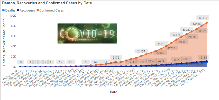
Italy is one of the most affected countries by the Corona Virus. It has reported 86,498 total cases and 9134 deaths as of 27th March 2020 due to this pandemic. It is interesting to know how this disease increases rapidly using visualization.
意大利是受电晕病毒影响最严重的国家之一。 截至2020年3月27 日 ,该报告共报告了86498例病例,死亡9134例。 有趣的是,通过可视化了解这种疾病如何Swift增加。
Note: You should validate data from valid sources such as the World Health Organization (WHO), Centers for Disease Control and Prevention(CDC).
注意:您应该验证来自有效来源的数据,例如世界卫生组织(WHO),疾病控制与预防中心(CDC)。
导入Power BI报表数据 (Import data for Power BI Report)
In this article, we will use reference data from the Wikipedia page 2020 coronavirus pandemic in Italy.
在本文中,我们将使用Wikipedia页面2020年意大利冠状病毒大流行的参考数据。
Launch Power BI Desktop and import data from a web data source using Get Data -> Web.
启动Power BI Desktop并使用Get Data-> Web从Web数据源导入数据。
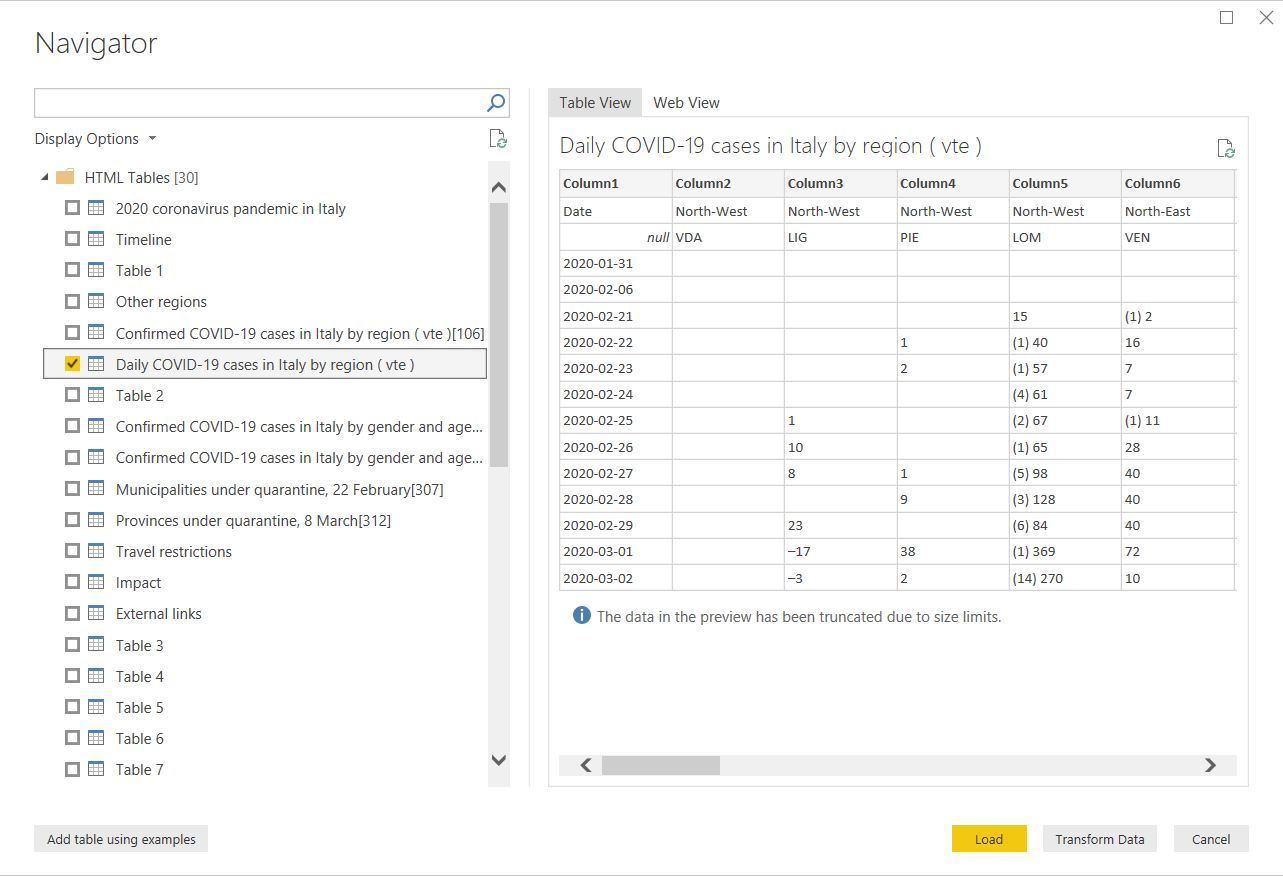
It shows you a list of tables from the pages. Select the highlighted table and click on Transform Data.
它显示了页面中的表格列表。 选择突出显示的表,然后单击“ 转换数据” 。
Before we prepare a visual, we need the following changes in the data set.
在准备视觉效果之前,我们需要对数据集进行以下更改。
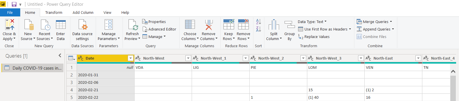
Click on Use first row as a header to use table column headers, as shown below:
单击“ 使用第一行作为标题”以使用表列标题,如下所示:
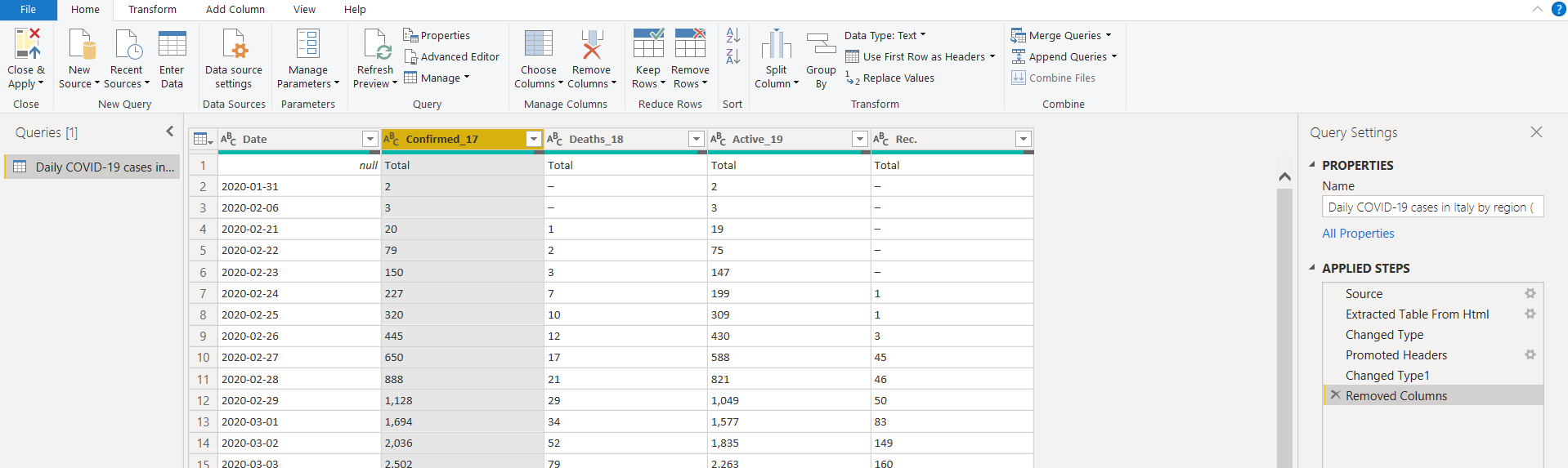
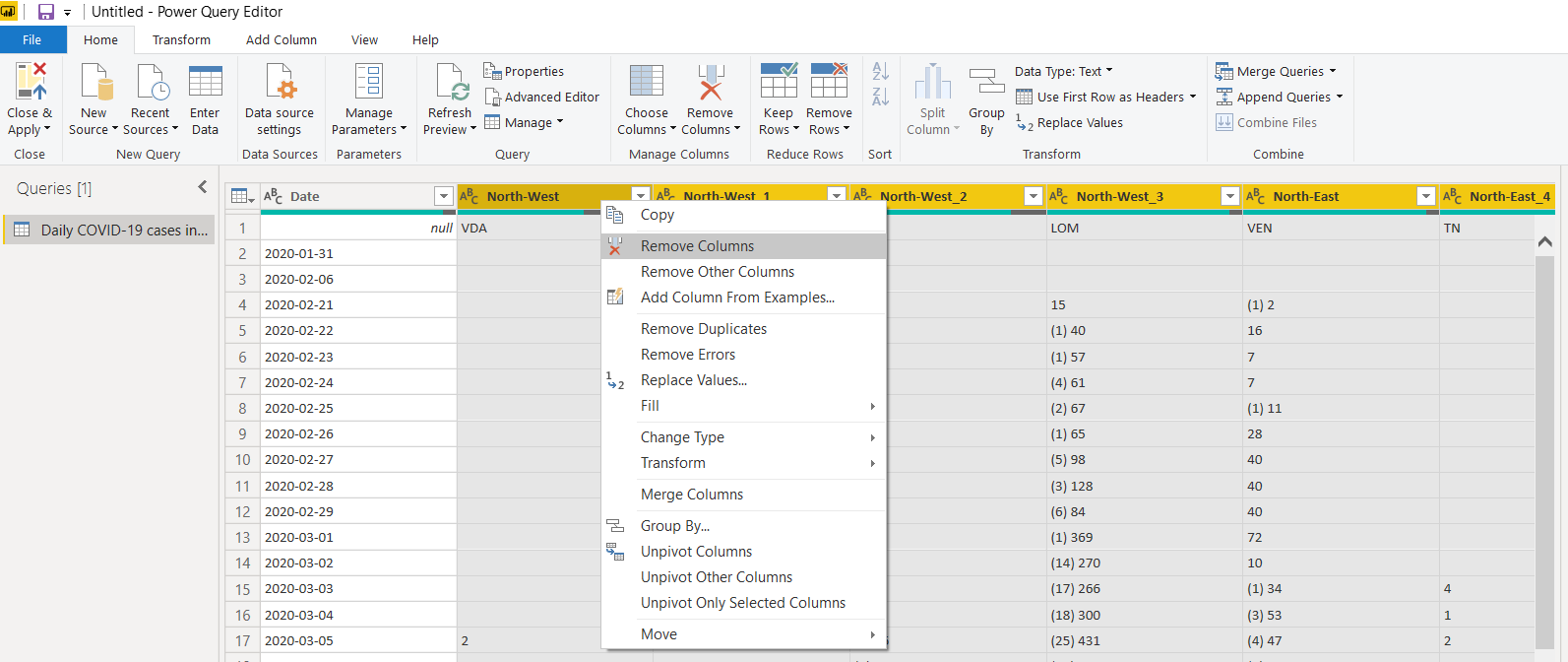
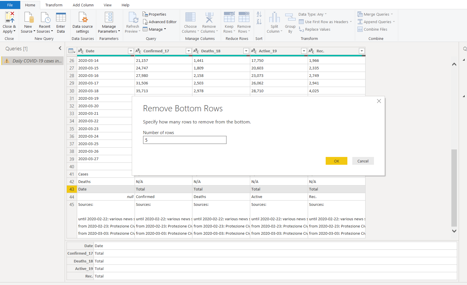
We do not require regional data in the data set. Select the unwanted columns and remove these. We can also remove the new cases columns data from the imported data set:
我们不需要数据集中的区域数据。 选择不需要的列并将其删除。 我们还可以从导入的数据集中删除新的案例列数据:
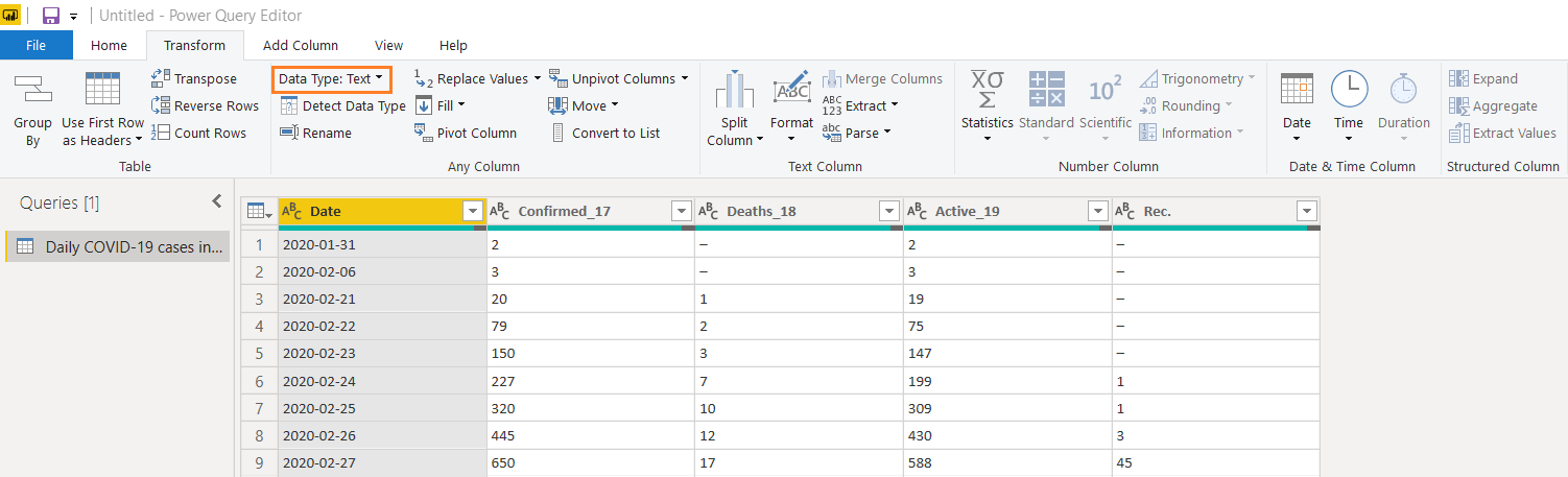
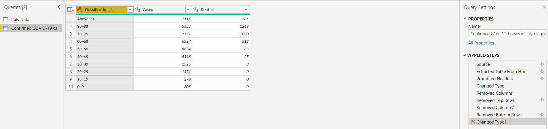
We have the following columns available after removing unwanted columns. You can also follow the applied steps shown in the below image.
删除不需要的列后,我们提供以下列。 您还可以按照下图所示应用步骤。
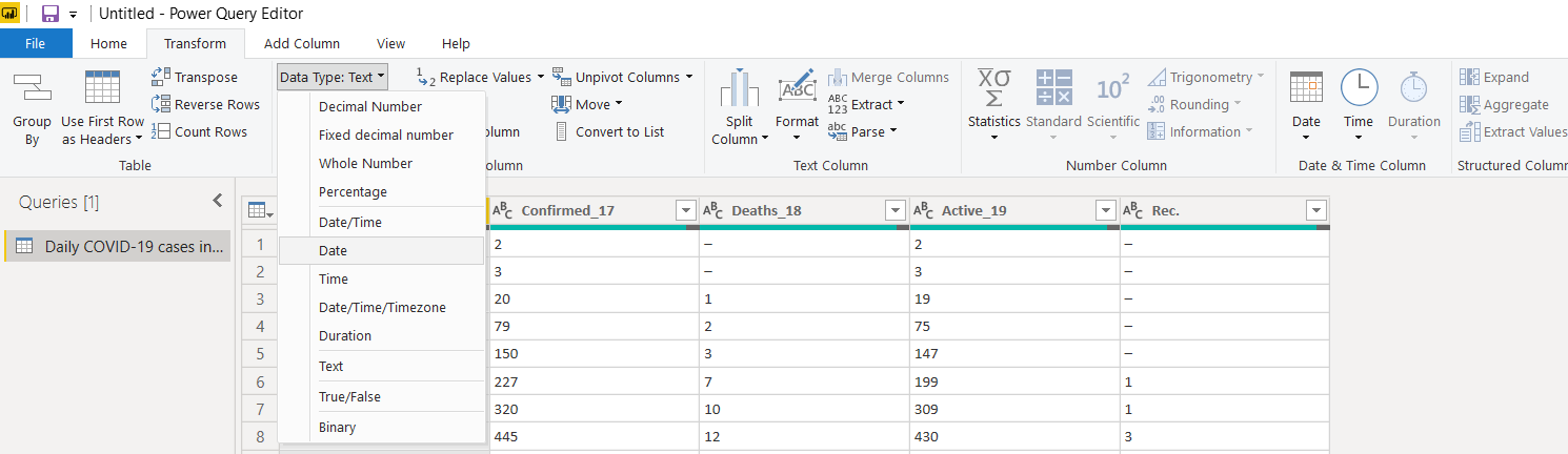
It is an important aspect the categorize each column with appropriate data types as well. If we do not assign the correct data type, it might create inaccurate charts since it does not recognize correct entries. As you see here, Power BI defined the data column as text. In the text format, it also treats the dates as text instead of dates.
同样重要的是,还要对每列进行适当的数据类型分类。 如果我们未分配正确的数据类型,则由于无法识别正确的条目,因此可能会创建不正确的图表。 如您在此处看到的,Power BI将数据列定义为文本。 在文本格式中,它将日期也视为文本而不是日期。
Click on Transform and change the data type to Date from a drop-down list.
单击转换,然后从下拉列表中将数据类型更改为日期。
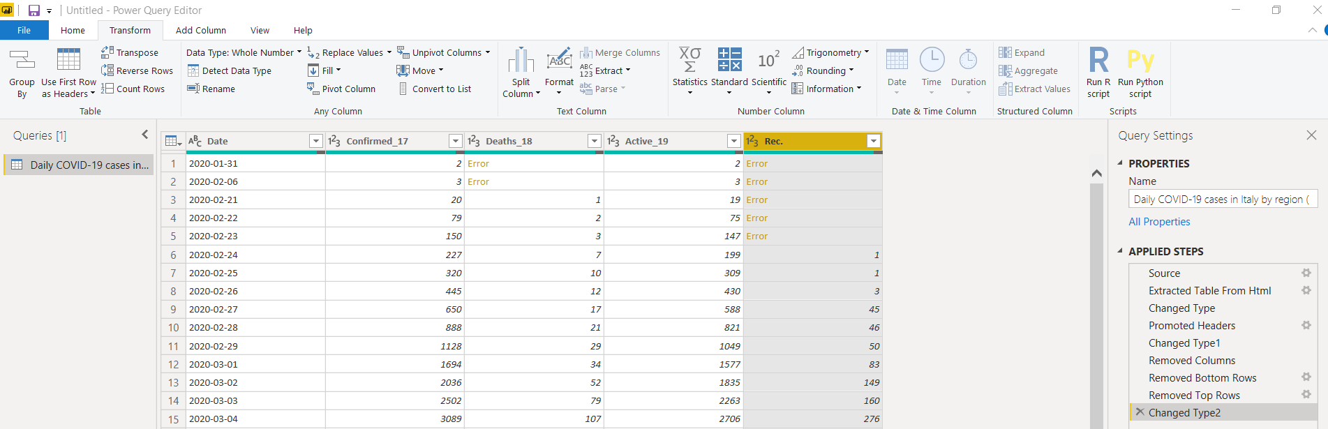
Similarly, change the data type for other columns as the Whole Number. In a few columns(Confirmed, Deaths and Active), once we change the data type to the whole number, it shows error for few rows data.
同样,将其他列的数据类型更改为“整数”。 在几列中(确认,死亡和活动),一旦我们将数据类型更改为整数,就会显示几行数据的错误。
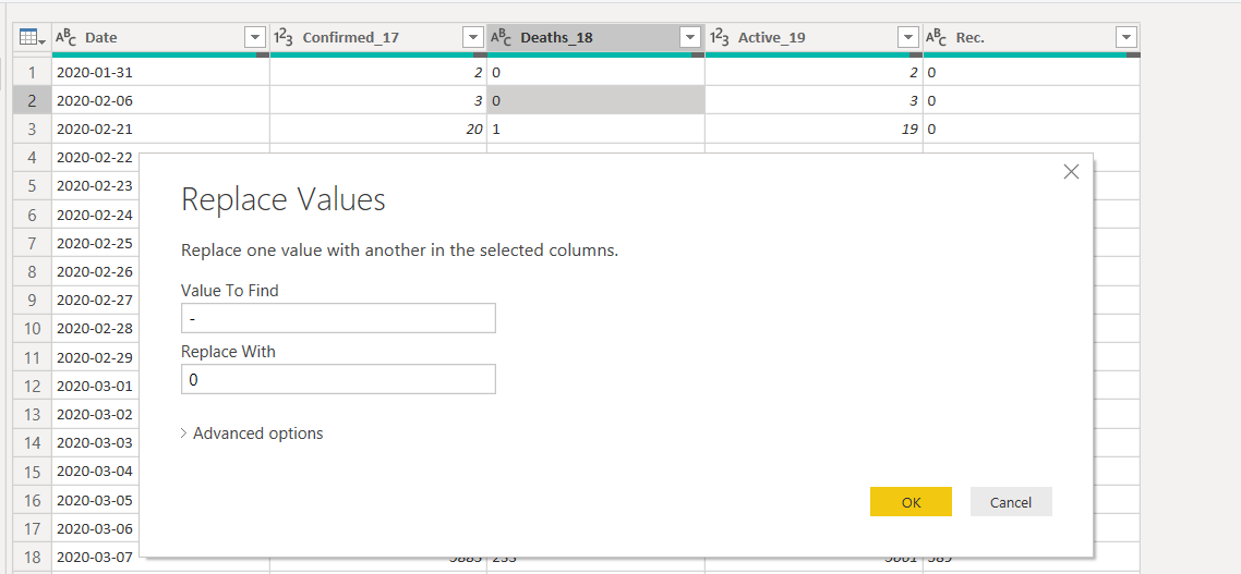
To resolve this, change the data type back to the text and replace the values for the dash (-) with zero.
要解决此问题,请将数据类型改回文本,然后将破折号(-)的值替换为零。
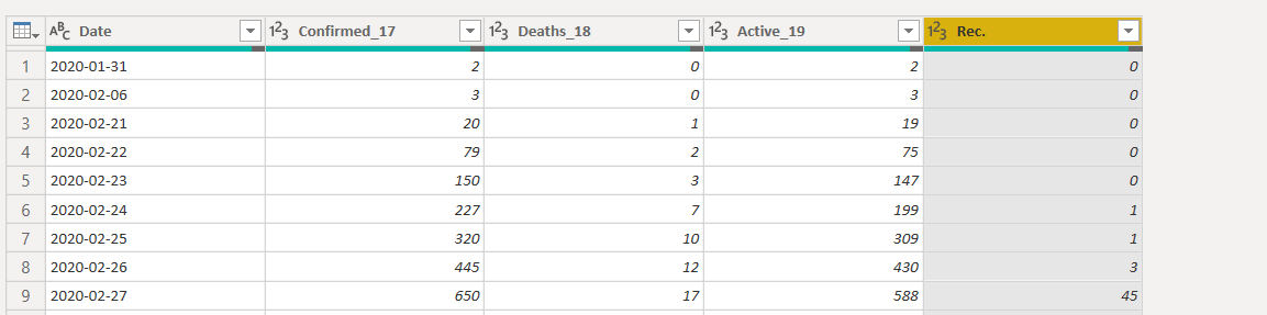
Now, switch to the whole number data type again, and it works fine.
现在,再次切换到整数数据类型,它可以正常工作。
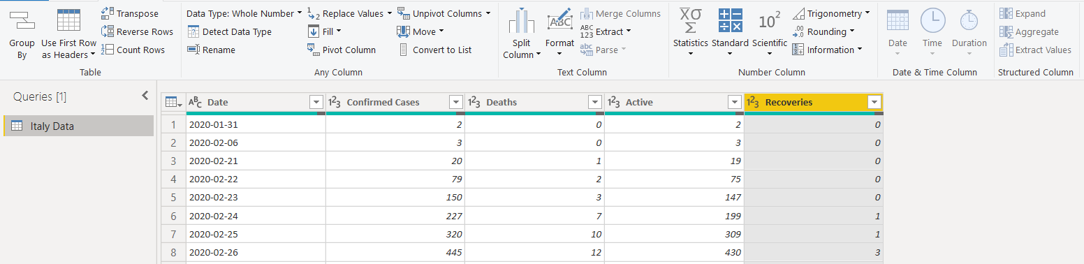
Rename the columns’ names to give a preferred naming convention
重命名列的名称以提供首选的命名约定
Save the changes (Close & Apply), and we get the data set in Power BI as shown below.
保存更改(关闭并应用),我们将在Power BI中获得数据集,如下所示。
在Power BI Desktop中创建面积图可视化 (Create an Area Chart visualization in Power BI Desktop)
Let’s start creating the visualizations for this article. We want the following area chart for this visual. It is available in the default visualizations.
让我们开始为本文创建可视化。 我们需要以下面积图来显示该视觉效果。 在默认的可视化文件中可用。

Use the following steps to prepare this visual.
使用以下步骤准备此视觉效果。
-
- Axis: Date 轴:日期
- Values: Deaths, Recoveries and Confirmed cases 值:死亡,恢复和确诊病例
- high-density sampling from the format area: 高密度采样 :
- data labels property. It shows the data labels ( values) on the chart area. Here, we choose display units as None to show actual values in the chart. We can use display units to shows values in thousands, Millions, Billions: 数据标签属性。 它在图表区域上显示数据标签(值)。 在这里,我们选择显示单位为“无”以在图表中显示实际值。 我们可以使用显示单位来显示数千,数百万和十亿的值:
- Show Marker. It shows data points in the chart. We can also change the marker shape if required: 显示标记 。 它在图表中显示数据点。 如果需要,我们还可以更改标记的形状:
- Title alignment: Set the tile alignment to left, center or right. Here, we select the center alignment. By default, it shows a title depending upon the selected data fields. You can also modify the default title as per your requirement: 标题对齐 :将图块对齐设置为左,中或右。 在这里,我们选择中心对齐。 默认情况下,它会根据所选数据字段显示标题。 您还可以根据需要修改默认标题:
Click on the image and import an image in the report. Adjust the image size and move it in the blank area of the chart:
单击图像,然后将图像导入报告中。 调整图像大小并将其移动到图表的空白区域:
It completes the configuration of the visual we showed earlier.
它完成了我们先前显示的视觉效果的配置。
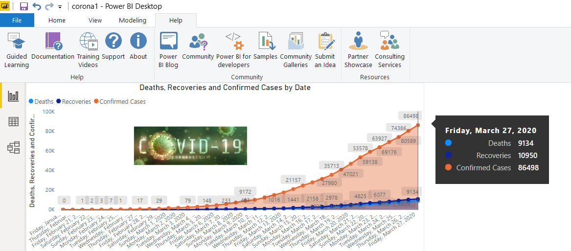
We can take the mouse pointer over any data point, and it gives you complete information.
我们可以将鼠标指针放在任何数据点上,它为您提供完整的信息。
- Date 日期
- Total confirmed cases, recoveries and deaths 确诊病例,康复和死亡总数
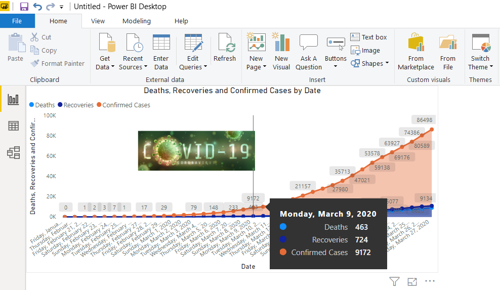
Here, we can notice that during initial days corona cases increase slowly, but later, we can case get doubled in few days only. For example, on 9th March 2020, we have 9172 confirmed cases in Italy.
在这里,我们可以注意到,在开始的日子里,电晕的情况缓慢增加,但是后来,我们的情况只会在几天之内增加一倍。 例如,在2020年3月9 日 ,我们在意大利有9172例确诊病例。
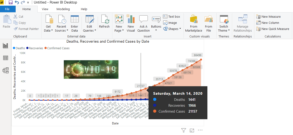
The confirmed cases doubled in just 5 days. On 14th March 2020, it shows 21157 confirmed cases.
确诊病例在短短5天内翻了一番。 2020年3月14 日 ,它显示了21157例确诊病例。
可视化冠状病毒对意大利年龄段的影响 (Visualize Coronavirus impact on the age groups in Italy)
Now, we will analyze the confirmed cases in Italy by their age group. For this, we will use the same URL and import the following data table. We do not need to close the report. You can click on the get data in the ribbon bar and use Get Data -> web for it.
现在,我们将按年龄段分析意大利确诊病例。 为此,我们将使用相同的URL并导入以下数据表。 我们不需要关闭报告。 您可以单击功能区栏中的获取数据,然后使用获取数据->网络。
Here, you can transform data, as shown earlier. After transformation, my data looks like below.
如前所述,您可以在这里转换数据。 转换后,我的数据如下所示。
Once we save the transformations, it shows an additional data set in the Power BI Report fields section, as shown below.
保存转换后,它将在Power BI报表字段部分中显示一个附加数据集,如下所示。
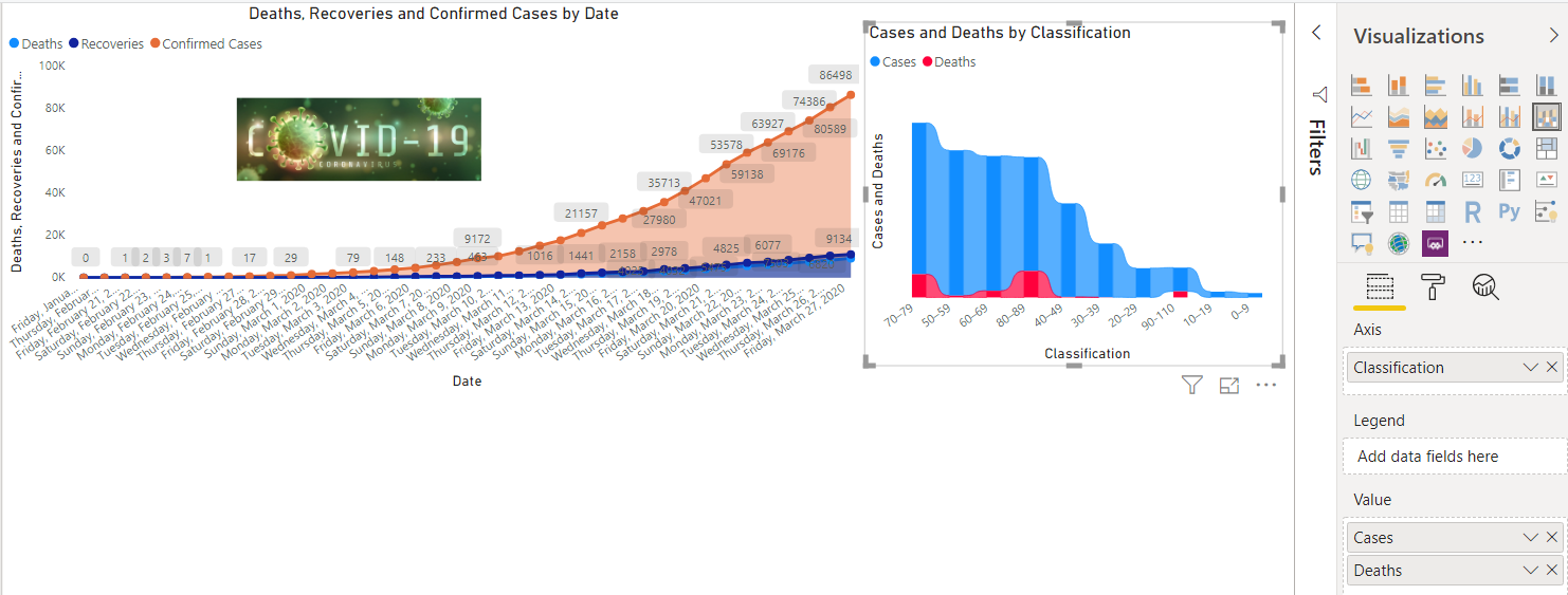
Once we have transformed data, drag the Ribbon chart and adjust the size of it in the Power BI Desktop report. In the chart configuration, drag the columns, as shown in the following image. We have not done any formatting in this chart; however, you can go in the format area and do the various configuration such as data color, title, axis, border.
转换完数据后,拖动功能区图表并在Power BI Desktop报告中调整其大小。 在图表配置中,拖动列,如下图所示。 我们在此图表中未进行任何格式化; 但是,您可以进入格式区域并进行各种配置,例如数据颜色,标题,轴,边框。
- Axis: Classification 轴:分类
- Value: Cases, Deaths 价值:案件,死亡
在Power BI报表中添加PIE图表 (Add the PIE chart in the Power BI Report)
We can use the PIE chart in Power BI to compare the categories among each other. For example, we want to know the percentage of cases and deaths in each age group. Let’s add a PIE chart from the visualizations and configure them for total cases and deaths, as shown below. Here, we see that Coronavirus mostly affects the old age group (70+ years).
我们可以使用Power BI中的PIE图表相互比较类别。 例如,我们想知道每个年龄段的病例和死亡百分比。 让我们从可视化图表中添加一个PIE图表,并针对总的病例数和死亡数配置它们,如下所示。 在这里,我们看到冠状病毒主要影响老年人群(70岁以上)。
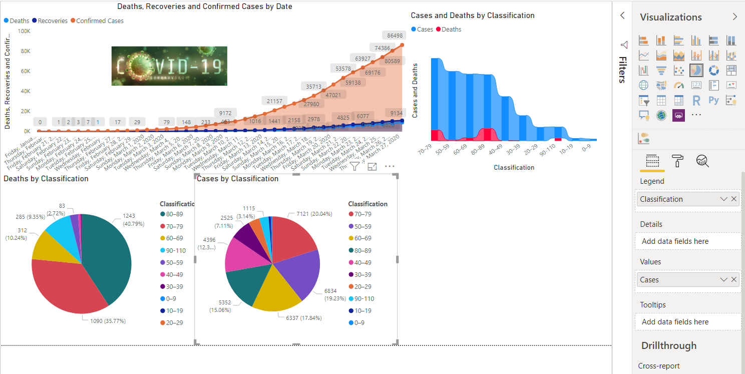
We can click on an individual category in the bar chart, and you can see the other data charts changes accordingly.
我们可以单击条形图中的单个类别,然后可以看到其他数据图表也发生了相应的变化。
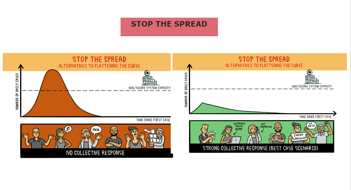
社会距离对日冕病毒传播的影响 (Social distance impact on Corona Virus spread)
In this last section of the article, I will add an important image showing the impact of social distancing on coronavirus disease from DeZeen. For this, add a new page in the Power BI Desktop report. We add the following items on the new page.
在本文的最后一部分,我将添加一个重要的图像,显示出社交距离对DeZeen的冠状病毒疾病的影响 。 为此,请在Power BI Desktop报告中添加一个新页面。 我们在新页面上添加以下项目。
- Add a text box and write the title of the page 添加一个文本框并写出页面标题
- Add image 添加图片
Here, you see that if you take precautions and make collective efforts, we can stop this disease spread and bring the world out of this unprecedented situation.
在这里,您可以看到,如果您采取预防措施并做出集体努力,我们就可以阻止这种疾病的蔓延并使世界摆脱这种前所未有的局面。
结论 (Conclusion)
In this article, we explored different ways of visualizing coronavirus impact in Italy on a daily basis. It also shows the coronavirus impact on different age groups. In the end, I hope you all doing good and taking all the necessary precautions and safety measures.
在本文中,我们每天探索可视化冠状病毒影响的不同方式。 它还显示了冠状病毒对不同年龄组的影响。 最后,我希望大家都做好事,并采取所有必要的预防措施和安全措施。
翻译自: https://www.sqlshack.com/analyze-coronavirus-data-with-power-bi-desktop-visualizations/


 2659
2659


 被折叠的 条评论
为什么被折叠?
被折叠的 条评论
为什么被折叠?
 到【灌水乐园】发言


