


flexbox布局
If there's one thing flexbox excels at, it's twelve-column layouts. In a twelve-column layout, the page is broken into twelve invisible columns. These columns have small amounts of space between them, called gutters. The page is divided into rows, and the containers in the rows take up a certain number of columns.
如果flexbox擅长一件事,那就是十二列布局。 在十二列布局中,页面分为十二个不可见的列。 这些列之间有少量空间,称为天沟 。 该页面分为几行,行中的容器占用一定数量的列。

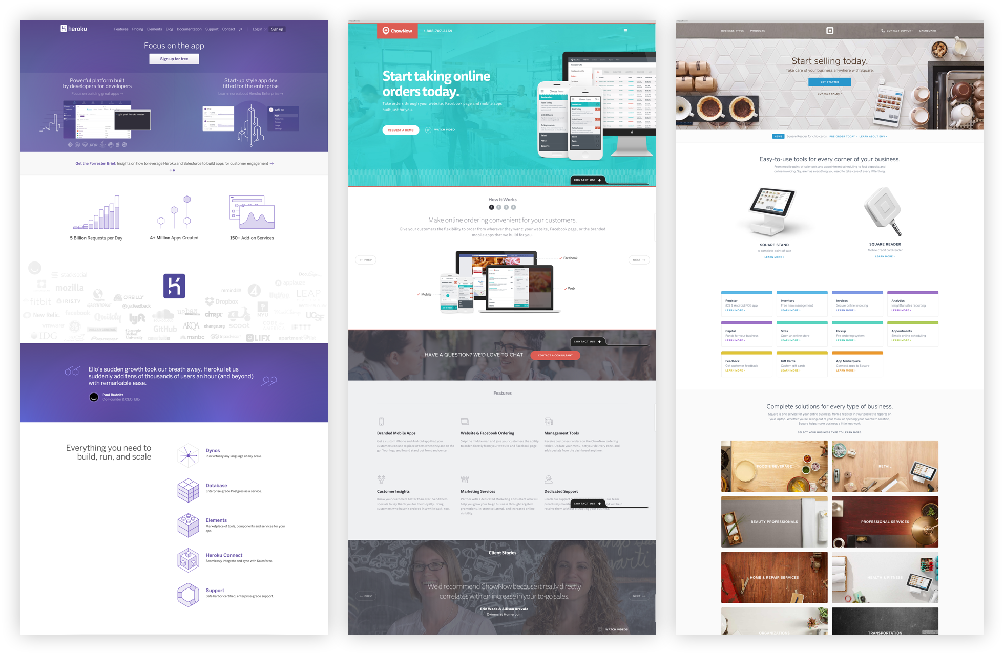
If you start to look for them, you'll see twelve-column layouts everywhere. Take a look at these landing pages from Heroku, ChowNow and Square. Notice how the sections are broken up into halves, thirds and fourths?
如果您开始寻找它们,那么到处都会看到十二列的布局。 看看来自Heroku , ChowNow和Square的这些着陆页。 请注意,这些部分如何分成两半,三分之四和四分之三?
In this article, I'll show you how to use flexbox's flex-grow, flex-shrink and flex-basis properties to build twelve-column layouts, without the need for a library!
在本文中,我将向您展示如何使用flexbox的flex-grow , flex-shrink和flex-basis属性来构建十二列布局,而无需使用库!
This article is an excerpt from Unraveling Flexbox, a book and video series on building flexbox layouts for the real world. If you like this post, be to check out the full series and subscribe to the Free Flexbox Starter Course.
本文摘自Unraveling Flexbox ,这是一本有关为现实世界构建Flexbox布局的书籍和视频系列。 如果您喜欢这篇文章,请查看完整的系列文章并订阅Free Flexbox Starter Course 。
设置容器 (Setting Up the Container)
Let's say you want each of the <div> elements in the following HTML to take up a third of the <section>.
假设您希望以下HTML中的每个<div>元素占据<section>的三分之一。
<section>
  <div class="column">First</div>
  <div class="column">Second</div>
  <div class="column">Third</div>
</section>

By default, the <section> element takes up 100% of the width of the screen. Start by limiting its width to 740 pixels. While you're at it, also add some space around the columns.
默认情况下, <section>元素占用屏幕宽度的100%。 首先将其宽度限制为740像素。 在使用它时,还要在列周围添加一些空间。
section {
  max-width: 740px;
  margin: 0 auto;
}

.column {
  margin: 10px;
}

Pop open the code examples and try dragging your browser window until it's smaller than 740 pixels. Notice how the <section> gets smaller as the screen shrinks, but stays fixed when the screen is larger than 740 pixels?
弹出代码示例,然后尝试拖动浏览器窗口,直到小于740像素为止。 请注意<section>如何随着屏幕缩小而变小,但是在屏幕大于740像素时保持不变?
灵活起来 (Flexin' It Up)
Make the <section> a flex container by setting it's display to flex.
将<section>设置为flex容器,方法是将其display设置为flex 。
section {
  max-width: 740px;
  margin: 0 auto;
  display: flex;
}

By default, flexbox sets the widths of the columns to the size of their content. You can change this behavior by using the flex-grow and flex-shrink properties.
默认情况下,flexbox将列的宽度设置为其内容的大小。 您可以通过使用flex-grow和flex-shrink属性来更改此行为。
The flex-grow property tells flexbox how to grow the item to take up additional space, if necessary. flex-shrink tells flexbox how to shrink when necessary. Since we want the columns to behave the same while growing and shrinking, set both of these properties to 1.
flex-grow属性告诉flexbox如果需要的话,如何增加项目以占用更多空间。 flex-shrink告诉flexbox必要时如何缩小。 由于我们希望列在增长和收缩时表现相同,因此将这两个属性都设置为1 。
.column {
  margin: 10px;
  flex-grow: 1;
  flex-shrink: 1;
}

Woohoo! The flexbox container now fills up three columns. The values for flex-grow and flex-shrink are proportional, meaning they change relative to other items in the flex container. Flexbox adds the values for the properties and then divides each column's value by that sum. So each column takes up 1 ÷ (1 + 1 + 1), or ⅓ of the total space.
hoo! 现在,flexbox容器将填充三列。 flex-grow和flex-shrink的值成比例 ,这意味着它们相对于flex容器中的其他项目改变。 Flexbox将属性的值相加,然后将每个列的值除以该总和。 因此,每列占用1 ÷ (1 + 1 + 1)或总空间的⅓。
What happens if one of the columns has a different value?
如果其中一列具有不同的值会怎样?
.column:first-of-type {
  flex-grow: 2;
  flex-shrink: 2;
}

The first column takes up the same amount of space as the other two. That's because the values add up to 4, so the first column is:
第一列占用的空间与其他两列相同。 那是因为这些值加起来等于4 ,所以第一列是:
2 ÷ (2 + 1 + 1) = ½
The other two are:
其他两个是:
1 ÷ (2 + 1 + 1) = ¼
关于该基础的一切 (All About That Basis)
If you look closely at the last example, you'll notice that the first column doesn't quite cover half of the container. If you add more content to the third column, you can really see the problem.
如果仔细观察最后一个示例,您会注意到第一列并没有完全覆盖容器的一半。 如果将更多内容添加到第三列,则可以真正看到问题。
<section>
  <div class="column">First</div>
  <div class="column">Second</div>
  <div class="column">
    The third column, with more content than
    before!
  </div>
</section>

What's going on? Why is flexbox not flexing correctly?
这是怎么回事? 为什么Flexbox无法正确弯曲?
It turns out flexbox doesn't distribute space evenly to each column. It figures out how much space each column starts with, specified by the flex-basis property. Then, the remaining space is distributed using the flex-grow and flex-shrink properties.
事实证明,flexbox不会将空间平均分配给每一列。 它计算出以flex-basis属性指定的每列以开头的空间。 然后,使用flex-grow和flex-shrink属性分配剩余空间。
This might seem confusing, and that's because it is. The way this stuff adds up is really complicated, but don't worry, you don't need to understand the nuances to use flexbox.
这看起来可能令人困惑,因为那是事实。 这些东西加起来的方式确实很复杂 ,但是不用担心,您不需要了解使用flexbox的细微差别。
Since we don't care about how much space the content originally takes up, set flex-basis to 0.
由于我们不在乎内容最初占用多少空间,因此请将flex-basis设置为0 。
.column {
  margin: 10px;
  flex-grow: 1;
  flex-shrink: 1;
  flex-basis: 0;
}

.column:first-of-type {
  flex-grow: 2;
  flex-shrink: 2;
  flex-basis: 0;
}

Tah-dah! It works! Well, kind of—there's one last thing to fix.
塔达! 有用! 好吧,这是要解决的最后一件事。
更多弹性基础 (More Flex Basis)
If you add another section below the first, you can see the problem.
如果您在第一部分下面添加另一部分,则可以看到问题。
<section>
  <div class="column">First</div>
  <div class="column">Second</div>
  <div class="column">Third</div>
</section>
<section>
  <div class="column">First</div>
  <div class="column">Second</div>
  <div class="column">Third</div>
  <div class="column">Fourth</div>
</section>
.column {
  margin: 10px;
  flex-grow: 1;
  flex-shrink: 1;
  flex-basis: 0;
}

section:first-of-type .column:first-of-type {
  flex-grow: 2;
  flex-shrink: 2;
  flex-basis: 0;
}

Why don't the columns line up? It's because flexbox includes the padding, border and margin in the basis when it calculates how big the item should be.
为什么列不对齐? 这是因为flexbox在计算项目的大小时会在基础中包含padding,border和margin。
The first and second columns in the second row have 22 pixels between them (20 pixels for the gutter and 2 pixels for the borders). We can add this missing space to the first column in the first row by setting flex-basis to 22px.
第二行中的第一和第二列之间有22个像素(装订线为20像素,边框为2像素)。 通过将flex-basis设置为22px我们可以将此丢失的空间添加到第一行的第一列中。
section:first-of-type .column:first-of-type {
  flex-grow: 2;
  flex-shrink: 2;
  flex-basis: 22px;
}

速记 (Shorthand)
Together, flex-grow, flex-shrink and flex-basis form the cornerstone of what makes flexbox flexible. Since these properties are so closely tied together, there's a handy shorthand property, flex, that lets you set all three. You can use it like this:
flex-grow , flex-shrink和flex-basis构成了使flexbox变得灵活的基石。 由于这些属性是如此紧密地联系在一起,因此有一个便捷的简写属性flex ,您可以设置这三个属性。 您可以像这样使用它:
flex: <flex-grow> <flex-shrink> <flex-basis>;
We can rewrite our CSS to look like this:
我们可以将CSS重写如下:
.column {
  flex: 1 1 0px;
}

section:first-of-type .column:first-of-type {
  flex: 2 2 22px;
}
Ahh, that's better. Why the 0px in the first flex declaration? There's a bug in Internet Explorer 10 and 11 that ignores flex if the basis doesn't include a unit.
啊,那更好。 为什么在第一个flex声明中使用0px ? 如果基础不包含单位,Internet Explorer 10和11中有一个错误会忽略flex 。
而已! (That's It!)
You've covered a ton of great stuff in this article, including flex-grow, flex-shrink and flex-basis. You've also seen how these properties can be used to implement twelve-column layouts.
您在本文中介绍了很多很棒的东西,包括flex-grow , flex-shrink和flex-basis 。 您还已经了解了如何使用这些属性来实现十二列布局。
If you're looking for a challenge, try finishing off the entire grid. When you're ready, check the CodePen below to see how it was done.
如果您正在寻找挑战,请尝试整理整个网格。 准备就绪后,请查看下面的CodePen来了解它是如何完成的。
See the Pen Flexbox 12-Column Grid Example by Landon Schropp (@LandonSchropp) on CodePen.
见钢笔Flexbox的12列网格实施例由兰登Schropp( @LandonSchropp上) CodePen 。
If you're still confused about how flex-grow, flex-shrink and flex-basis work, don't worry. These properties are the hardest thing to understand about flexbox. You'll be reviewing them again in later lessons, including the next one, where you'll build an awesome video player layout! To make sure you get it, head over to the Free Flexbox Starter Course and sign up. Also, check out my full book, Unraveling Flexbox, for the complete series.
如果您仍然对flex-grow , flex-shrink和flex-basis工作方式感到困惑, 请不要担心 。 这些属性是关于flexbox的最难理解的东西。 您将在以后的课程中(包括下一课)再次对其进行复习,在那里您将建立一个很棒的视频播放器布局! 为了确保您能得到它,请转到“ 免费Flexbox入门课程”并注册。 另外,请查看我的完整书《 Unraveling Flexbox》 ,以获取完整的系列文章。
flexbox布局


 扫一扫
扫一扫
 467
467

 被折叠的 条评论
为什么被折叠?
被折叠的 条评论
为什么被折叠?
 到【灌水乐园】发言


