


图像中查找直线

Analyzing images with code can be difficult. How do you make your code “understand” the context of an image?
用代码分析图像可能很困难。 您如何使代码“理解”图像的上下文?
In general, the first step of analyzing images with AI is finding the dominant colors. In this tutorial, we’re going to find dominant colors in images using matplotlib‘s image class. Finding dominant colors is also something you can do with third-party APIs, but we’re going to build our own system for doing this so that we have total control over the process.
通常, 使用AI分析图像的第一步是找到主要颜色。 在本教程中,我们将使用matplotlib的image类在图像中找到主导色。 查找主导色也是您可以使用第三方API进行的操作,但是我们将构建自己的系统来执行此操作,以便我们可以完全控制该过程。
We will first look at converting an image into its component colors in the form of a matrix, and then perform k-means clustering on it to find the dominant colors.
我们将首先研究将图像转换成矩阵形式的其组成颜色,然后对它执行k均值聚类以找到主要颜色。
先决条件 (Prerequisites)
This tutorial assumes that you know basics of Python, but you don’t need to have worked with images in Python before.
本教程假定您了解Python的基础知识,但您之前无需使用Python处理图像。
This tutorial is based on the following:
本教程基于以下内容:
- Python version 3.6.5
- matplotlib version 2.2.3: to decode images and visualize dominant colors
- scipy version 1.1.0: to perform clustering that determines dominant colors
- Python版本3.6.5
- matplotlib 2.2.3版:解码图像并可视化主色
- scipy版本1.1.0:执行确定主导颜色的聚类
The packages matplotlib and scipy can be installed through a package manager — pip. You may want to install specific versions of packages in a virtual environment to make sure there are no clashes with dependencies of other projects you are working on.
可以通过软件包管理器pip来安装matplotlib和scipy软件包。 您可能需要在虚拟环境中安装特定版本的软件包,以确保与正在处理的其他项目的依赖项没有冲突。
pip install matplotlib==2.2.3 pip install scipy==1.1.0pip install matplotlib==2.2.3 pip install scipy==1.1.0
Further, we analyze JPG images in this tutorial, the support for which is available only when you install an additional package, pillow.
此外,我们将在本教程中分析JPG图像,仅当您安装其他包装枕头时,该支持才可用。
Alternatively, you can just use a Jupyter notebook. The code for this tutorial was run on a Jupyter notebook in Anaconda version 1.8.7. These above packages are pre-installed in Anaconda.
另外,您也可以只使用Jupyter笔记本。 本教程的代码在Anaconda 1.8.7版的Jupyter笔记本上运行。 以上这些软件包已预先安装在Anaconda中。
import matplotlib matplotlib.__version__import matplotlib matplotlib.__version__
import PIL PIL.__version__import PIL PIL.__version__
import scipy scipy.__version__import scipy scipy.__version__
解码图像 (Decoding images)
Images may have various extensions — JPG, PNG, TIFF are common. This post focuses on JPG images only, but the process for other image formats should not be very different. The first step in the process is to read the image.
图像可能具有各种扩展名-JPG,PNG,TIFF很常见。 这篇文章仅关注JPG图片,但是其他图片格式的处理应该不会有太大不同。 该过程的第一步是读取图像。
An image with a JPG extension is stored in memory as a list of dots, known as pixels. A pixel, or a picture element, represents a single dot in an image. The color of the dot is determined by a combination of three values — its three component colors (Red, Blue and Green). The color of the pixel is essentially a combination of these three component colors.
具有JPG扩展名的图像作为点列表(称为像素)存储在内存中。 像素或图片元素表示图像中的单个点。 点的颜色由三个值的组合确定-它的三个分量颜色(红色,蓝色和绿色)。 像素的颜色本质上是这三种颜色的组合。
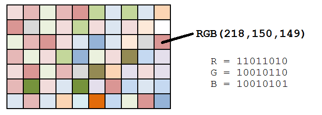 Image source:
图片来源: Datagenetics
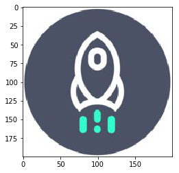
Let us use Dataquest’s logo for the purpose of finding dominant colors in the image. You can download the image here.
让我们使用Dataquest的徽标来查找图像中的主色。 您可以在此处下载图像。
To read an image in Python, you need to import the image class of matplotlib (documentation). The imread() method of the image class decodes an image into its RGB values. The output of the imread() method is an array with the dimensions M x N x 3, where M and N are the dimensions of the image.
要在Python中读取图像,您需要导入matplotlib的image类( documentation )。 图像类的imread()方法将图像解码为其RGB值。 imread()方法的输出是一个尺寸为M x N x 3的数组,其中M和N是图像的尺寸。
from matplotlib import image as img image = img.imread('./dataquest.jpg') image.shapefrom matplotlib import image as img image = img.imread('./dataquest.jpg') image.shape
You can use the imshow() method of matplotlib‘s pyplot class to display an image, which is in the form of a matrix of RGB values.
您可以使用matplotlib的pyplot类的imshow()方法显示图像,该图像采用RGB值矩阵的形式。
%matplotlib inline from matplotlib import pyplot as plt plt.imshow(image) plt.show()%matplotlib inline from matplotlib import pyplot as plt plt.imshow(image) plt.show()
The matrix we get from the imread() method depends on the type of the image being read. For instance, PNG images would also include an element measuring a pixel’s level of transparency. This post will only cover JPG images.
我们从imread()方法获得的矩阵取决于所读取图像的类型。 例如,PNG图像还将包括一个用于测量像素透明度的元素。 这篇文章将只涵盖JPG图片。
Before moving on to clustering the images, we need to perform an additional step. In the process of finding out the dominant colors of an image, we are not concerned about the position of the pixel. Hence, we need to convert the M x N x 3 matrix to three individual lists, which contain the respective red, blue and green values. The following snippet converts the matrix stored in image into three individual lists, each of length 40,000 (200 x 200).
在继续对图像进行聚类之前,我们需要执行其他步骤。 在找出图像的主要颜色的过程中,我们不关心像素的位置。 因此,我们需要将M x N x 3矩阵转换为三个单独的列表,其中包含各自的红色,蓝色和绿色值。 以下代码段将存储在图像中的矩阵转换为三个单独的列表,每个列表的长度为40,000(200 x 200)。
The snippet above creates three empty lists, and then loops through each pixel of our image, appending the RGB values to our r, g, and b lists, respectively. If done correctly, each list wiill have a length of 40,000 (200 x 200).
上面的代码段创建了三个空列表,然后循环遍历图像的每个像素,分别将RGB值附加到我们的r , g和b列表中。 如果正确完成,每个列表的长度将为40,000(200 x 200)。
集群基础 (Clustering Basics)
Now that we have stored all of the component colors of our image, it is time to find the dominant colors. Let us now take a moment to understand the basics of clustering and how it is going to help us find the dominant colors in an image.
现在我们已经存储了图像的所有组成色,是时候找到主要颜色了。 现在让我们花一点时间来理解聚类的基础知识,以及它如何帮助我们找到图像中的主要颜色。
Clustering is a technique that helps in grouping similar items together based on particular attributes. We are going to apply k-means clustering to the list of three colors that we have just created above.
聚类是一项有助于根据特定属性将相似项目分组在一起的技术。 我们将对上面刚刚创建的三种颜色的列表应用k均值聚类 。
The colors at each cluster center will reflect the average of the attributes of all members of a cluster, and that will help us determine the dominant colors in the image.
每个聚类中心的颜色将反映聚类所有成员的属性的平均值,这将有助于我们确定图像中的主要颜色。
有几种主要颜色? (How Many Dominant Colors?)
Before we perform k-means clustering on the pixel data points, it might be good for us to figure out how many clusters are ideal for a given image, since not all images will have the same number of dominant colors.
在我们对像素数据点执行k均值聚类之前,对并非所有图像都具有相同数量的主色,找出一个给定图像理想的聚类可能对我们来说是一件好事。
Since we are dealing with three variables for clustering — the Red, Blue and Green values of pixels — we can visualize these variables on three dimensions to understand how many dominant colors may exist.
由于我们正在处理三个用于聚类的变量-像素的红色,蓝色和绿色值-我们可以在三个维度上可视化这些变量,以了解可能存在多少种主色。
To make a 3D plot in matplotlib, we will use the Axes3D() class (documentation). After initializing the axes using the Axes3D() class, we use the scatter method and use the three lists of color values as arguments.
要在matplotlib制作3D图,我们将使用Axes3D()类( documentation )。 使用Axes3D()类初始化轴后,我们使用scatter方法,并将三个颜色值列表用作参数。
from mpl_toolkits.mplot3d import Axes3D fig = plt.figure() ax = Axes3D(fig) ax.scatter(r, g, b) plt.show()from mpl_toolkits.mplot3d import Axes3D fig = plt.figure() ax = Axes3D(fig) ax.scatter(r, g, b) plt.show()
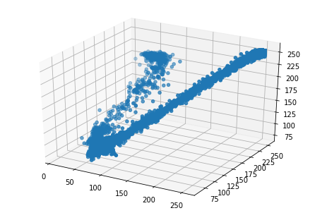
In the resultant plot, we can see that the distribution of points forms two elongated clusters. This is also supported by the fact that by looking at it, we can see that the image is primarily composed of two colors. Therefore, we will focus on creating two clusters in the next section.
在结果图中,我们可以看到点的分布形成了两个拉长的簇。 通过查看它,我们可以看到图像主要由两种颜色组成,这也支持了这一点。 因此,在下一节中,我们将重点介绍创建两个群集。
First, though, we can probably guess that it’s possible that a 3D plot may not yield distinct clusters for some images. Additionally, if we were using a PNG image, we would have a fourth agrument (each pixel’s transparency value), which would make plotting in three dimensions impossible. In such cases, you may need to use the elbow method to determine the ideal number of clusters.
首先,尽管如此,我们可能会猜测3D图可能无法为某些图像生成不同的聚类。 另外,如果我们使用的是PNG图像,则将有第四个拼合度(每个像素的透明度值),这将使得无法在三个维度上进行绘制。 在这种情况下,您可能需要使用弯头方法来确定理想的群集数。
在SciPy中执行聚类 (Perform Clustering in SciPy)
In the previous step, we’ve determined that we’d like two clusters, and now we are ready to perform k-means clustering on the data. Let’s create a Pandas data frame to easily manage the variables.
在上一步中,我们确定需要两个聚类,现在可以对数据执行k均值聚类了。 让我们创建一个Pandas数据框来轻松管理变量。
There are essentially three steps involved in the process of k-means clustering with SciPy:
使用SciPy进行k均值聚类的过程实质上涉及三个步骤:
- Standardize the variables by dividing each data point by its standard deviation. We will use the
whiten()method of thevqclass. - Generate cluster centers using the
kmeans()method. - Generate cluster labels for each data point using the
vq()method of thevqclass.
- 通过将每个数据点除以其标准偏差来标准化变量。 我们将使用
vq类的whiten()方法。 - 使用
kmeans()方法生成聚类中心。 - 使用
vq类的vq()方法为每个数据点生成群集标签。
The first step above ensures that the variations in each variable affects the clusters equally. Imagine two variables with largely different scales. If we ignore the first step above, the variable with the larger scale and variation would have a larger impact on the formation of clusters, thus making the process biased. We therefore standardize the variable using the whiten() function. The whiten() function takes one argument, a list or array of the values of a variable, and returns the standardized values. After standardization, we print a sample of the data frame. Notice that the variations in the columns has reduced considerably in the standardized columns.
上面的第一步确保每个变量的变化均等地影响聚类。 想象一下两个尺度差异很大的变量。 如果我们忽略上面的第一步,那么规模和变化较大的变量将对簇的形成产生更大的影响,从而使过程产生偏差。 因此,我们使用whiten()函数对变量进行了标准化。 whiten()函数采用一个参数,变量值的列表或数组,然后返回标准化值。 标准化后,我们将打印数据框的样本。 请注意,标准化列中列的变化已大大减少。
from scipy.cluster.vq import whiten df['scaled_red'] = whiten(df['red']) df['scaled_blue'] = whiten(df['blue']) df['scaled_green'] = whiten(df['green']) df.sample(n = 10)from scipy.cluster.vq import whiten df['scaled_red'] = whiten(df['red']) df['scaled_blue'] = whiten(df['blue']) df['scaled_green'] = whiten(df['green']) df.sample(n = 10)
| red | 红 | blue | 蓝色 | green | 绿色 | scaled_red | scaled_red | scaled_blue | scaled_blue | scaled_green | scaled_green | ||
|---|---|---|---|---|---|---|---|---|---|---|---|---|---|
| 24888 | 24888 | 255 | 255 | 255 | 255 | 255 | 255 | 3.068012 | 3.068012 | 3.590282 | 3.590282 | 3.170015 | 3.170015 |
| 38583 | 38583 | 255 | 255 | 255 | 255 | 255 | 255 | 3.068012 | 3.068012 | 3.590282 | 3.590282 | 3.170015 | 3.170015 |
| 2659 | 2659 | 67 | 67 | 91 | 91 | 72 | 72 | 0.806105 | 0.806105 | 1.281238 | 1.281238 | 0.895063 | 0.895063 |
| 36954 | 36954 | 255 | 255 | 255 | 255 | 255 | 255 | 3.068012 | 3.068012 | 3.590282 | 3.590282 | 3.170015 | 3.170015 |
| 39967 | 39967 | 255 | 255 | 255 | 255 | 255 | 255 | 3.068012 | 3.068012 | 3.590282 | 3.590282 | 3.170015 | 3.170015 |
| 13851 | 13851 | 75 | 75 | 101 | 101 | 82 | 82 | 0.902357 | 0.902357 | 1.422033 | 1.422033 | 1.019377 | 1.019377 |
| 14354 | 14354 | 75 | 75 | 101 | 101 | 82 | 82 | 0.902357 | 0.902357 | 1.422033 | 1.422033 | 1.019377 | 1.019377 |
| 18613 | 18613 | 75 | 75 | 100 | 100 | 82 | 82 | 0.902357 | 0.902357 | 1.407954 | 1.407954 | 1.019377 | 1.019377 |
| 6719 | 6719 | 75 | 75 | 100 | 100 | 82 | 82 | 0.902357 | 0.902357 | 1.407954 | 1.407954 | 1.019377 | 1.019377 |
| 14299 | 14299 | 71 | 71 | 104 | 104 | 82 | 82 | 0.854231 | 0.854231 | 1.464272 | 1.464272 | 1.019377 | 1.019377 |
The next step is to perform k-means clustering with the standardized columns. We will use the kmeans() function of perform clustering. The kmeans() function (documentation) has two required arguments — the observations and the number of clusters. It returns two values — the cluster centers and the distortion. Distortion is the sum of squared distances between each point and its nearest cluster center. We will not be using distortion in this tutorial.
下一步是使用标准化列执行k均值聚类。 我们将使用kmeans()函数执行聚类。 kmeans()函数( 文档 )具有两个必需的参数-观测值和簇数。 它返回两个值-聚类中心和变形。 失真是每个点与其最近的群集中心之间的距离平方的总和。 在本教程中,我们不会使用失真。
The final step in k-means clustering is generating cluster labels. However, in this exercise, we won’t need to do that. We are only looking for the dominant colors, which are represnted by the cluster centers.
k均值聚类的最后一步是生成聚类标签。 但是,在本练习中,我们不需要这样做。 我们只在寻找占主导地位的颜色,这些颜色由群集中心代表。
显示主要颜色 (Display Dominant Colors)
We have performed k-means clustering and generated our cluster centers, so let’s see what values they contain.
我们已经执行了k均值聚类并生成了聚类中心,因此让我们看看它们包含哪些值。
print(cluster_centers)print(cluster_centers)
As you can see, the results we get are standardized versions of RGB values. To get the original color values we need to multiply them with their standard deviations.
如您所见,我们得到的结果是RGB值的标准化版本。 为了获得原始颜色值,我们需要将它们与标准偏差相乘。
We will display the colors in the form of a palette using the imshow() method of matplotlib‘s pyplot class. However, to display colors, imshow() needs the values of RGB in the range of 0 to 1, where 1 signifies 255 in our original scale of RGB values. We therefore must divide each RGB component of our cluster centers with 255 in order to get to a value between 0 to 1, and display them through the imshow() method.
我们将使用matplotlib的pyplot类的imshow()方法以调色板的形式显示颜色。 但是,要显示颜色, imshow()需要RGB值在0到1的范围内,其中1表示我们原始RGB值比例中的255。 因此,我们必须将群集中心的每个RGB分量除以255,以获得0到1之间的值,并通过imshow()方法显示它们。
Finally, we have one more consideration before we plot the colors using the imshow() function (documentation). The dimensions of the cluster centers are N x 3, where N is the number of clusters. imshow() is originally intended to display an A X B matrix of colors, so it expects a 3D array of dimentions A x B x 3 (three color elements for each block in the palette). Hence, we need to convert our N x 3 matrix to 1 x N x 3 matrix by passing the colors of the cluster centers as a list with a single element. For instance, if we stored our colors in colors we need to pass [colors] as an argument to imshow().
最后,在使用imshow()函数绘制颜色( 文档 )绘制颜色之前,我们还有其他考虑。 聚类中心的尺寸为N x 3,其中N是聚类数。 imshow()最初旨在显示颜色的AXB矩阵,因此它期望3D尺寸为A x B x 3的数组(调色板中每个块包含三个颜色元素)。 因此,我们需要通过将聚类中心的颜色作为单个元素的列表传递,将N x 3矩阵转换为1 x N x 3矩阵。 举例来说,如果我们存储在我们的颜色colors ,我们需要传递[colors]作为参数传递给imshow()
Let’s explore the dominant colors in our image.
让我们探索图像中的主要色彩。
colors = [] r_std, g_std, b_std = df[['red', 'green', 'blue']].std() for cluster_center in cluster_centers: scaled_r, scaled_g, scaled_b = cluster_center colors.append(( scaled_r * r_std / 255, scaled_g * g_std / 255, scaled_b * b_std / 255 )) plt.imshow([colors]) plt.show()colors = [] r_std, g_std, b_std = df[['red', 'green', 'blue']].std() for cluster_center in cluster_centers: scaled_r, scaled_g, scaled_b = cluster_center colors.append(( scaled_r * r_std / 255, scaled_g * g_std / 255, scaled_b * b_std / 255 )) plt.imshow([colors]) plt.show()
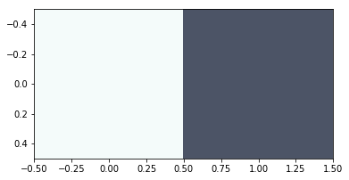
As expected, the colors seen in the image are quite similar to the prominent colors in the image that we started with. That said, you’ve probably noticed that the light blue color above doesn’t actually appear in our source image. Remember, the cluster centers are the means all of of the RGB values of all pixels in each cluster. So, the resultant cluster center may not actually be a color in the original image, it is just the RBG value that’s at the center of the cluster all similar looking pixels from our image.
不出所料,图像中看到的颜色与我们开始使用的图像中的突出颜色非常相似。 也就是说,您可能已经注意到上面的浅蓝色实际上并没有出现在我们的源图像中。 请记住,聚类中心是每个聚类中所有像素的所有RGB值的均值。 因此,最终的聚类中心实际上可能不是原始图像中的颜色,而只是RBG值位于聚类中心,即图像中所有看起来相似的像素。
结论 (Conclusion)
In this post, we looked at a step by step implementation for finding the dominant colors of an image in Python using matplotlib and scipy. We started with a JPG image and converted it to its RGB values using the imread() method of the image class in matplotlib. We then performed k-means clustering with scipy to find the dominant colors. Finally, we displayed the dominant colors using the imshow() method of the pyplot class in matplotlib.
在本文中,我们逐步研究了如何使用matplotlib和scipy在Python中查找图像的主色。 我们从JPG图像开始,然后使用matplotlib图像类的imread()方法将其转换为RGB值。 然后,我们使用scipy进行k均值聚类,以找到主要颜色。 最后,我们使用matplotlib pyplot类的imshow()方法显示了主色。
Want to learn more Python skills? Dataquest offers a full sequence of courses that can take you from zero to data scientist in Python. Sign up and start learning for free!
想学习更多的Python技能? Dataquest提供了一系列完整的课程,可以帮助您从零开始学习Python。 注册并免费开始学习!
翻译自: https://www.pybloggers.com/2019/02/tutorial-find-dominant-colors-in-an-image-through-clustering/
图像中查找直线


 4222
4222

 被折叠的 条评论
为什么被折叠?
被折叠的 条评论
为什么被折叠?
 到【灌水乐园】发言


