


 本文介绍了Python中使用matplotlib库创建条形图的方法,包括标准条形图、带有颜色变化的条形图、带有字符串标签的条形图以及使用不透明度的随机条形图。条形图是一种数据可视化工具,常用于比较离散类别的数据,通过matplotlib库的bar函数可以轻松实现。
python 画条状图
A bar graph is a type of data visualization technique that is very often used to represent data in the form of a vertical bar. The height of the bar is proportional to the value. They allow us to compare data very clearly and therefore, bar graphs or bar charts are included in most of the presentations worldwide. A bar graph can be used to show comparisons between discrete classes and one of the two axes represents the specific categories that are being compared, and the other axis represents a measured value (for most of the cases, the y-axis represents the value and x-axis consist of discrete classes).
条形图是一种数据可视化技术,通常用于以竖条形式表示数据。 条形的高度与值成正比。 它们使我们可以非常清晰地比较数据,因此,全球大多数演示中都包含条形图或条形图。 条形图可用于显示离散类之间的比较,并且两个轴之一表示要比较的特定类别,另一个轴表示测量值(在大多数情况下,y轴表示值,而x轴由离散类组成)。
matplotlib allows us to use this particular class of data visualization via an inbuilt function matplotlib.bar().
matplotlib允许我们通过内置函数matplotlib.bar()使用此特定类的数据可视化。
The following are examples for understanding the implementation of bar graphs.
以下是用于理解条形图实现的示例。
1)标准条形图 (1) Standard Bar Graph)
Syntax:
句法:
plt.bar(x, y)
x - x axis distribution
x -x轴分布
y - height of the bar
y-条形的高度
2)具有颜色变化的标准条形图(绿色) (2) Standard Bar Graph with Color Change (Green))
Syntax:
句法:
plt.bar(x, y, color='g')
color='g' - green color bars
color ='g'-绿色彩条

3)带字符串的条形图 (3) Bar Graph with String)
Syntax:
句法:
xx = np.array(['a','b','c','d','e','f','g','u'])
plt.bar(xx, y, color='g')
xx - using names instead of numeric values on individual bar
xx-在单个栏上使用名称代替数字值

4)使用不透明比率的随机条形图 (4) A Random Bar graph with using opaque ratio)
Syntax:
句法:
plt.bar(np.arange(26), np.random.randint(0,50,26), alpha = 0.6)
alpha=0.6 - opaque ratio as 0.6
alpha = 0.6-不透明比为0.6

Python代码演示条形图示例 (Python code to demonstrate example of bar graph)
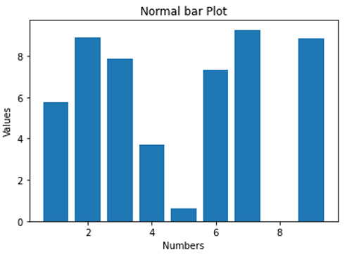
# Data Visualization using Python
# Bar Graph

import numpy as np
import matplotlib.pyplot as plt

N = 8
x = np.array([1,2,3,4,5,6,7,9])
xx = np.array(['a','b','c','d','e','f','g','u'])
y = np.random.rand(N)*10

# a normal bar plot with default features
plt.bar(x, y)
plt.xlabel('Numbers')
plt.ylabel('Values')
plt.title('Normal bar Plot')
plt.show()

# a bar plot with green collour
plt.figure()
plt.bar(x, y, color='g')
plt.xlabel('Numbers')
plt.ylabel('Values')
plt.title('Different Colour')
plt.show()

# a bar plot with string points
plt.figure()
plt.bar(xx, y, color='g')
plt.xlabel('Numbers')
plt.ylabel('Values')
plt.title('Bar Graph with String')
plt.show()

# a combined bar Plot
plt.figure()
plt.bar(np.arange(26), np.random.randint(0,50,26), alpha = 0.6)
plt.xlabel('Numbers')
plt.ylabel('Values')
plt.title('Random Plot')
plt.show()
Output:
输出:
Output is as figure
python 画条状图


 3027
3027

 被折叠的 条评论
为什么被折叠?
被折叠的 条评论
为什么被折叠?
 到【灌水乐园】发言


