


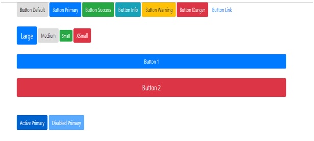
Bootstrap has 7 different types of buttons with contextual classes from which we can create buttons easily by using these classes (.btn-default, .btn-success, .btn-danger, .btn-primary, .btn-info, .btn-warning, .btn-link).
Bootstrap具有上下文类型的 7种不同类型的按钮 ,我们可以通过使用这些类轻松地创建按钮( .btn-default , .btn-success , .btn-danger , .btn-primary , .btn-info , .btn-警告 , .btn-link )。
Example Code:
示例代码:
<button type="button" class="btn btn-default">Button Default</button>
<button type="button" class="btn btn-primary">Button Primary</button>
<button type="button" class="btn btn-success">Button Success</button>
<button type="button" class="btn btn-info">Button Info</button>
<button type="button" class="btn btn-warning">Button Warning</button>
<button type="button" class="btn btn-danger">Button Danger</button>
<button type="button" class="btn btn-link">Button Link</button>
We can also make different size of buttons by using different button size classes (.btn-sm, .btn-lg, .btn-md, .btn-xs).
我们还可以通过使用不同的按钮大小类( .btn-sm , .btn-lg , .btn-md , .btn-xs )来制作不同大小的按钮。
Example Code:
示例代码:
<button type="button" class="btn btn-primary btn-lg">Large button</button>
<button type="button" class="btn btn-default btn-md">Mediumbutton</button>
<button type="button" class="btn btn-success btn-sm">Small button </button>
<button type="button" class="btn btn-danger btn-xs">extraSmall button </button>
Here we also have a .btn-block level button spans the entire width of the parent element.
在这里,我们还有一个.btn块级按钮,它跨越父元素的整个宽度。
Example Code:
示例代码:
<button type="button" class="btn btn-primary btn-block">Button 1</button>
<button type="button" class="btn btn-danger btn-lgbtn-block">Button 2</button>
A button can be set to an .active class (appear pressed) or a .disabled class (unclickable) state.
可以将按钮设置为.active类(按显示)或.disabled类( 不可单击)状态。
Example Code:
示例代码:
<button type="button" class="btn btn-primary active">Active Primary</button>
<button type="button" class="btn btn-primary disabled">Disabled Primary</button>
Result
结果
Conclusion:
结论:
In this article, we have learnt about different button classes with contextual class, button size class, block button classes and active & disabled classes in Bootstrap. If you have doubt/query, feel free to ask in the comment box.
在本文中,我们了解了Bootstrap中不同的按钮类,包括上下文类 , 按钮大小类,块按钮类以及活动和禁用类 。 如果您有疑问/疑问,请随时在评论框中提问。
翻译自: https://www.includehelp.com/html/types-of-buttons-using-classes-in-bootstrap.aspx


 扫一扫
扫一扫
 164
164

 被折叠的 条评论
为什么被折叠?
被折叠的 条评论
为什么被折叠?
 到【灌水乐园】发言


