


wpf 导航菜单
介绍 (Introduction)
Navigation menus can enhance the quality of the user experience of your WPF application but how do you go about adding a compact navigation menu without using a third party control or the UWP NavigationView? In this article, I'll go over how you can create one using a ListBox. All the functionality required to create the navigation menu will be done using XAML only; so no code-behind, commands or frameworks.
导航菜单可以提高WPF应用程序的用户体验质量,但是如何在不使用第三方控件或UWP NavigationView情况下添加紧凑的导航菜单呢? 在本文中,我将介绍如何使用ListBox创建一个。 创建导航菜单所需的所有功能都只能使用XAML来完成; 因此没有代码,命令或框架。
背景 (Background)
The sample application for this article has three views which the user can switch between: HomeView, EmailView and CloudView. The views are user controls and don't have much content except for an icon and text indicating which view is which.
本文的示例应用程序具有三个视图,用户可以在三个视图之间进行切换: HomeView , EmailView和CloudView 。 这些视图是用户控件,除了用于指示哪个视图的图标和文本外,没有太多内容。
<UserControl x:Class="CompactNavigationMenu.Views.EmailView"

            xmlns="http://schemas.microsoft.com/winfx/2006/xaml/presentation"

            xmlns:x="http://schemas.microsoft.com/winfx/2006/xaml"

            xmlns:mc="http://schemas.openxmlformats.org/markup-compatibility/2006"

            xmlns:d="http://schemas.microsoft.com/expression/blend/2008"

            xmlns:local="clr-namespace:CompactNavigationMenu.Views"

            xmlns:iconPacks="http://metro.mahapps.com/winfx/xaml/iconpacks"

            xmlns:vm="clr-namespace:CompactNavigationMenu.ViewModels"

            mc:Ignorable="d"

            d:DesignHeight="450" d:DesignWidth="800">
    <UserControl.DataContext>
        <vm:EmailViewModel/>
    </UserControl.DataContext>

    <Grid>
        <StackPanel Orientation="Vertical"

                    HorizontalAlignment="Center"

                    VerticalAlignment="Center">
            <iconPacks:PackIconMaterialDesign HorizontalAlignment="Center"

                                            Foreground="{StaticResource PrimaryDarkBrush}"

                                            Width="100" Height="100" Kind="Email"/>

            <TextBlock FontSize="40" FontWeight="Bold"

                         VerticalAlignment="Center" HorizontalAlignment="Center"

                         Foreground="{StaticResource PrimaryDarkBrush}"

                         Text="{Binding Title}"/>
        </StackPanel>
    </Grid>
</UserControl>
导航菜单 (Navigation Menu)
A compact navigation menu only displays icons, which the user should be able to easily interpret. As stated in the introduction, I'll highlight how to make a navigation menu using a ListBox but first let's take a look at the layout of the MainWindow.
紧凑的导航菜单仅显示图标,用户应该能够轻松地对其进行解释。 如引言中所述,我将重点介绍如何使用ListBox制作导航菜单,但首先让我们看一下MainWindow的布局。
<Window x:Class="CompactNavigationMenu.MainWindow"

        xmlns="http://schemas.microsoft.com/winfx/2006/xaml/presentation"

        xmlns:x="http://schemas.microsoft.com/winfx/2006/xaml"

        xmlns:d="http://schemas.microsoft.com/expression/blend/2008"

        xmlns:mc="http://schemas.openxmlformats.org/markup-compatibility/2006"

        mc:Ignorable="d"

        Height="400" Width="600" Background="#FFEAEBEC"

        Title="Nav" WindowStartupLocation="CenterScreen">

        ...

    <Grid>
        <Grid.ColumnDefinitions>
            <ColumnDefinition Width="Auto"/>
            <ColumnDefinition/>
        </Grid.ColumnDefinitions>

        <ListBox x:Name="NavigationMenuListBox"

                Style="{StaticResource NavigationListBoxStyle}"

                ItemContainerStyle="{DynamicResource NavigationListBoxItemStyle}"

                ItemTemplate="{DynamicResource NavigationDataTemplate}"

                ItemsSource="{StaticResource NavigationMenuItems}"/>

        <ContentControl Grid.Column="1" Style="{StaticResource NavigationContentStyle}"/>
    </Grid>
</Window>
The Window has a Grid with two columns: The first column hosts the ListBox that acts as the navigation menu while the second column hosts a ContentControl where the three views are switched.
该Window具有一个由两列组成的Grid :第一列包含用作导航菜单的ListBox ,第二列包含用于切换三个视图的ContentControl 。
To get the ListBox to act as a suitable menu, a custom ListBox style is required.
若要使ListBox充当合适的菜单,需要自定义ListBox样式。
<Style x:Key="NavigationListBoxStyle" TargetType="{x:Type ListBox}">
    <Setter Property="Background" Value="{StaticResource PrimaryDarkBrush}"/>
    <Setter Property="ScrollViewer.HorizontalScrollBarVisibility" Value="Disabled"/>
    <Setter Property="ScrollViewer.VerticalScrollBarVisibility" Value="Disabled"/>
    <Setter Property="VerticalContentAlignment" Value="Center"/>
    <Setter Property="HorizontalContentAlignment" Value="Center"/>
    <Setter Property="SelectedIndex" Value="0"/>
    <Setter Property="Width" Value="Auto"/>
    <Setter Property="Template">
        <Setter.Value>
            <ControlTemplate TargetType="{x:Type ListBox}">
                <Border Background="{TemplateBinding Background}"

                        BorderThickness="0"

                        Padding="0"

                        SnapsToDevicePixels="true">
                    <ScrollViewer Padding="{TemplateBinding Padding}"

                                    Focusable="false">
                        <ItemsPresenter SnapsToDevicePixels=
                                    "{TemplateBinding SnapsToDevicePixels}"/>
                    </ScrollViewer>
                </Border>
            </ControlTemplate>
        </Setter.Value>
    </Setter>
</Style>
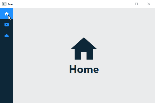
By default, the Border that makes up the ControlTemplate of a ListBox has its Padding and BorderThickness set to a value of 1. This has the unintended consequence of creating a slight gap between a ListBoxItem and the edges of the ListBox.
默认情况下,组成ListBox的ControlTemplate的Border的Padding和BorderThickness设置为1 。 这具有意想不到的结果,即在ListBoxItem和ListBox的边缘之间产生微小的间隙。
In the image above, you can notice a slight gap between the selected item, i.e., the first item, and the edges of the ListBox in its default state. The gap can be partially eliminated by setting the value of the Padding of the Border in the ControlTemplate to zero.
在上图中,您会注意到所选项目(即第一个项目)与默认状态下的ListBox的边缘之间存在细微的间隙。 通过将ControlTemplate Border的Padding的值设置为零,可以部分消除间隙。
A custom ListBoxItem style is also required to completely eliminate the gap and to give ListBoxItems a custom look when in various states; like a blue Background and white Foreground when selected.
还需要自定义ListBoxItem样式,以完全消除差距并在各种状态下为ListBoxItem自定义外观。 例如蓝色Background和白色Foreground 。
<Style x:Key="NavigationListBoxItemStyle" TargetType="{x:Type ListBoxItem}">
    <Setter Property="Background" Value="Transparent"/>
    <Setter Property="Foreground" Value="{StaticResource PrimaryLightBrush}"/>
    <Setter Property="Margin" Value="-1"/>
    <Setter Property="ToolTip" Value="{Binding}"/>
    <Setter Property="HorizontalContentAlignment"

            Value="{Binding HorizontalContentAlignment,
            RelativeSource={RelativeSource AncestorType={x:Type ItemsControl}}}"/>
    <Setter Property="VerticalContentAlignment"

            Value="{Binding VerticalContentAlignment,
            RelativeSource={RelativeSource AncestorType={x:Type ItemsControl}}}"/>
    <Setter Property="Template">
        <Setter.Value>
            <ControlTemplate TargetType="{x:Type ListBoxItem}">
                <Border x:Name="Bd"

                        BorderBrush="{TemplateBinding BorderBrush}"

                        BorderThickness="{TemplateBinding BorderThickness}"

                        Background="{TemplateBinding Background}"

                        Padding="{TemplateBinding Padding}"

                        SnapsToDevicePixels="true">
                    <ContentPresenter HorizontalAlignment=
                                    "{TemplateBinding HorizontalContentAlignment}"

                                    VerticalAlignment=
                                    "{TemplateBinding VerticalContentAlignment}"

                                    SnapsToDevicePixels=
                                    "{TemplateBinding SnapsToDevicePixels}"/>
                </Border>
                <ControlTemplate.Triggers>
                    <Trigger Property="IsSelected" Value="true">
                        <Setter TargetName="Bd" Property="Background"

                         Value="{StaticResource PrimaryLightBrush}"/>
                        <Setter Property="Foreground" Value="White"/>
                    </Trigger>
                    <MultiTrigger>
                        <MultiTrigger.Conditions>
                            <Condition Property="IsSelected" Value="true"/>
                            <Condition Property="Selector.IsSelectionActive" Value="false"/>
                        </MultiTrigger.Conditions>
                        <Setter Property="Background" TargetName="Bd"

                         Value="{StaticResource PrimaryLightBrush}"/>
                        <Setter Property="Foreground" Value="White"/>
                    </MultiTrigger>
                    <Trigger Property="IsEnabled" Value="false">
                        <Setter Property="Foreground"

                         Value="{DynamicResource {x:Static SystemColors.GrayTextBrushKey}}"/>
                    </Trigger>
                </ControlTemplate.Triggers>
            </ControlTemplate>
        </Setter.Value>
    </Setter>
</Style>
Notice I've set the Margin of the ListBoxItem to -1. This completely eliminates the gap between the ListBoxItem and the edges of the ListBox.
注意,我已经将ListBoxItem的Margin设置为-1 。 这完全消除了ListBoxItem和ListBox的边缘之间的间隙。
A DataTemplate is required for the ListBox ItemTemplate. The DataTemplate will contain the icon displayed in a ListBoxItem.
ListBox ItemTemplate需要一个DataTemplate 。 DataTemplate将包含在ListBoxItem显示的图标。
<DataTemplate x:Key="NavigationDataTemplate">
    <iconPacks:PackIconMaterialDesign x:Name="MenuItemIcon" VerticalAlignment="Center"

                                        HorizontalAlignment="Center" Margin="12"/>
    <DataTemplate.Triggers>
        <DataTrigger Binding="{Binding}" Value="Home">
            <Setter TargetName="MenuItemIcon" Property="Kind" Value="Home"/>
        </DataTrigger>
        <DataTrigger Binding="{Binding}" Value="Email">
            <Setter TargetName="MenuItemIcon" Property="Kind" Value="Email"/>
        </DataTrigger>
        <DataTrigger Binding="{Binding}" Value="Cloud">
            <Setter TargetName="MenuItemIcon" Property="Kind" Value="Cloud"/>
        </DataTrigger>
    </DataTemplate.Triggers>
</DataTemplate>
I'm using a DataTrigger to change the icon based on a binding which is of type string. You may recall that the ListBox's ItemsSource property was bound to a StaticResource named NavigationMenuItems. The resource is just a collection of strings.
我正在使用DataTrigger基于string类型的绑定来更改图标。 您可能还记得ListBox的ItemsSource属性绑定到名为NavigationMenuItems的StaticResource 。 资源只是strings的集合。
<x:Array x:Key="NavigationMenuItems" Type="system:String">
    <system:String>Home</system:String>
    <system:String>Email</system:String>
    <system:String>Cloud</system:String>
</x:Array>
And that's all that's required to get the ListBox appropriately set up. The ContentControl where the views are switched only requires some minor styling to play along with the ListBox.
这就是正确设置ListBox需要的。 切换视图的ContentControl只需要一些样式即可与ListBox一起播放。
<Style x:Key="NavigationContentStyle" TargetType="ContentControl">
    <Setter Property="ContentTemplate" Value="{StaticResource HomeViewTemplate}"/>
    <Style.Triggers>
        <DataTrigger Binding="{Binding ElementName=NavigationMenuListBox, Path=SelectedItem}"

                     Value="Email">
            <Setter Property="ContentTemplate" Value="{StaticResource EmailViewTemplate}"/>
        </DataTrigger>
        <DataTrigger Binding="{Binding ElementName=NavigationMenuListBox, Path=SelectedItem}"

                     Value="Cloud">
            <Setter Property="ContentTemplate" Value="{StaticResource CloudViewTemplate}"/>
        </DataTrigger>
    </Style.Triggers>
</Style>
Views are switched based on the value of the ListBox's SelectedItem. The ContentTemplate of the ContentControl can be either one of three DataTemplates.
根据ListBox的SelectedItem的值切换视图。 ContentControl的ContentTemplate可以是三个DataTemplate之一。
<DataTemplate x:Key="HomeViewTemplate">
    <views:HomeView/>
</DataTemplate>

<DataTemplate x:Key="EmailViewTemplate">
    <views:EmailView/>
</DataTemplate>

<DataTemplate x:Key="CloudViewTemplate">
    <views:CloudView/>
</DataTemplate>
结论 (Conclusion)
That's it, I hope you've gained some useful knowledge from this article. If you prefer taking another approach, you can look at the other available options which I mentioned in the introduction.
就是这样,我希望您从本文中获得了一些有用的知识。 如果您喜欢采用其他方法,则可以查看我在简介中提到的其他可用选项。
翻译自: https://www.codeproject.com/Articles/5275552/WPF-Compact-Navigation-Menu
wpf 导航菜单


 2979
2979


 被折叠的 条评论
为什么被折叠?
被折叠的 条评论
为什么被折叠?
 到【灌水乐园】发言


