


 本文深入探讨了使用div和表格进行网页布局的方法,包括基本布局、浮动与串联块的区别、垂直元素定位等。文章指出,虽然两者在布局控制上都能发挥作用,但div布局有时需要处理如浮动和内联块的复杂性,而表格布局则更直接。作者提醒开发者注意编辑器和最小化工具对布局的影响,并提供了各种布局示例和解决常见问题的技巧。
div 表格布局
内容 (Contents)
介绍 (Introduction)
This is a straightforward article demonstrating some very basic UI layout concepts using either DIV or TABLE elements. The impetus for this is simply that I often struggle with figuring out the nuances of how to position elements in the UI so I get both the look and behavior that I want. By look, I mean the positioning of sections of the UI and the elements within those sections, and by behavior, I mean how the UI behaves when the browser window is resized. I'm not covering things like device screen sizes or replacing a menu bar with a "triple bar" dropdown -- there are component libraries like Bootstrap to handle that.
这是一篇简单的文章,演示了使用DIV或TABLE元素的一些非常基本的UI布局概念。 这样做的动力很简单,就是我经常要弄清楚如何在UI中放置元素的细微差别,以便获得所需的外观和行为。 通过外观,我是指UI的各个部分的位置以及这些部分中的元素,并且通过行为,是指调整浏览器窗口大小时UI的行为。 我没有介绍设备屏幕尺寸或用“三栏”下拉菜单替换菜单栏的问题,而是通过Bootstrap这样的组件库来处理。
All of these examples can be coded in Visual Code and viewed side-by-side with Quick HTML Previewer, which of all the HTML preview plugins that I looked at is the only one that I found actually works.
所有这些示例都可以用Visual Code编码,并可以与Quick HTML Previewer并排查看,在我查看的所有HTML预览插件中,我发现这是唯一可以实际使用的插件。
基本布局 (Basic Layout )
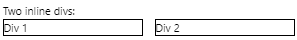
Let's start with something basic -- two inline divs. The HTML:
让我们从基本的东西开始-两个内联div 。 HTML:
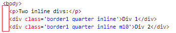
<p>Two inline divs:</p>
<div class='border1 quarter inline'>Div 1</div>
<div class='border1 quarter inline m10'>Div 2</div>
And the CSS I'm using to define the border, width, margin, and inline styles:
我用来定义边框,宽度,边距和内联样式CSS:
.border1 {
  border-style:solid;
  border-width: 1px;
}

.quarter {
  width: 25%;
}

.inline {
  display: inline-block;
}

.m10 {
  margin-left:10px;
}
Yielding:
屈服:
浮动与串联块 (Float vs. Inline Block)
If you want some in depth reading about the two, I suggest Ternstyle's blog entry and Thoughtbot's blog entry. For now, let's just deal with the practical issues, otherwise known as WTF???
如果您想深入了解这两者,建议您使用Ternstyle的博客条目和Thoughtbot的博客条目 。 现在,让我们处理实际问题,否则称为WTF ???
Let's compare that with using a float style instead. The HTML:
让我们将其与使用float样式进行比较。 HTML:
<p>Inline divs using float:<br>
Note a slight shift of Div2 to the left as compared to using inline.</p>
<div class='border1 quarter fleft'>Div 1</div>
<div class='border1 quarter fleft m10'>Div 2</div>
And the fleft CSS:
和最fleft CSS:
.fleft {
  float:left;
}

Looks pretty much the same, right? But notice there's a slight spacing difference between the two divs:
看起来几乎一样,对不对? 但是请注意,两个div之间存在微小的间距差异:
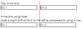
Why is that? Well, read on.
这是为什么? 好吧,继续读下去。
字里行间 (Reading Between the Lines)
As it turns out, using inline-block respects any text between the divs, whereas float moves the text between the divs out to the right. This is an important behavioral difference! So the difference between the divs using inline-block is because I have spaces in the HTML:
事实证明,使用inline-block尊重div之间的所有文本,而float会将div之间的文本向右移。 这是重要的行为差异! 因此,使用inline-block的div之间的区别是因为我在HTML中有空格:
See the indentation of my nicely formatted HTML? Let's exaggerate this difference between inline-block and float, getting rid of my left margin and removing the editor's indentation:
看到格式正确HTML的缩进吗? 让我们夸大inline-block和float之间的区别,摆脱我的左边距并删除编辑器的缩进:
<p>Two inline-block divs:</p>
James <div class='border1 quarter inline'>Div 1</div>Tiberius
<div class='border1 quarter inline'>Div 2</div> Kirk

<p>Two float divs:</p>
James <div class='border1 quarter fleft'>Div 1</div>Tiberius
<div class='border1 quarter fleft'>Div 2</div> Kirk
And we get:
我们得到:
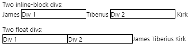
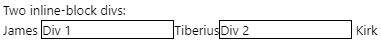
Oh wow. Even the carriage return between the inline-block divs is adding a space:
哇哦 甚至inline-block div之间的回车都添加了一个空格:
<p>Two inline-block divs:</p>
James <div class='border1 quarter inline'>Div 1</div>Tiberius
<div class='border1 quarter inline'>Div 2</div> Kirk
Notice the space before the second div has now been removed:
请注意,现在已删除第二个div之前的空格:
第1课-编辑对您的想法感到困惑 (Lesson 1 - Your Editor Is Messing With Your Head)
Your lovely HTML indentation, and in particular, the auto-indenting that your editor is doing for you, is affecting your layout using inline-block!
您可爱HTML缩进,尤其是编辑器为您做的自动缩进 ,正在使用inline-block影响布局。
第2课-最小化器也会让您的头陷入困境 (Lesson 2 - Your Minimizer Will Mess With Your Head Too)
So you've created the perfect layout in your editor and then you run a minimizer which potentially removes the whitespace and carriage returns between your divs. Suddenly, your UI looks slightly different!
因此,您已经在编辑器中创建了完美的布局,然后运行了一个最小化程序,它可能会删除div之间的空格和回车符。 突然,您的UI看起来有些不同!
第3课-所有解决方案均不正确 (Lesson 3 - All the Solutions Are Bad)
All of the solutions are ugly. From here and here, they are:
- Remove all whitespace and carriage returns between divs. So much for readable HTML. 删除div之间的所有空格和回车符。 对于可读HTML来说就这么多。
Use
float, but that has side-effects like we saw above with text between thedivs.使用
float,但是它具有副作用,就像我们在div之间的文本所见。Create a container
divwithfont-sizeof0then override the font size in the childdivs. Gross.创建一个
font-size为0的容器div,然后覆盖子div的字体大小。 毛。
And my favorite driving-the-porcelain-bus solution:
我最喜欢的“驾驶公交车”解决方案:
James<!--
--><div class='border1 quarter inline'>Div 1</div>Tiberius<!--
--><div class='border1 quarter inline'>Div 2</div> Kirk
OK then. So there really is, at least in my opinion, no viable solution that maintains a nicely formatted HTML document and renders the same identical layout when the HTML is minimized. Which basically means, always test your layout as minimized HTML rather than in a preview editor. And of course, there's no preview editor that I know of that will minimize your HTML before feeding it to the browser. Hmmm, there's another article idea! Of course, if you have a really smart minimizer that respects whitespace and carriage returns between and around inline-block divs, that would help too. Anyone with better suggestions?
那好吧。 因此,至少在我看来,确实没有可行的解决方案来维护格式良好HTML文档并在HTML最小化时呈现相同的布局。 从根本上讲,这意味着始终以最小化HTML而不是在预览编辑器中测试布局。 当然,据我所知,没有预览编辑器可以将HTML最小化,然后再将其提供给浏览器。 嗯,还有另一个文章创意! 当然,如果您有一个非常聪明的最小化程序,它尊重inline-block div之间及其周围的空格和回车符,那么也将有所帮助。 有人有更好的建议吗?
左,中和右,参加比赛! (Left, Center, and Right, Atten-hup!)
Most of the time, I need layout options that include being able to position an entire section to the left, center, and/or right of the page as well as position the elements within those sections on the left, center, right and top, middle, or bottom. That's not too much to ask for, is it? Riiiight.
大多数时候,我需要布局选项,包括能够将整个部分定位到页面的左侧,中心和/或右侧,以及将元素定位在这些部分中的左侧,中心,右侧和顶部,中间或底部。 要求不太多,不是吗? 权。
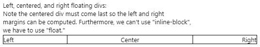
Here's the HTML for a simple layout (note I'm using float):
这是简单布局HTML(请注意,我正在使用float ):
<p>Left, centered, and right floating divs:<br>
Note the centered div must come last so the left and right<br>
margins can be computed. Furthermore, we can't use "inline-block",<br>
we have to use "float."</p>
<div class='border1 fleft quarter'>Left</div>
<div class='border1 fright quarter taright'>Right</div>
<div class='border1 center tacenter'>Center</div>
and the additional CSS:
以及其他CSS:
.center {
  margin-left:auto;
  margin-right:auto;
}

.quarter {
  width: 25%;
}

.fleft {
  float:left;
  padding: 0;
  margin: 0;
}

.fright {
  float:right;
}

.tacenter {
  text-align: center;
}

.taright {
  text-align: right;
}
And the result:
结果:
第3课-浮动而不是串联块 (Lesson 3 - Floats, Not Inline-Block)
We have to use
float!我们必须使用
float!The center
divhas to come last!中心
div必须倒数第一!
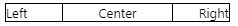
If we try to use inline-block with float, the center auto-margin is ignored. Using this HTML:
如果我们尝试将inline-block与float一起使用,则中心自动边距将被忽略。 使用此HTML:
<div class='border1 inline fleft quarter'>Left</div>
<div class='border1 inline center quarter tacenter'>Center</div>
<div class='border1 inline fright quarter taright'>Right</div>
we get:
我们得到:
The problem here is that the we're specifying the width of the center region. This means that the center doesn't dynamically expand the way the center float version does when the browser width shrinks.
这里的问题是我们要指定中心区域的宽度。 这意味着当浏览器宽度缩小时,中心不会像中心float版本那样动态扩展。
Using float:
使用float :
Using inline-block:
使用inline-block :
Instead, the center div width, using inline-block, is determined by the content of the div. This makes it impossible to right-justify text against the left edge of the rightmost div. Got that? If there is a solution, I haven't found it. Anyone?
相反,使用inline-block的中心div宽度由div的内容确定。 这样就不可能在最右边div的左边缘上使文本右对齐。 了解? 如果有解决方案,我还没有找到。 任何人?
第4课-始终测试不同的宽度 (Lesson 4 - Always Test Different Widths)
We can get some bizarre effects. Given this HTML:
我们可以得到一些奇怪的效果。 鉴于此HTML:
<p>Playing with wrapper and inner widths:</p>
<div class='border1 fleft quarter'>Left</div>
<div class='border1 fright right quarter taright'>Right</div>
<div class='border1 center tacenter w40p'>
  <div class='border1 fleft taleft w40p'>Left: Some long text that forces a line wrap.</div>
  <div class='border1 fright right taright w40p'>
   Right: Some long text that forces a line wrap.</div>
  <div class='border1 center tacenter'>Center: Some long text that forces a line wrap.</div>
</div>
We can resize the width of the browser window and we see:
我们可以调整浏览器窗口的宽度,然后看到:
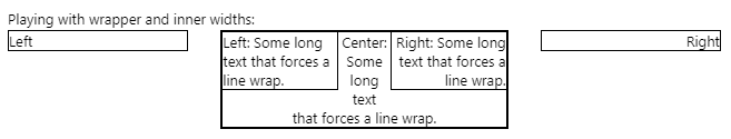
But wait! A little different width and we get:
可是等等! 稍有不同的宽度,我们得到:
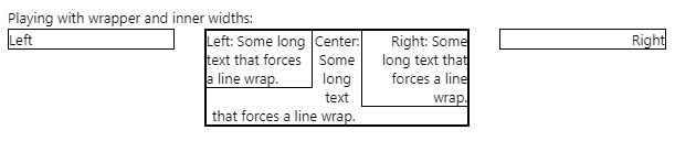
This effect is the result of the inner right div's height forcing the inner-center text at the bottom to not be able to extend the full width of the center div. Makes sense, right? The point being, always test your layout with different browser widths. Within reason, of course!
此效果是由于内部右div的高度导致底部的inner-center文本无法扩展中心div的整个宽度而导致的。 有道理吧? 关键是,始终使用不同的浏览器宽度测试布局。 在合理的范围内,当然!
垂直元素定位 (Vertical Element Positioning)
I discovered vanseo design's blog post that solved this problem for me, so what you see here is just a regurgitation of their post. To achieve this:
我发现了vanseo design的博客文章为我解决了这个问题,因此您在这里看到的只是对其文章的反感 。 为达到这个:
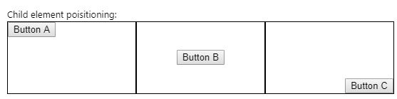
Requires treating the divs as table cells! Here's the HTML:
需要将div视为表单元格! 这是HTML:
<p>Child element positioning:</p>
  <div class='parent border1 fleft w33p h100px'>
  <div class="child-top-left"><button>Button A</button></div>
</div>
  <div class='parent border1 fleft w33p h100px'>
  <div class="child-middle-center"><button>Button B</button></div>
</div>
  <div class='parent border1 fleft w33p h100px'>
  <div class="child-bottom-right"><button>Button C</button></div>
</div>
and here's the additional CSS:
这是附加CSS:
.w33p {
  width: 33%;
}

.h100px {
  height: 100px;
}

.parent {display: table;}

.child-top-left {
  display: table-cell;
}

.child-middle-center {
  display: table-cell;
  vertical-align: middle;
  text-align: center;
}

.child-bottom-right {
  display: table-cell;
  vertical-align: bottom;
  text-align: right;
}
Funny how we use the text-align style to align inner HTML elements! So this works because we're creating divs that simulate table cells, which is a natural lead in to the next section, doing the same thing with tables. But first...
有趣的是,我们如何使用text-align样式来对齐内部HTML元素! 之所以这样行得通,是因为我们正在创建用于模拟表格单元格的div ,这自然是引向下一部分的内容,对表格进行相同的操作。 但首先...
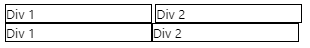
清除浮动和内联代码块 (Clearing Float and Inline Block)
Consider this fragment:
考虑以下片段:
<div class='border1 quarter inline'>Div 1</div>
<div class='border1 quarter inline m10'>Div 2</div>

<div class='border1 quarter fleft'>Div 1</div>
<div class='border1 quarter fleft m10'>Div 2</div>
Resulting in:
导致:

That isn't what we want at all! To deal with this, we need to clear the float elements on the left and right:.
那根本不是我们想要的! 为了解决这个问题,我们需要清除左侧和右侧的float元素:。
HTML:
HTML:
<div class='border1 quarter inline'>Div 1</div>
<div class='border1 quarter inline m10'>Div 2</div>

<div class='clear'></div>

<div class='border1 quarter fleft'>Div 1</div>
<div class='border1 quarter fleft m10'>Div 2</div>
CSS:
CSS:
.clear {
  clear:both;
}
Resulting in a "new line":
导致出现“换行”:
While a paragraph creates the same effect, it adds undesirable vertical separation between the two divs.
段落虽然产生相同的效果,但在两个div之间增加了不希望的垂直分隔。
HTML:
HTML:
<div class='border1 quarter inline'>Div 1</div>
<div class='border1 quarter inline m10'>Div 2</div>

<p></p>

<div class='border1 quarter fleft'>Div 1</div>
<div class='border1 quarter fleft m10'>Div 2</div>
Result:
结果:

固定宽度左右格 (Fixed Width Left and Right Divs)
Let's say you want 3 divs where the left and right are of fixed (in pixels) width and the center div resizes based on the browser width. The only solution I found (after perusing SO) is to use the calc style:
假设您需要3 div ,其中左右两边的width是固定的(以像素为单位),而中心div根据浏览器的width调整。 我发现的唯一解决方案(仔细阅读SO之后)是使用calc样式:
<p>Left and Right divs of fixed width:</p>

<div class='parent border1 fleft w100px h100px'>
  <div class="child-top-left"><button>Button A</button></div>
</div>
<div class='parent border1 fleft h100px' style='width: calc(100% - 206px);'>
  <div class="child-middle-center"><button>Button B</button></div>
</div>
<div class='parent border1 fleft w100px h100px'>
  <div class="child-bottom-right"><button>Button C</button></div>
</div>
Since this calculation is so dependant on the number of divs in the "row", I decided to put this in as an actual style rather than as CSS. The number 206 comes from the left and right divs being 100 pixels each, plus 1 pixel for the borders for each div: 100 + 100 + 1 + 1 + 1 + 1 + 1 + 1 = 206.
由于此计算非常依赖于“ row ”中div的数量,因此我决定将其作为实际style而不是CSS。 数字206来自左右div每个div为100像素,再加上每个div的边框为1像素: 100 + 100 + 1 + 1 + 1 + 1 + 1 + 1 = 206 。
The result works nicely regardless of browser window width:
无论浏览器窗口的宽度如何,结果都可以很好地工作:
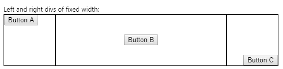
Not ideal with this magic number, and compare this to the solution using tables.
使用此幻数不理想,并将其与使用表的解决方案进行比较。
According to the Mozilla docs: "The calc() CSS function lets you perform calculations when specifying CSS property values. It can be used anywhere a <length>, <frequency>, <angle>, <time>, <percentage>, <number>, or <integer> is allowed."
根据Mozilla的文档 :“ calc() CSS函数可让您在指定CSS属性值时执行计算。它可以在<length> , <frequency> , <angle> , <time> , <percentage> , <number>或<integer>是允许的。”
分区滚动 (Div Scrolling)
A lot of times, you'll see a div that has a scrollbar when the content exceeds the height. Let's see how that's done using the overflow-y and height styles.
很多时候,当内容超出高度时,您会看到一个带有滚动条的div 。 让我们看看如何使用overflow-y和height样式完成此操作。
HTML:
HTML:
<p>Left div scrolling:</p>
<div class='parent border1 fleft w100px h100px'>
  <div class="child-top-left">
    <div class='scrolly h100p'>
      <p>Menu Item 1</p>
      <p>Menu Item 2</p>
      <p>Menu Item 3</p>
      <p>Menu Item 4</p>
      <p>Menu Item 5</p>
      <p>Menu Item 6</p>
    </div>
  </div>
</div>
  <div class='parent border1 fleft h100px' style='width: calc(100% - 206px);'>
  <div class="child-middle-center"><button>Button B</button></div>
</div>
  <div class='parent border1 fleft w100px h100px'>
  <div class="child-bottom-right"><button>Button C</button></div>
</div>
Additional CSS:
其他CSS:
.h100p {
  height: 100%;
}

.scrolly {
  overflow-y: auto;
}
Note that we have to use an inner div for the child div. The result is:
请注意,我们必须使用一个内部div为孩子div 。 结果是:

The scrollbar goes away if the height of the child's inner div is less than the child div. What we lose though is the ability to vertically align the inner elements; they can still be horizontally aligned. This makes a kind of sense, as why would you have a scrollbar with content that is vertically centered or at the bottom?
如果子级的内部div的高度小于子级div ,则scrollbar消失。 但是,我们失去的是垂直对齐内部元素的能力。 它们仍然可以水平对齐。 这很有道理,为什么您的滚动条的内容垂直居中或在底部?
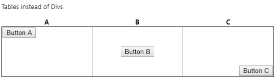
使用表格代替Divs (Using Tables instead of Divs)
Let's cut right to the chase and reproduce the previous layout using actual tables, rows, and columns. Here's the HTML:
让我们切入正题,并使用实际的表,行和列重现以前的布局。 这是HTML:
<p>Tables instead of Divs</p>
<table class='w100p'>
  <tr>
    <th>A</th>
    <th>B</th>
    <th>C</th>
  </tr>
  <tr class='h100px'>
    <td class='border1 w33p vatop'><button>Button A</button></td>
    <td class='border1 w33p tacenter vacenter'><button>Button B</button></td>
    <td class='border1 w33p taright vabottom'><button>Button C</button></td>
  </tr>
</table>
And the CSS:
和CSS:
.w100p {
  width: 100%;
}

.taleft {
  text-align: left;
}

.tacenter {
  text-align: center;
}

.taright {
  text-align: right;
}

.vatop {
  vertical-align: top;
}

.vamiddle {
  vertical-align: middle;
}

.vabottom {
  vertical-align: bottom;
}
Resulting in:
导致:

Notice the space between the columns? To get rid of that, we have to use the border-collapse style:
注意到列之间的间隔了吗? 为了摆脱这种情况,我们必须使用border-collapse样式:
HTML:
HTML:
<table class='w100p noborders'>
CSS:
CSS:
.noborders {
  border-collapse: collapse;
}
Resulting in:
导致:
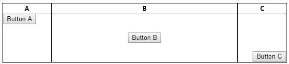
第5课-隐藏间距 (Lesson 5 - Hidden Spacing)
As with divs, table columns have hidden spacing you may not be aware of. I'm beginning to realize that it's a good idea to start a UI layout design with borders around everything so you can see exactly what's going on in the layout! This is easily accomplished by specifying the CSS style for your elements, for example:
与div ,表列具有您可能不知道的隐藏间距。 我开始意识到,开始UI布局设计时要在所有内容周围加上边框,这样一来,您就可以准确地看到布局中发生了什么! 通过为您的元素指定CSS样式即可轻松实现,例如:
table {
  border-style:solid;
  border-width: 1px;
}

th {
  border-style:solid;
  border-width: 1px;
}

tr {
  border-style:solid;
  border-width: 1px;
}

td {
  border-style:solid;
  border-width: 1px;
}
You can then delete this CSS when you're happy with the layout.
如果对布局感到满意,则可以删除此CSS。
固定宽度列 (Fixed Width Columns)
Here, the auto style and the col elements come into play. The following example illustrates the left and right columns having fixed widths and the center column being sized to fit between the two.
auto样式和col元素在这里起作用。 下面的示例说明了具有固定宽度的左列和右列,中间列的大小设置为适合两者之间的大小。
HTML (note I'm using the element CSS described above to set the border for the table, tr, th, and td elements):
HTML(注意,我正在使用上述元素CSS来设置table , tr , th和td元素的边框):
<p>Three column with left and right in fixed pixels</p>
<table class='w100p noborders' style='table-layout:fixed'>
  <col class='w100px'/>
  <col class='wauto'/>
  <col class='w100px'/>
  <tr>
    <th>A</th>
    <th>B</th>
    <th>C</th>
  </tr>
  <tr class='h100px'>
    <td class='vatop'><button>Button A</button></td>
    <td class='tacenter vacenter'><button>Button B</button></td>
    <td class='taright vabottom'><button>Button C</button></td>
  </tr>
</table>
Additional CSS:
其他CSS:
.w100px {
  width: 100px;
}

.wauto {
  width: auto;
}
This resulting in the center column resizing as the browser width is increased / decreased while the left and right columns remain fixed width.
这导致中心列的大小随着浏览器宽度的增加/减小而改变,而左列和右列保持固定宽度。

列滚动 (Column Scrolling)
As with divs, let's see if we can get scrolling to work in a column. The solution is quite simple -- put a div inside the td! Contrast this with the approach described in the section on divs, particularly note that the height when using divs was specified as 100% while here, it's specified as the column height, 100 pixels matching the outer tr height.
与div ,让我们看看是否可以滚动以在列中工作。 解决方案非常简单-将div放入td ! 将此与div s一节中描述的方法进行对比,尤其要注意,使用div s时的height被指定为100%,而在这里,它被指定为列高,与外部tr height匹配100个像素 。
HTML:
HTML:
<p>Column Scrolling</p>
<table class='w100p noborders' style='table-layout:fixed'>
  <col class='w100px'/>
  <col class='wauto'/>
  <col class='w100px'/>
  <tr>
    <th>A</th>
    <th>B</th>
    <th>C</th>
  </tr>
  <tr class='h100px'>
    <td class='vatop'>
      <div class='scrolly h100px'>
        <p>Menu Item 1</p>
        <p>Menu Item 2</p>
        <p>Menu Item 3</p>
        <p>Menu Item 4</p>
        <p>Menu Item 5</p>
        <p>Menu Item 6</p>
      </div>
    </td>
    <td class='tacenter vacenter'><button>Button B</button></td>
    <td class='taright vabottom'><button>Button C</button></td>
  </tr>
</table>
Additional CSS:
其他CSS:
.scrolly {
  overflow-y: auto;
}
And we get:
我们得到:
结论 (Conclusion)
So that's as far as I want to take this today. What I've shown here is that you can use divs and tables for layout control equally well, though given that some of div layout requires having the div behave like a table and table cell tends to suggest that using tables is better than divs. Also, some of the wonky things like using the calc() function are not necessary with tables. I hope you at least had fun reading this and perhaps learned a thing or two. And if there's a better way of doing things, please leave a comment!
所以这就是我今天要讲的。 我在这里显示的是,尽管某些div布局需要让div表现得像table一样,但是您可以将div和table s同样很好地用于布局控制,而table单元格往往表明使用table s比div s。 此外,表也不需要使用诸如calc()函数之类的一些不可思议的事情。 我希望您至少能从阅读中获得乐趣,也许学到了一两个东西。 如果有更好的做事方法,请发表评论!
翻译自: https://www.codeproject.com/Articles/5164453/Fun-Exploring-Div-and-Table-Layout
div 表格布局


 扫一扫
扫一扫
 4454
4454

 被折叠的 条评论
为什么被折叠?
被折叠的 条评论
为什么被折叠?
 到【灌水乐园】发言


