2023-08-25 TAntdSelectTable组件组件新增上下键盘高亮选择回车选中功能
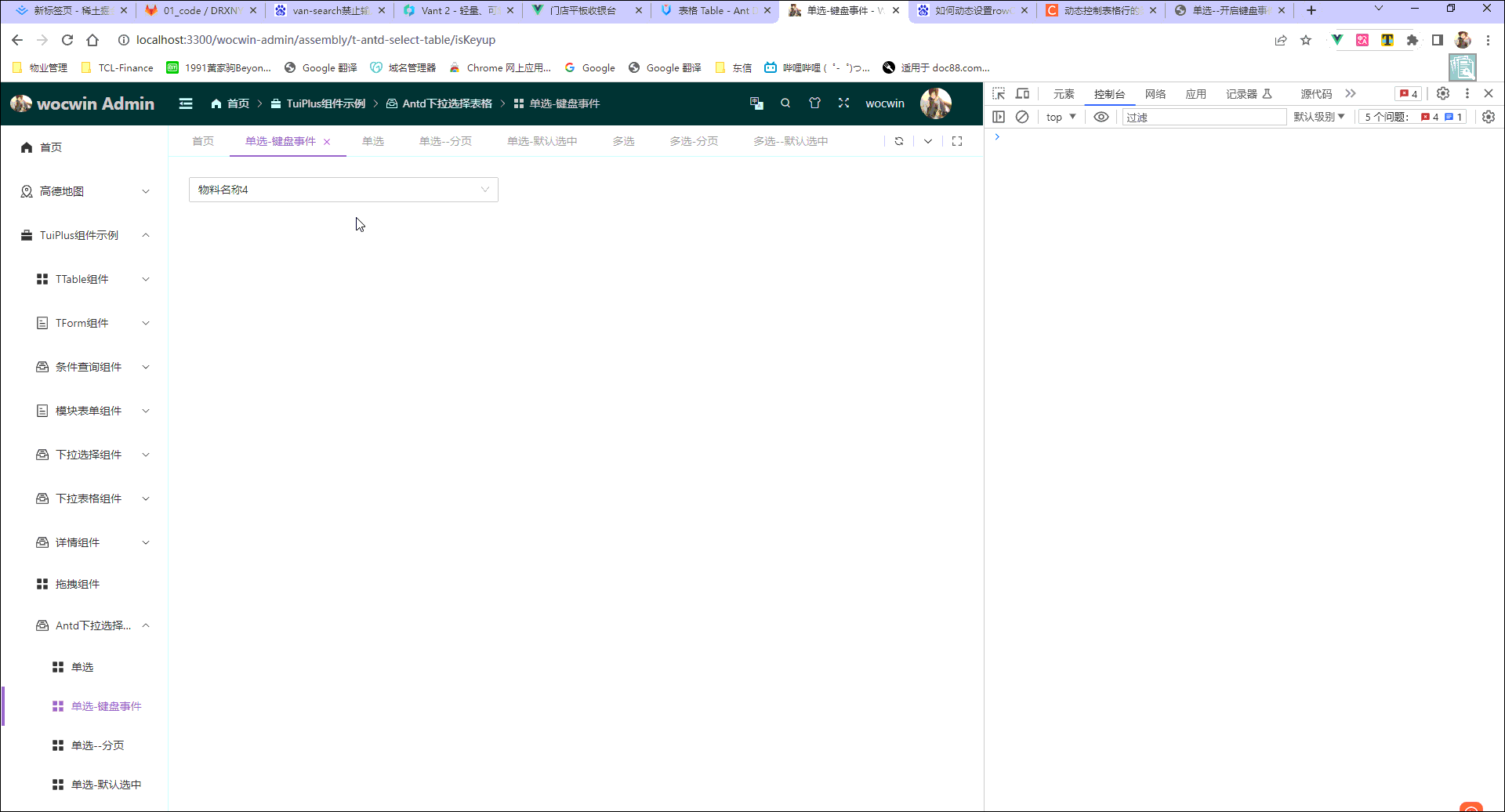
一、最终效果
二、代码示例
<t-antd-select-table
    ref="tantdselecttable"
    selectWidth="40%"
    v-model="state.selectVal"
    :table="state.table"
    :columns="state.table.columns"
    :scroll="{ x: 2000, y: 400 }"
    isShowPagination
    :keywords="{ label: 'materialName', value: 'materialCode' }"
    @checked-change="checkedChange"
    :defaultSelectVal="state.defaultSelectVal"
    @change="tablePaginationChange"
    placeholder="antd下拉选择表格"
  ></t-antd-select-table>
三、配置参数(Attributes)继承 a-table 及 a-select 属性
| 参数 | 说明 | 类型 | 默认值 |
|---|
| v-model | 绑定值 keywords.label | Array | - |
| table | 表格数据对象 | Object | {} |
| —data | 展示下拉数据源 | Array | [] |
| —pagination | 配合isShowPagination,其配置继承a-table | Array | [] |
| columns | 表格列的配置描述,具体项AntDesignVue文档 | Array | [] |
| keywords | 关键字配置 | Object | 无 |
| ------label | 选项的标签 | String | ‘label’ |
| ------value | 选项的值((value-key 配置) ) | String | ‘value’ |
| rowSelection | 列表项是否可选择–具体查看AntDesignVue文档 | Object | - |
| isShowPagination | 是否开启分页 | Boolean | false |
| isKeyup | 单选是否开启键盘事件(上下选择高亮,回车选中) | Boolean | false |
| mode | 是否多选(配置’multiple’)默认单选 | String | - |
| defaultSelectVal | 设置第一页默认选中项–keywords.value 值 | Array | - |
| selectWidth | select宽度 (string设置百分比,number设置px) | String/Number | 200 |
| tableWidth | table 宽度 | Number | 550 |
2-1、columns 配置参数(Attributes)继承 a-table columns 属性
| 参数 | 说明 | 类型 | 默认值 |
|---|
| align | 设置列的对齐方式 | left /right /center | left |
| colSpan | 表头列合并,设置为 0 时,不渲染 | number | - |
| customCell | 设置单元格属性 | Function(record, rowIndex, column) | - |
| customFilterDropdown | 启用 v-slot:customFilterDropdown,优先级低于 filterDropdown | boolean | false |
| customHeaderCell | 设置头部单元格属性 | Function(column) | - |
| customRender | 生成复杂数据的渲染函数,参数分别为当前行的值,当前行数据,行索引 | Function({text, record, index, column}) {} | - |
| dataIndex | 列数据在数据项中对应的路径,支持通过数组查询嵌套路径 | string / string[] | - |
| defaultFilteredValue | 默认筛选值 | string[] | - |
| defaultSortOrder | 默认排序顺序 ascend | descend - | |
| ellipsis | 超过宽度将自动省略 设置为 true 或 { showTitle?: boolean } 时,表格布局将变成 tableLayout=“fixed”。 | boolean / { showTitle?: boolean } | false |
| filterDropdown | 可以自定义筛选菜单,此函数只负责渲染图层,需要自行编写各种交互 | VNode | - |
| filterDropdownVisible | 用于控制自定义筛选菜单是否可见 | boolean | - |
| filtered | 标识数据是否经过过滤,筛选图标会高亮 | boolean | false |
| filteredValue | 筛选的受控属性,外界可用此控制列的筛选状态,值为已筛选的 value 数组 | string[] | - |
| filterIcon | 自定义 filter 图标。 | VNode / ({filtered: boolean, column: Column}) => vNode | false |
| filterMode | 指定筛选菜单的用户界面 | ‘menu’ /‘tree’ | ‘menu’ |
| filterMultiple | 是否多选 | boolean | true |
| filters | 表头的筛选菜单项 | object[] | - |
| filterSearch | 筛选菜单项是否可搜索 | Boolean | false |
| fixed | 列是否固定,可选 true(等效于 left) ‘left’ ‘right’ | boolean/string | false |
| key | Vue 需要的 key,如果已经设置了唯一的 dataIndex,可以忽略这个属性 | string | - |
| maxWidth | 拖动列最大宽度,会受到表格自动调整分配宽度影响 | number | - |
| minWidth | 拖动列最小宽度,会受到表格自动调整分配宽度影响 | number | 50 |
| resizable | 是否可拖动调整宽度,此时 width 必须是 number 类型 | boolean | - |
| responsive | 响应式 breakpoint 配置列表。未设置则始终可见。 | Breakpoint[] | - |
| showSorterTooltip | 表头显示下一次排序的 tooltip 提示, 覆盖 table 中 showSorterTooltip | boolean /Tooltip props | true |
| sortDirections | 支持的排序方式,取值为 ‘ascend’ ‘descend’ | Array | [‘ascend’, ‘descend’] |
| sorter | 排序函数,本地排序使用一个函数(参考 Array.sort 的 compareFunction),需要服务端排序可设为 true | Function/boolean | - |
| sortOrder | 排序的受控属性,外界可用此控制列的排序,可设置为 ‘ascend’ ‘descend’ false | boolean/string | - |
| title | 列头显示文字 | string | - |
| width | 列宽度 | string/number | - |
| onFilter | 本地模式下,确定筛选的运行函数, 使用 template 或 jsx 时作为filter事件使用 | Function | - |
| onFilterDropdownVisibleChange | 自定义筛选菜单可见变化时调用,使用 template 或 jsx 时作为filterDropdownVisibleChange事件使用 | function(visible) {} | - |
2-2、a-pagination 配置参数(Attributes)继承 a-pagination属性(分页配置)
| 参数 | 说明 | 类型 | 默认值 |
|---|
| current(v-model) | 当前页数 | number | - |
| defaultPageSize | 默认的每页条数 | number | 10 |
| disabled | 禁用分页 | boolean | - |
| hideOnSinglePage | 只有一页时是否隐藏分页器 | boolean | false |
| itemRender | 用于自定义页码的结构,可用于优化 SEO | ({page, type: ‘page’ / ‘prev’ /‘next’, originalElement}) => vNode / v-slot | - |
| pageSize(v-model) | 每页条数 | number | - |
| pageSizeOptions | 指定每页可以显示多少条 | string[] | [‘10’, ‘20’, ‘30’, ‘40’] |
| responsive | 当 size 未指定时,根据屏幕宽度自动调整尺寸 | boolean | - |
| showLessItems | 是否显示较少页面内容 | boolean | false |
| showQuickJumper | 是否可以快速跳转至某页 | boolean | false |
| showSizeChanger | 是否展示 pageSize 切换器,当 total 大于 50 时默认为 true | boolean | - |
| showTotal | 用于显示数据总量和当前数据顺序 | Function(total, range) | - |
| simple | 当添加该属性时,显示为简单分页 | boolean | - |
| size | 当为「small」时,是小尺寸分页 | string | “” |
| total | 数据总数 | number | 0 |
2-3、rowSelection 配置参数(Attributes)继承 a-table rowSelection 属性
| 参数 | 说明 | 类型 | 默认值 |
|---|
| checkStrictly | checkable 状态下节点选择完全受控(父子数据选中状态不再关联) | boolean | true |
| columnTitle | 自定义列表选择框标题 | string/VNode | - |
| columnWidth | 自定义列表选择框宽度 | string/number | - |
| fixed | 把选择框列固定在左边 | boolean | - |
| getCheckboxProps | 选择框的默认属性配置 | Function(record) | - |
| hideDefaultSelections | 去掉『全选』『反选』两个默认选项 | boolean | false |
| hideSelectAll | 隐藏全选勾选框与自定义选择项 | boolean | false |
| preserveSelectedRowKeys | 当数据被删除时仍然保留选项的 key | boolean | - |
| selectedRowKeys | 指定选中项的 key 数组,需要和 onChange 进行配合 | string[] | [] |
| selections | 自定义选择项 配置项, 设为 true 时使用默认选择项 | object[] / boolean | true |
| type | 多选/单选,checkbox or radio | string | checkbox |
| onChange | 选中项发生变化时的回调 | Function(selectedRowKeys, selectedRows) | - |
| onSelect | 用户手动选择/取消选择某列的回调 | Function(record, selected, selectedRows, nativeEvent) | - |
| onSelectAll | 用户手动选择/取消选择所有列的回调 | Function(selected, selectedRows, changeRows) | - |
| onSelectInvert | 用户手动选择反选的回调 | Function(selectedRows) | - |
| onSelectNone | 用户清空选择的回调 | function() | - |
四、事件(events)继承 a-table 及 a-select 事件
| 事件名 | 说明 | 回调参数 |
|---|
| checkedChange | 选中项事件 | 返回选中项的 keywords.value 集合与选中的项集合 |
五、方法(a-select—Methods)
| 方法名 | 说明 | 回调参数 |
|---|
| focus | 使 input 获取焦点 | - |
| blur | 使 input 失去焦点,并隐藏下拉框 | - |
| openSelectDropdown | 显示下拉框 | - |
六、 源码
<template>
<a-select
ref="selectRef"
v-model:value="childSelectedValue"
class="t-antd-select-table"
dropdownClassName="t_antd_select_dropdown"
:style="`width:${typeof selectWidth === 'number' ? `${selectWidth}px` : `${selectWidth}`}`"
:mode="mode"
:open="open"
v-bind="selectAttr"
:value-key="keywords.value"
:filterOption="false"
@search="filterMethodHandle"
@dropdown-visible-change="visibleChange"
@deselect="removeTag"
@clear="clear"
@input-key-down="selectKeyup"
>
<template #notFoundContent>
<div class="t-table-select__table" :style="{ width: `${tableWidth}px` }">
<a-table
ref="selectTable"
:data-source="state.tableData"
:columns="columns"
bordered
:row-key="getRowKey"
:row-class-name="getRowClass"
:pagination="isShowPagination && table.pagination"
:row-selection="
rowSelection || {
selectedRowKeys: state.selectedRowKeys,
onChange: onSelectChange,
onSelectNone: onSelectNone,
type: mode === 'multiple' ? 'checkbox' : 'radio'
}
"
:customRow="rowClick"
v-bind="$attrs"
>
<template #[item]="scope" v-for="item in renderArr">
<slot :name="item" :scope="scope" v-bind="scope || {}"></slot>
</template>
<slot></slot>
</a-table>
</div>
</template>
</a-select>
</template>
<script setup lang="ts" name="TAntdSelectTable">
import { computed, useAttrs, ref, watch, reactive, onMounted, useSlots } from "vue";
const props = defineProps({
modelValue: {
type: [String, Number, Array]
},
table: {
type: Object,
default: () => {
return {};
}
},
columns: {
type: Array as unknown as any[],
default: () => []
},
rowClickRadio: {
type: Boolean,
default: true
},
rowSelection: {
type: Object
},
isShowPagination: {
type: Boolean,
default: false
},
keywords: {
type: Object,
default: () => {
return {
label: "label",
value: "value"
};
}
},
mode: {
type: String
},
isKeyup: {
type: Boolean,
default: false
},
selectWidth: {
type: [String, Number],
default: 200
},
tableWidth: {
type: Number,
default: 550
},
defaultSelectVal: {
type: Array as unknown as any[]
}
});
const selectAttr = computed(() => {
return {
allowClear: true,
showSearch: true,
dropdownMatchSelectWidth: false,
...useAttrs()
};
});
const slots = useSlots();
const renderArr = Object.keys(slots);
const isDefaultSelectVal = ref(true);
const open = ref(false);
const nowIndex = ref(-1);
const state: any = reactive({
defaultSelectValue: props.defaultSelectVal,
tableData: props.table.data,
activeTableRow: {},
selectedRowKeys: [] as (string | number)[],
selectedRows: []
});
const selectRef: any = ref<HTMLElement | null>(null);
const selectTable: any = ref<HTMLElement | null>(null);
const emits = defineEmits(["checkedChange", "update:modelValue"]);
watch(
() => props.table.data,
val => {
state.tableData = val;
},
{ deep: true }
);
watch(
() => props.defaultSelectVal,
val => {
state.defaultSelectValue = val;
if (val && isDefaultSelectVal.value) {
defaultSelect(val);
}
},
{ deep: true }
);
let childSelectedValue = computed({
get() {
return props.modelValue;
},
set(val) {
emits("update:modelValue", val);
}
});
onMounted(() => {
if (state.defaultSelectValue && isDefaultSelectVal.value) {
defaultSelect(state.defaultSelectValue);
}
});
const onSelectChange = (selectedRowKeys: any, selectedRows: any) => {
setTimeout(() => {
state.selectedRowKeys = selectedRowKeys;
state.selectedRows = selectedRows;
isDefaultSelectVal.value = false;
if (state.selectedRowKeys.length > 0 && state.selectedRows.length > 0) {
if (props.mode === "multiple") {
childSelectedValue.value =
state.selectedRows.length > 0 && state.selectedRows.map((item: { [x: string]: any }) => item[props.keywords.label]);
} else {
state.activeTableRow = state.selectedRows[0];
childSelectedValue.value = state.selectedRows[0][props.keywords.label];
blur();
}
} else {
childSelectedValue.value = undefined;
}
emits("checkedChange", state.selectedRowKeys, state.selectedRows);
}, 10);
};
const rowClick = (record: { [x: string]: any }) => {
return {
onClick: () => {
if (props.mode !== "multiple") {
if (!props.rowClickRadio) return;
const keys = [];
const items = [];
keys.push(record[props.keywords.value]);
items.push(record);
onSelectChange(keys, items);
} else {
const indexRow = state.selectedRowKeys.indexOf(record[props.keywords.value]);
indexRow === -1 ? state.selectedRowKeys.push(record[props.keywords.value]) : state.selectedRowKeys.splice(indexRow, 1);
if (indexRow === -1) {
state.selectedRows.push(record);
} else {
state.selectedRows.splice(indexRow, 1);
}
onSelectChange(state.selectedRowKeys, state.selectedRows);
}
}
};
};
const selectKeyup = (e: { keyCode: any }) => {
if (!(props.mode === "multiple")) {
if (!props.isKeyup) return;
if (state.tableData.length === 0) return;
switch (e.keyCode) {
case 40:
if (state.tableData[nowIndex.value + 1] !== undefined) {
state.activeTableRow = state.tableData[nowIndex.value + 1];
nowIndex.value = nowIndex.value + 1;
} else {
nowIndex.value = 0;
state.activeTableRow = state.tableData[0];
}
break;
case 38:
if (state.tableData[nowIndex.value - 1] !== undefined && nowIndex.value > 0) {
state.activeTableRow = state.tableData[nowIndex.value - 1];
nowIndex.value = nowIndex.value - 1;
} else {
nowIndex.value = 0;
state.activeTableRow = state.tableData[0];
}
break;
case 13:
if (state.tableData[nowIndex.value]) {
const keys = [];
const items = [];
keys.push(state.tableData[nowIndex.value][props.keywords.value]);
items.push(state.tableData[nowIndex.value]);
onSelectChange(keys, items);
}
break;
}
}
};
const getRowClass = (record: any) => {
return state.activeTableRow[props.keywords.value] === record[props.keywords.value] && props.isKeyup
? "active-selected-row"
: "";
};
const defaultSelect = (defaultSelectVal: any[]) => {
if (props.mode === "multiple") {
setTimeout(() => {
if (defaultSelectVal.length > 0) {
let multipleList: any = [];
let selectedRowKeys: any = [];
let selectedRows: any = [];
defaultSelectVal.map((val: any) => {
state.tableData.forEach((row: any) => {
if (val === row[props.keywords.value]) {
multipleList.push(row);
}
});
});
multipleList.forEach((row: { [x: string]: any }) => {
state.tableData.forEach((item: { [x: string]: any }) => {
if (item[props.keywords.value] === row[props.keywords.value]) {
selectedRowKeys.push(item[props.keywords.value]);
selectedRows.push(item);
}
});
});
state.selectedRowKeys = selectedRowKeys;
state.selectedRows = selectedRows;
childSelectedValue.value =
state.selectedRows.length > 0 && state.selectedRows.map((item: { [x: string]: any }) => item[props.keywords.label]);
} else {
childSelectedValue.value = undefined;
}
}, 0);
} else {
setTimeout(() => {
if (defaultSelectVal.length > 0) {
state.tableData.map((val: { [x: string]: any }) => {
if (val[props.keywords.value] === defaultSelectVal[0]) {
state.selectedRowKeys = defaultSelectVal;
state.selectedRows = [val];
}
});
childSelectedValue.value = state.selectedRows[0] && state.selectedRows[0][props.keywords.label];
} else {
childSelectedValue.value = undefined;
}
}, 20);
}
};
const getRowKey = (row: { [x: string]: any }) => {
return row[props.keywords.value];
};
const filterMethodHandle = (input: string) => {
setTimeout(() => {
const tableData = JSON.parse(JSON.stringify(props.table?.data));
if (tableData && tableData.length > 0) {
if (!(props.mode === "multiple")) {
if (input) {
state.selectedRowKeys = [];
} else {
tableData.map((item: { [x: string]: any }) => {
if (item[props.keywords.value] === (state.selectedRows[0] && state.selectedRows[0][props.keywords.value])) {
state.selectedRowKeys = [item[props.keywords.value]];
}
});
}
}
state.tableData = tableData.filter((item: { [x: string]: string | any[] }) => {
if (item[props.keywords.label].includes(input)) {
return item;
}
});
}
}, 0);
};
const visibleChange = (visible: boolean) => {
open.value = visible;
if (visible) {
if (props.defaultSelectVal && isDefaultSelectVal.value) {
defaultSelect(props.defaultSelectVal);
}
} else {
filterMethodHandle("");
}
};
const removeTag = (tag: any) => {
const row = state.tableData.find((item: { [x: string]: any }) => item[props.keywords.label] === tag);
if (row) {
const indexRow = state.selectedRowKeys.indexOf(row[props.keywords.value]);
indexRow === -1 ? state.selectedRowKeys.push(row[props.keywords.value]) : state.selectedRowKeys.splice(indexRow, 1);
if (indexRow === -1) {
state.selectedRows.push(row);
} else {
state.selectedRows.splice(indexRow, 1);
}
onSelectChange(state.selectedRowKeys, state.selectedRows);
}
};
const onSelectNone = () => {
nextTick(() => {
state.selectedRowKeys = [];
state.selectedRows = [];
childSelectedValue.value = [];
});
};
const clear = () => {
if (props.mode === "multiple") {
onSelectNone();
} else {
console.log("单选");
nextTick(() => {
state.selectedRowKeys = [];
state.selectedRows = [];
state.activeTableRow = {};
});
}
};
const blur = () => {
selectRef.value.blur();
};
const focus = () => {
selectRef.value.focus();
};
const openSelectDropdown = () => {
open.value = true;
};
defineExpose({ focus, blur, openSelectDropdown, state });
</script>
<style lang="scss">
.t_antd_select_dropdown {
.t-table-select__table {
padding: 10px;
.ant-table-body,
.ant-table-header {
margin: 0;
}
.ant-table-body {
.ant-table-tbody {
.ant-table-row {
cursor: pointer;
}
.ant-table-row-selected,
.active-selected-row {
color: #409eff;
background-color: #ecf5ff;
}
}
}
}
.ant-pagination {
flex-wrap: nowrap;
}
}
</style>
七、在线预览目录
源码地址
gitHub组件地址
gitee码云组件地址
在线预览地址
相关文章
基于ElementUi或AntdUI再次封装基础组件文档
基于Element-plus再次封装基础组件文档(vue3+ts)


 8983
8983


 被折叠的 条评论
为什么被折叠?
被折叠的 条评论
为什么被折叠?
 到【灌水乐园】发言


