


使用padding来代替伪元素实现绘图
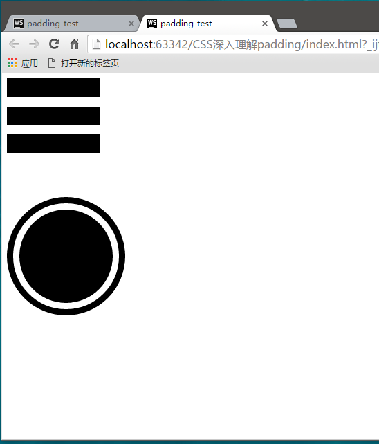
HTML
<div class="line-tri"></div>


<div class="eye"></div>
CSS
        .line-tri{
            width: 150px;
            height: 30px;
            padding:15px 0;
            border-top:30px solid;
            border-bottom: 30px solid;
            background-color: currentcolor;
            background-clip: content-box;
        }

        .eye{
            width:150px;
            height: 150px;
            padding:10px;
            border:10px solid;
            border-radius: 50%;
            background-color: currentcolor;
            background-clip: content-box;
        }
看一下效果:
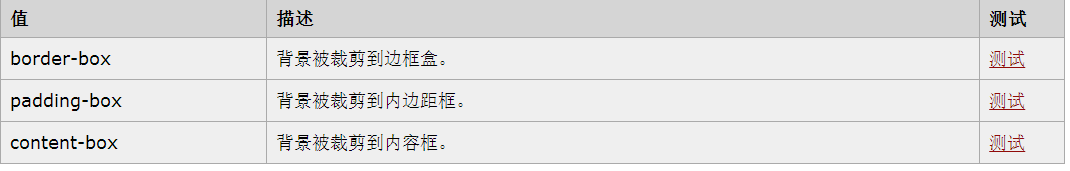
其中涉及到的css3属性background-clip,他还是用来规定背景的显示区域的。他总共有三个属性值:


 384
384


 被折叠的 条评论
为什么被折叠?
被折叠的 条评论
为什么被折叠?
 到【灌水乐园】发言


