


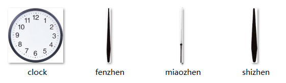
效果图:

一、图片分解:
1、表盘:

2、秒针:

3、分针:

4、时针:

二、工程目录结构:

1、css目录结构:

2、html目录结构:
3、images目录结构:
三、代码部分
HTML部分:
<!DOCTYPE html>
<html lang="en">
<head>
    <meta charset="UTF-8">
    <title>Title</title>
    <link rel="stylesheet" href="../css/public.css">
    <link rel="stylesheet" href="../css/index.css">
</head>
<body>
<div class="clock">
    <img src="../images/miaozhen.png" alt="" class="mz" id="mz">
    <img src="../images/fenzhen.png" alt="" class="fz" id="fz">
    <img src="../images/shizhen.png" alt="" class="sz" id="sz">
</div>
<script>
    //获取元素
    let miaozhen = document.getElementById("mz");
    let fenzhen = document.getElementById("fz");
    let shizhen = document.getElementById("sz");

    let timeGo = function () {
       let mydate = new Date();
       let miao = mydate.getSeconds();
        let fen = mydate.getMinutes();
        let shi = mydate.getHours();
        let haomiao = mydate.getMilliseconds();

       miaozhen.style.transform = `rotateZ(${miao*6+haomiao*0.006}deg)`;
       fenzhen.style.transform = `rotateZ(${fen*6+miao*6*6/360}deg)`;
        shizhen.style.transform = `rotateZ(${shi*30+fen*6*30/360}deg)`;
    }
    let myset = setInterval(timeGo,100)
</script>
</body>
</html>
CSS部分:
1、public.css部分:
*{
    margin: 0;
    padding: 0;
}
ul,li,ol{
    list-style: none;
}
a{
    text-decoration: none;
}
img{
    border:none;
}
.clears{
    clear: both;
    height: 0;
    overflow: hidden;
    line-height: 0;
    font-size: 0;
}
button{
    border: none;
    outline: none;
    cursor: pointer;
}
body{
    font-family: Arial,Verdana,"Microsoft Yahei","Pingfang SC","Simsun";
    font-size: 14px;
}
2、index.css部分
.clock{
    width: 454px;
    height: 454px;
    margin-left: auto;
    margin-right: auto;
    margin-top: 50px;
    background: url("../images/clock.png") no-repeat center;
    position: relative;
}
.mz{
    position: absolute;
    left: 50%;
    top: 50%;
    margin-left: -4.5px;
    margin-top: -130px;
    transform-origin: center 130px;
    transform: rotateZ(0deg);
}
.fz{
    position: absolute;
    left: 50%;
    top: 50%;
    margin-left: -4.5px;
    margin-top: -155px;
    transform-origin: center 155px;
    transform: rotateZ(0deg);
}
.sz{
    position: absolute;
    left: 50%;
    top: 50%;
    margin-left: -4.5px;
    margin-top: -110px;
    transform-origin: center 110px;
    transform: rotateZ(30deg);
}


 252
252


 被折叠的 条评论
为什么被折叠?
被折叠的 条评论
为什么被折叠?
 到【灌水乐园】发言


