


 本文介绍如何使用Qt自定义一个支持QSS样式的SwitchButton,包括实现思路、具体步骤及扩展样式方法。通过继承QPushButton并利用QStyleOption,实现动态渐变效果与复杂样式。
Qt实现一个支持QSS的Switch Button(开关按钮)
本文会比较长,目的是为了提供一种实现自定义复杂控件的方式,对于使用 QSS 应用样式的项目可能会有帮助。
实现的过程会相对比较复杂和难理解,仅作为研究,对于实际开发可能没什么太大价值。
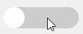
放上最终的实现效果图:
Github源码
问题
- 常见的 Switch Button ,至少包含两部分,槽和滑块,这种由多个小部件组合的控件,在 Qt 内部属于 Complex Control(复杂控件),比如 QComboBox、QSlider。使用样式表定义各部分子控件的样式,需要使用子控件选择器:
QProgressBar::chunk { background-color: #05B8CC; width: 20px; } - Qt 确实没有开放 QStyleSheetStyle 以及相关的 QSS 解析,所以扩充 QSS 的方式实现自定义复杂控件时不可能的。
解决思路
-
我在 QComboBox文字居中的一种解决办法 中发现,QStyle 使用该接口绘制控件(也有其他类似接口):
void QStyle::drawControl(QStyle::ControlElement, const QStyleOption *, QPainter *, const QWidget *)需要 QStyleOption 和 QWidget , 但 QStyleOption 不需要与 QWidget 的类型对应。比如可以使用 QStyleOptionSlider ,但传递 QPushButoon 类型的控件,这样定义在 QPushButoon 上的属于 QSlider 的样式同样可以绘制出来,尽管 QPushButoon 并不支持这些属性:
QPushButton{
    color : red;
}
QPushButton::handle{
    background: blue;
}
这样从侧面证明了,QSS 仅仅只是样式定义的集合,当选择器匹配到控件时,并不关心控件类型,只要绘制时对应的 QStyleOption 能获取到定义的样式即可,而这些样式会被覆盖到 QStyleOption::palette,来实现动态的样式,这也是为什么 QWidget::palette() 并不能影响 QSS 的原因。
实现方式
- 使用 QPushButton 作为基类,将 Switch Button 各部分绘制到按钮上,这样可以保留按钮原生的属性和信号。 Switch Button 可以分为两个部分,槽和滑块,槽可以使用按钮背景控制,滑块作为子控件,使用 QSlider 或其子类。
-
绘制槽
定义好样式,固定高度和圆角,Checked 的伪状态使用 on(实际 Qt 源码在 Checked 时也使用 QStyle::State_On):
SwitchButton{
    background:#CCCCCC; /*Unchecked背景*/
    border: none;
    border-radius: 15px; /*圆角*/
    height: 30px;
}
SwitchButton:on{
    background: #4CCCE6;
}
重写QPushButton::paintEvent ,分两层绘制按钮背景。
QStyleOptionButton buttonOpt;
initStyleOption(&buttonOpt);    // 初始化状态
buttonOpt.rect.adjust(0, 0, -1, 0); // 绘制滑块可能会有一像素偏差
buttonOpt.state &= ~QStyle::State_On;   // 先绘制Unchecked时背景
style()->drawControl(QStyle::CE_PushButtonBevel, &buttonOpt, &painter, this);

painter.setOpacity(progress);   // 定义一个动态渐变值,0~1变化,用透明度动画控制切换

buttonOpt.state |= QStyle::State_On;    // 绘制Checked时背景
style()->drawControl(QStyle::CE_PushButtonBevel, &buttonOpt, &painter, this);
由于滑块滑动过程是个动态过程,背景从 Unchecked 到 Checked 需要切换,这里为了简单控制,使用了两层绘制,所以可能不适合使用带有透明度的颜色值。其他方式在后面会简单介绍。
-
绘制滑块
定义滑块样式。Switch Button 的滑块意义上也可以叫做 handle,所以使用 handle 子控件,滑块高度默认是槽的高度,我这里使用了 QScrollBar 的样式,所以需要限制滑块宽度,也可以使用 QSlider 等。
SwitchButton::handle{
    background: white;
    border:none;
    min-width:30px;
    max-width:30px;
    border-radius:15px; /*圆角*/
}
在绘制背景色后绘制滑块,使用了 QStyleOptionSlider :
painter.setOpacity(1.0); //滑块不透明 QStyleOptionSlider sliderOpt; sliderOpt.init(this); sliderOpt.minimum = 0; sliderOpt.maximum = sliderOpt.rect.width(); // 直接使用像素范围 int position = int(progress * (sliderOpt.rect.width())); // 根据动态值控制滑块范围 sliderOpt.sliderPosition = qMin(qMax(position, 0), sliderOpt.maximum); sliderOpt.sliderValue = sliderOpt.sliderPosition; // 重设滑块区域,Qt源码会这么做,否则会绘制到整个按钮上 sliderOpt.rect = style()->subControlRect(QStyle::CC_ScrollBar, &sliderOpt, QStyle::SC_ScrollBarSlider, this); style()->drawControl(QStyle::CE_ScrollBarSlider, &sliderOpt, &painter, this); // 绘制滑块 -
定义动画
最后可以定义个动画,当状态切换时触发动画,设置 0~1 变化来绘制滑块位置和背景色的渐变。
QVariantAnimation *animation = new QVariantAnimation(this);
animation->setStartValue(0.0);
animation->setEndValue(1.0);
animation->setDuration(200);
connect(animation, &QVariantAnimation::valueChanged, this, [this](const QVariant & val){
    progress = val.toReal();    // progress定义为成员
    update();
});
按钮状态切换为 Checked 时,progress 需要从 0 → 1 变化,所以为正向;状态切换为Unchecked时,progress从 1 → 0 ,所以反向。快读点击时需要暂停动画,重设方向并继续。
QAbstractAnimation::Direction direction = checked ? QAbstractAnimation::Forward : QAbstractAnimation::Backward; bool pause = animation->state() == QAbstractAnimation::Running; if(pause) animation->pause(); animation->setDirection(direction); if(pause) animation->resume(); else animation->start(QAbstractAnimation::KeepWhenStopped); update(); -
更复杂的样式
整个绘制全部使用 QStyle 接口,除了动画时间使用了固定值,其他所有样式完全通过 QSS 设计,按钮 pressed、hover 等状态下的样式也不会受到影响。
如果要针对 handle 单独设置 hover、pressed 等样式,需要根据鼠标位置计算是否在 handle 上,并设置 QStyleOptionComplex::activeSubControls 和 QStyleOption::state 后绘制,判断坐标点位置的子控件也有对应的接口:
virtual QStyle::SubControl QStyle::hitTestComplexControl(...)如果handle不需要拖拽动作,支持的意义不大。不过,Win10 设置里的 Switch Button 是支持鼠标拖拽的,当拖拽超过半个按钮宽度会切换状态,释放后 handle 会从释放位置滑向一边。要支持的话需要兼顾 QPushButon 的原生的鼠标动作,比较麻烦。
其他不同的 Switch Button
- 文章开头的动态图展示了上述代码最终的结果。网络上也有其他稍有差别的 Switch Button,最后做个总结。
-
槽与滑块高度不同

这种可以通过修改上述样式实现:/* 通过修改 marin实现 */ SwitchButton{ border: none; border-radius: 10px; height: 20px; margin: 5px; } SwitchButton::handle{ background: white; border:none; min-width:30px; max-width:30px; margin:-5px; border-radius:15px; } -
有表示开、关状态的文字

这种可以增加绘制按钮文字的逻辑,不过需要控制文字位置,可以根据滑块位置和按钮左侧,居中绘制文字。 -
滑块左侧和右侧颜色不同

这种可以通过修改绘制绘制区域来实现:sliderOpt.rect = style()->subControlRect(QStyle::CC_ScrollBar, &sliderOpt, QStyle::SC_ScrollBarSlider, this); // 将绘制槽的第二层背景色代码移动到获取handle位置之后,修改绘制区域右侧到handle右侧 buttonOpt.state |= QStyle::State_On; buttonOpt.rect.setRight(sliderOpt.rect.right()); style()->drawControl(QStyle::CE_PushButtonBevel, &buttonOpt, &painter, this); style()->drawControl(QStyle::CE_ScrollBarSlider, &sliderOpt, &painter, this);改变绘制区域可能会因为一些margin、padding等不一致引起偏移。
总结
- 如果使用 QPainter 自己绘制,开放接口设置颜色、圆角等样式可能更方便快速开发,上述方法确实过于复杂。
- 尝试实现的过程试过不同的 QStyleOption ,不合适就要重来,查看Qt源码来确定状态和接口是可用的,花费的时间太长。多种控件的混合绘制导致默认样式非常丑,也仅能用于使用 QSS 定制样式的项目。
- 就这些,希望各位能有所收获。


 扫一扫
扫一扫


 494
494

 被折叠的 条评论
为什么被折叠?
被折叠的 条评论
为什么被折叠?
 到【灌水乐园】发言


