


 本文介绍如何在Angular项目中集成Bootstrap框架,包括安装依赖库、配置样式文件及使用Bootstrap组件的过程。通过实例演示了如何实现手风琴效果及按钮、警报框等元素,并解决了图标显示问题。
ng new angular-bootstrap-app

yarn add jquery --save
yarn add popper.js --save
yarn add bootstrap@next
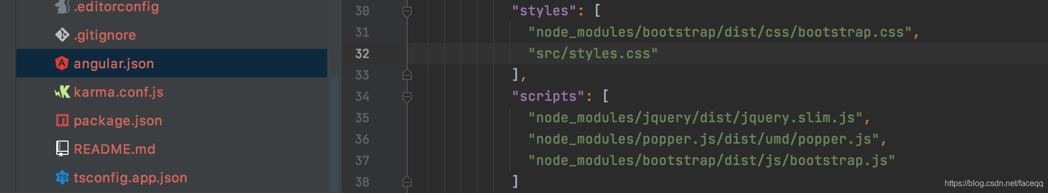
编辑 angular.json styles and scripts
测试
app.component.html添加如下code
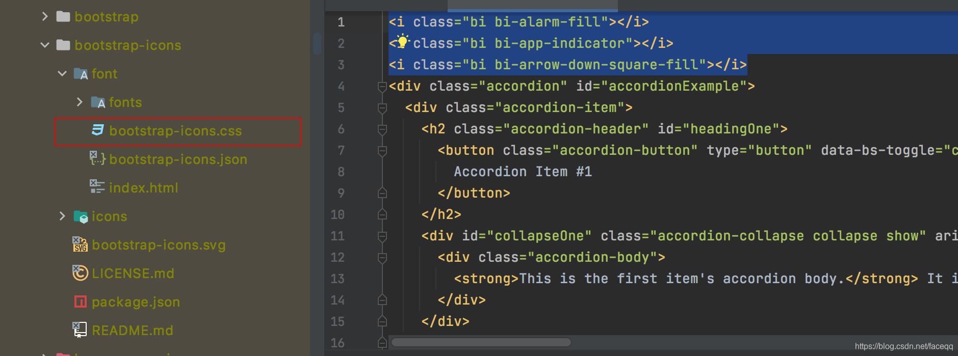
<i class="bi bi-alarm-fill"></i>
<i class="bi bi-app-indicator"></i>
<i class="bi bi-arrow-down-square-fill"></i>
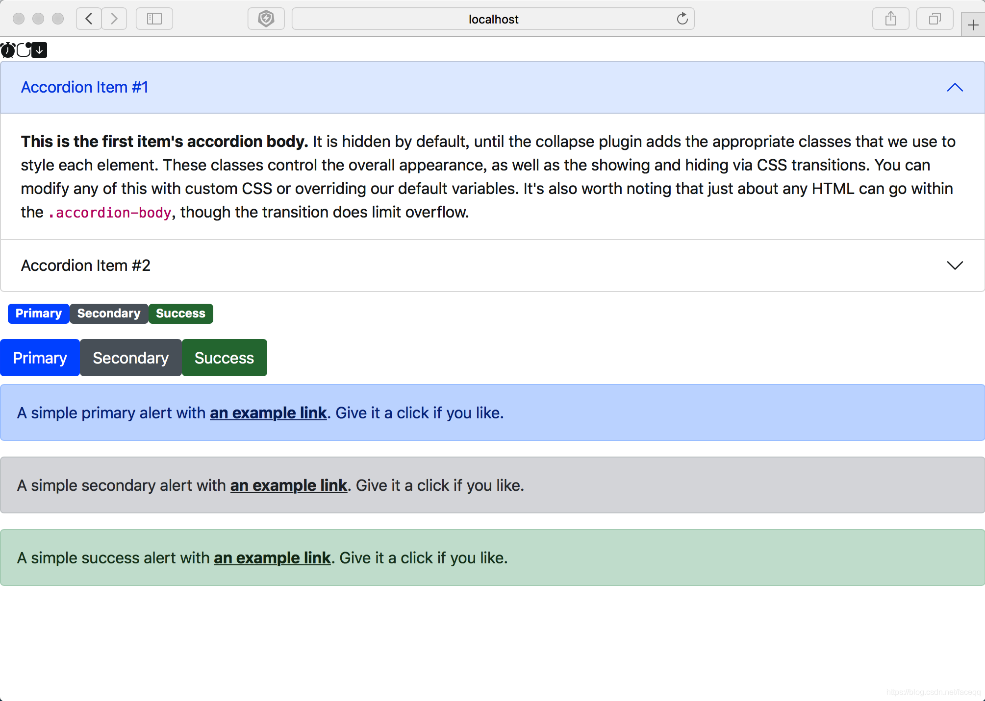
<div class="accordion" id="accordionExample">
<div class="accordion-item">
<h2 class="accordion-header" id="headingOne">
<button class="accordion-button" type="button" data-bs-toggle="collapse" data-bs-target="#collapseOne" aria-expanded="true" aria-controls="collapseOne">
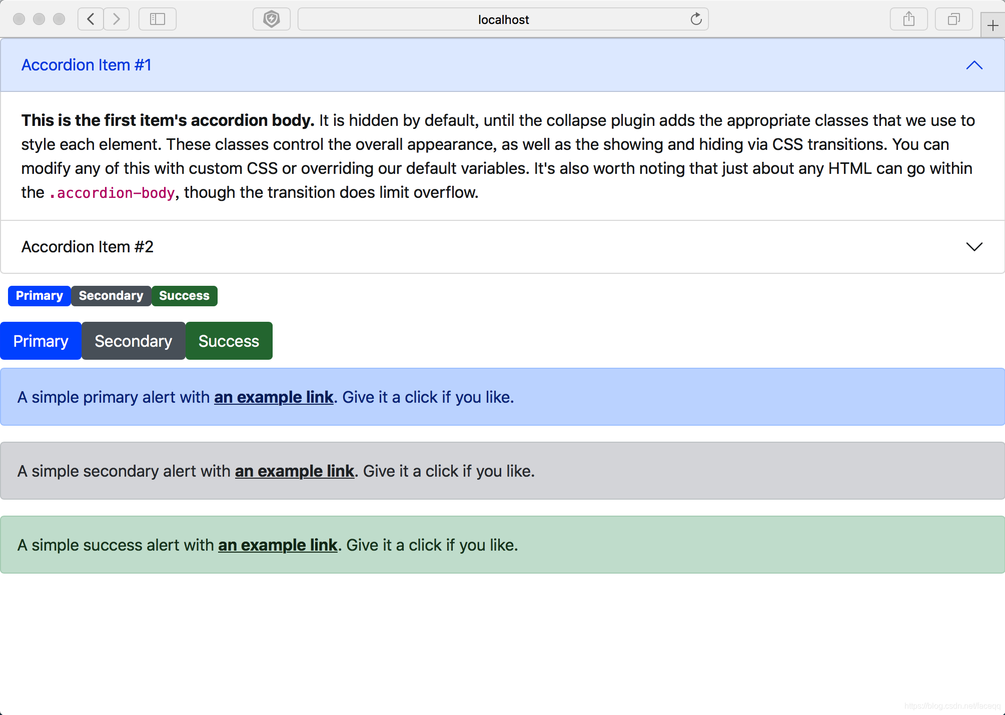
Accordion Item #1
</button>
</h2>
<div id="collapseOne" class="accordion-collapse collapse show" aria-labelledby="headingOne" data-bs-parent="#accordionExample">
<div class="accordion-body">
<strong>This is the first item's accordion body.</strong> It is hidden by default, until the collapse plugin adds the appropriate classes that we use to style each element. These classes control the overall appearance, as well as the showing and hiding via CSS transitions. You can modify any of this with custom CSS or overriding our default variables. It's also worth noting that just about any HTML can go within the <code>.accordion-body</code>, though the transition does limit overflow.
</div>
</div>
</div>
<div class="accordion-item">
<h2 class="accordion-header" id="headingTwo">
<button class="accordion-button collapsed" type="button" data-bs-toggle="collapse" data-bs-target="#collapseTwo" aria-expanded="false" aria-controls="collapseTwo">
Accordion Item #2
</button>
</h2>
<div id="collapseTwo" class="accordion-collapse collapse" aria-labelledby="headingTwo" data-bs-parent="#accordionExample">
<div class="accordion-body">
<strong>This is the second item's accordion body.</strong> It is hidden by default, until the collapse plugin adds the appropriate classes that we use to style each element. These classes control the overall appearance, as well as the showing and hiding via CSS transitions. You can modify any of this with custom CSS or overriding our default variables. It's also worth noting that just about any HTML can go within the <code>.accordion-body</code>, though the transition does limit overflow.
</div>
</div>
</div>
</div>
<div class="pb-md-2 m-2">
<span class="badge bg-primary">Primary</span>
<span class="badge bg-secondary">Secondary</span>
<span class="badge bg-success">Success</span>
</div>
<div class="mb-2">
<button type="button" class="btn btn-primary">Primary</button>
<button type="button" class="btn btn-secondary">Secondary</button>
<button type="button" class="btn btn-success">Success</button>
</div>
<div class="alert alert-primary" role="alert">
A simple primary alert with <a href="#" class="alert-link">an example link</a>. Give it a click if you like.
</div>
<div class="alert alert-secondary" role="alert">
A simple secondary alert with <a href="#" class="alert-link">an example link</a>. Give it a click if you like.
</div>
<div class="alert alert-success" role="alert">
A simple success alert with <a href="#" class="alert-link">an example link</a>. Give it a click if you like.
</div>
运行效果
我们发现
<i class="bi bi-alarm-fill"></i> <i class="bi bi-app-indicator"></i> <i class="bi bi-arrow-down-square-fill"></i>这三行代表的图标并没有出现,我们需要继续引入图标库
yarn add bootstrap-icons
我们在angular.json sytles中添加 bootstrap-icons.css
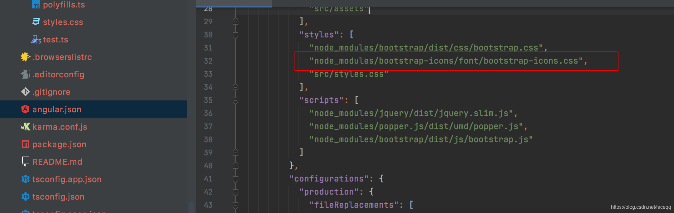
重启应用
图标可以正常显示


 扫一扫
扫一扫


 301
301

 被折叠的 条评论
为什么被折叠?
被折叠的 条评论
为什么被折叠?
 到【灌水乐园】发言


